
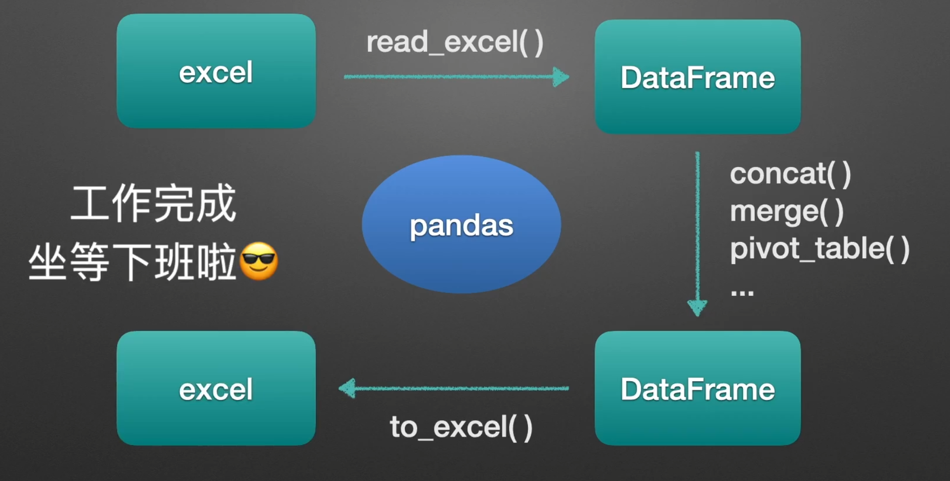
自动化办公(python+excel)
一文上手sklearn机器学习库 - 知乎 (zhihu.com)
Pandas工具简要介绍
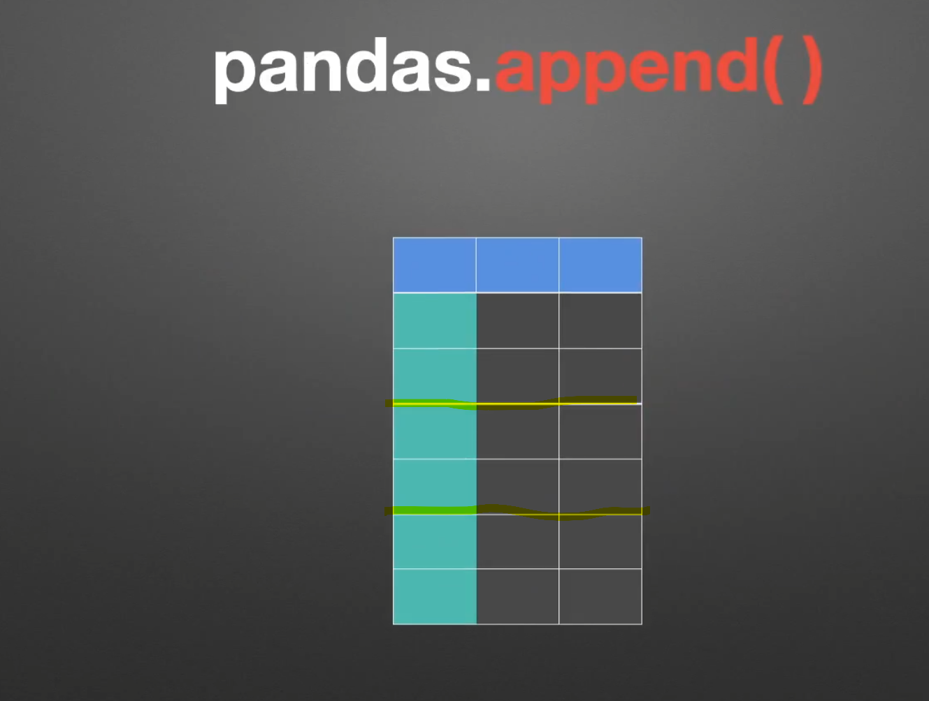
append()
join()

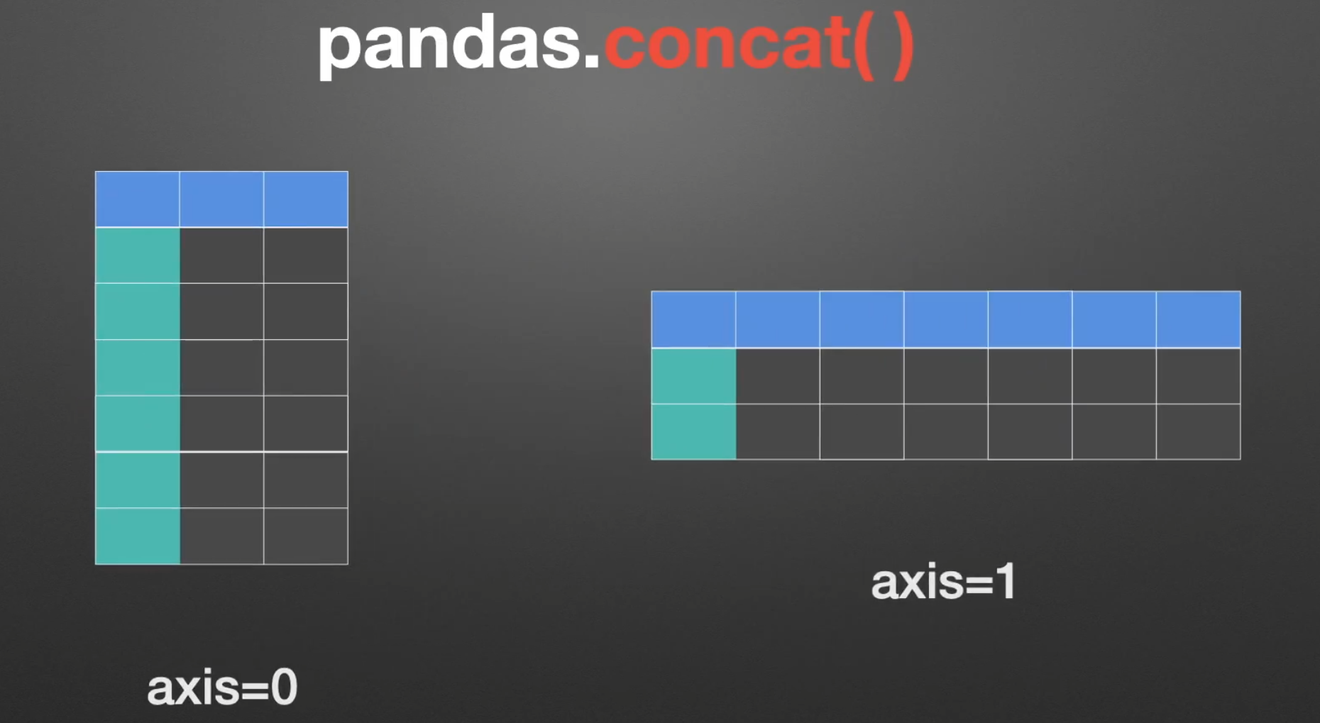
concat()
merge()
pivot_table()
窗口操作 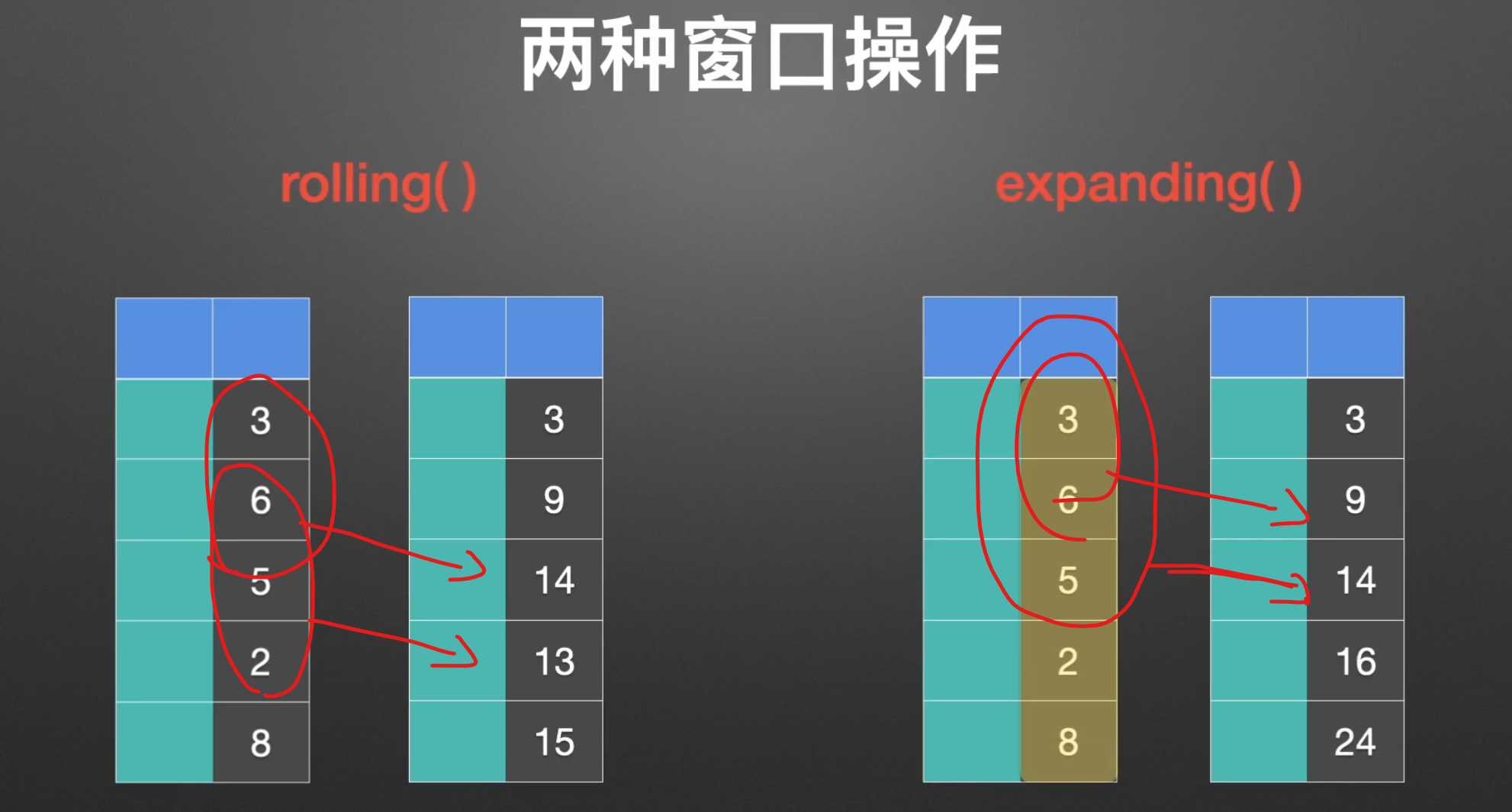
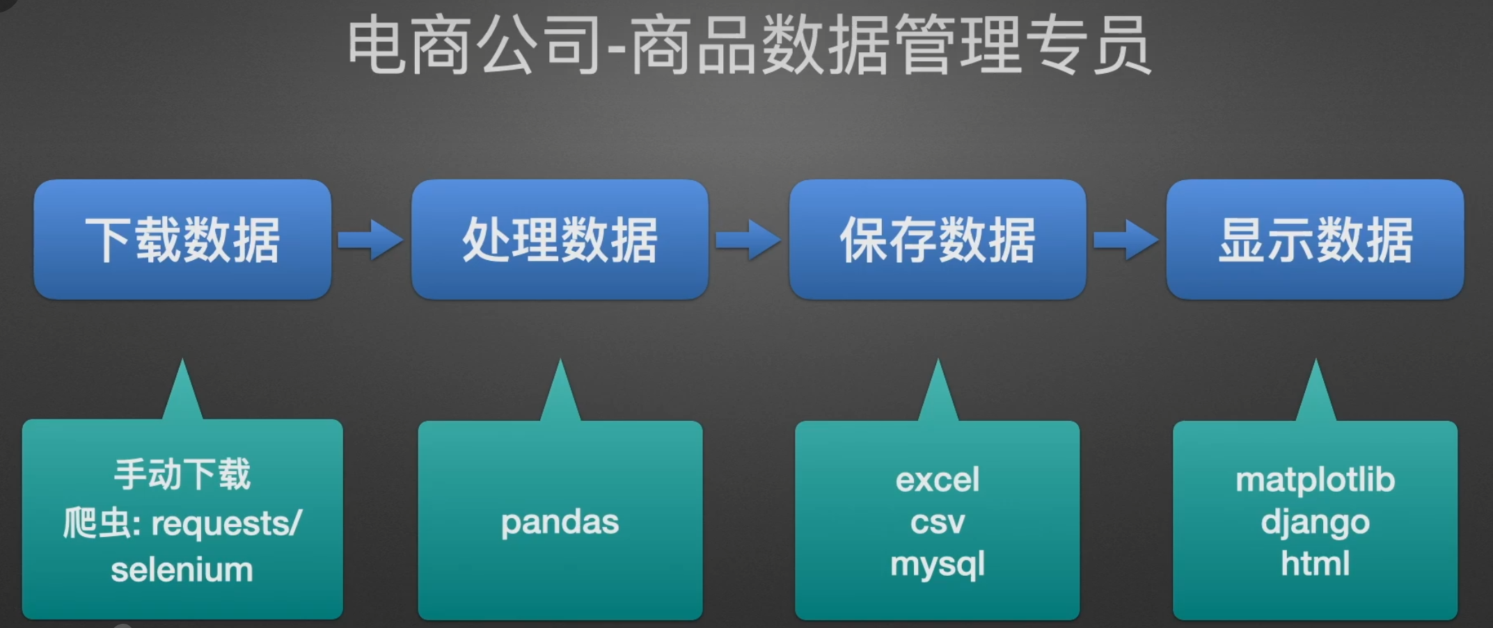
工作职位展示
Pandas简介
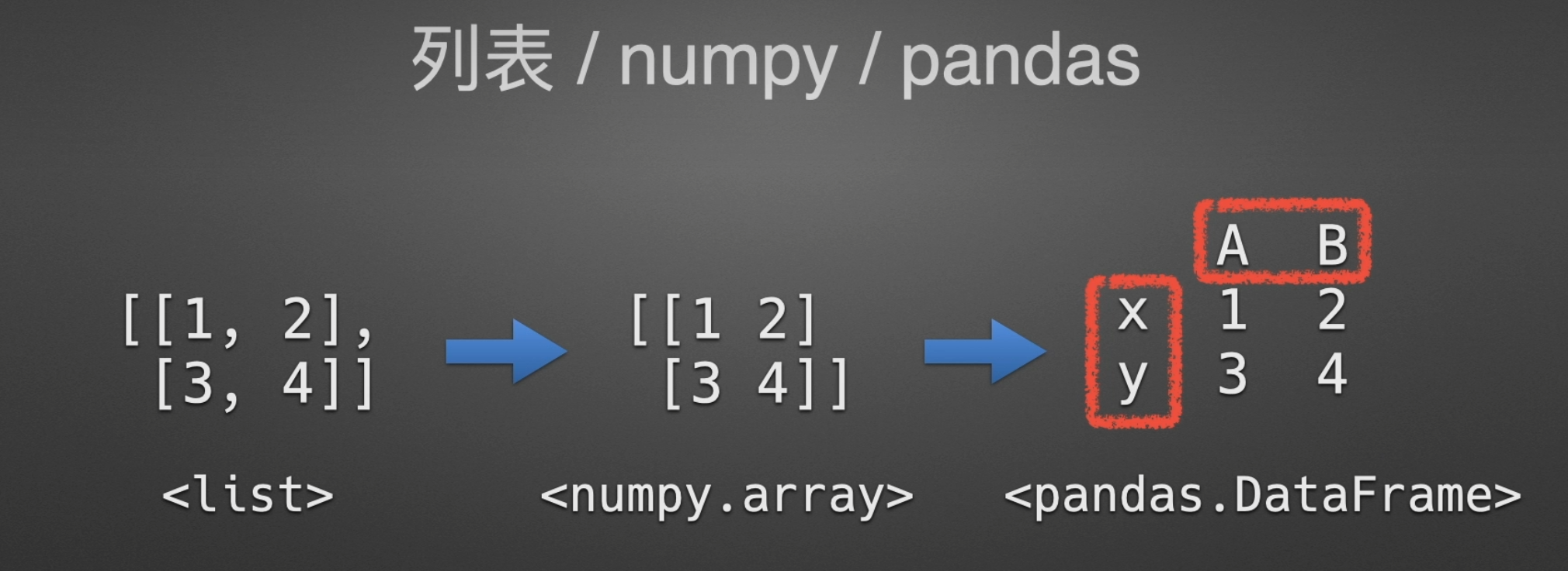
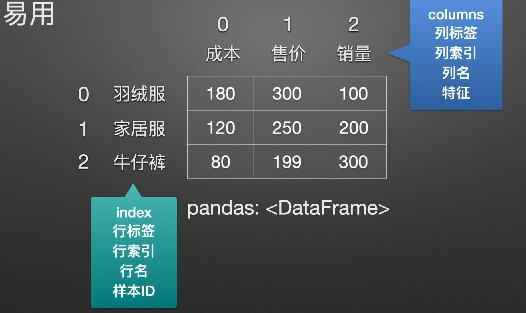
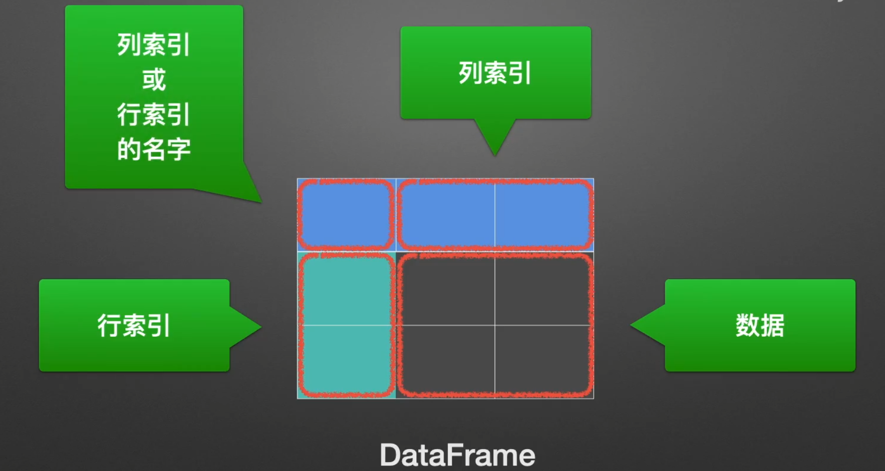
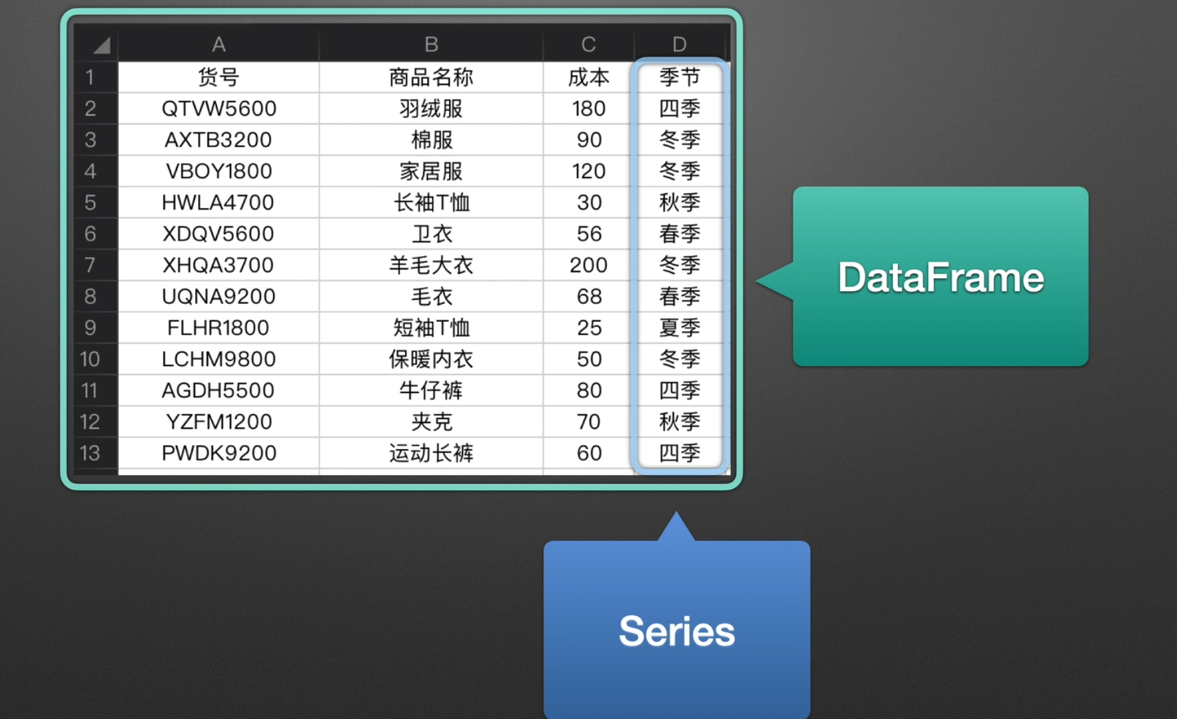
Series & DataFrame

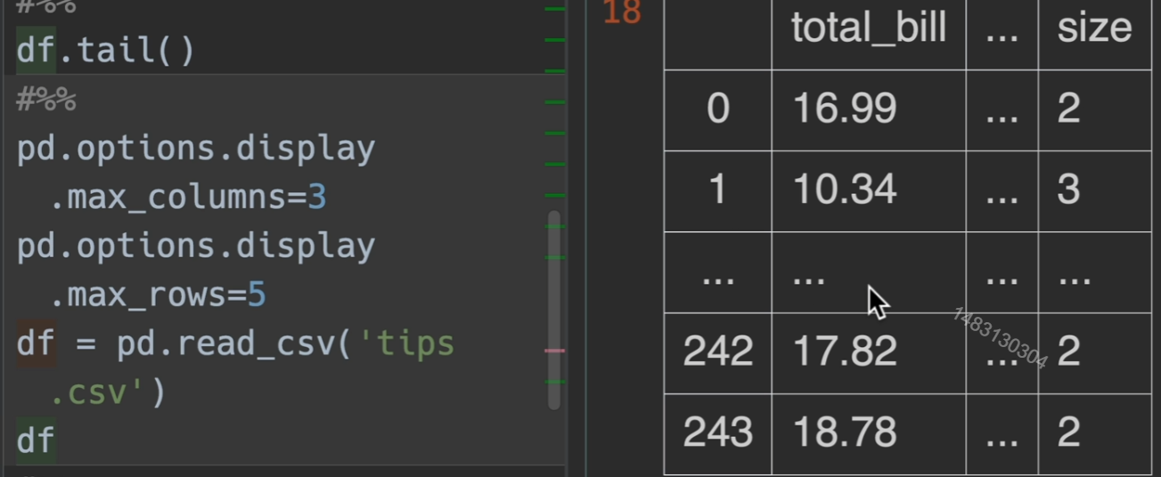
read_excel()参数介绍
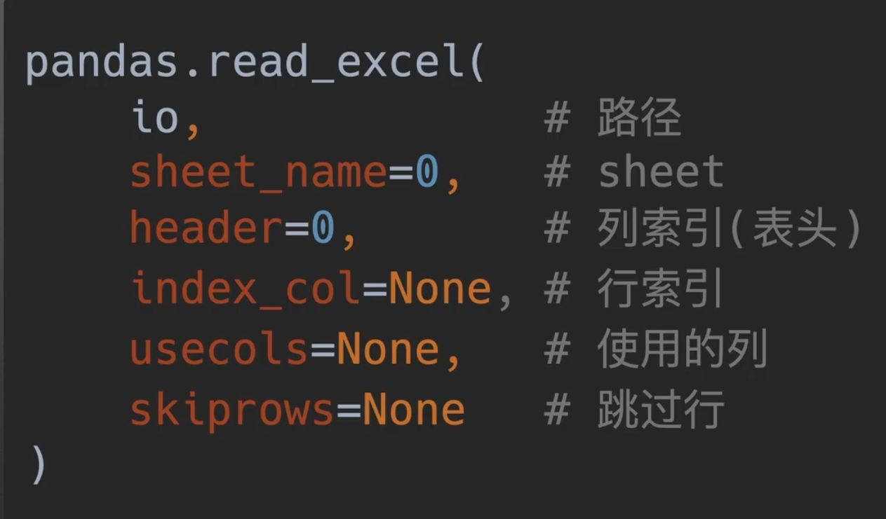
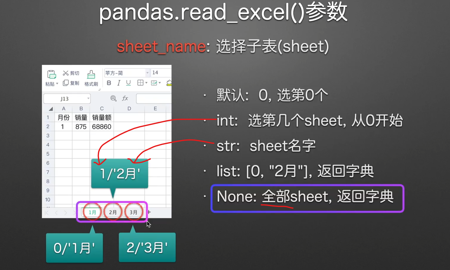
选择子表
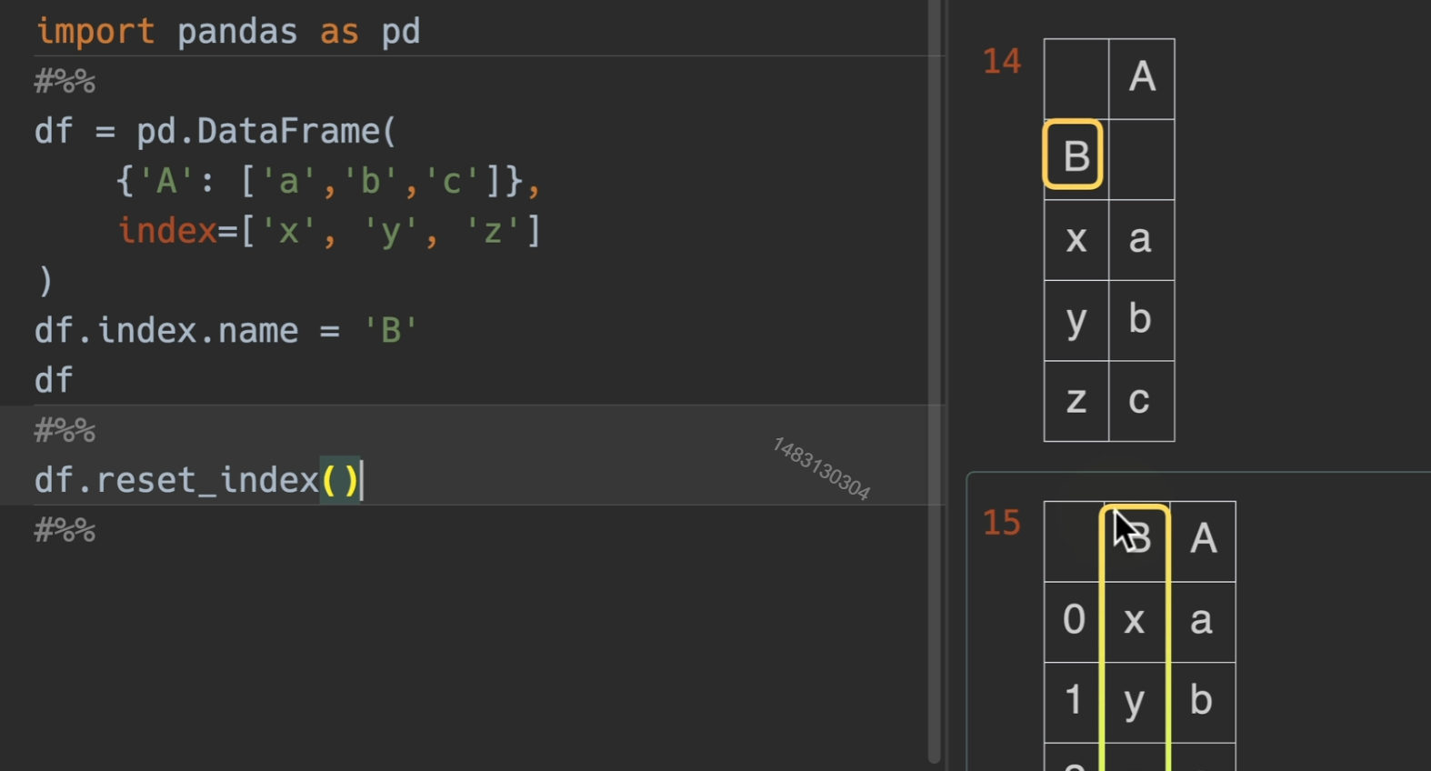
指定表头
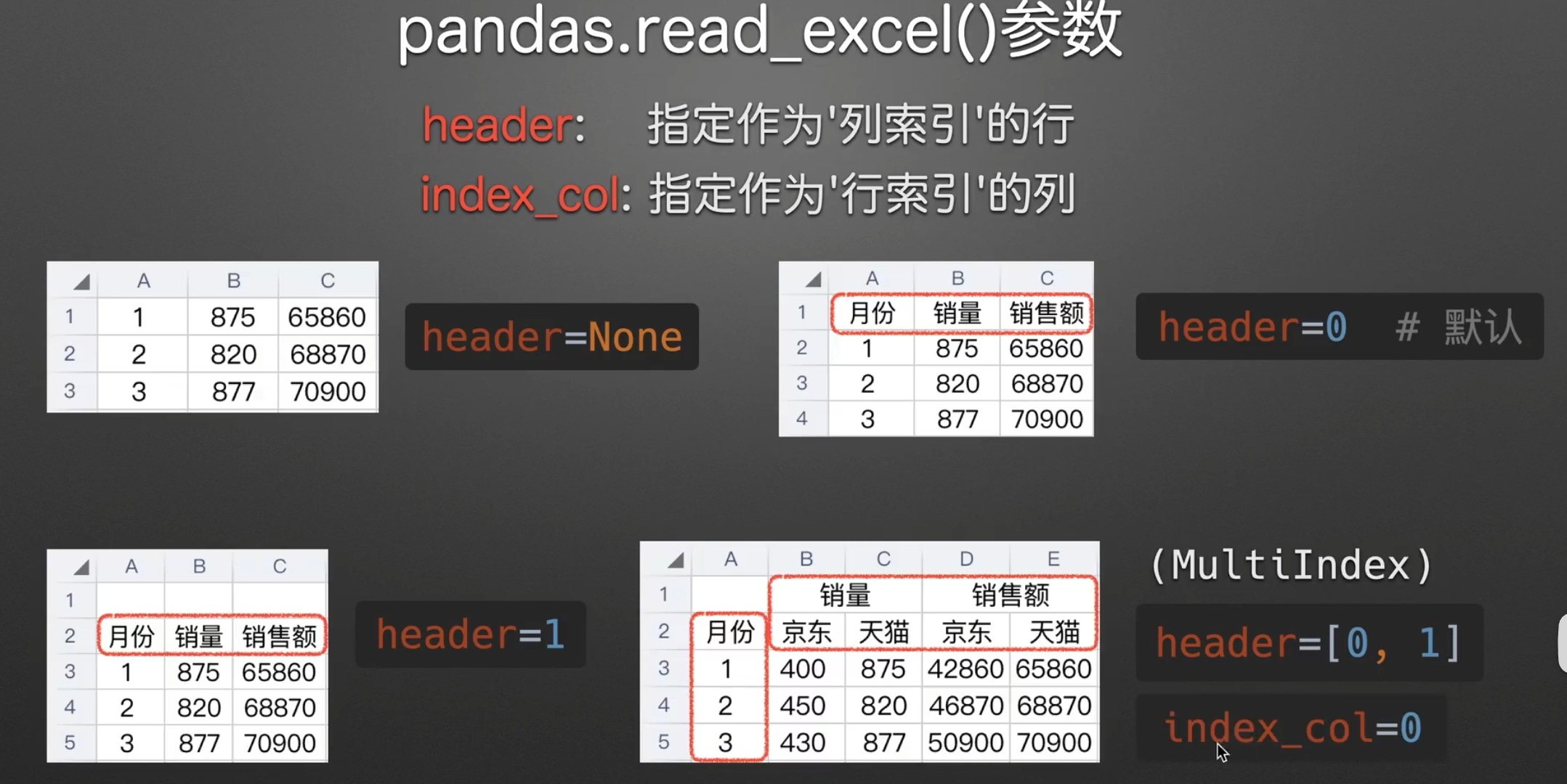
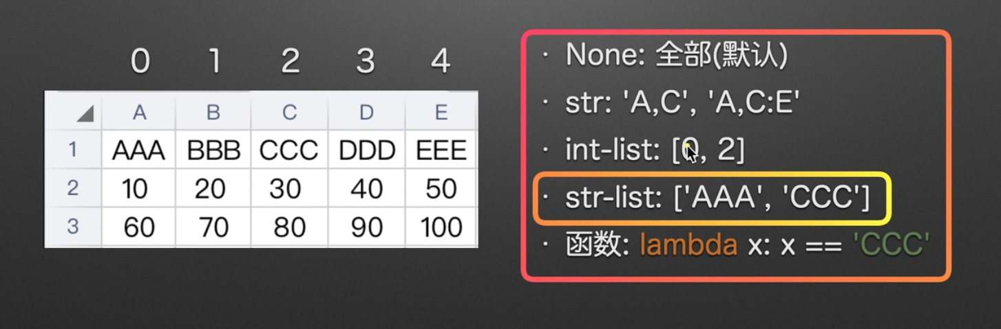
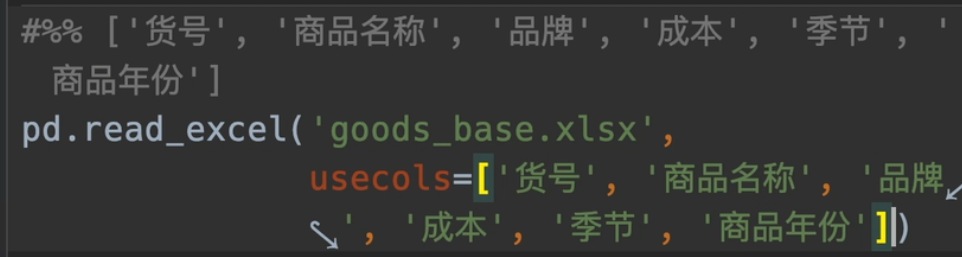
指定使用列
强烈推荐str-list
获取str-list小彩蛋

对其ctrl c

将不要的名字删除,再使用split函数

最后cv,一键得结果
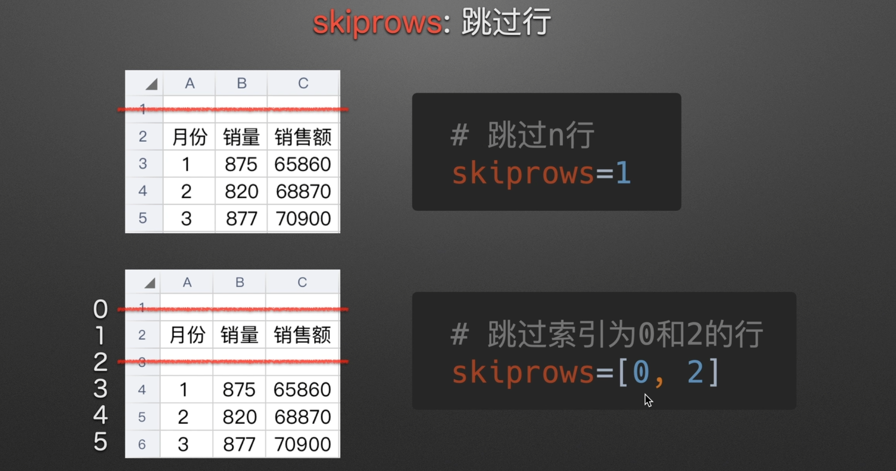
跳过不要的行
跳过不要的列已经给你了usecols这个参数了,所以也无需单独设置
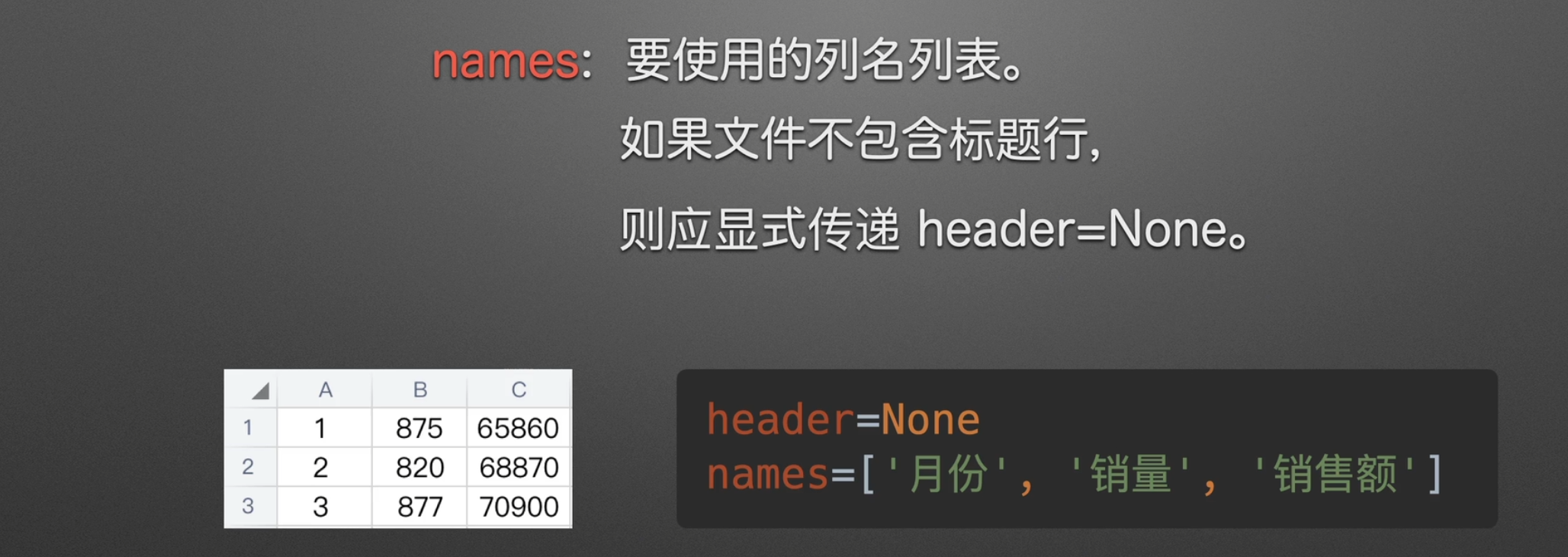
设置列名
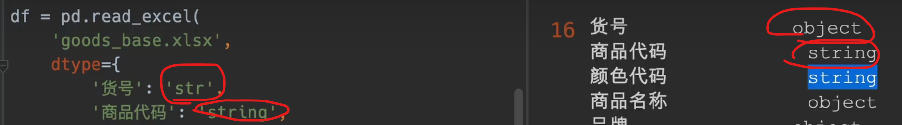
定义列名和类型
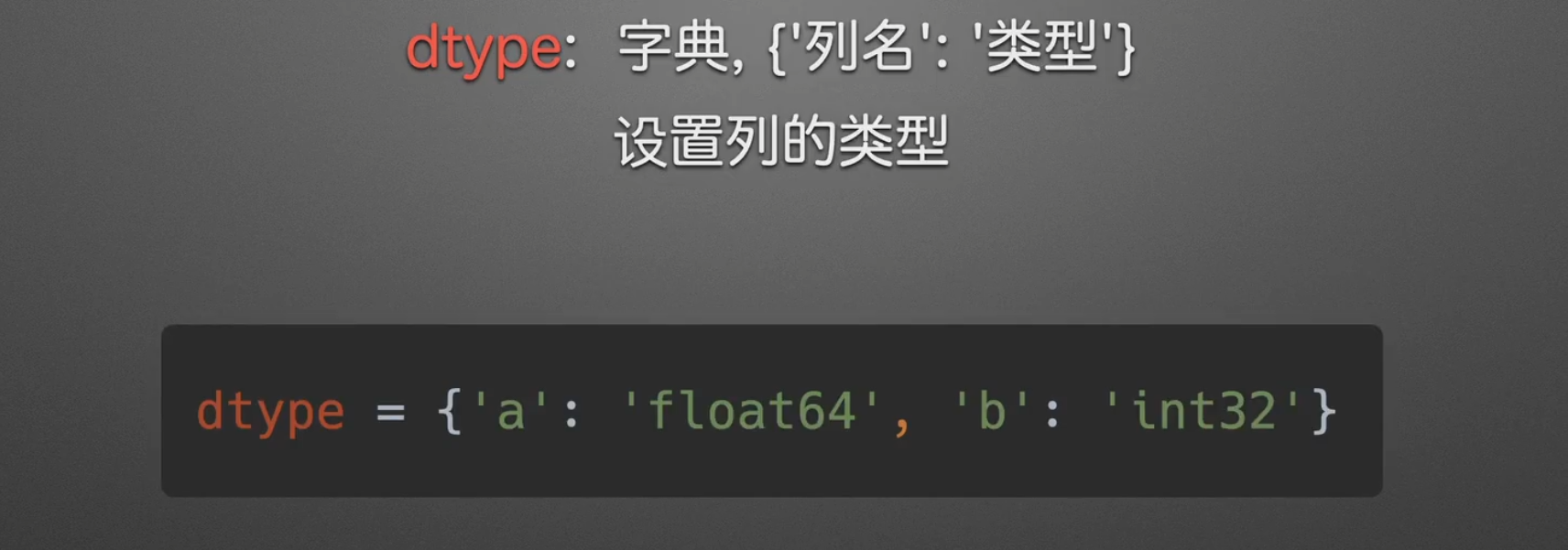
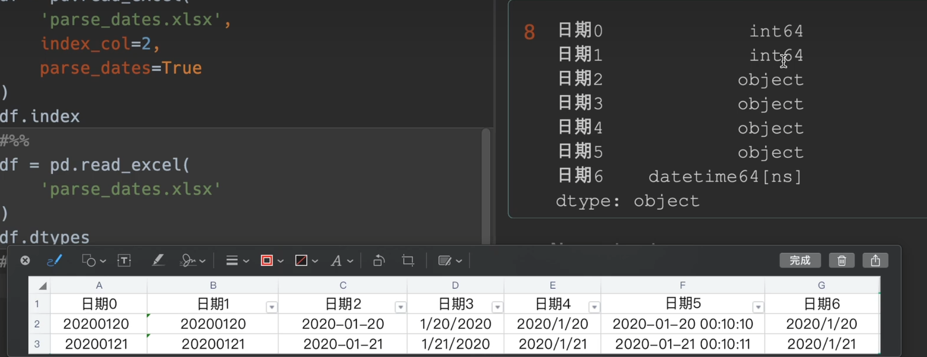
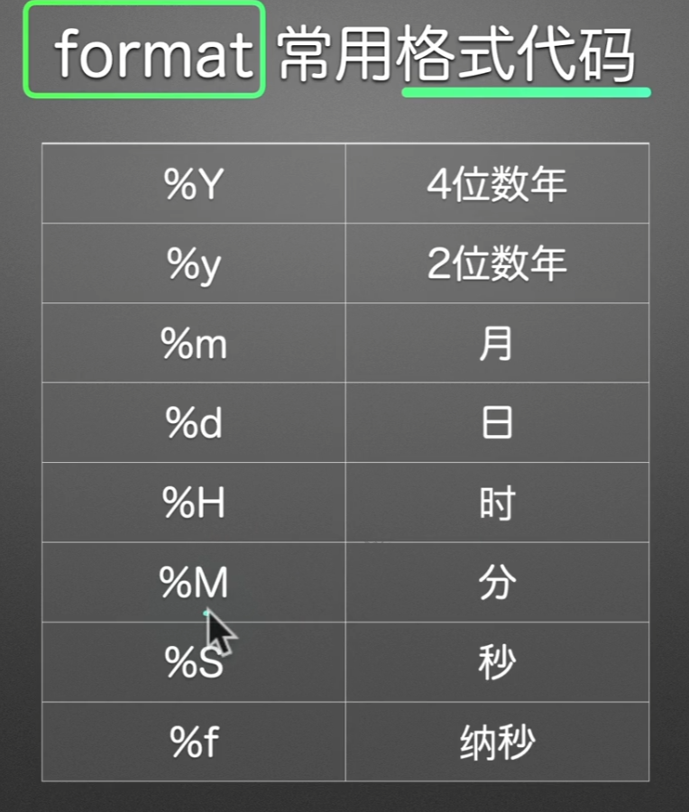
dtype类型大全
一般来说int65, float64,bool,datetime64[ns],object系统可用推导出来,别的可能就要求手动了
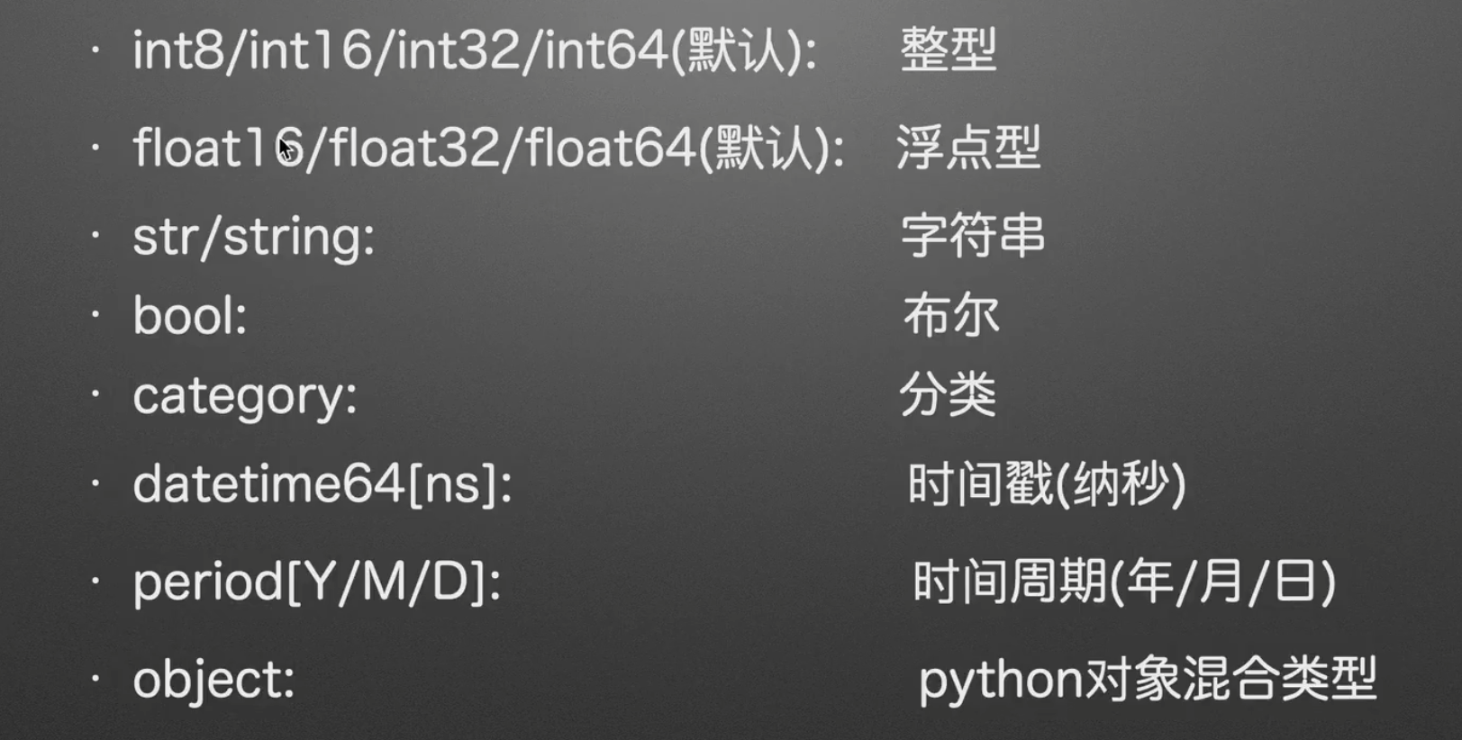
str与string的区别是,str默认保存为object对象
另外像季节品牌这些比较少的量可以设置为category,种类有两种好处
- 节约内存
- 方便自定义排序
我们设置dtype的目的是:不同类型的数据,有自己的一套函数,我们为了方便操作,因此得改变数据类型
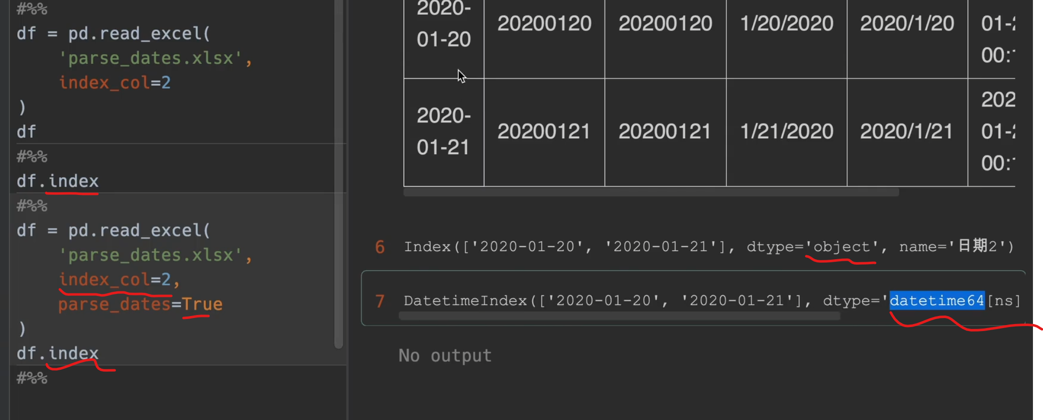
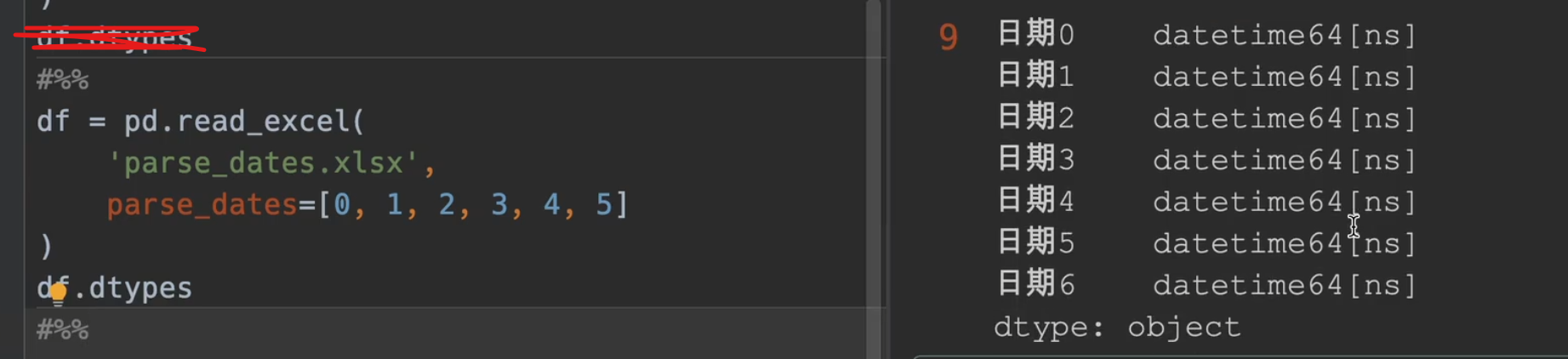
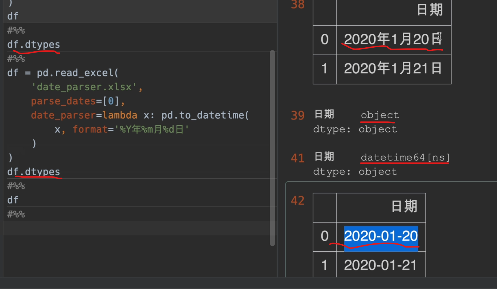
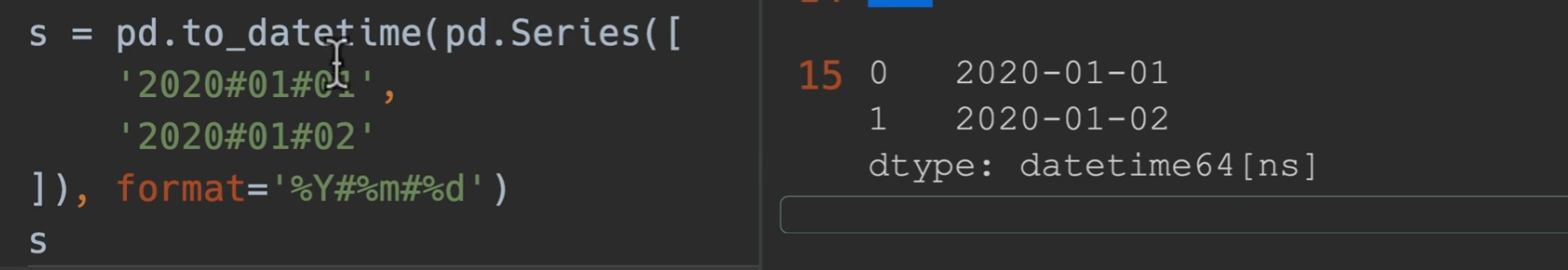
自定义日期解析
parse_dates是动词,解析日期,date_parser是名词,日期解析器
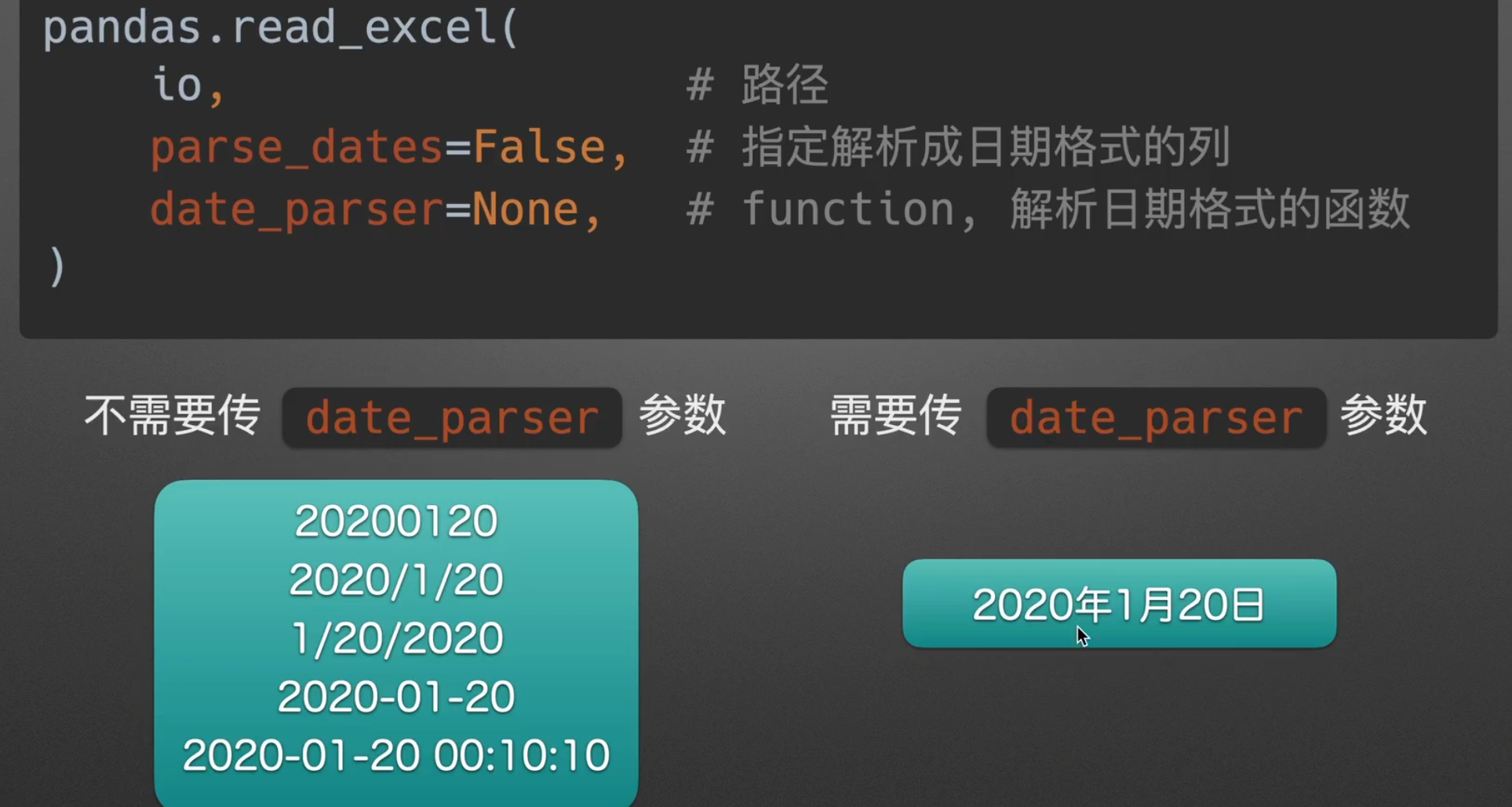
parse_dates
不是True,False,就是列表,字典,不能单独传入一个列名,要加列表的括号

将分开的年月日类型拼接成一个日期类型
parse_dates的作用就是如此立竿见影
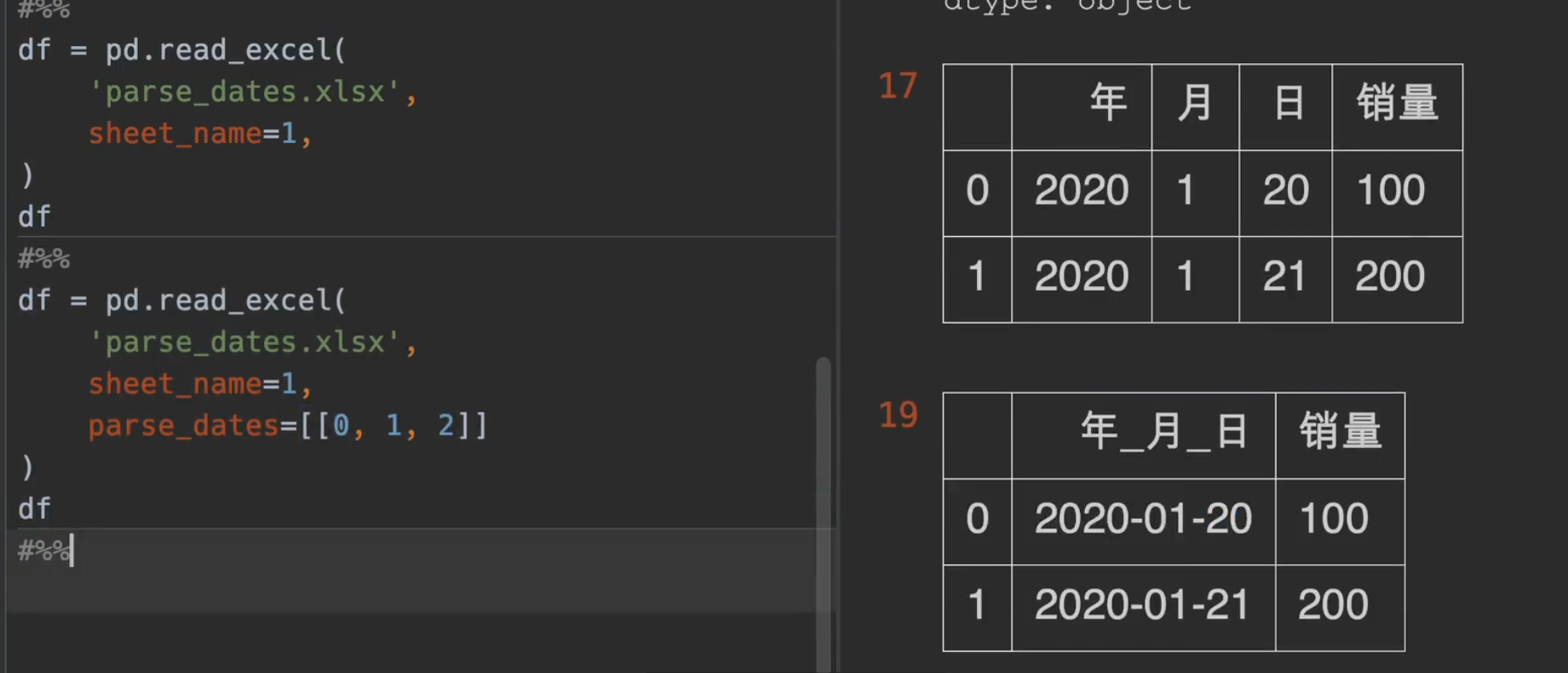
日期替换年_月_ 日
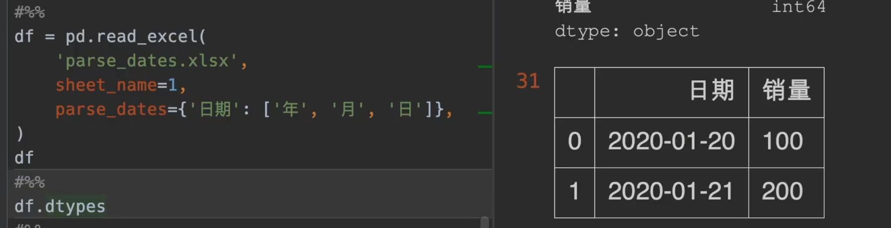
date_parser
其中一个 x 就是一个series

处理缺失值

实践
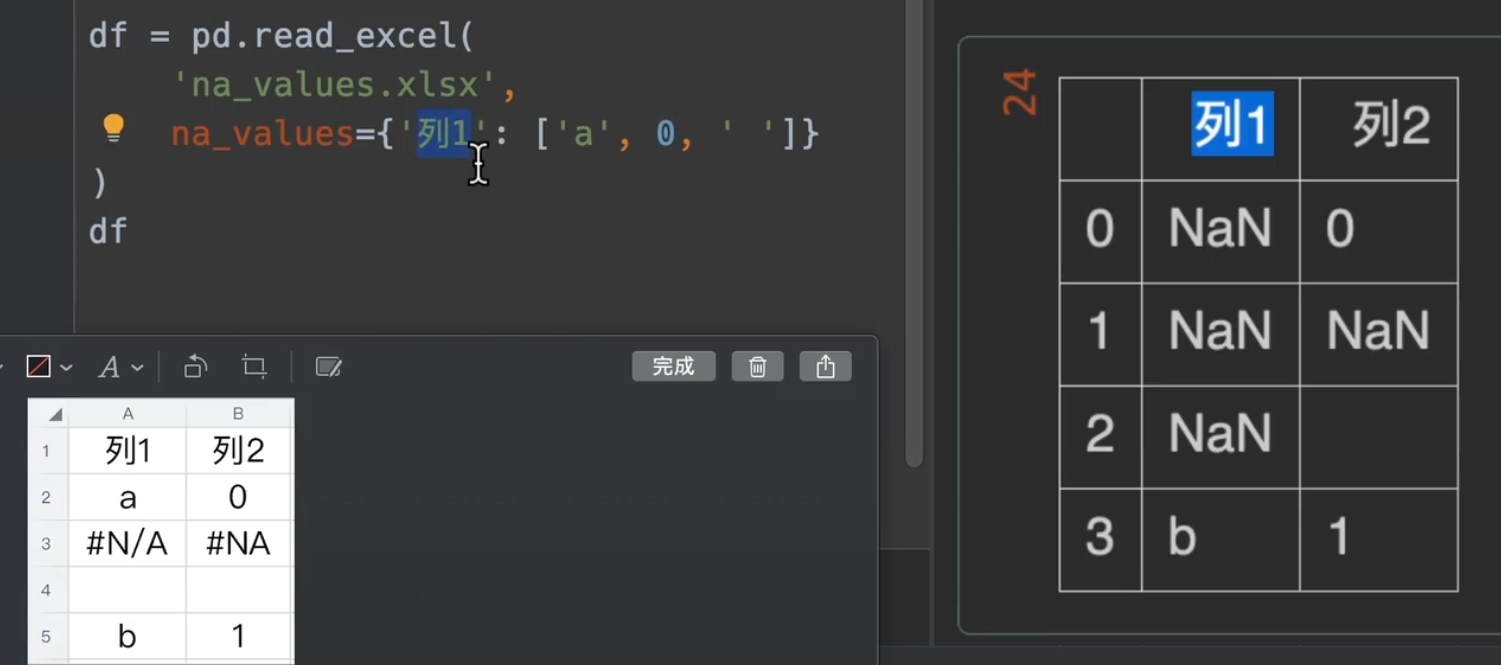
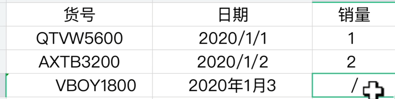
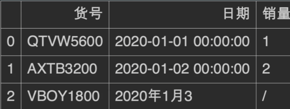
我们来说明一下数据,首先第二行第二列是一个空格,这样的格式显然是不规范的,是一个小坑
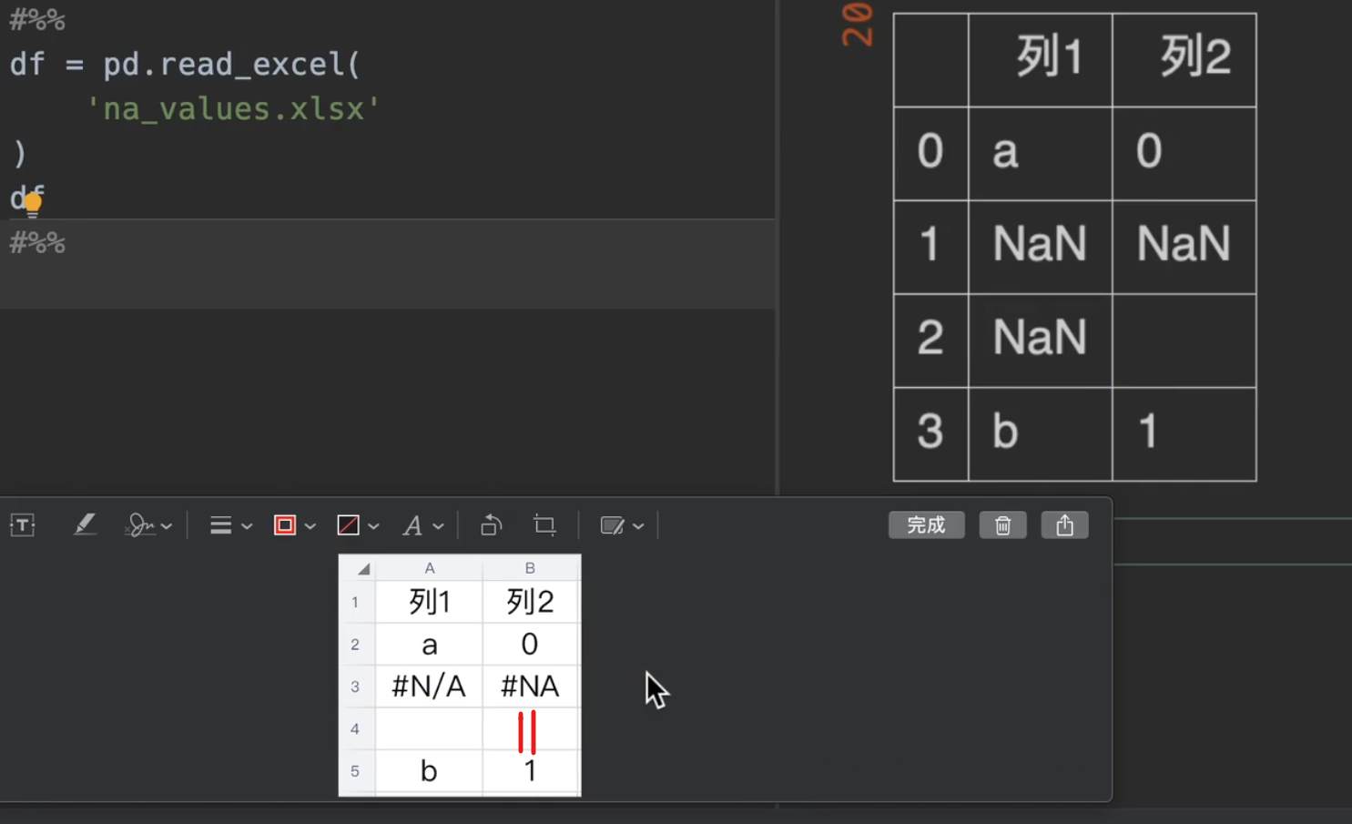
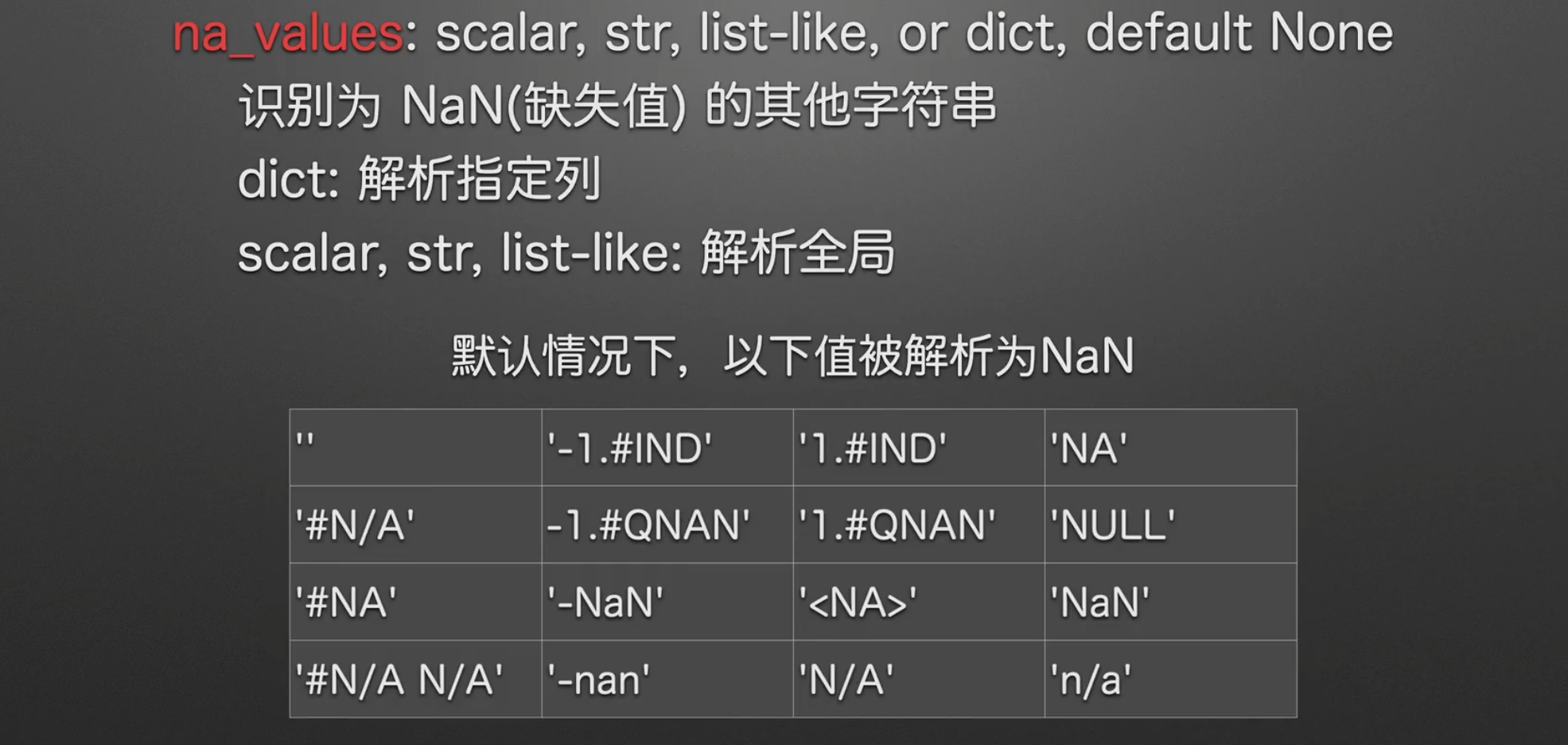
我们只需要在na_values里输入一个列表,就可以把我们想要替换成缺失值的替换出去。
另外。下图excel表格中#N/A与#NA是默认会被解析为NaN的字符串
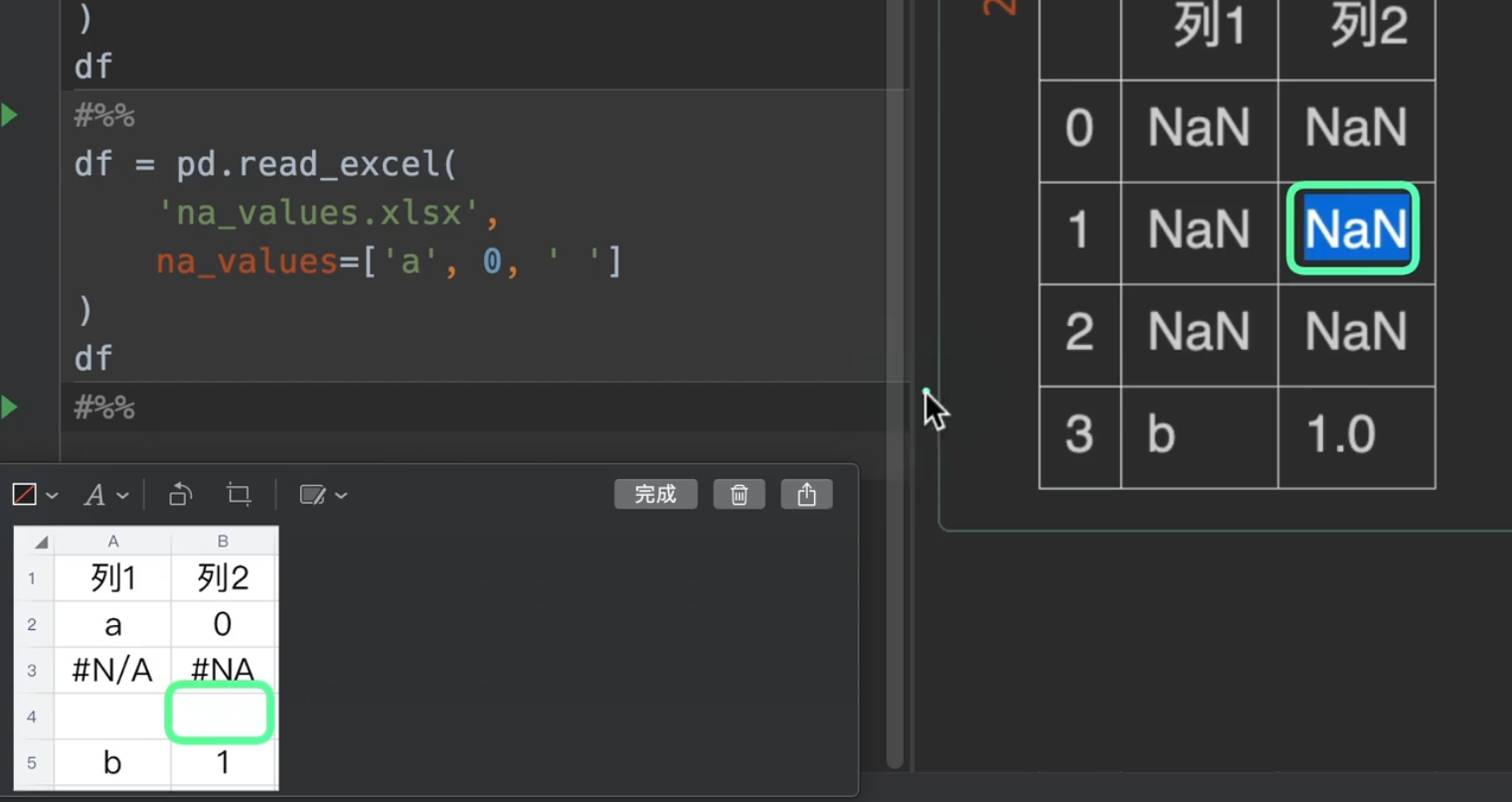
更多的,我们还可以传入一个字典进入na_values,指定我们想要替换的列(如果有想要替换的行直接转置就完事了,完全不麻烦)
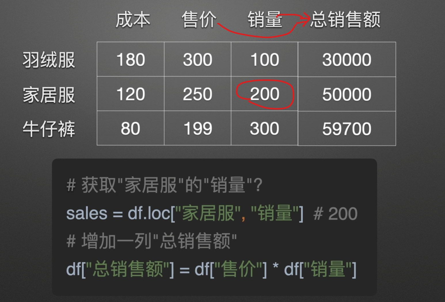
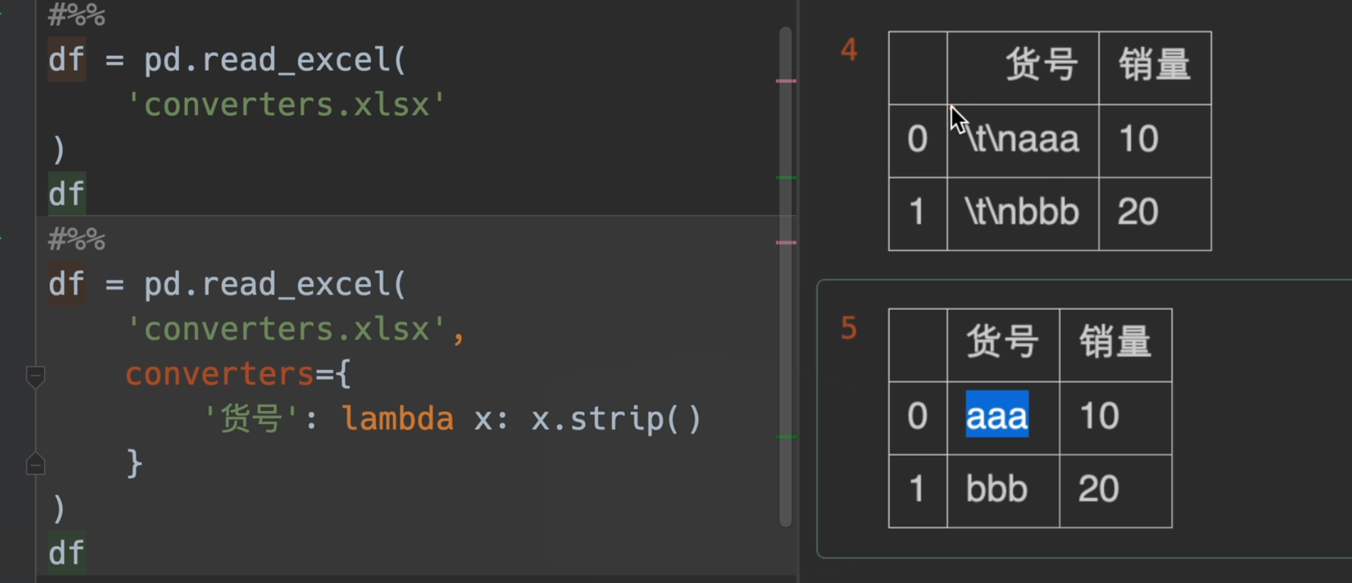
值转换(+-*/)
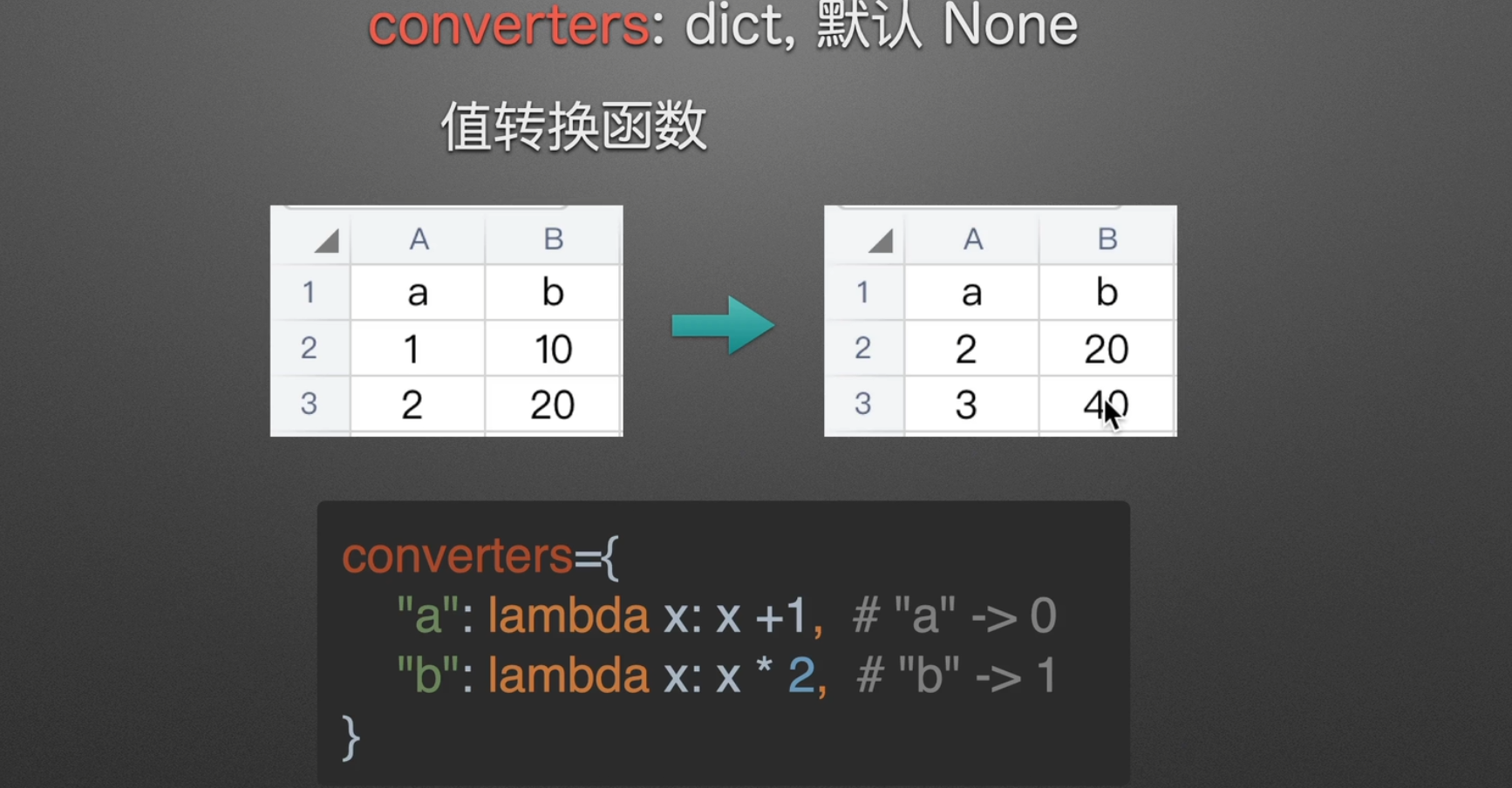
Python strip() 方法用于移除字符串头尾指定的字符(默认为空格或换行符)或字符序列。
注意:该方法只能删除开头或是结尾的字符,不能删除中间部分的字符。
lambda x: x.strip()也可以写成str.strip
若要去除中间空格:
1、使用字符串函数replace
1 | 1 a = 'hello world' |
2、使用字符串函数split
1 | 1 a = ''.join(a.split()) |
3、使用正则表达式
1 | 1 import re |
4、int(对于数字)
1 | content = input("请输入内容:").strip() #可输入1 + 3 |
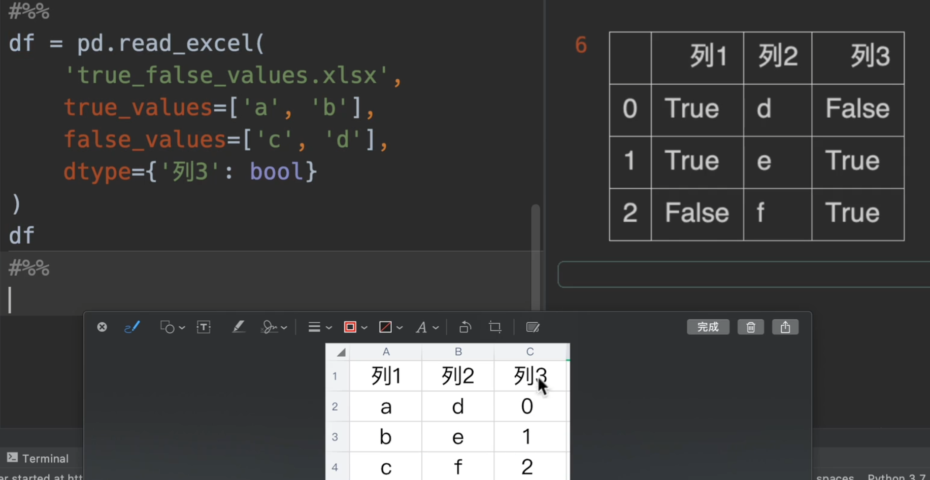
字符串转bool
只有一列全都转换,他才会转换成功,因为d为false,但是e、f没有在列表中,所以转化失败
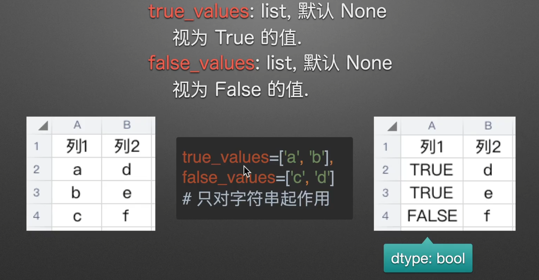
不过xxx_values无法对数字类型使用,要转换可以用之前讲到的dtype
其他参数补充
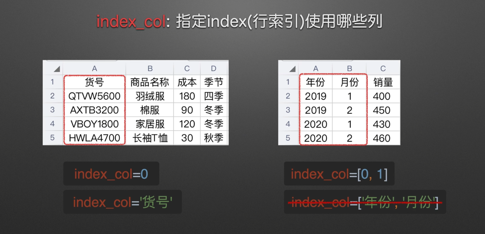
指定index
是否转换数据为series

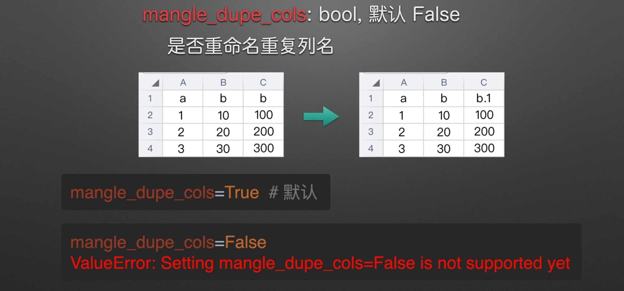
是否重命名列
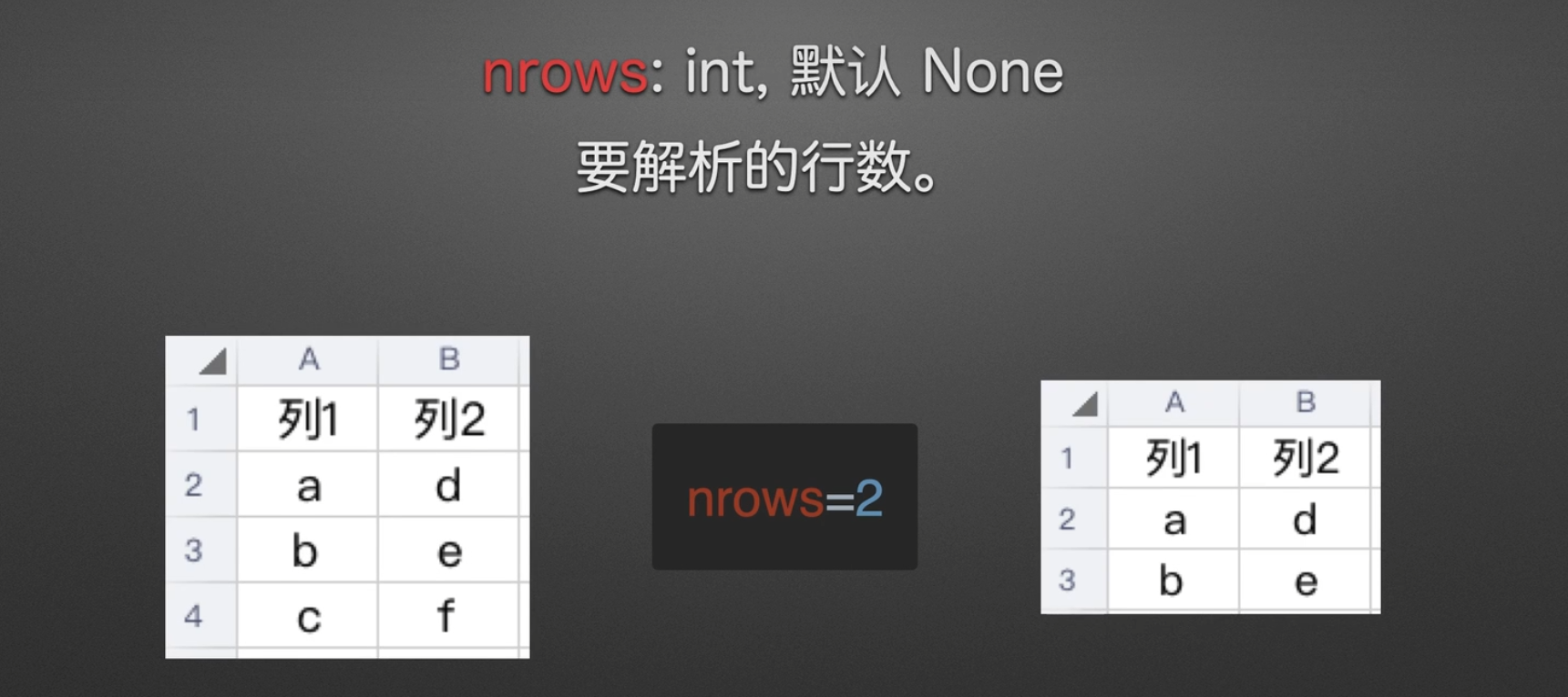
指定解析行
解析不包括表头,从表头下一行开始,如果包括表头,就是三行
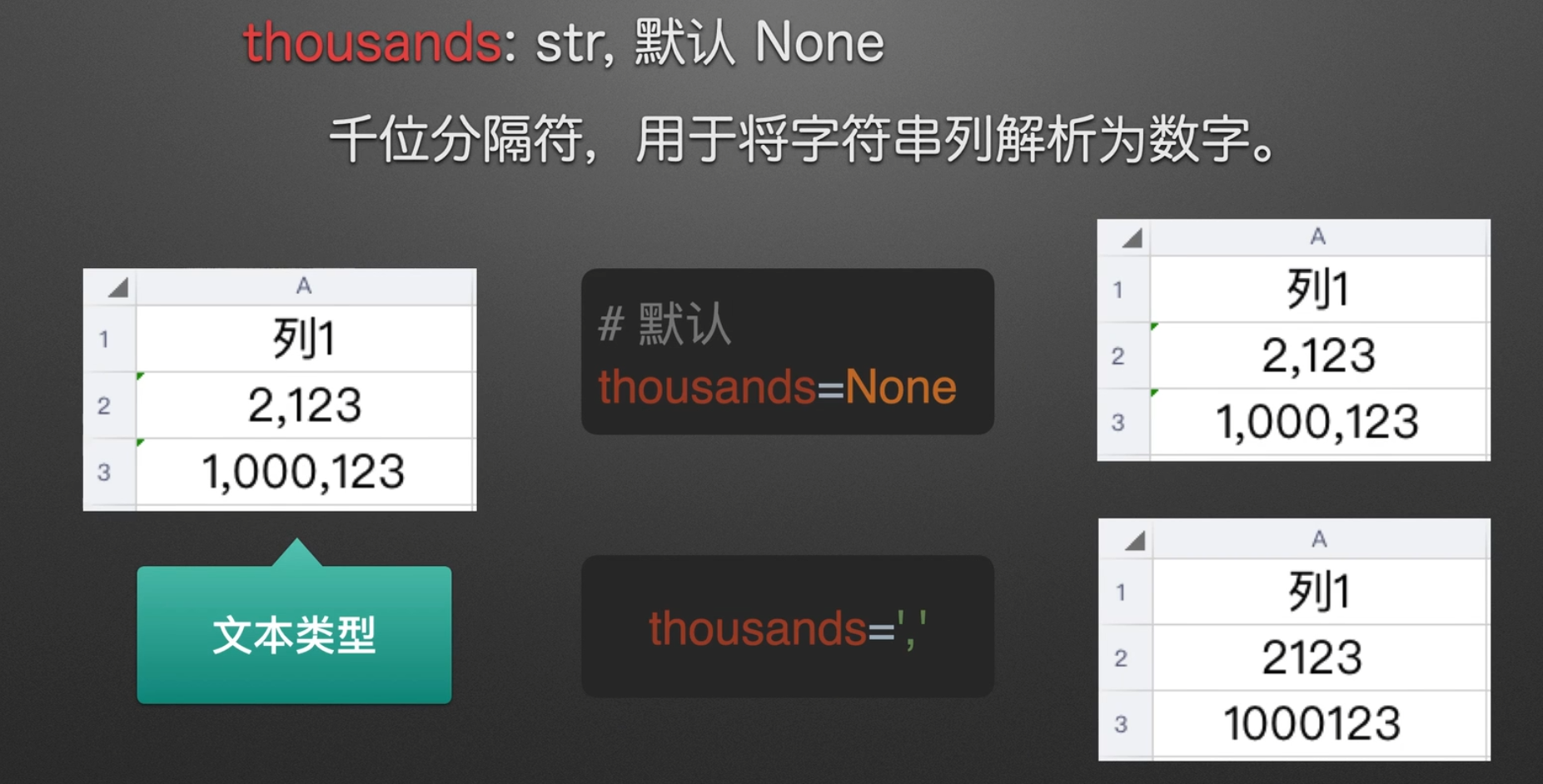
字符串文本解析为数字
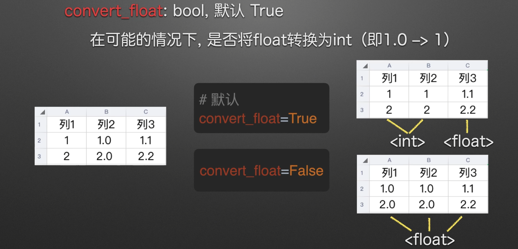
是否转浮点类型
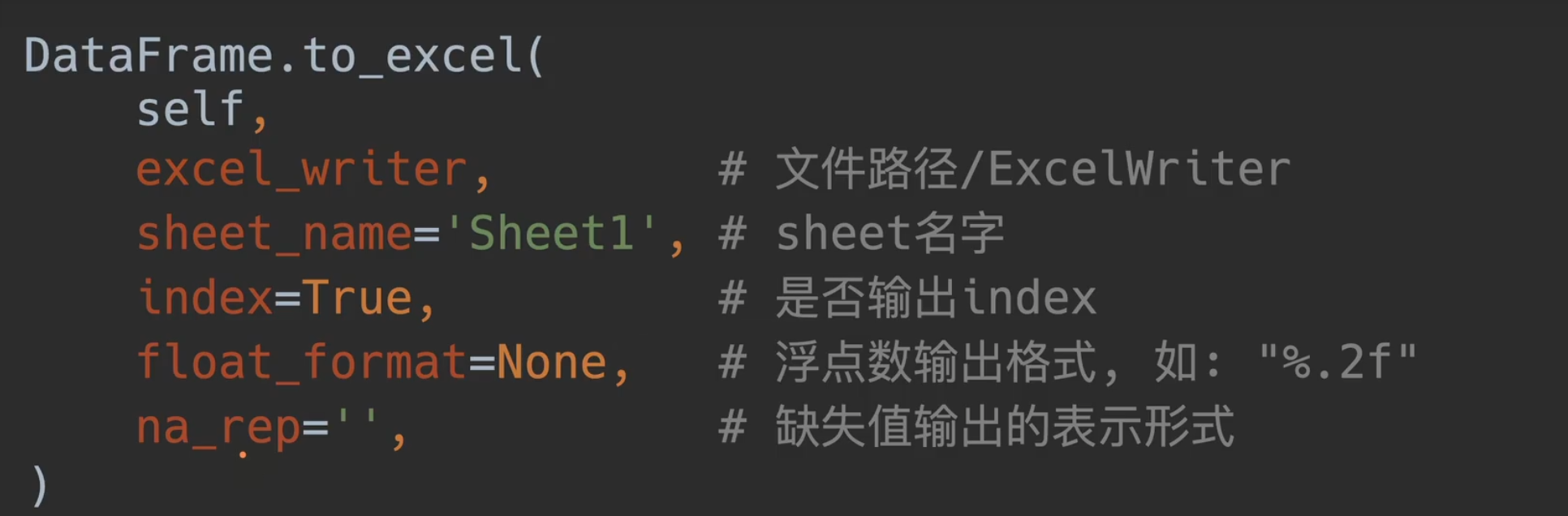
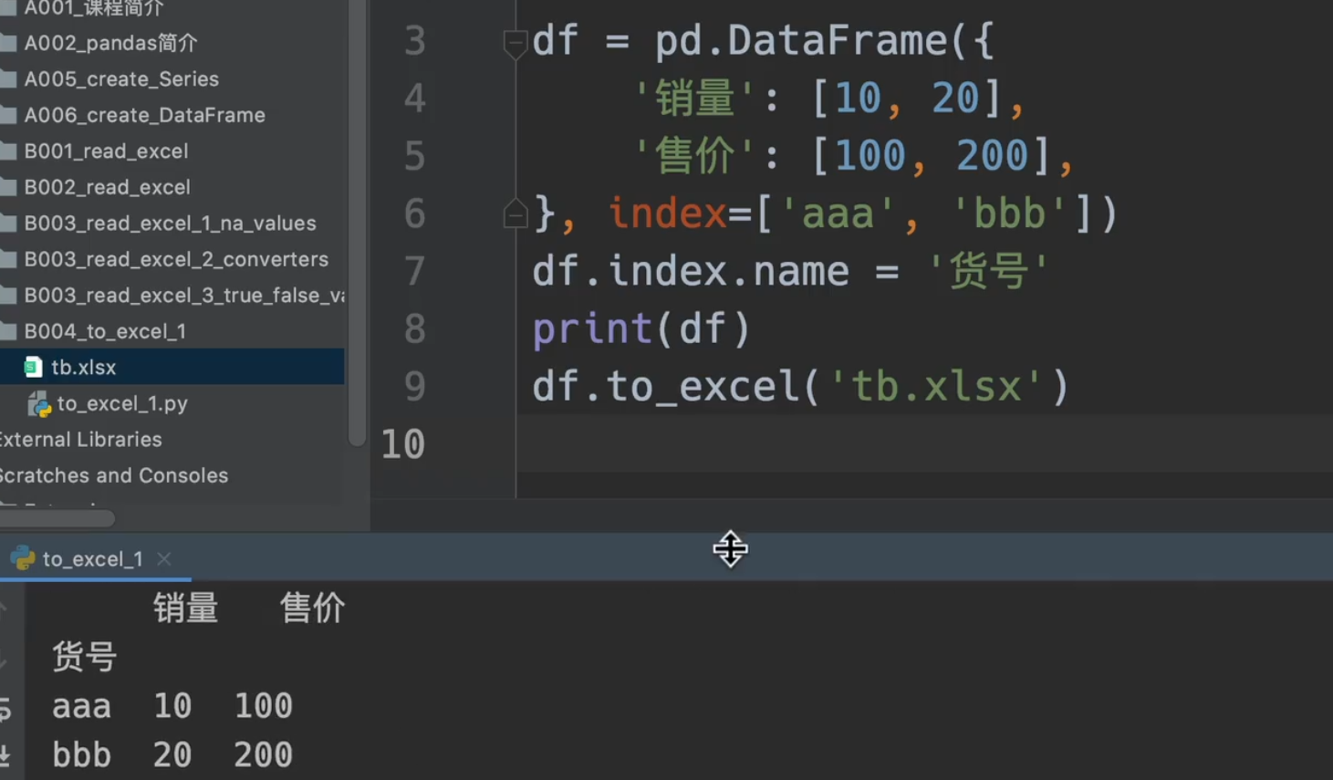
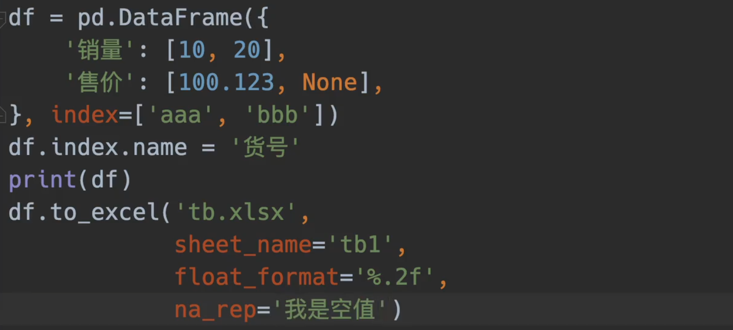
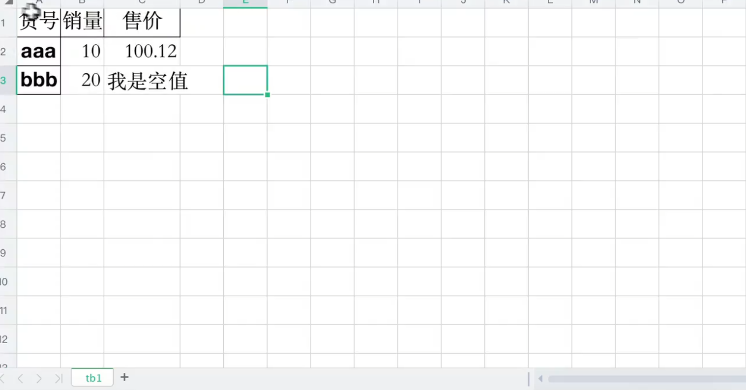
to_excel()参数介绍
是否输出行索引
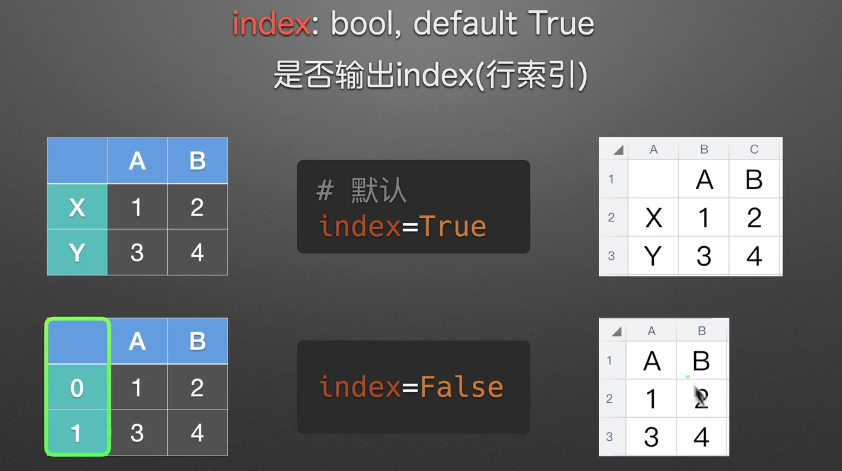
即在’tb.xlsx’后面加上, index = False/True
同时我们也可以给行索引加上名字,也就是dataframe.index.name
命名表名,规范float格式,设置空
ExcelWriter()参数介绍
他的优势就是可以输出两个表到同一个文件中
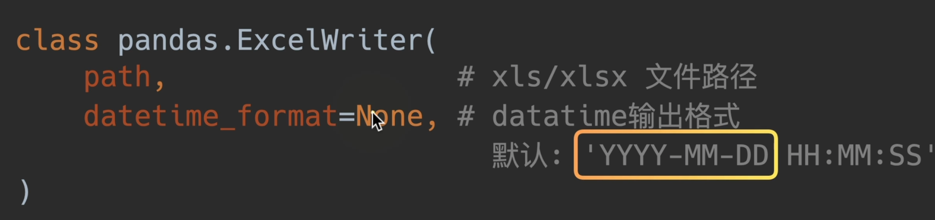
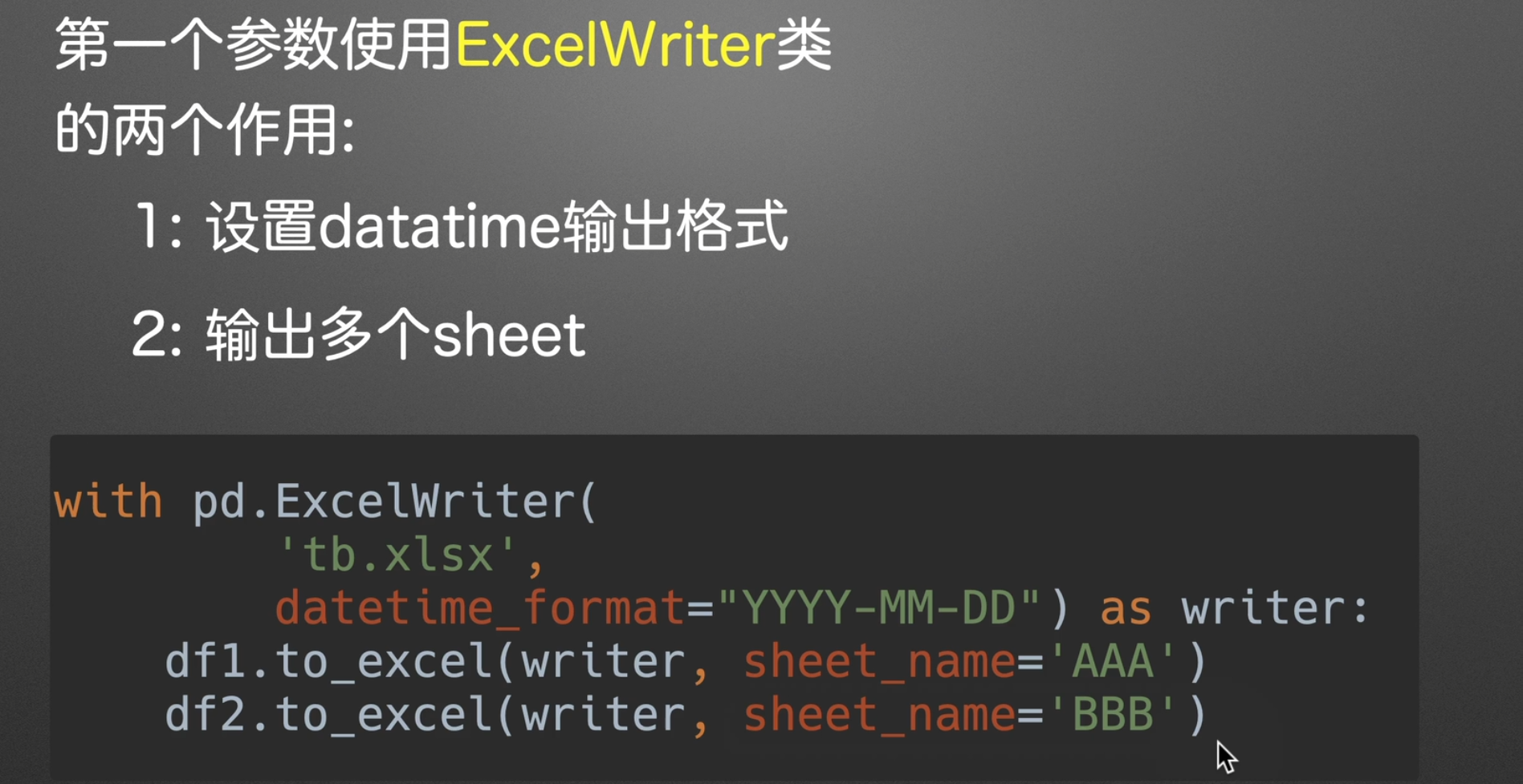
假如不传datatime_format,那么输出默认就是
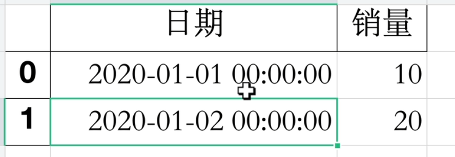
但实际工作中一般是不想看到这个时分秒的,但这都是看个人的需求了。
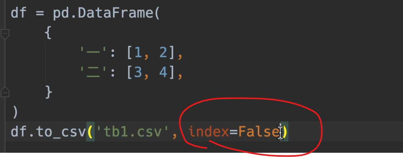
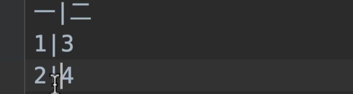
写/读csv
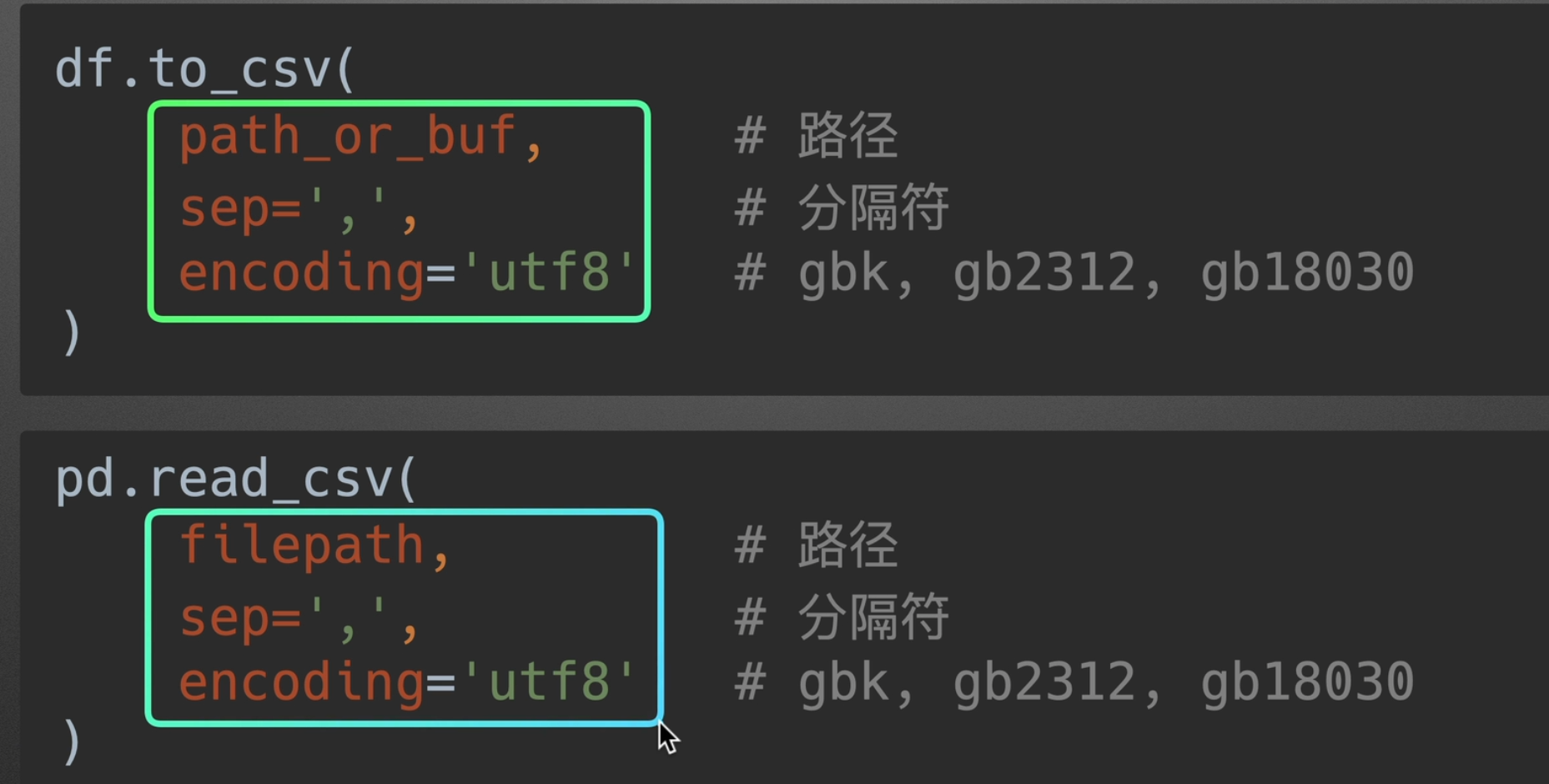
默认采用index=False,不然读出来就不是标准格式了
标准读出以后: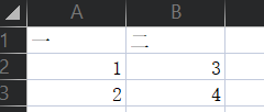
也可用sep指定分隔符
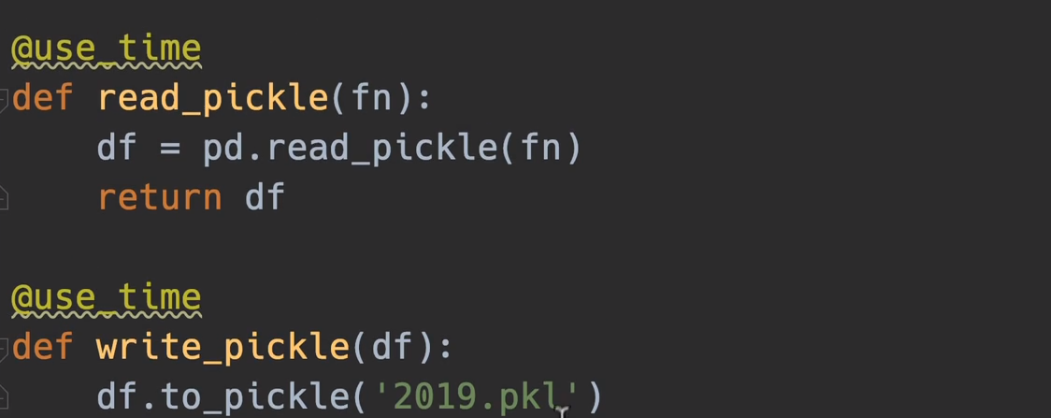
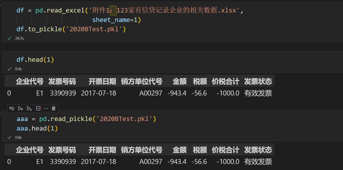
读写pickle文件
pickle是一个二进制文件,用于将原本的xlsx或者csv文件转成机器语言,从而几百倍的提高读写效率,相当于一个全局变量,所以我们以后几乎就可以直接使用pickle来进行操作,从而最大成本的节省我们的时间,并且与直接读写csv效果是完全一样的。
效果立竿见影
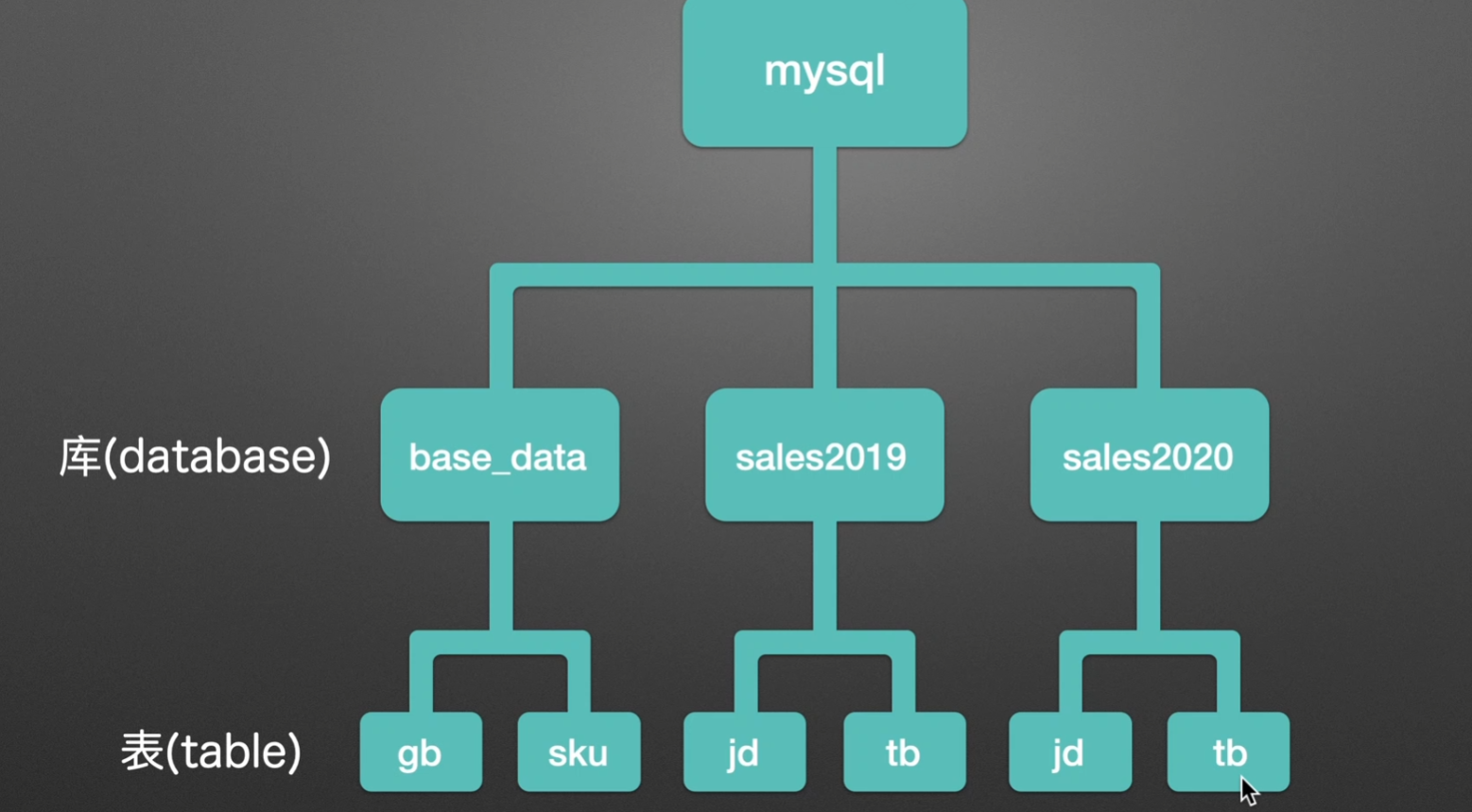
pandas + sql
我们需求:实现这样一个功能,将本地的excel表格存放到mysql中,如果还有2021年的数据,也同样创一个新的库
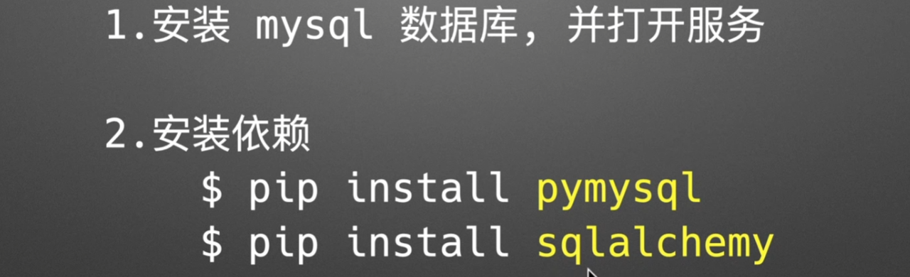
1.安装依赖
2.造库造表

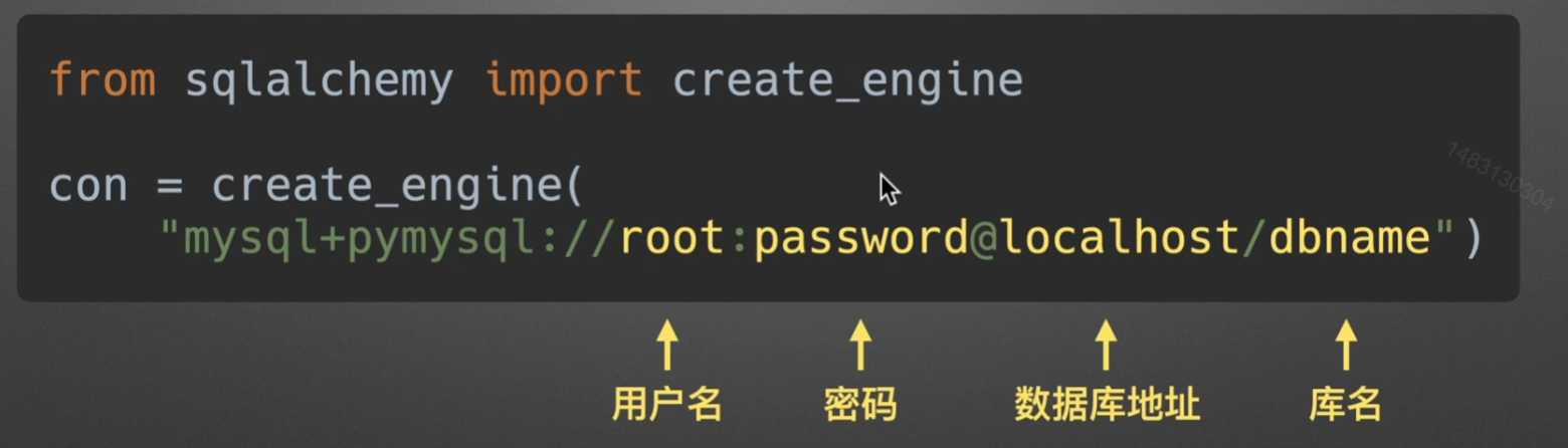
3.创建引擎
读写执行sql语句
to_sql
相关api
chunksize是为了避免你的内存装不下,每一次批量读取
if_exists的replace慎用,他会删除你的表并且创建一个新的表,尽量不用
append参数很常用,也就是把你当前dataframe的内容一行行追加到表中
fail是提醒你之前是否存在该表,如果已经存在这个表就报错
实例如下
1 | import pandas as pd |
read_sql
参数说明:
第一个参数为选择表名或者直接输入语句吗,
con为选择引擎
columns可以选择列名,但是如果第一个参数是语句,则该句无效
1 | import pandas as pd |
mysql执行
1 | # 很简单,执行语句只需要用execute套住mysql代码就行。 |
index索引

识别
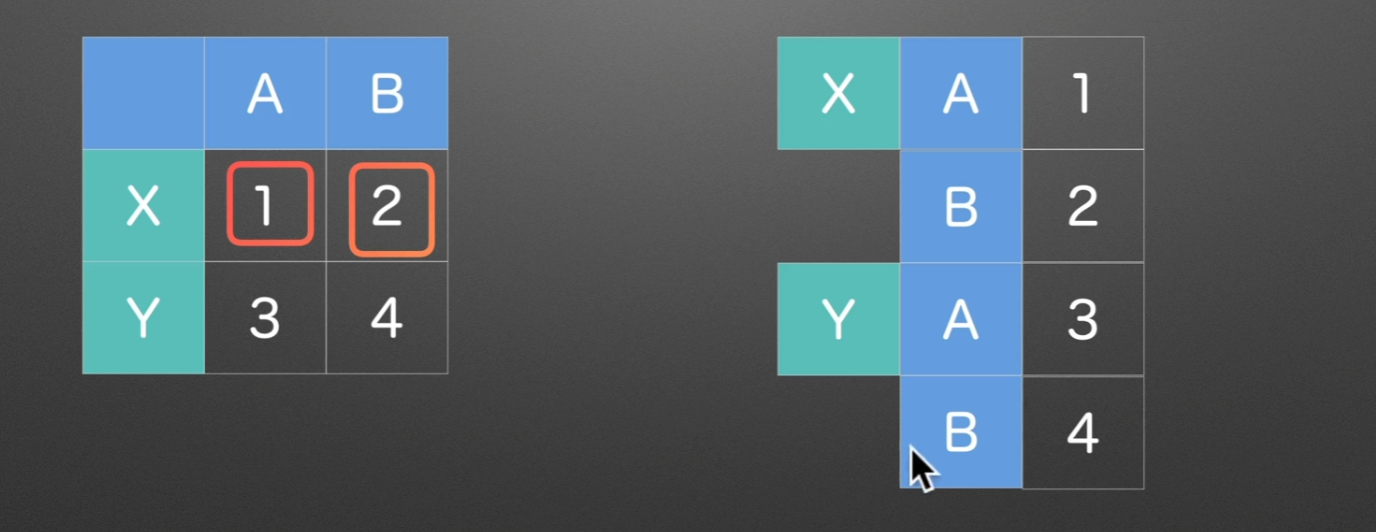
通过每一个格子的索引,我们可以知道他具体代表的含义
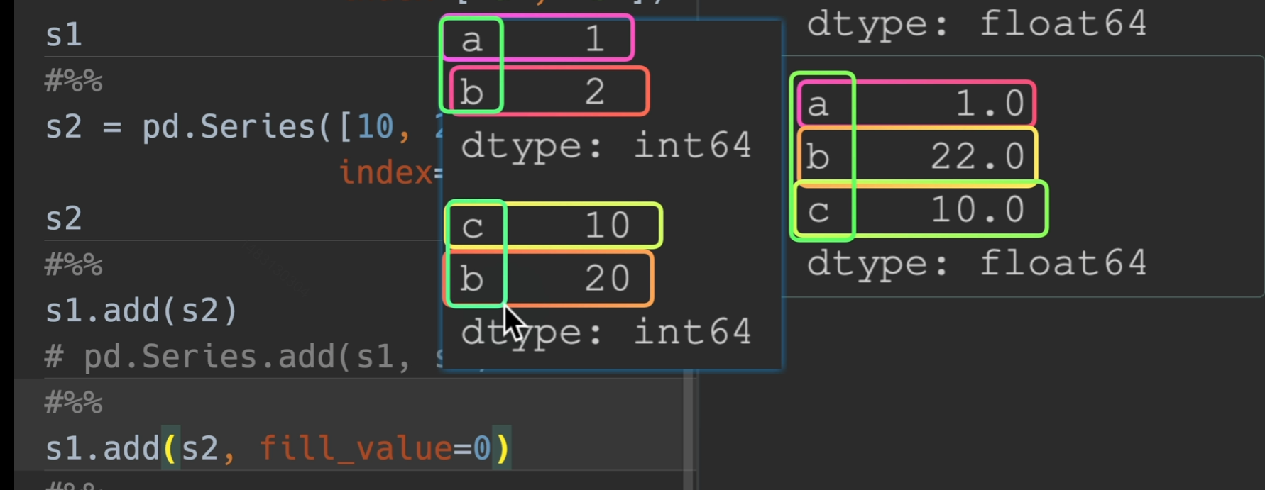
对齐
pandas在操作之前,会根据索引,自动帮我们将同一类型的实物对齐,例如下面这两个series是没有对齐的。

所以相加之前,会将同类型的对齐,这就是
索引对齐的作用

上下左右也同理,先对齐,在拼接
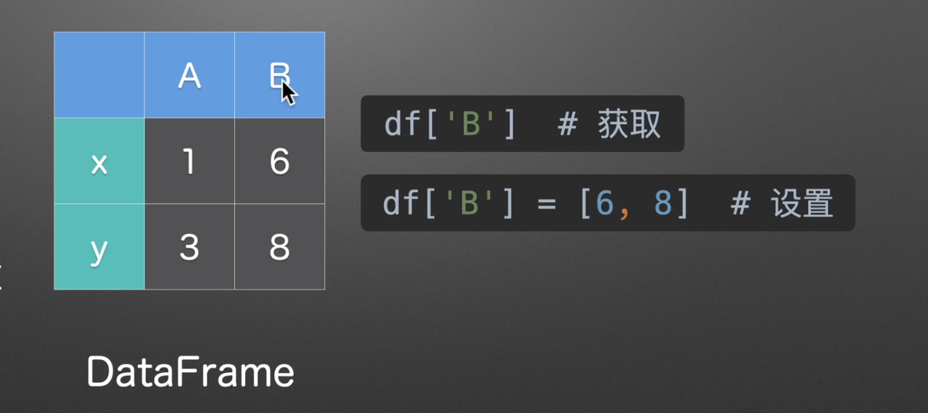
获取和设置
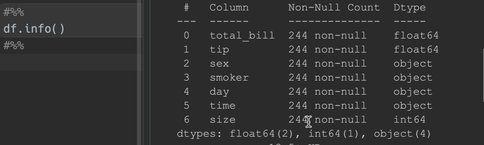
查看dataframe基本信息
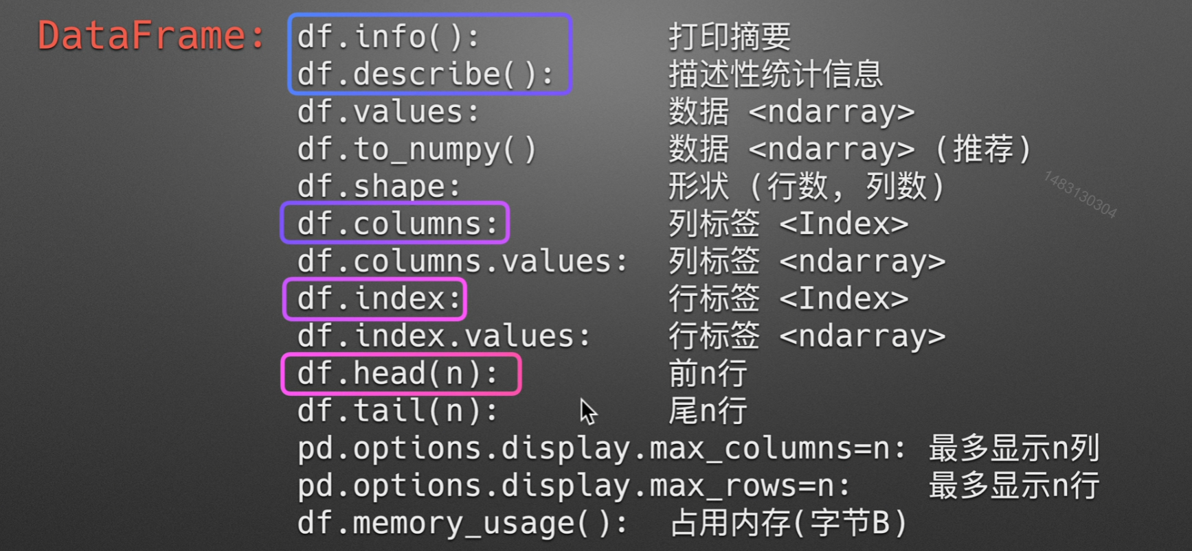
info()
打印摘要:如果有列显示的数字比244要少,那么他就是有空值,这里就没有空值
describe()
描述性统计信息:只统计数字类型,非数字的不会统计
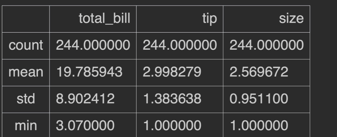
其中,std为样本标准差
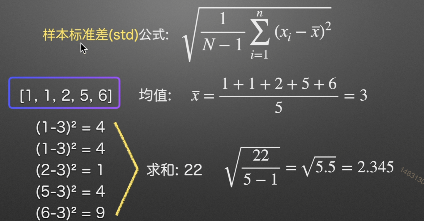
什么是样本标准差
举个例子,全国成年男性的身高是一个总体,我们想知道身高的标准差。最准确的测量办法就是对所有男性进行身高测量,然后求平均值,然后按照公式变换,最后除以n。
但是,测量全国所有男性身高几乎是不可能的事,或者说成本太高。
可我们就是想知道这个总体的标准差怎么办?
我们可以进行抽样,按照抽样规则,选取合适的样本量,抽取一定数量的男性测量,这个就是样本。可以肯定的是,样本的数量会比总体小很多(如果不是这样,那么抽样就没有意义)。测量样本的身高就要比测量总体简单多了。
对每个样本进行测量,得到身高用于计算标准差,那么这个标准差就是样本标准差。
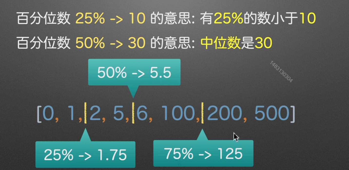
25%
计算方法:,在这里就是只看1,2,然后再把2 - 1最后得到的这个1 * 25%,用 2 - 0.25即是最后的结果1.75
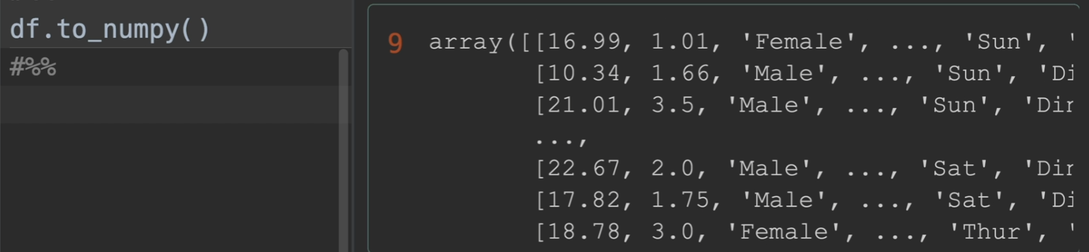
to_numpy()
将数据转化为numpy形式
其余一些参数的测试
columns查看列索引,values转化为numpy,tolist转化为列表。

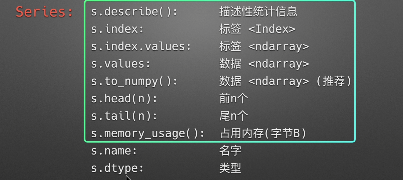
Series查看数据基本信息
这些都和dataframe的大同小异
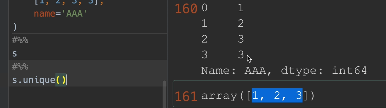
检查唯一性
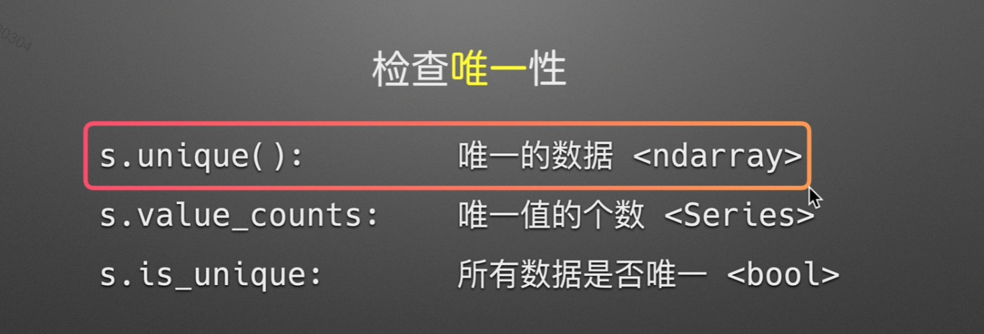
方法展示
返回唯一存在的值
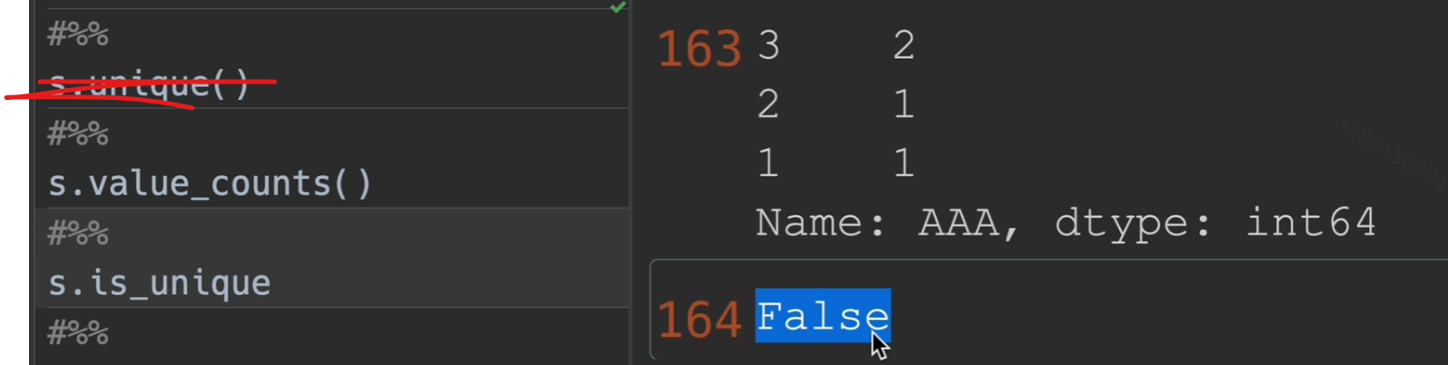
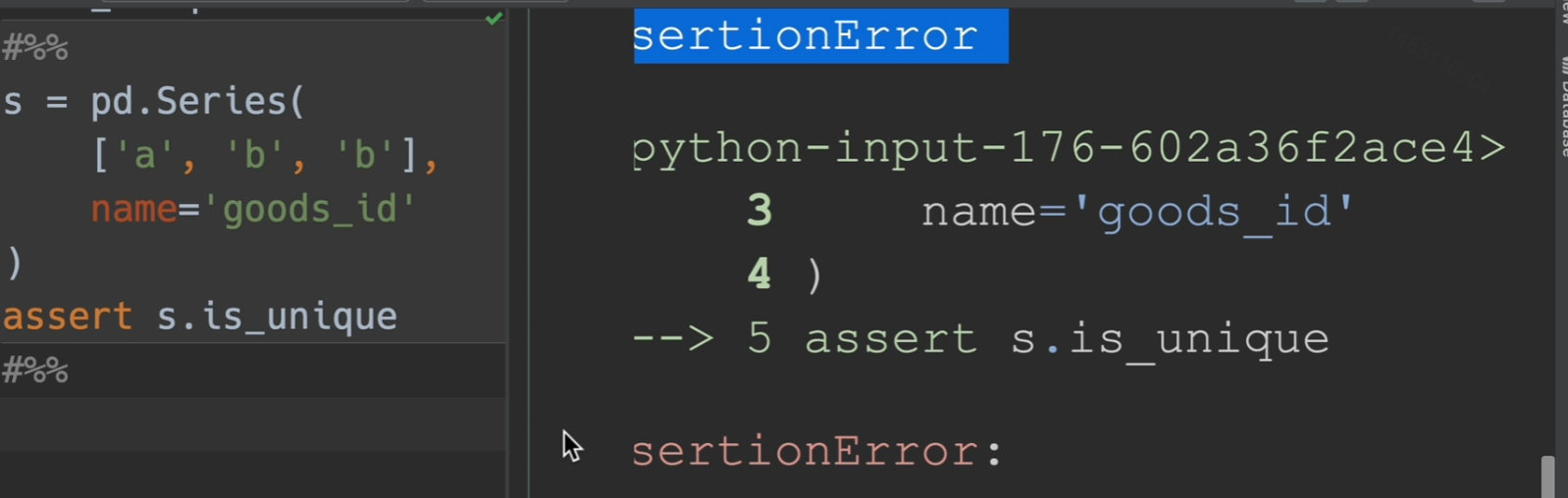
assert
assert函数相当于一个断点的功能,保证函数的参数是唯一的
检查长度

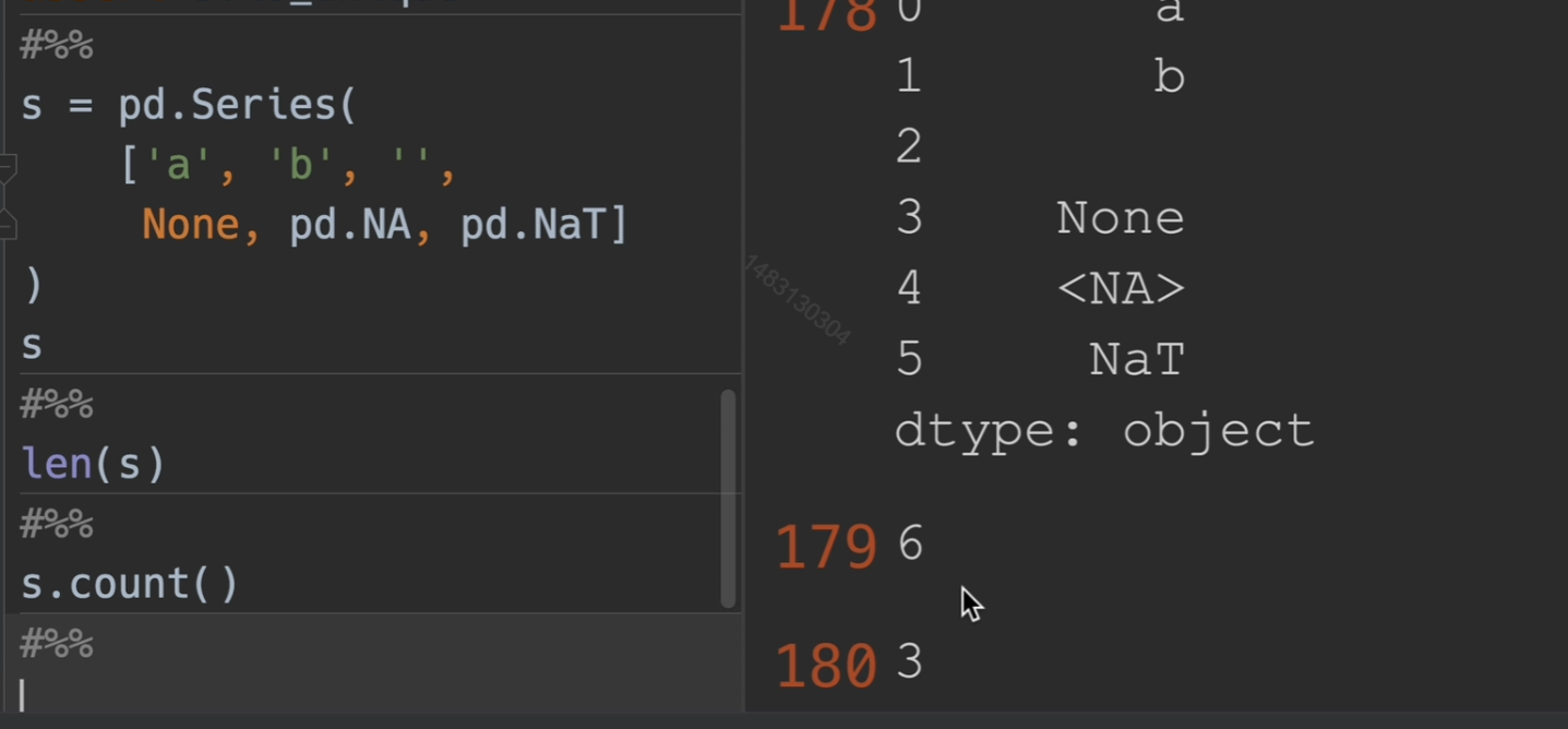
检查空值

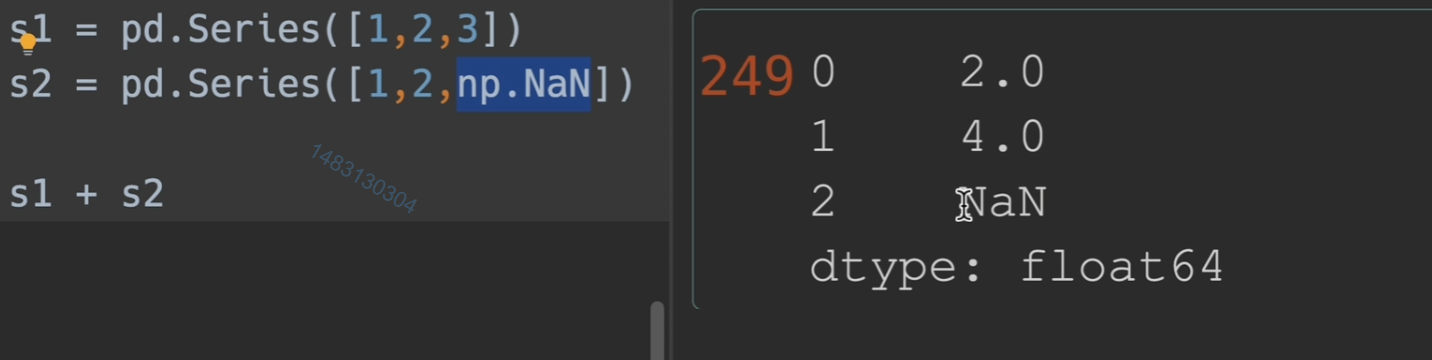
空值加法也会变成空值,因此我们必须处理掉空值
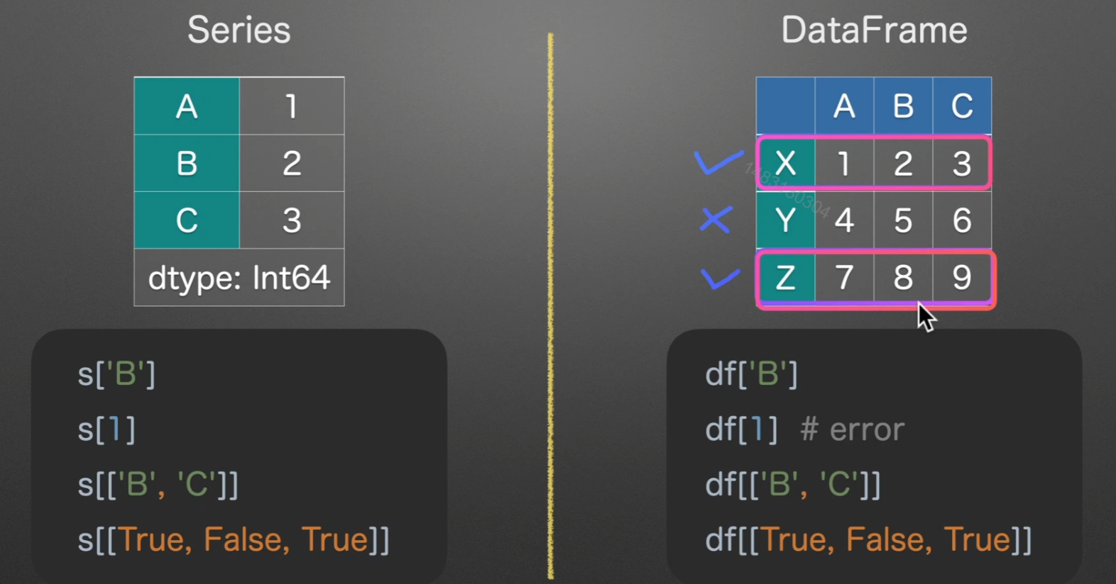
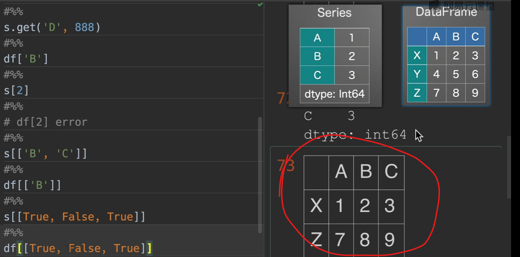
dick-like选择数据
series转dataframe:series.to_frame().reset_index()
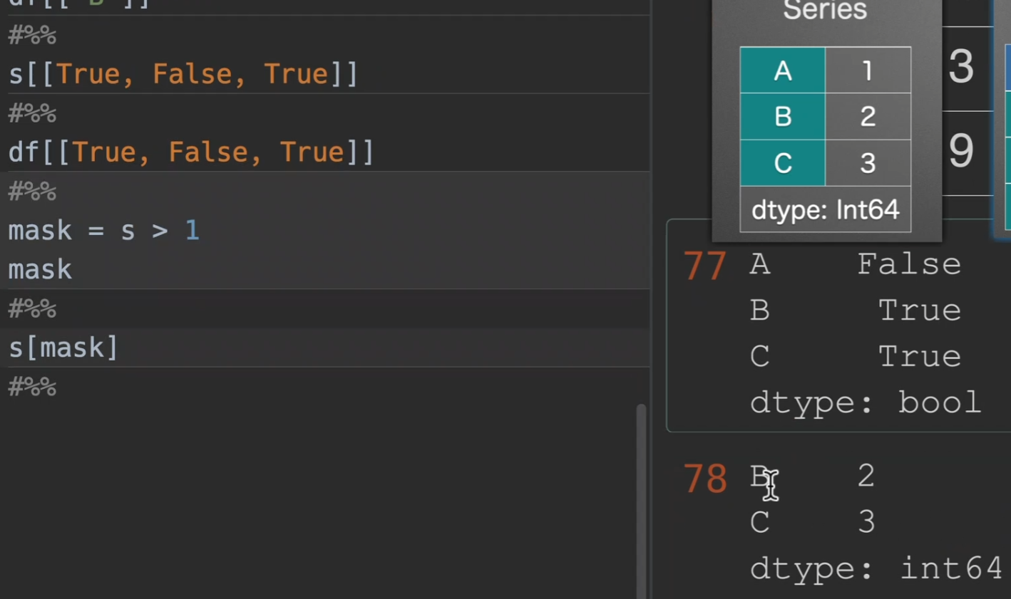
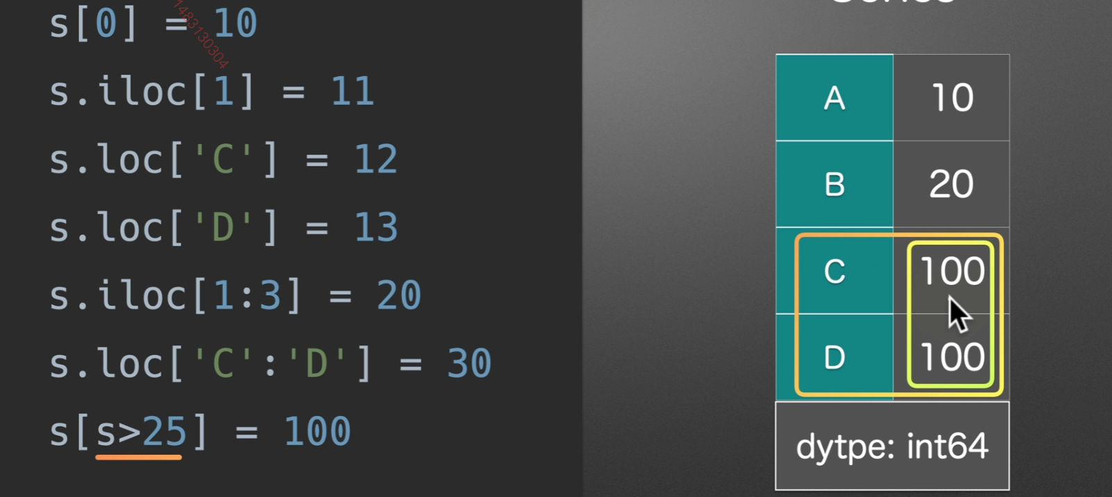
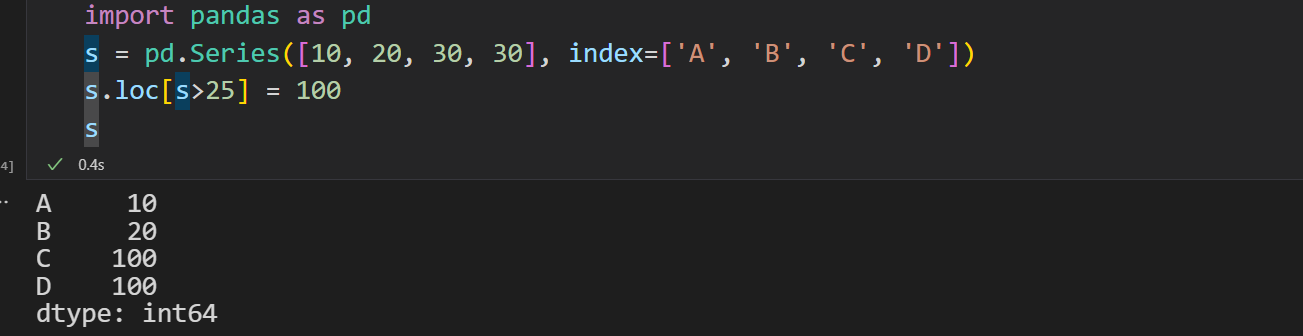
mask选取
在实际生活中我们时常需要这样的取法,因为我们可以通过条件来生成mask,并且注意,如果我们以[ ]的方式来取数据,则是series,想要取得dataframe,就[[ ]]就行,再另外,注意观察[[True, False, True]],首先数量是一样多得(不一样就报错),和行数,其次,为True的才显示,我们可以利用这个来筛选很多的数据!!!
我们先创建掩码,选择我们想要的数据,得到以后就可以进行进一步操作(s为series列表)
当然我们也可以直接在括号中使用,跳过生成掩码这一部分
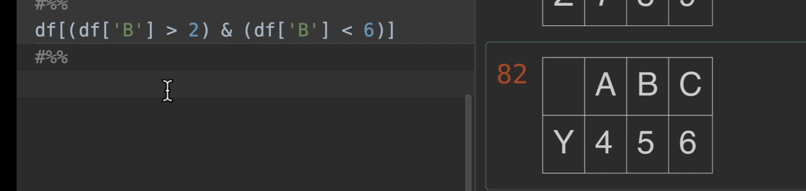
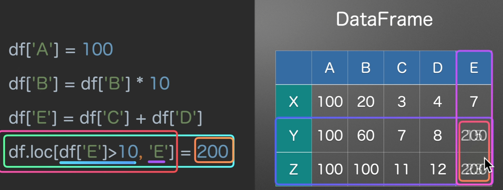
下面这个的意思是,取B这一列,返回数据中大于2,小于6的那一行
取反

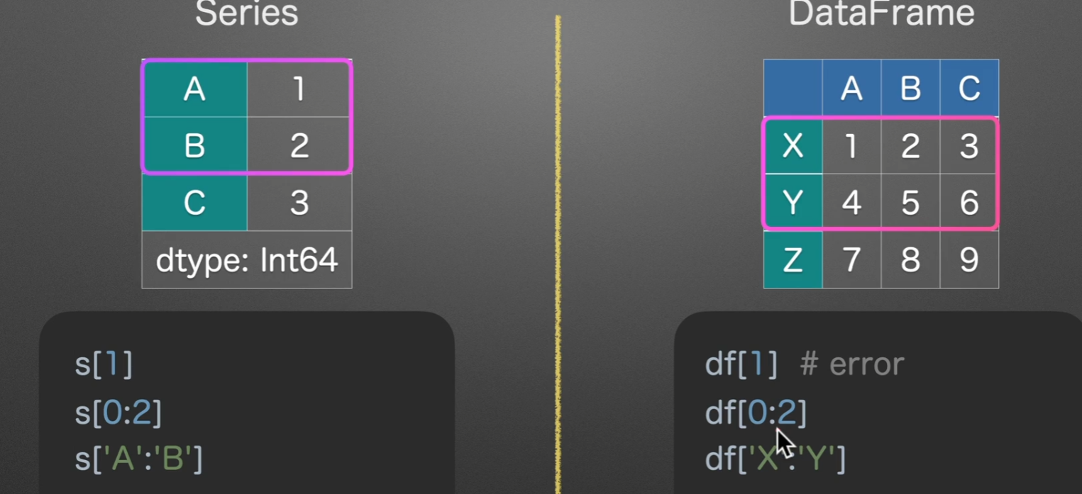
list-like切片选数据
值得注意的是,数字切片左闭右开,字符串切片边界全取,另外切片都是切的行,=-=列通常都是读取数据后就选好了的吧
loc选数据
取行可以不提列,取列必须提行
loc –> location
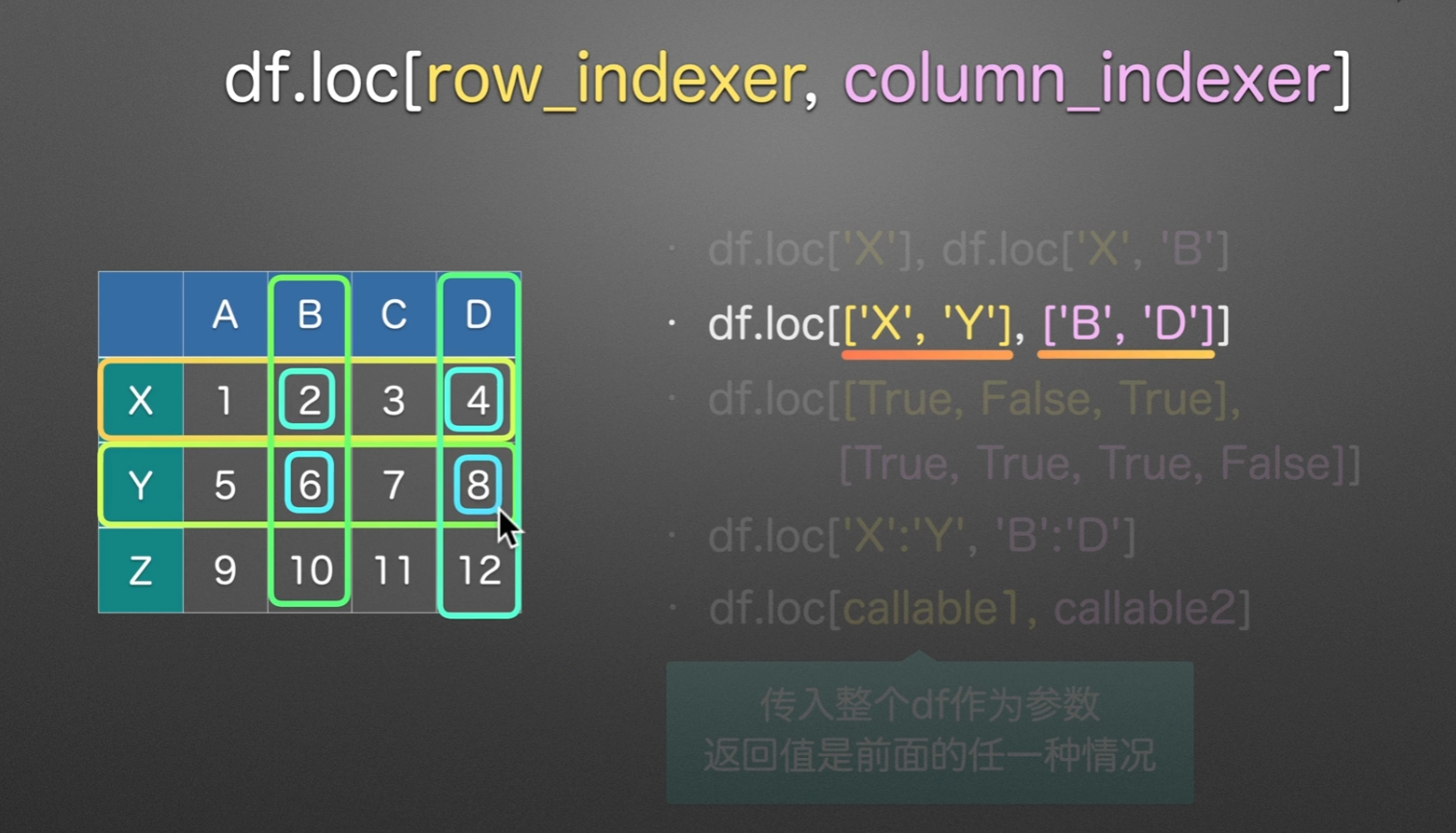
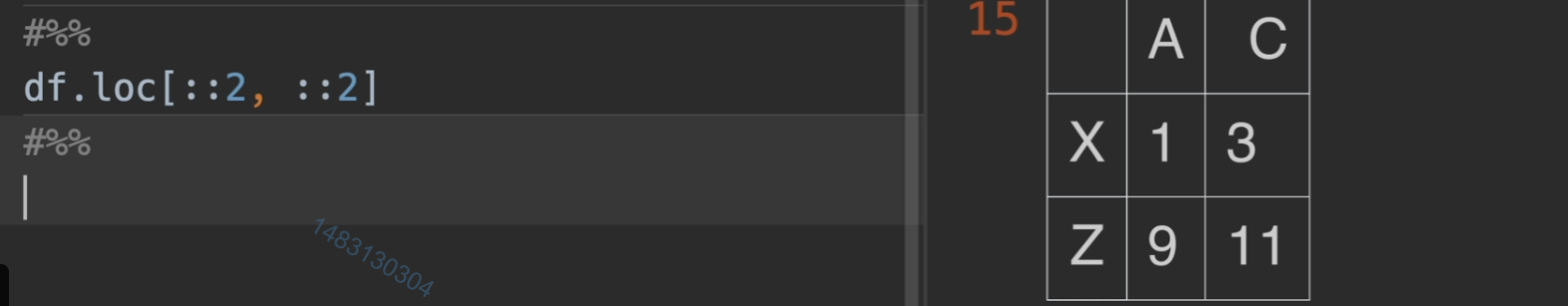
一个值得关注的点,:代表选中全部 ::-1代表选中全部,但是倒过来
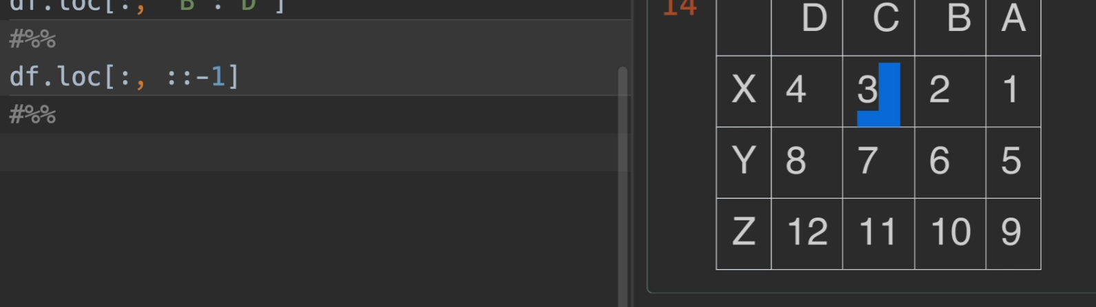
甚至还可以给定步长 :: 2代表两步取一次,其实::-1的话,也就是每一步是-1,不断走,也便是倒序了
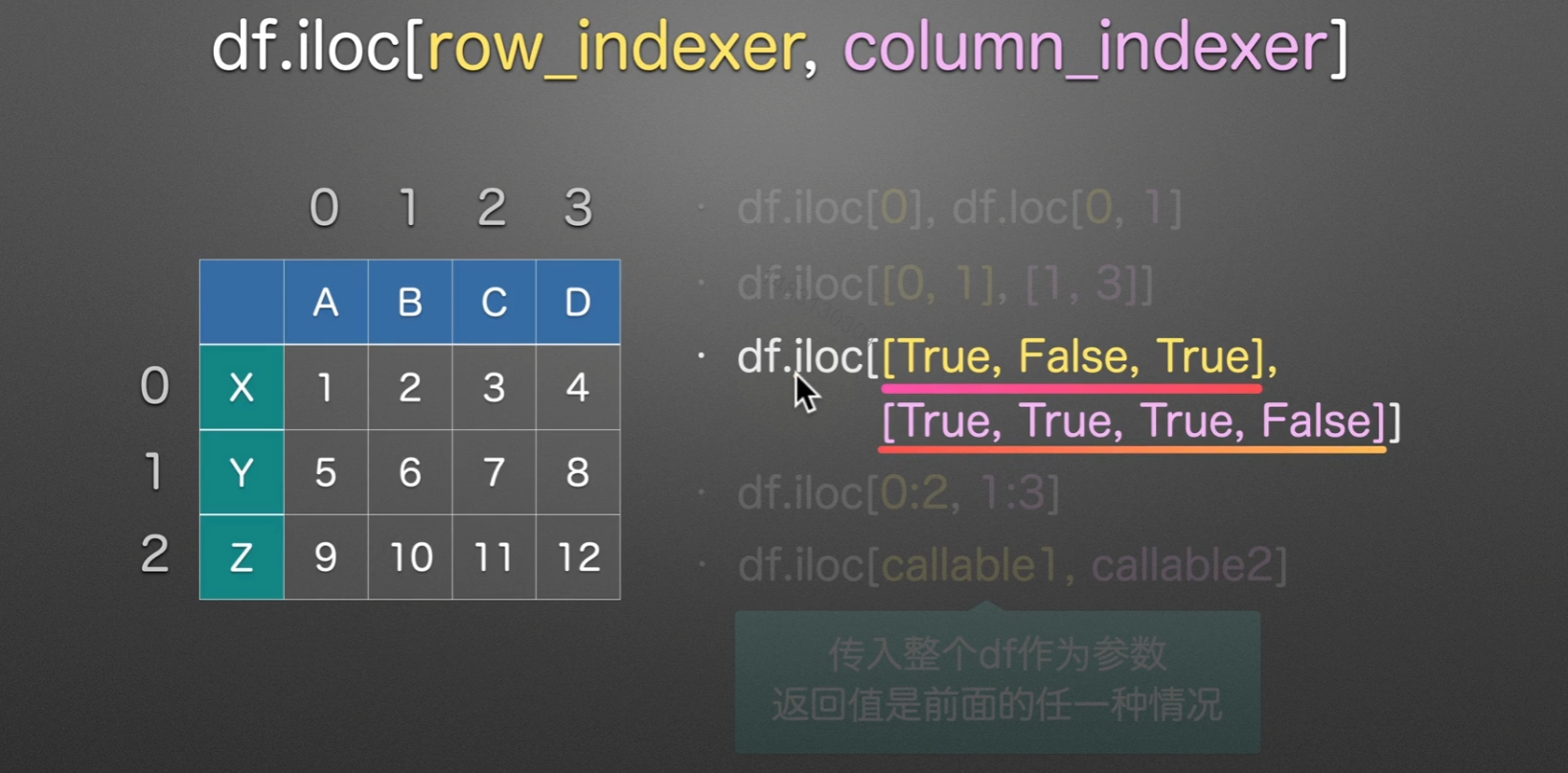
iloc选择数据
i 就是
integer,他和loc唯一的区别就是,iloc通常使用整数索引,这样使用的时候是不包括最后一个标签的,但是loc使用的时候包括最后一个,别的没变化。另外,loc适用范围广得多,iloc只能使用整数标签。
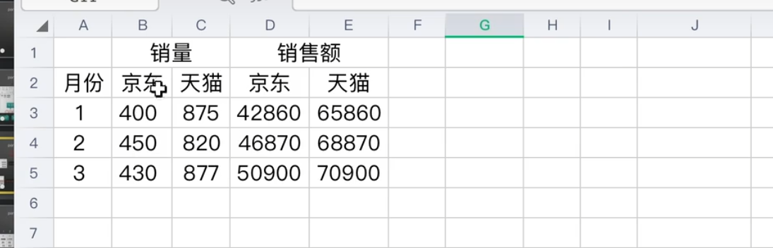
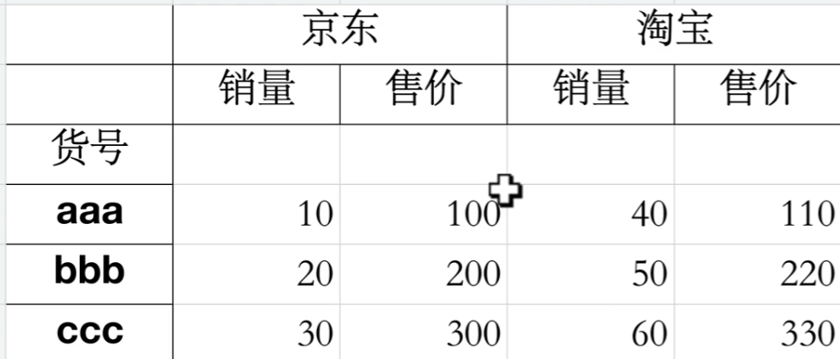
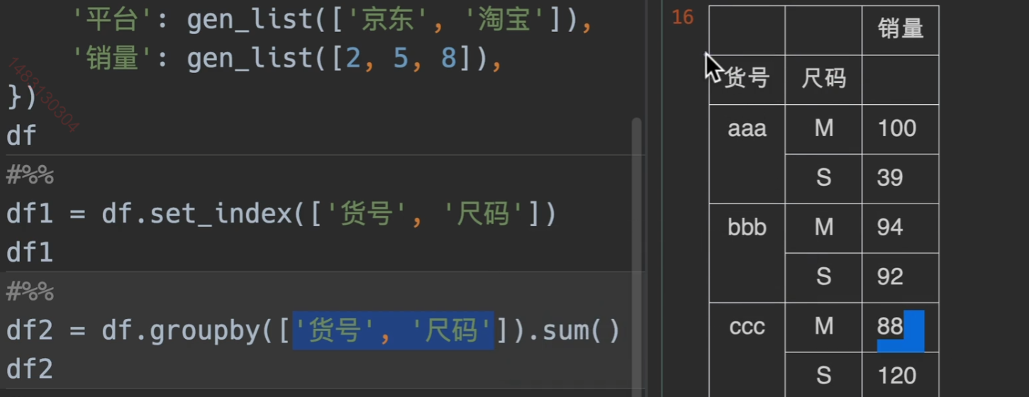
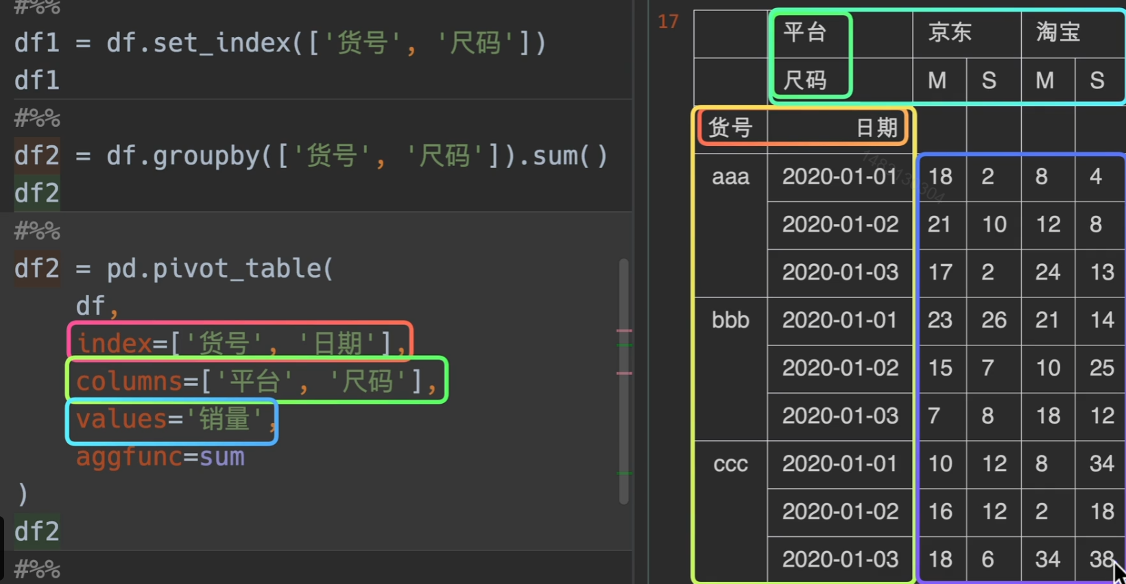
Mutilndex多层索引
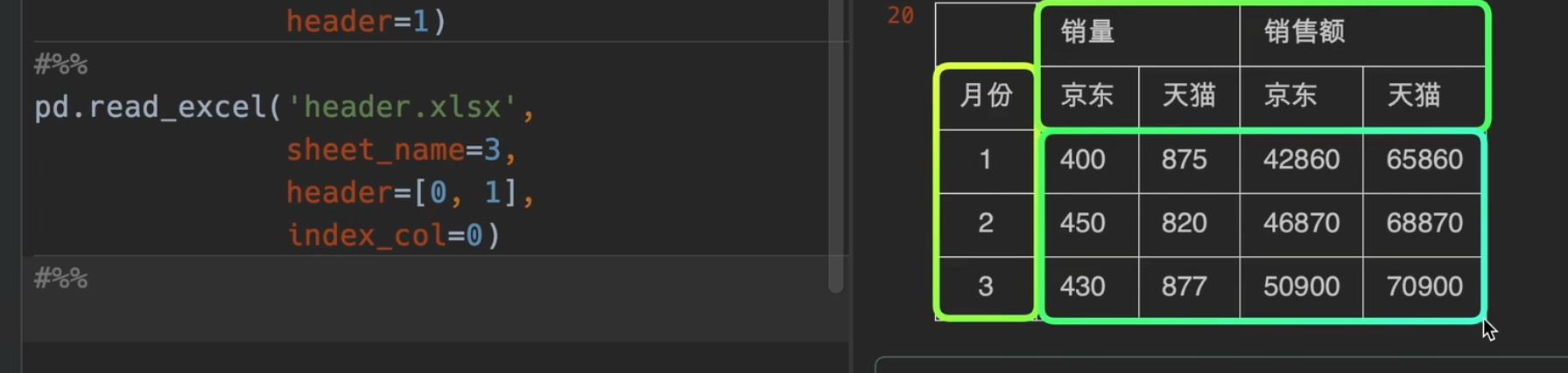
读写多层索引excel表
index_col基本能满足要求,但还是有所不足
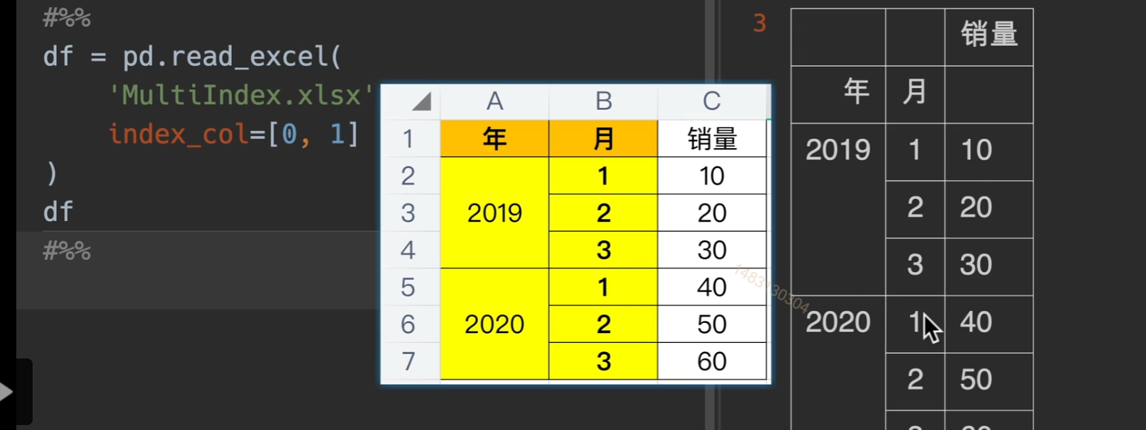
如果列索引(销量)有名字的话,就显示在他左边的空格中。
这里,简单的读取,乍一看没问题,但其实我们可以发现发现,他把货号当成了列索引的名字,并且行索引没有名字,因此我们需要做一点小变动,具体就是df.index.name = '货号' & df.columns.names = [None, None]
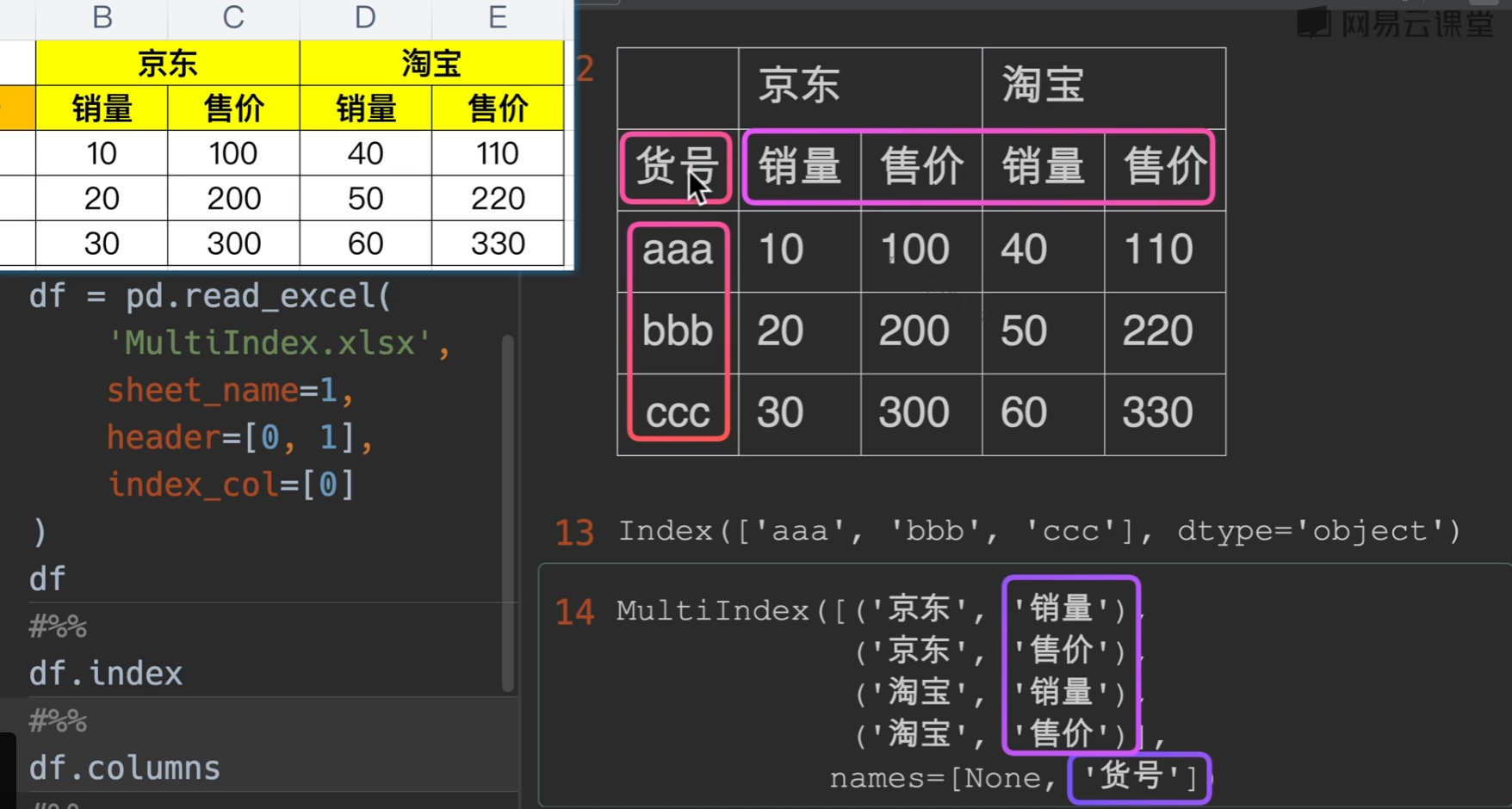
这个才是标准格式
创建多层索引
相邻两个相同,excel展示的时候会自动合并
list-like创建法

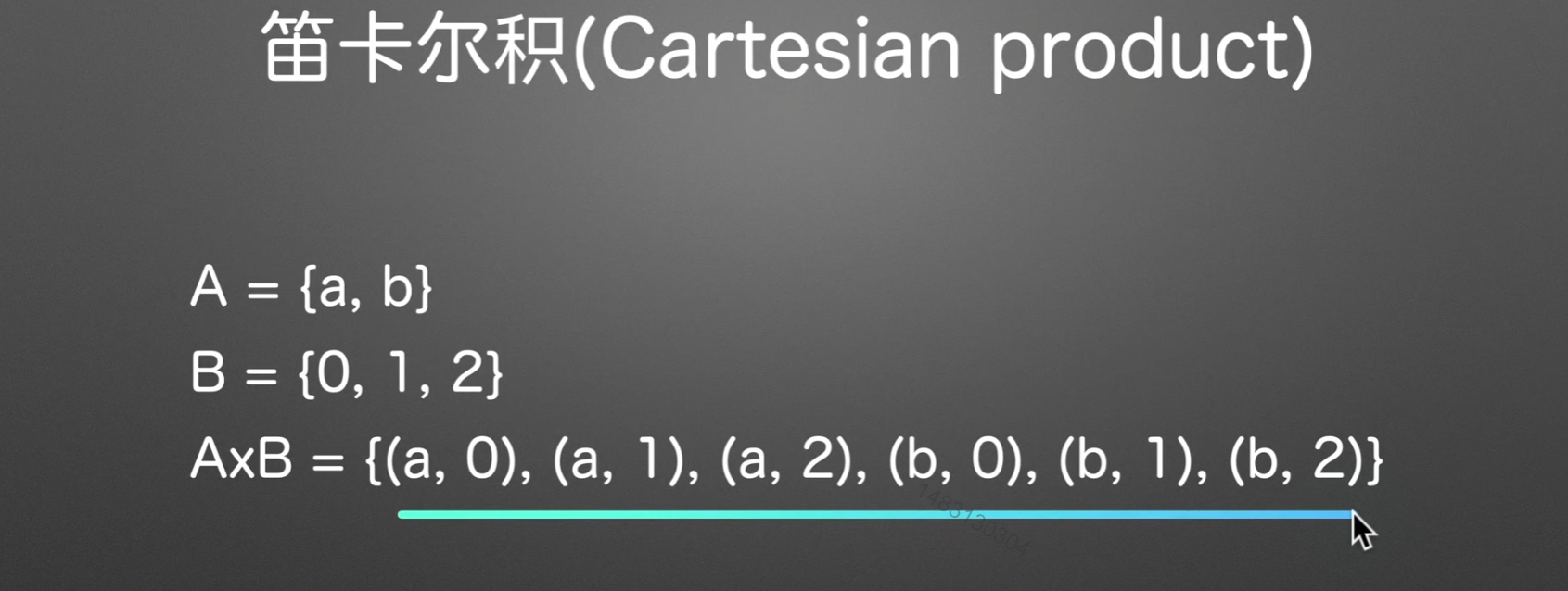
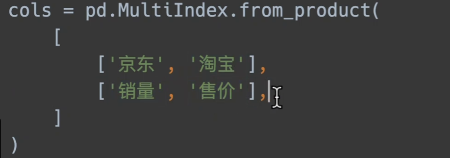
笛卡尔积创建
a集合和b集合,以有序的方式一一对应合并,最终组成的大集合称为笛卡尔积
此外更多….
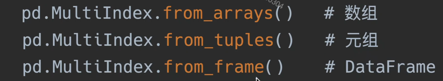
已有表格基础生成Multindex
在数模中,我们提炼二级指标说不定就可以用这个
自定义生成随机样本
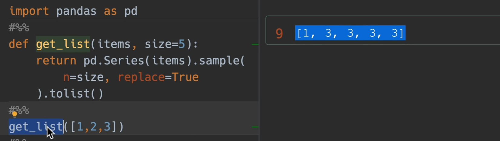
- sample()函数,n为生成的多少,replace为取出后是否放回,前面调用它的series的items就是原材料
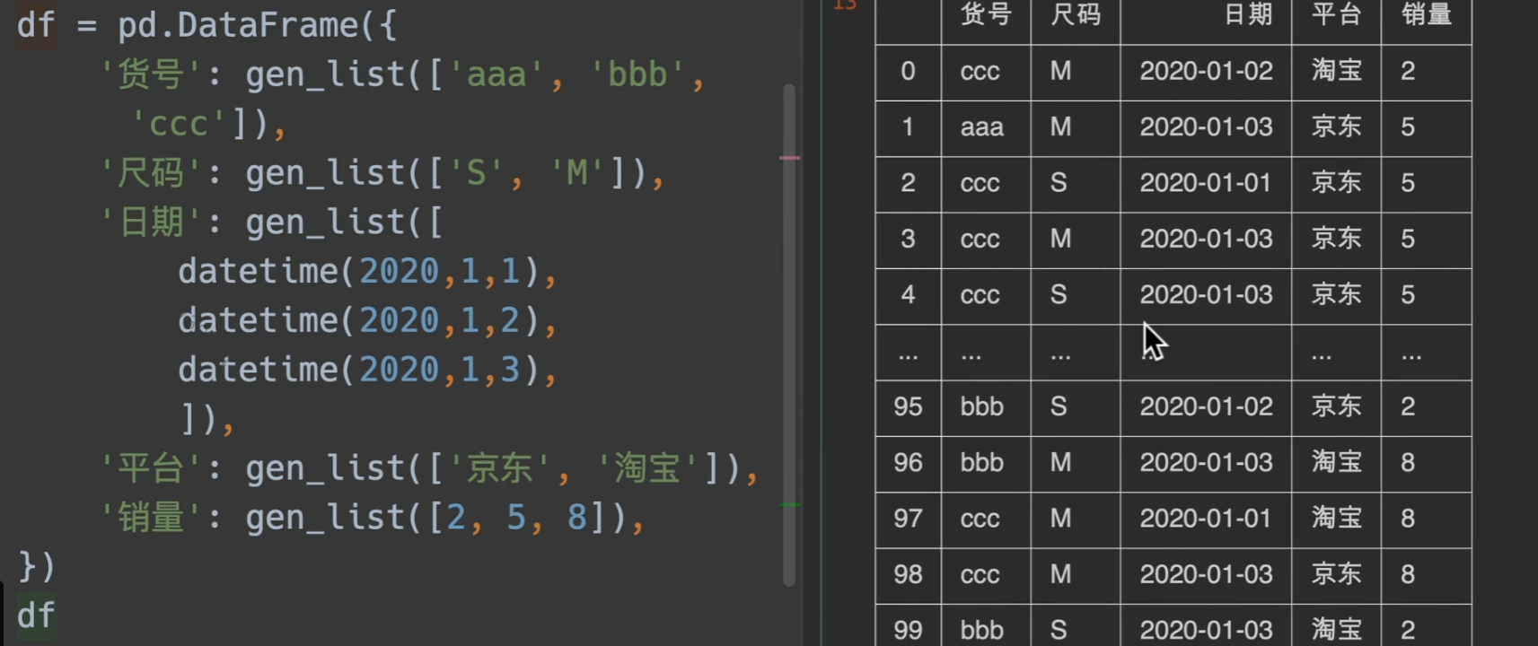
采用随机采样快速填充结果
groupby快速分组yyds
透视表等等在学!
无敌!
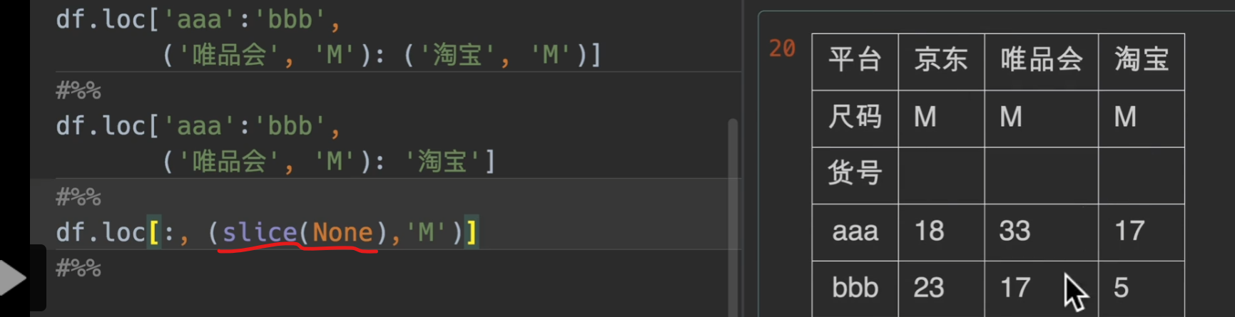
多层索引取值
这个看看就好了!大概意思就是这个,有个注意点是,这种多层索引都是采用字典机制,所以,我们传入参数是(‘淘宝’,’M’)这样的形式
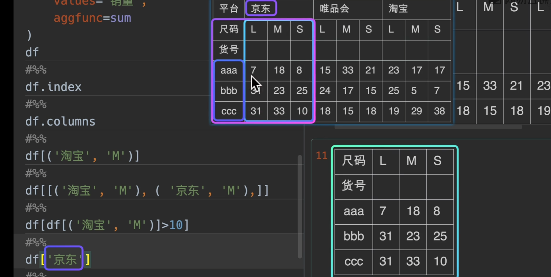
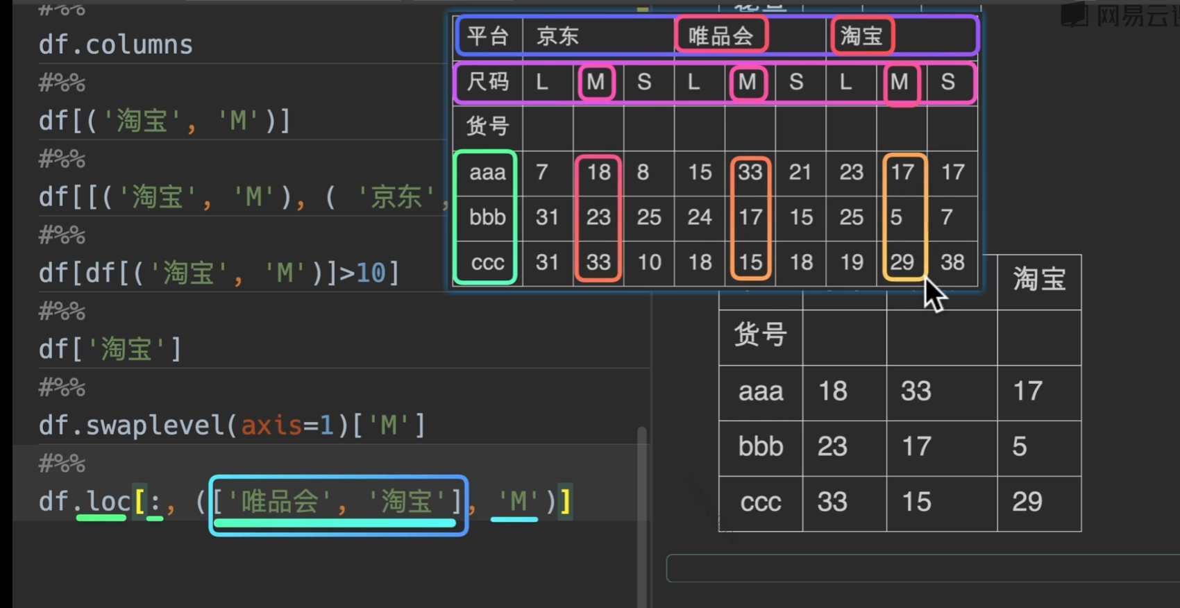
slice(None)的意思就是选择全部,不能用
:

数据赋值
直接loc改也同样有效哦
总之一句话,灵活选择,务必记住loc是先行后列!
缺失值
python中缺失值的类别
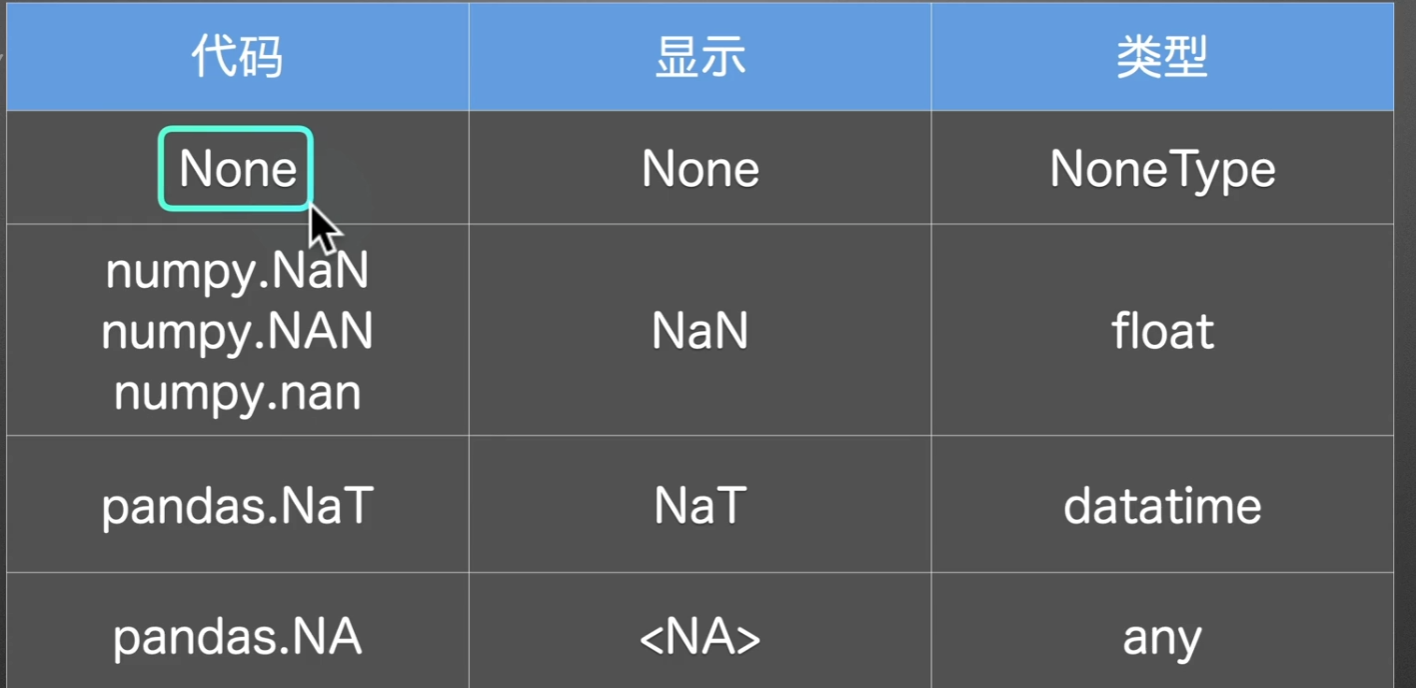
让我们来观察一下空值都长啥样
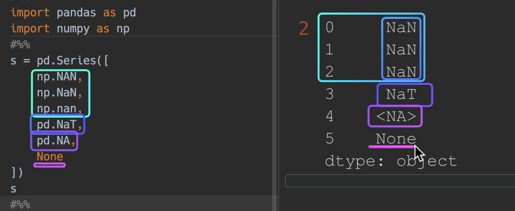
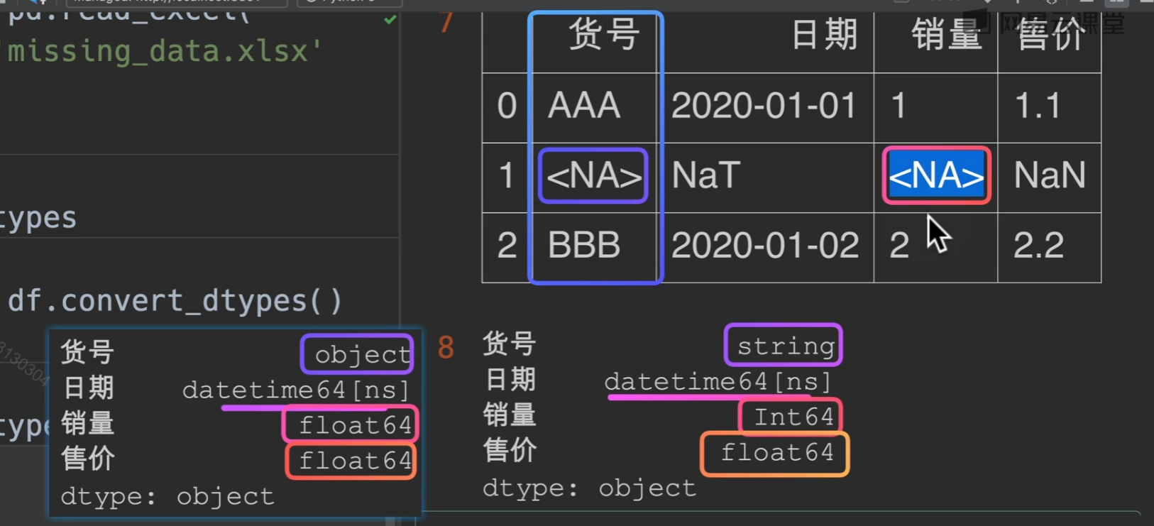
df.convert_dtypes()可以自动将空值转化为最可能的形式,最常见的是
NaN
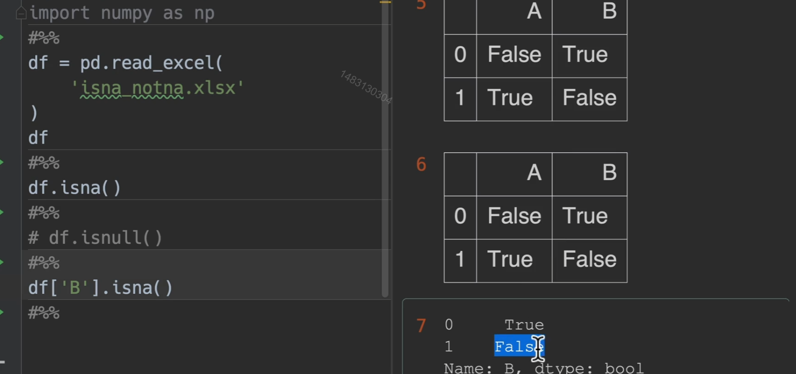
检测缺失值
isna()/isnull() notna()/notnull() 相邻两行意思是完全一样的,输出的结果就是掩码,是空值的地方为True,其他是false
删除缺失值
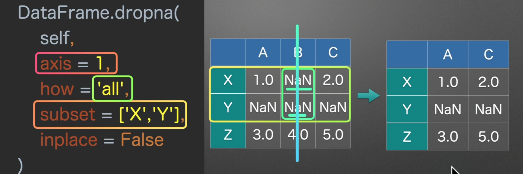
dropna()
- axis = 0的意思就是选中行,也就是我们接下来的操作都是对一行一行的
- how = ‘any’的意思是,只要哪一行有空值,无论一个还是多个,他都会进行删除 ‘all’的意思是必须这一行全部为空值,才进行删除
- subset = None 的意思是检测所有的列,他可以传入一个列表,指定检测的列
- inplace = False 这个参数在大多函数中都有,意义是是否就地操作,如果为True那么就是就地执行操作,没有返回值,如果为False就是新开辟一个空间,并且返回操作后的结果
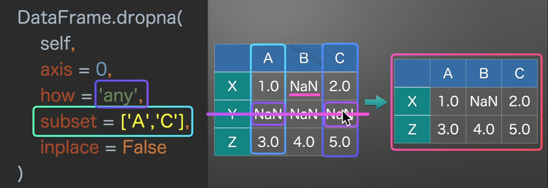
选中行删除,how为any,subset为None,inplace为False为系统默认
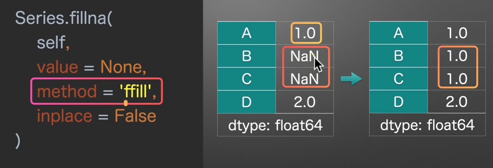
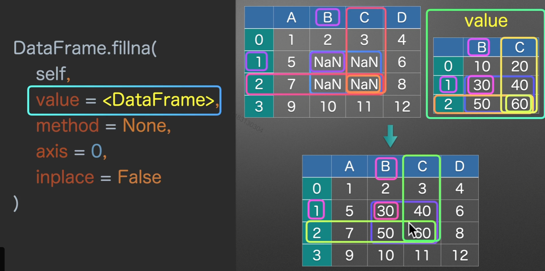
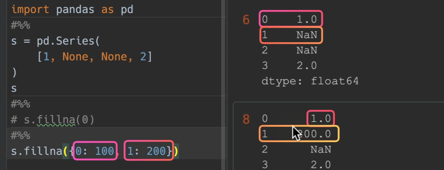
填充缺失值
fillna()
- value = xx 默认填充值
- method = ‘ffill’(forward)为遇到空值默认向前查找对应的值来填充、‘bfill’(back)遇到缺失值默认向后查找值来填充,注意,这里的前后,当axis为0时,默认为上下;为1时,默认为左右
-
value和method是必须传一个,而且也只能传一个
同时value也可以填入dataframe,此时,他找就是找行列索引,如果是一样的,那么才将这个dataframe的值填入对应dataframe

实际工作中最常用
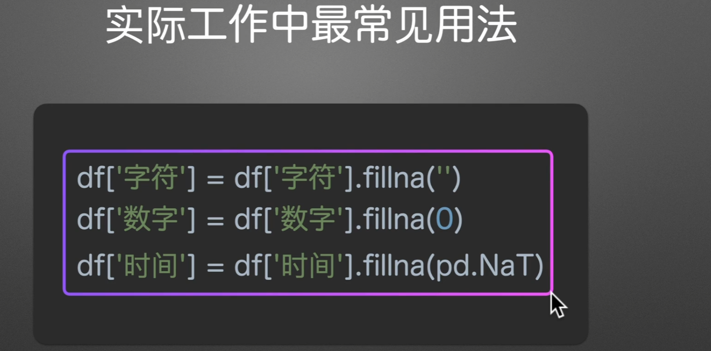
fillna只会填入空值(换言之,已存在的就不会填入)
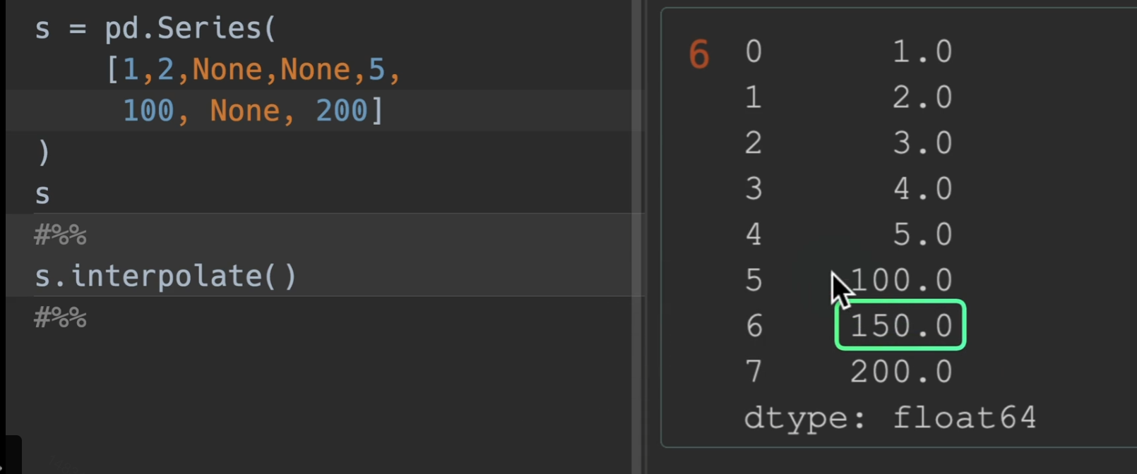
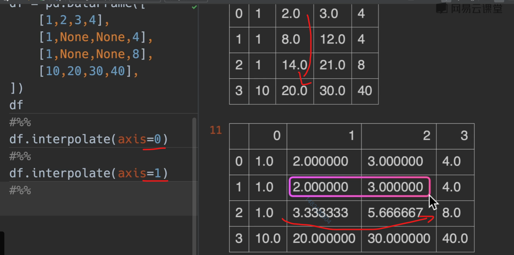
线性插值
interpolate(),他只利用了相邻的前后两点,别的没用。
数值运算
需要注意的问题


对空值的处理
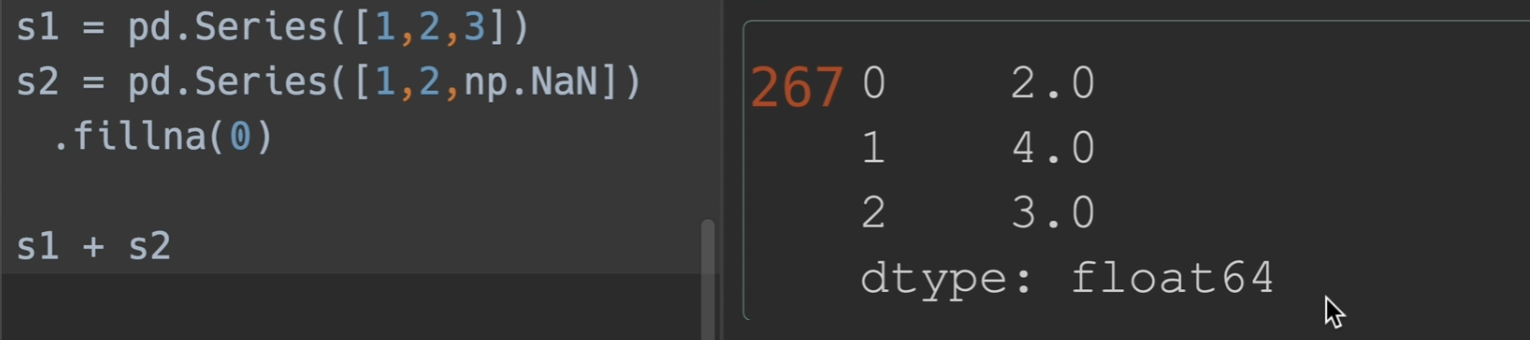
两种方法均可,第二种是运算的时候默认换成0
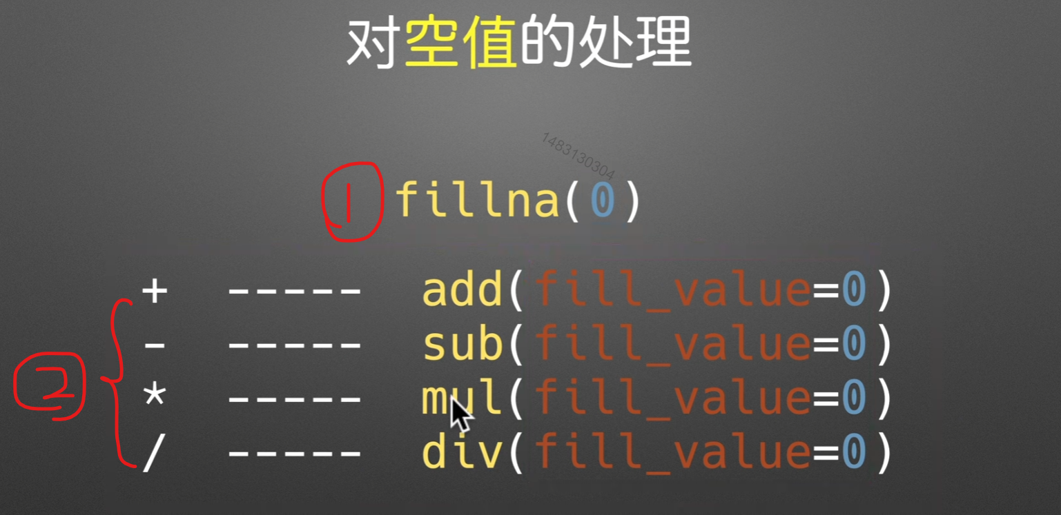
对除数为0的数
用1来代表任何数


Series不对齐情况
用add、sub、mul、div这些,将其fill_value = 0 可以在计算时补0,使得仅并集计算,不会爆NaN错误
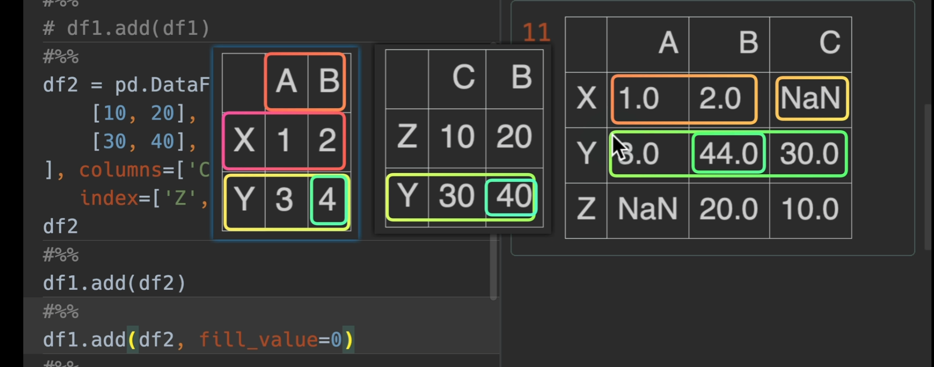
dataframe情况举例
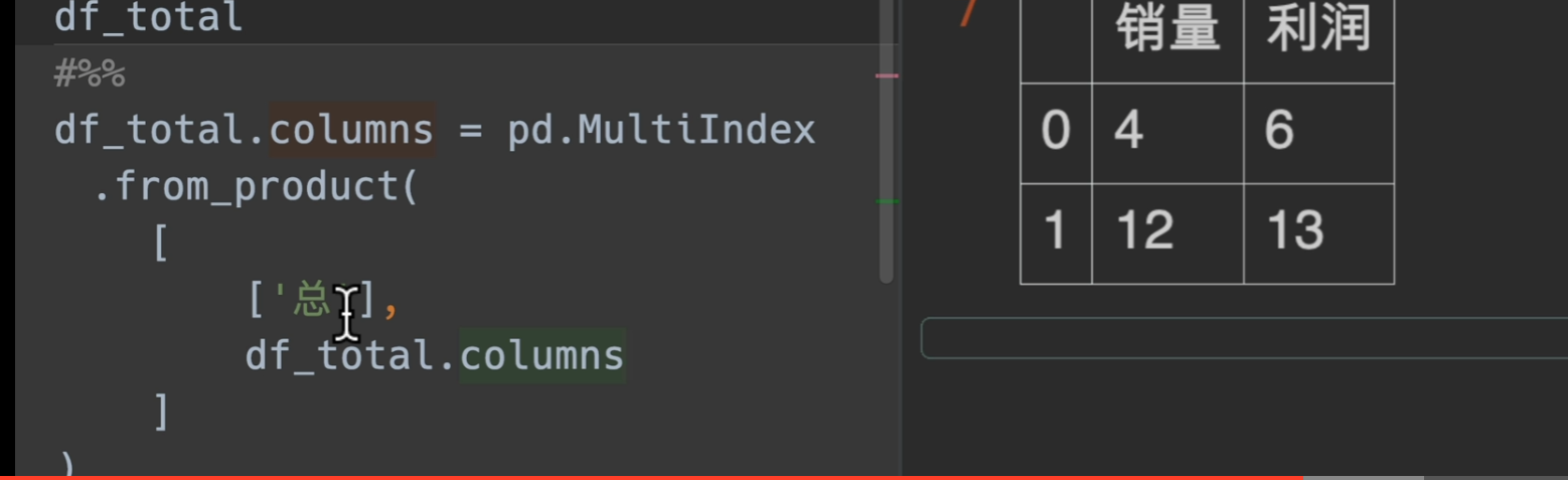
Muitindex实现
假如我们要将京东和淘宝的数据合并,并显示一个总需求,那我们应该怎么做呢?
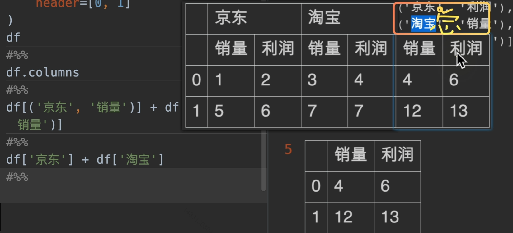
这里我们采用笛卡儿积的方式进行匹配
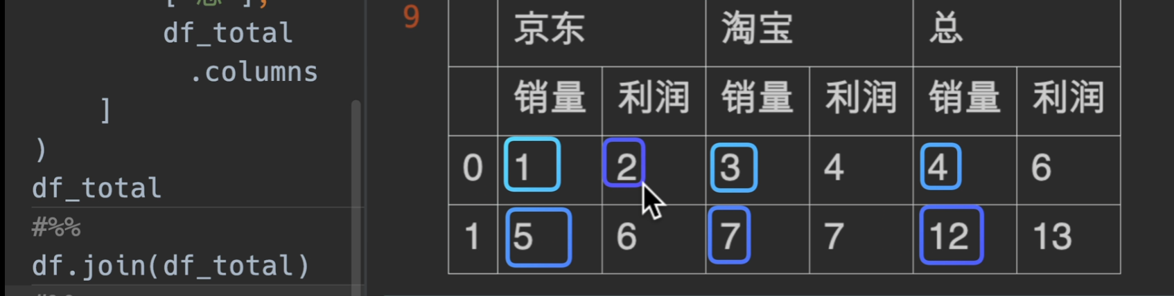
到这里我们使用join函数就实现了需求了
字符串
字符串操作
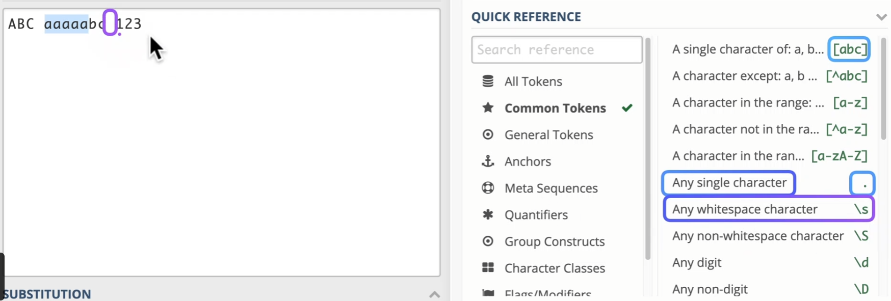
regex101: build, test, and debug regex
以下是最常用的一些:除此以外还有
\w匹配任意字符\d匹配数字a+匹配延续字符
在python中我们常常导入这样的包,然后就使用这几个方法。
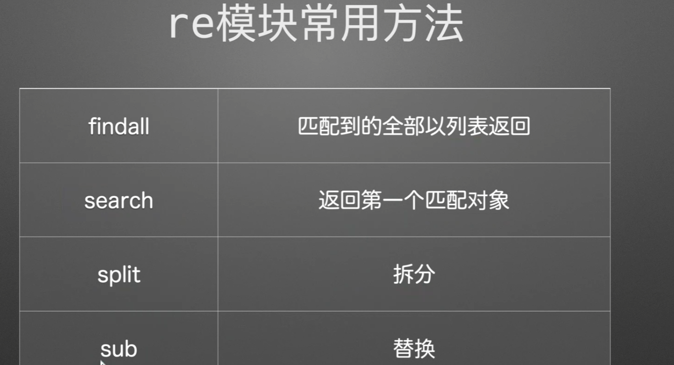
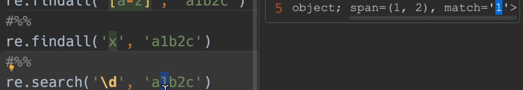
findall()
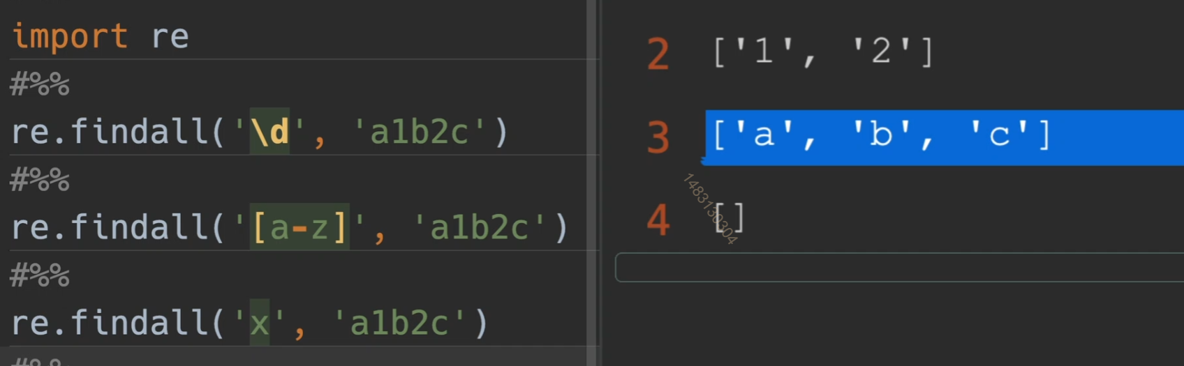
search()
注意,这个span,不是指找到了1、2,而是说
match=1,它的位置索引是[1,2),也就是第一号的位置
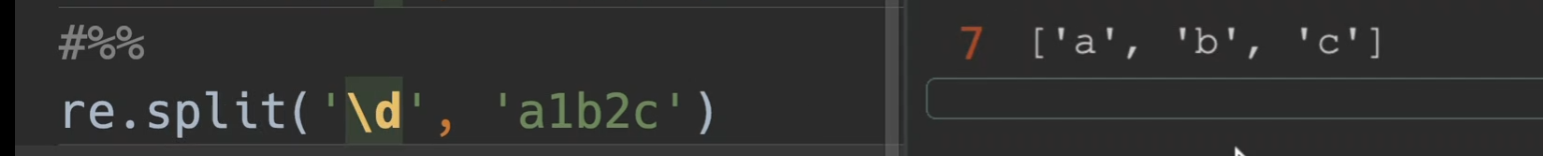
split()
以数字进行拆分
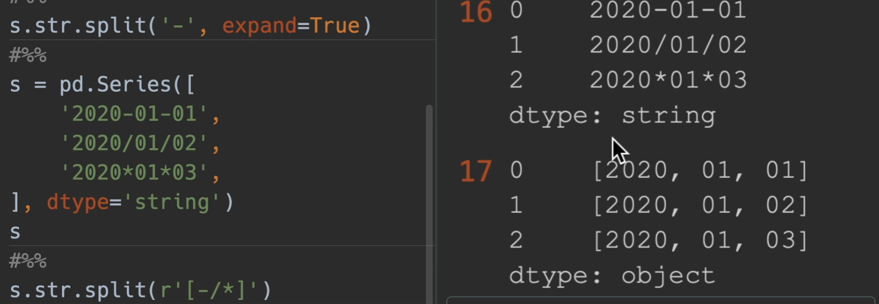
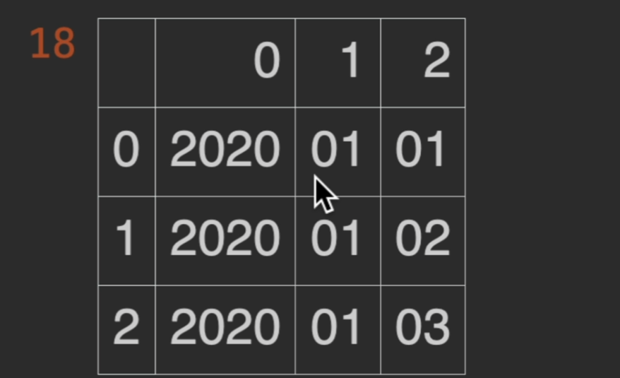
这里使用r放在开头,表示他是一个原始的字符串,用[ xxxxx ]表示这里面的都需要匹配到,另外,如果再加一个参数为expand = True,那么series将变成一个dataframe
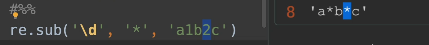
sub()
将\d找到的数字全部替换为*
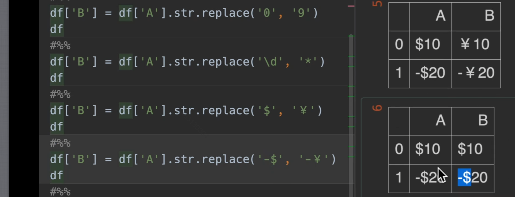
replace()
超过一个字符的,就视为正则表达式
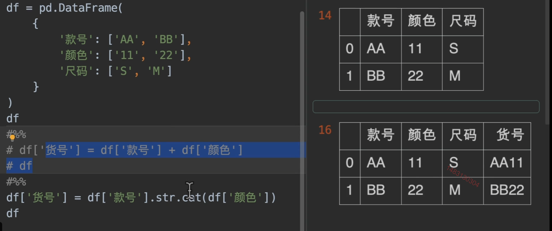
cat()
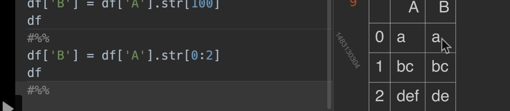
str取值与切片
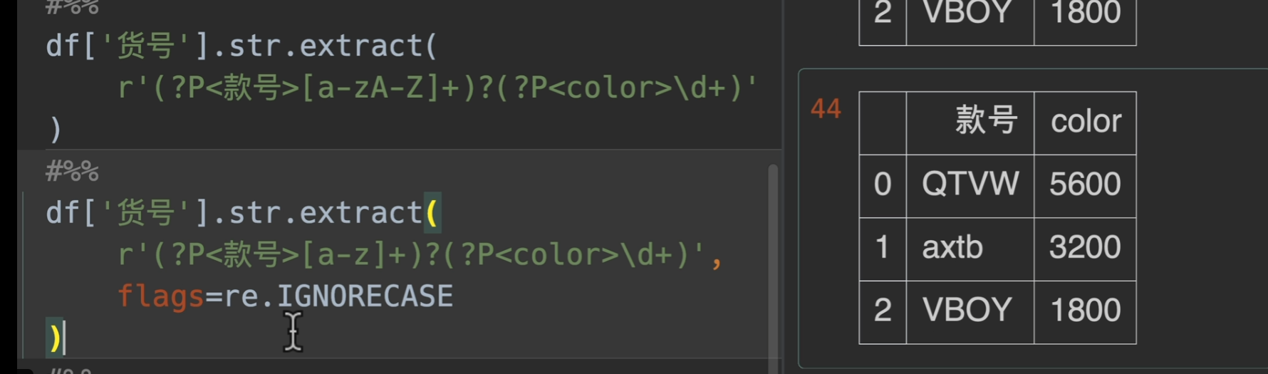
extract()提取
这里第一个参数传入一个正则表达式,注意是用括号括起来的,使用时必须有捕获组(capture group),其实一个括号括起来就代表一个捕获组,例如正则表达式
(\d{4})-(\d{2}-(\d\d))这个正则表达式可以用来匹配格式为yyyy-MM-dd的日期
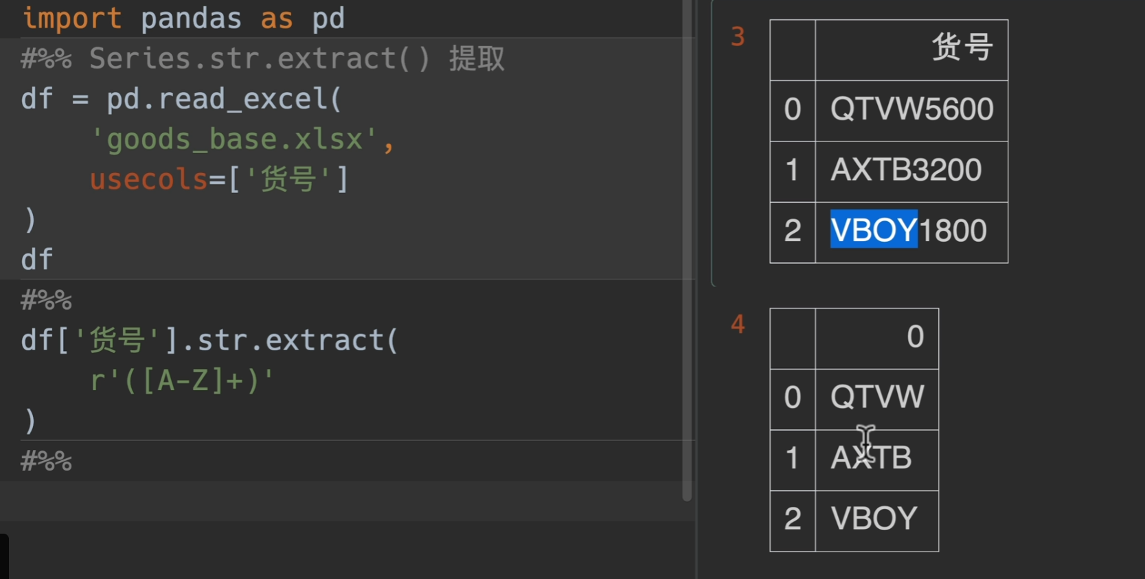
另外(?P
xxx)这个是正则表达式的一个语法,可以给捕获组取到的东西命名
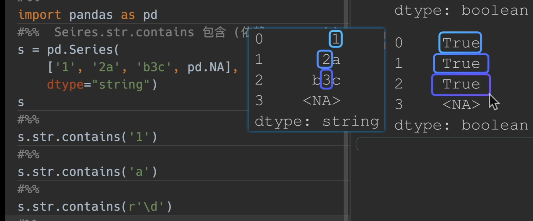
contain()
在添加一个参数,na = False,即可将下图中
转化为False
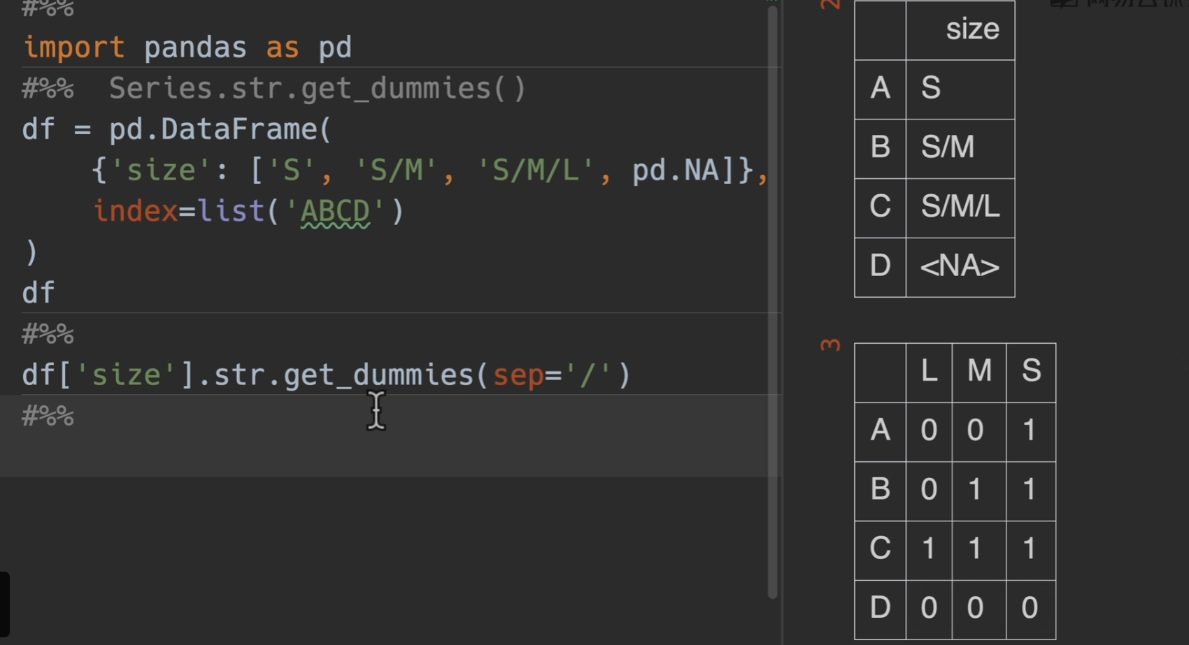
get_dummies()获取独热编码
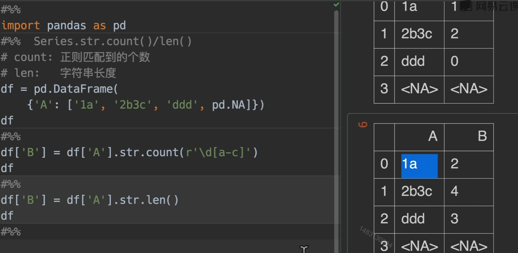
count()/len()
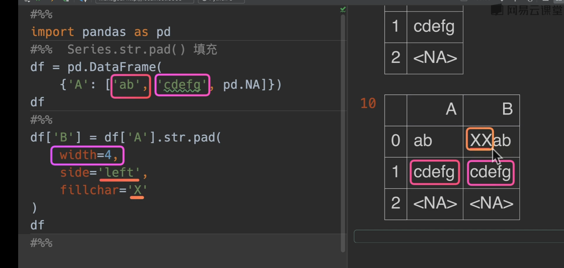
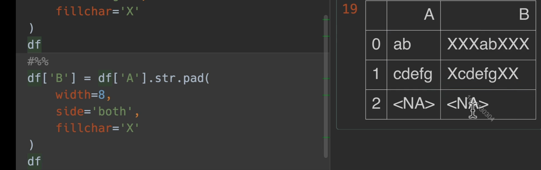
pad()填充
string类型

推荐使用StringDtype,避免混淆的情况
访问器
使用之前必须保证调用元素都是string类型,不然可能出现一些意想不到的结果。
可以使用
astype进行转换。

访问器应用实操
第一列多加了空格,第二列最后为文本,第三列最后也为文本,但我们用pandas读入之后是这样的,数据量多了之后很难发现有什么问题
如果我们应用了一个convert_dtypes()之后仍然发生数据类型对不上的情况,很有可能数据源就是有问题的
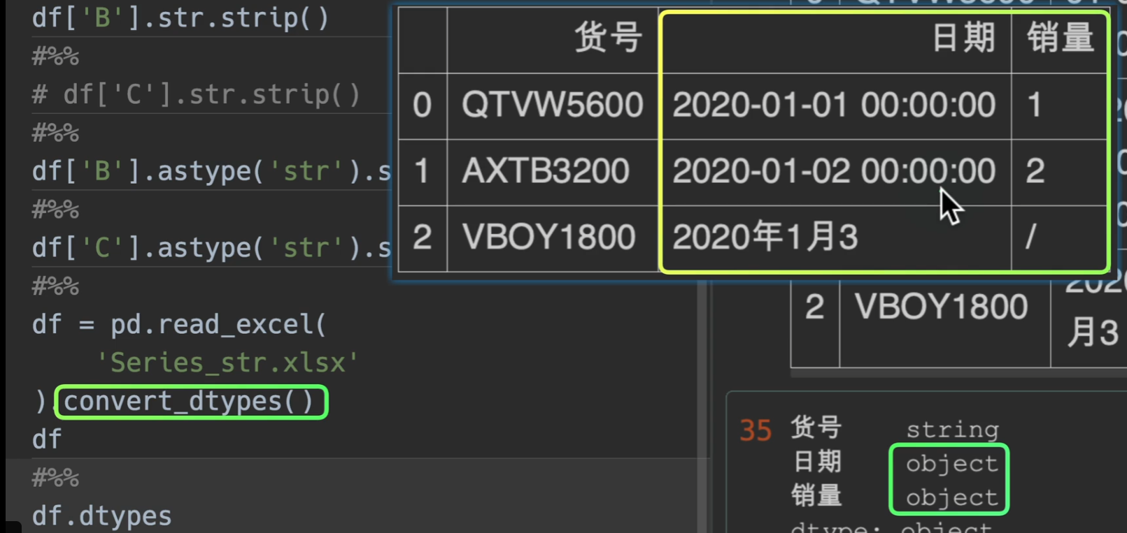
这个时候怎么处理呢?
时间
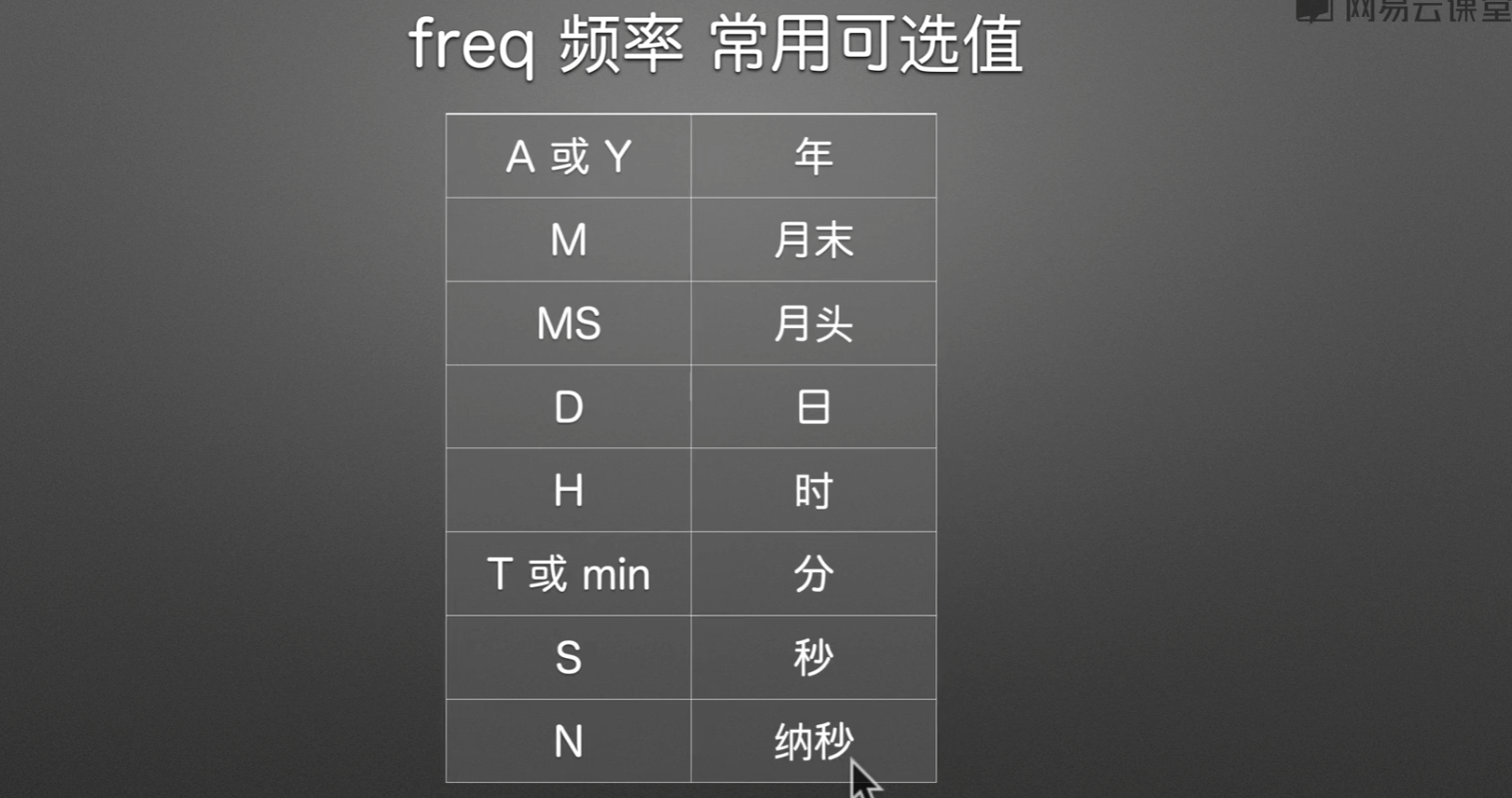
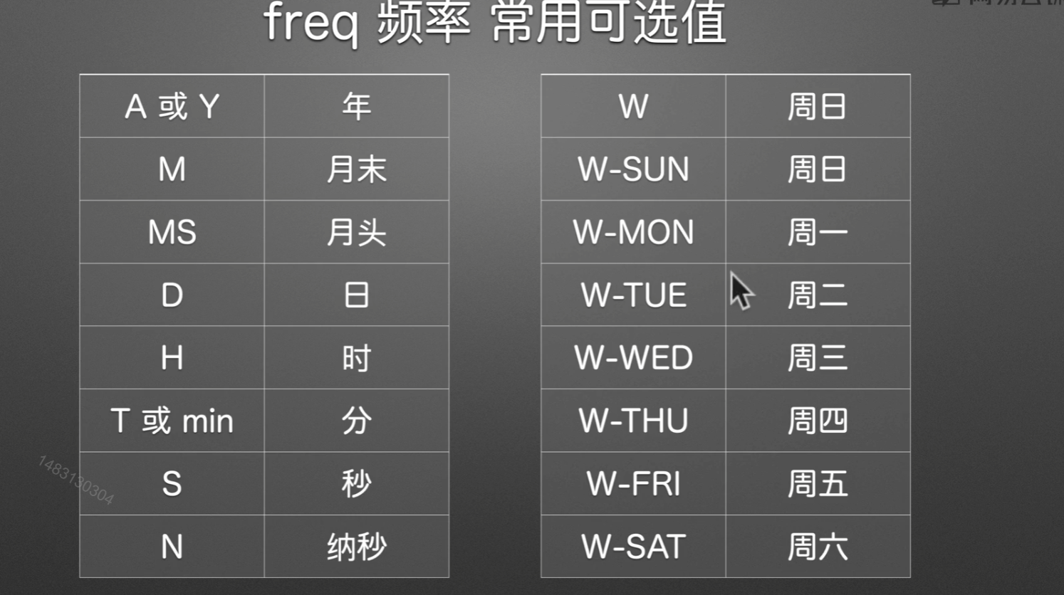
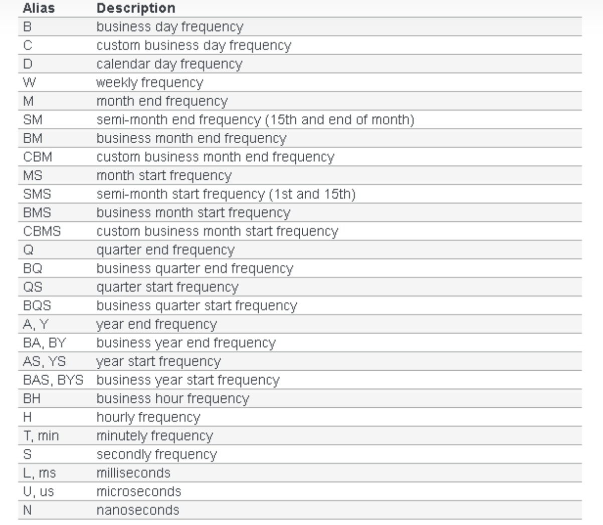
Time series / date functionality — pandas 1.4.4 documentation (pydata.org) 如果不知道有哪些时间类型,点我进入
时间类型
通常舍弃最后一个时间偏移量,用时间增量来代替
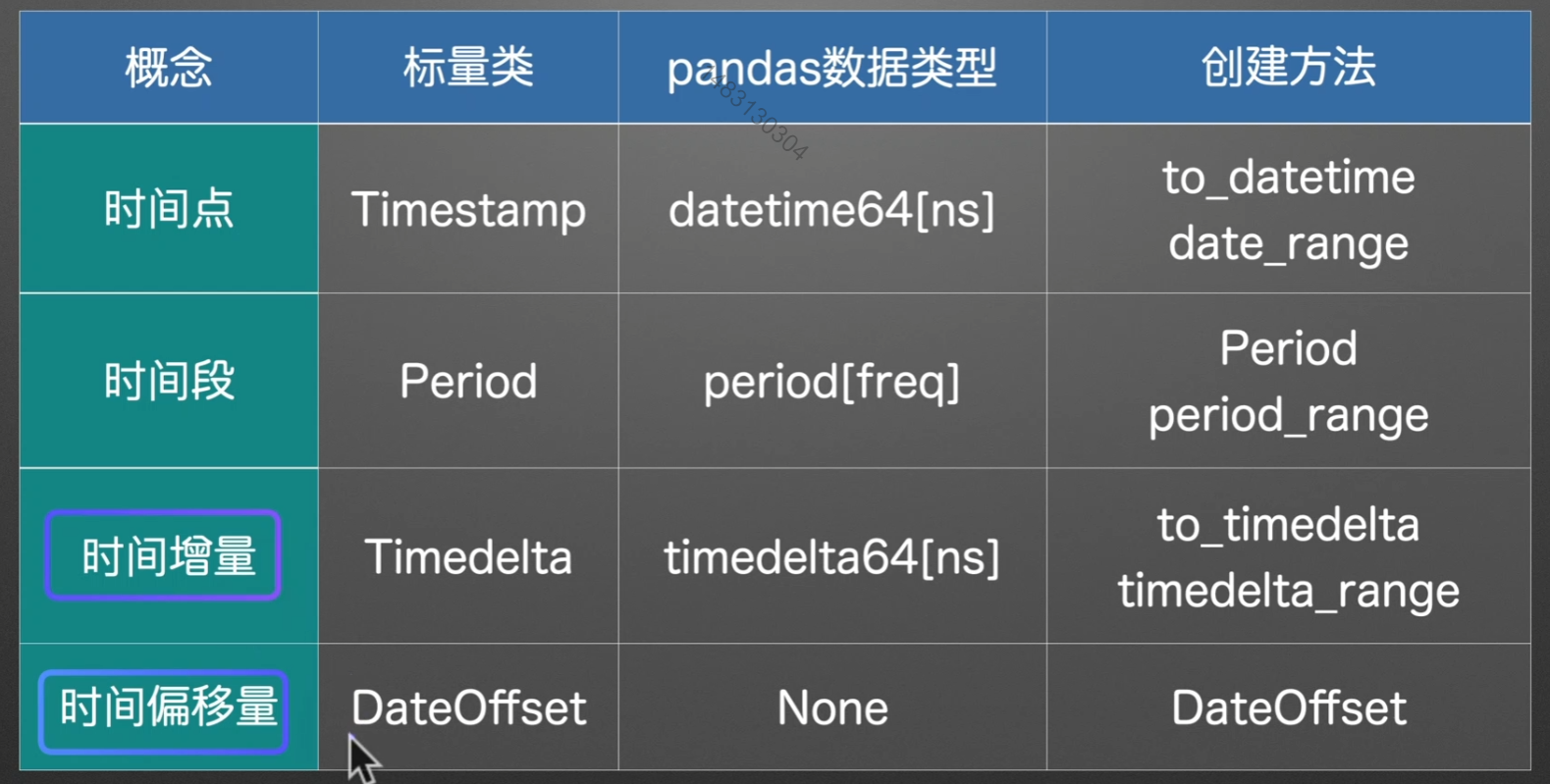
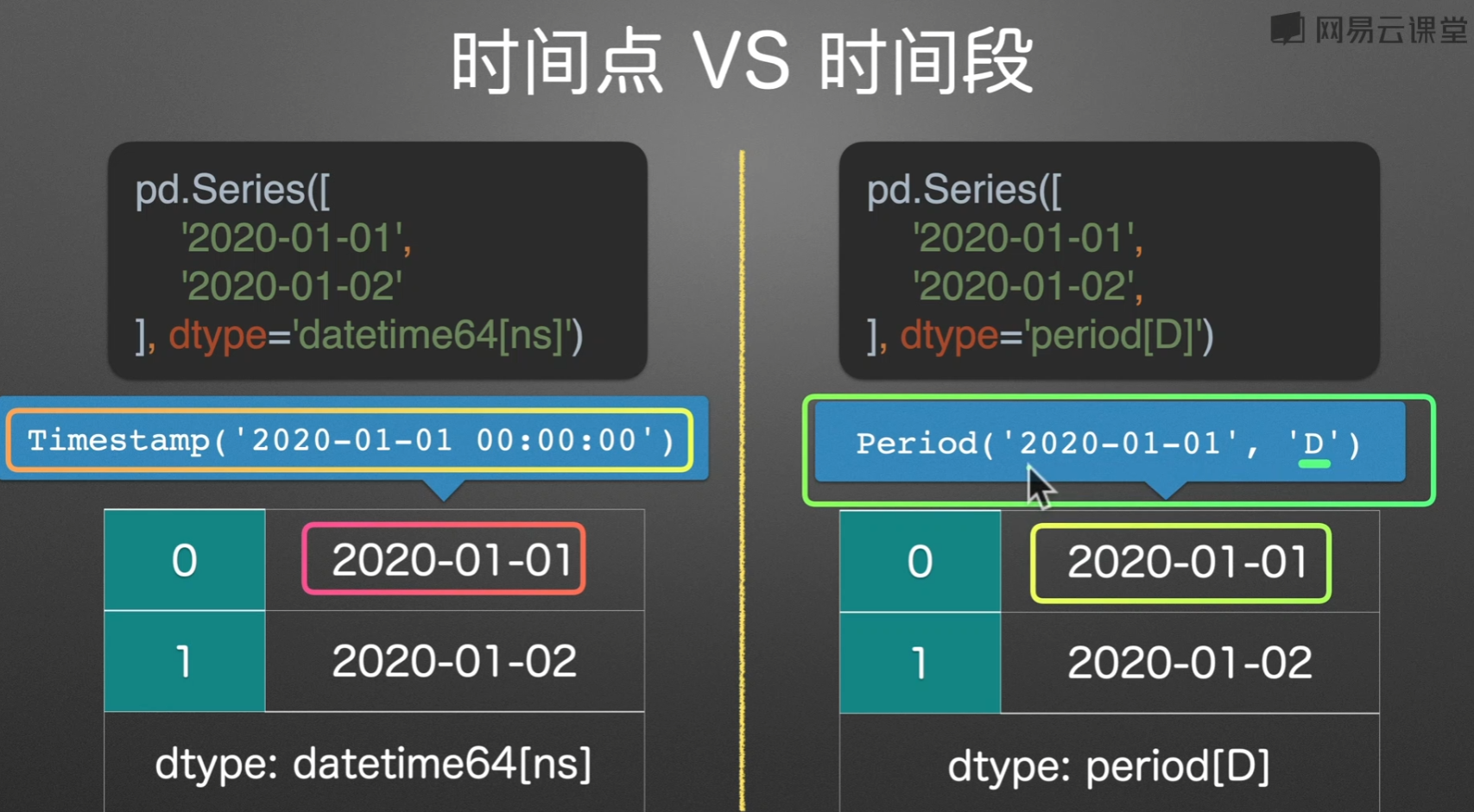
时间点/时间段
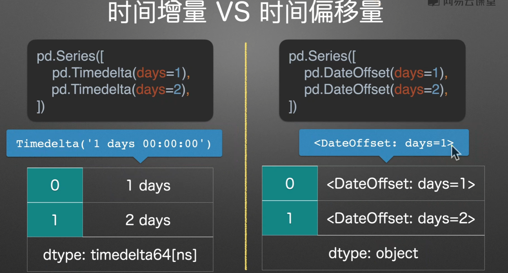
时间增量/时间偏移
实例演示
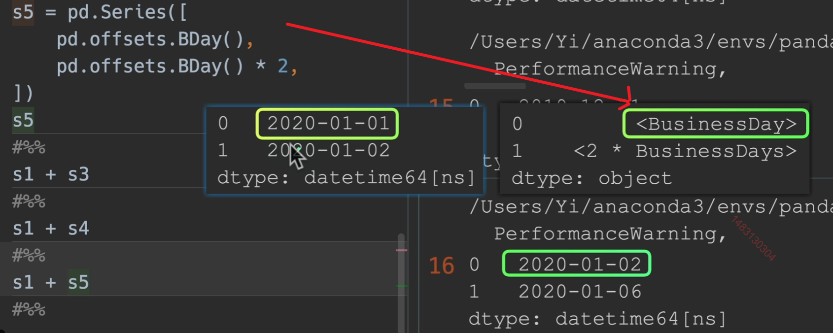
Timedelta和DataOffset可以与其他时间点进行运算。
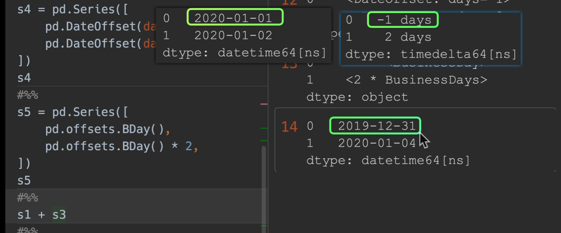
1月1号加一个工作日变成了2号,这没问题,一月二号加两个工作日变成了六号,这是因为二号是周五了,于是他跳过了周六周日,再加了两个工作日到周二,也就是六号
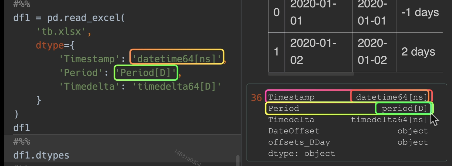
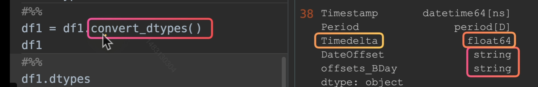
指定读入类型,但如果我们直接用convert_dtypes(),则会有可能Timedelta转换错误
转换时间序列
to_datetime()
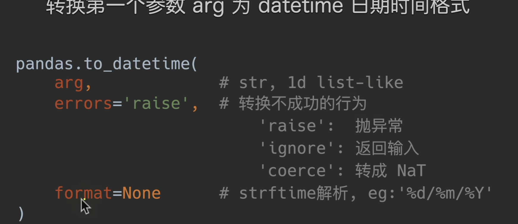
coerce转成NaT,也就是说,转换成功的转换,转换不成功的自动转换成时间类型的空值
生成时间戳范围
date_range()
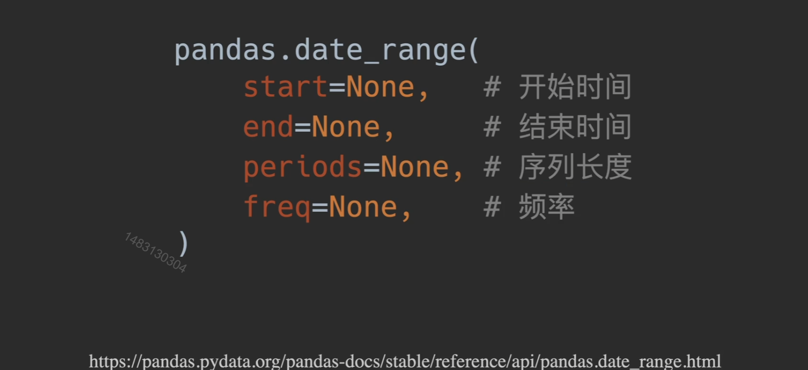
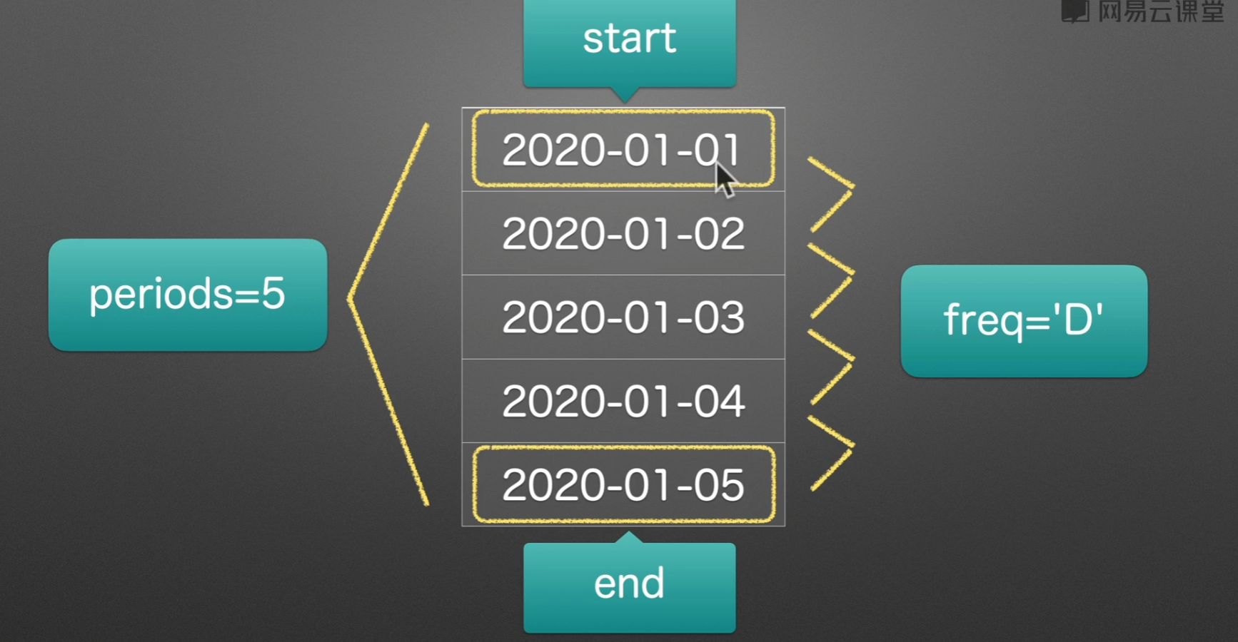
B和C为取工作日 pandas date_range freq 可选值 - Tiac - 博客园 (cnblogs.com)
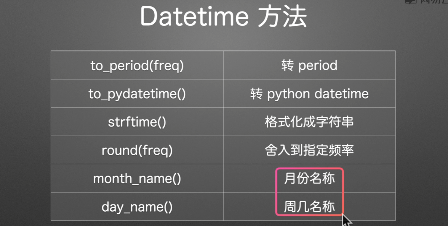
时间序列访问器

属性
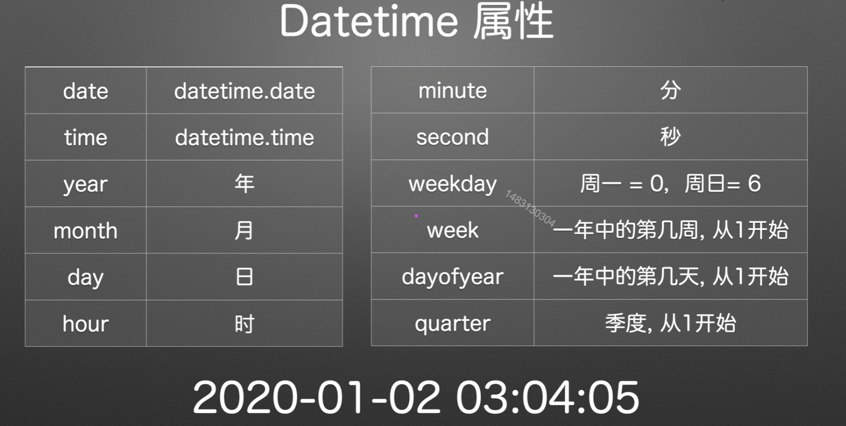
方法
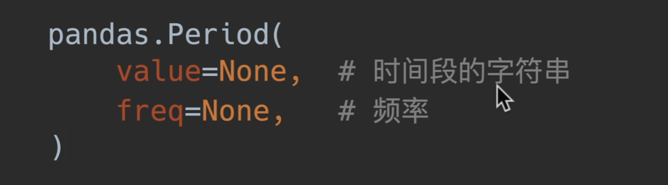
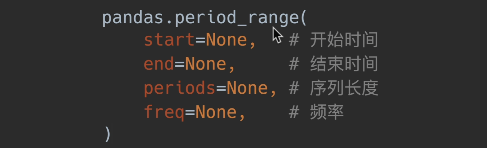
Period创建
start_time、end_time是时间点,也就是后面有0时0分0秒那种

Timetelta时间间隔
Timedelta()
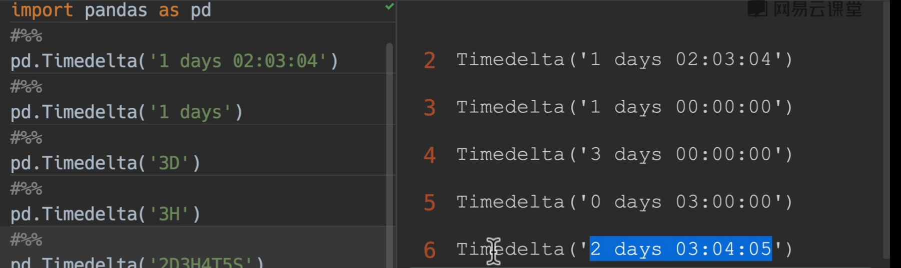
unit用法

to_timedelta()
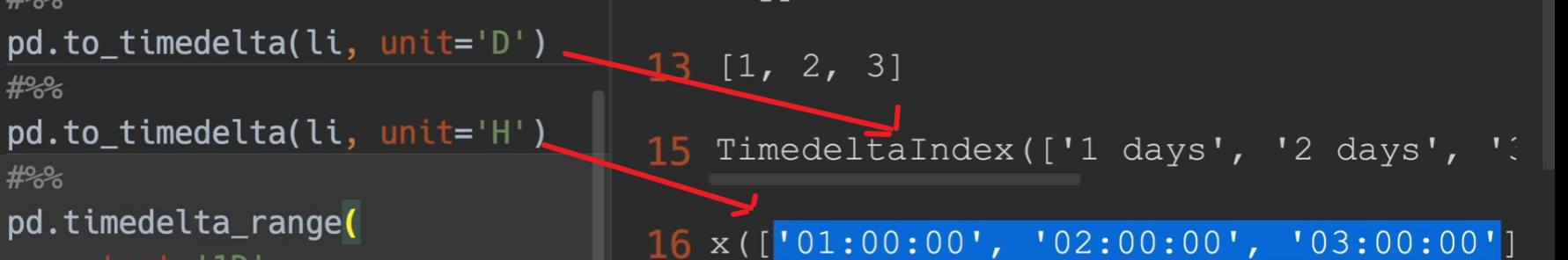
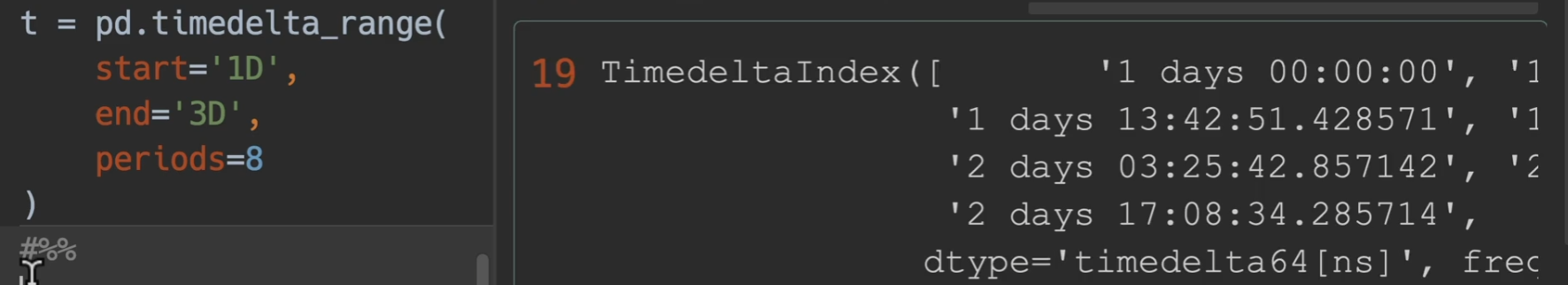
timedelta_range()
更多详情,请见pandas.Timestamp — pandas 1.4.4 documentation (pydata.org)
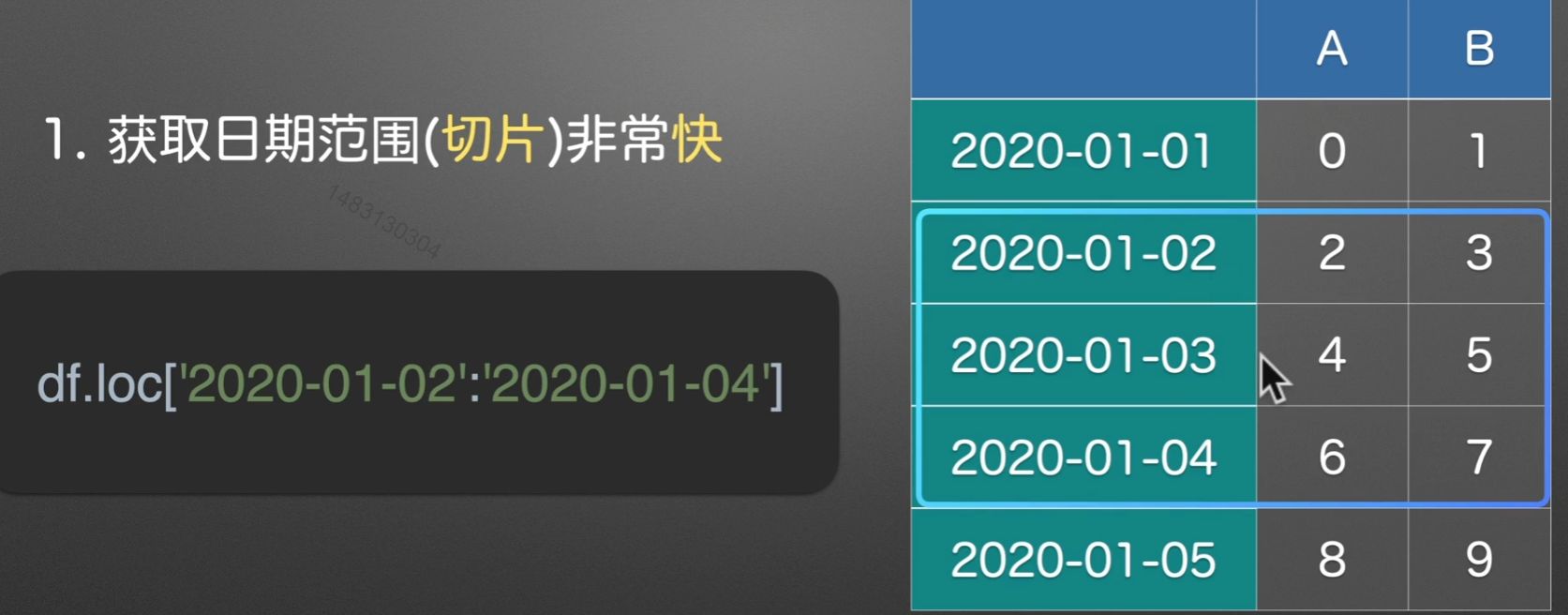
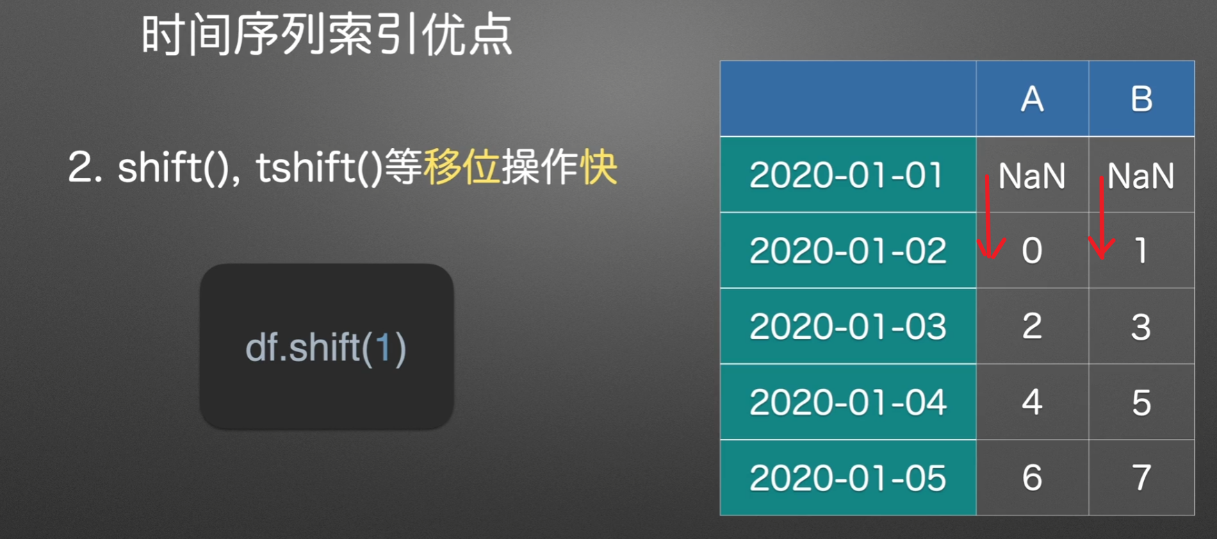
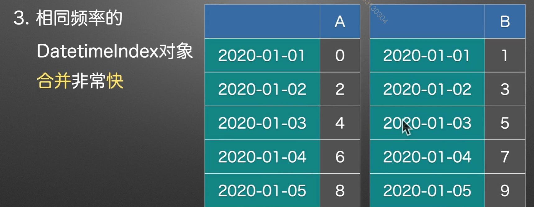
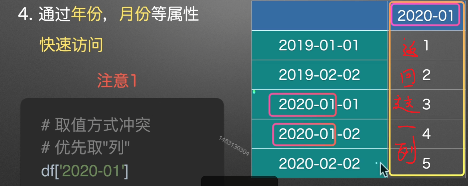
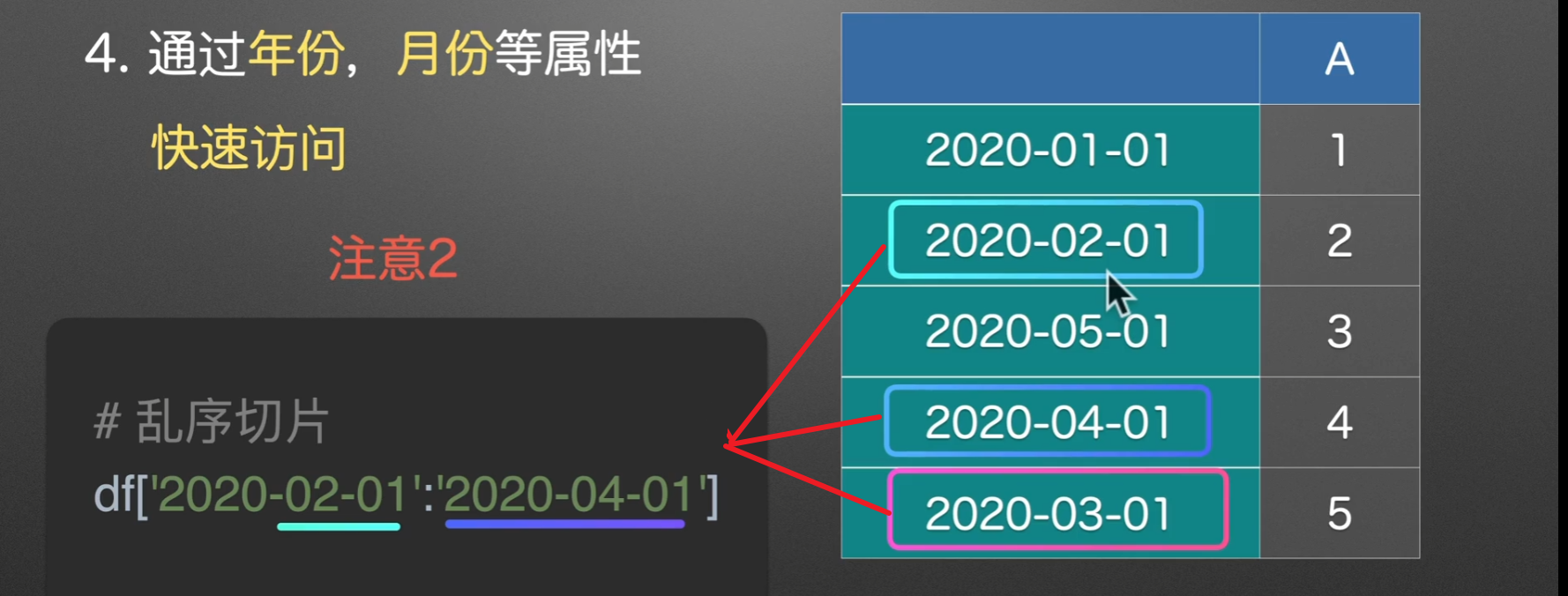
时间序列索引
优点
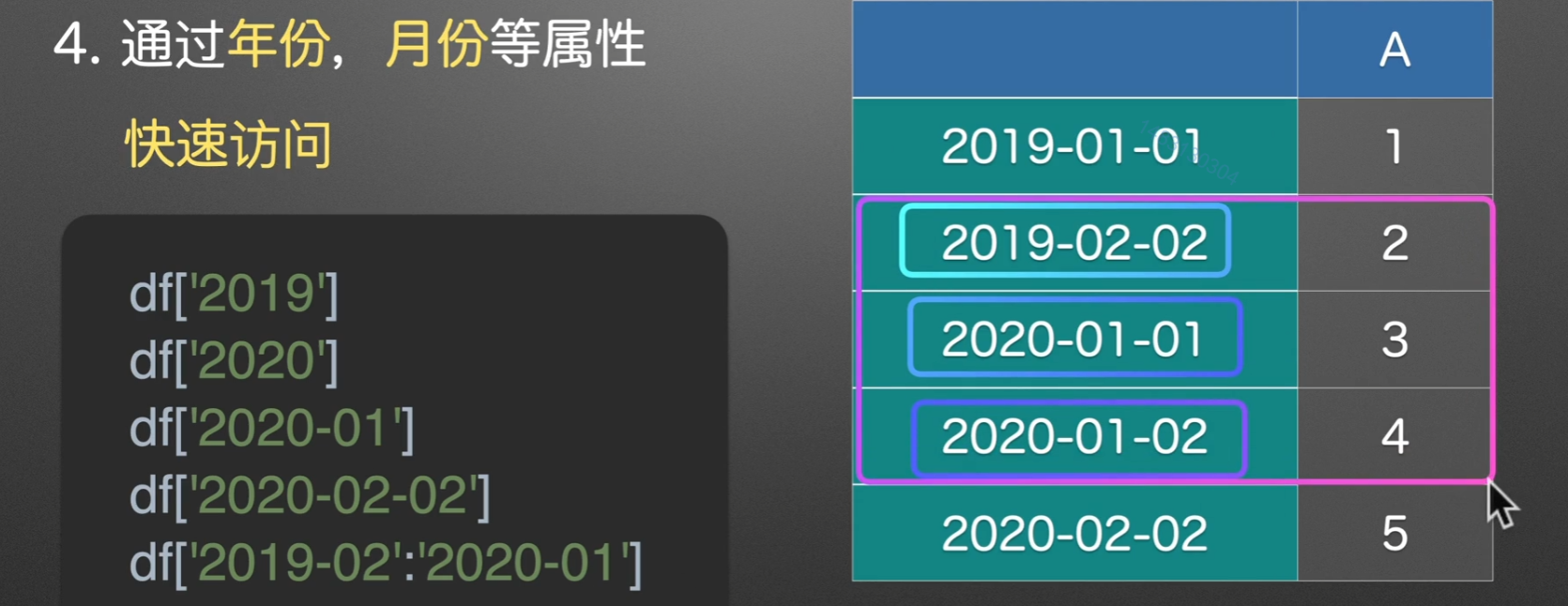
注意点
多表合并
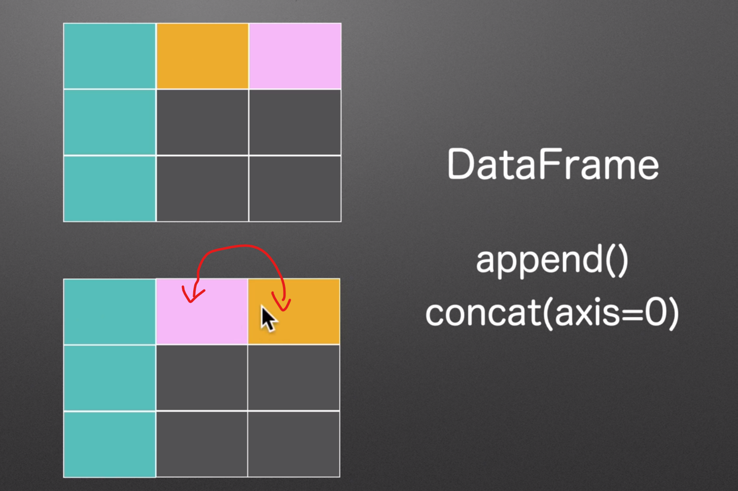
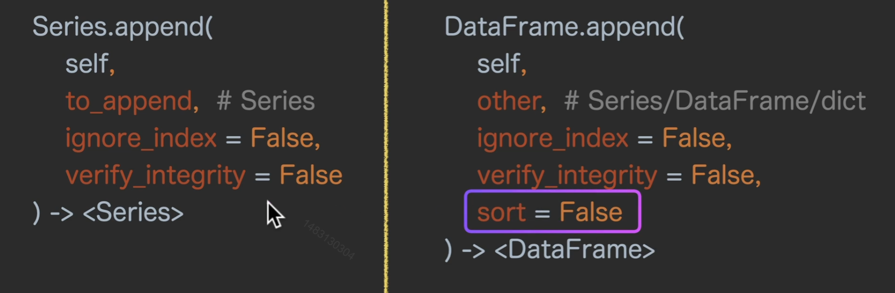
append()上下合并
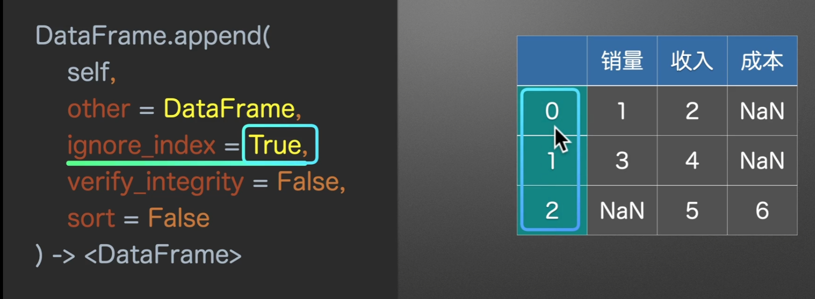
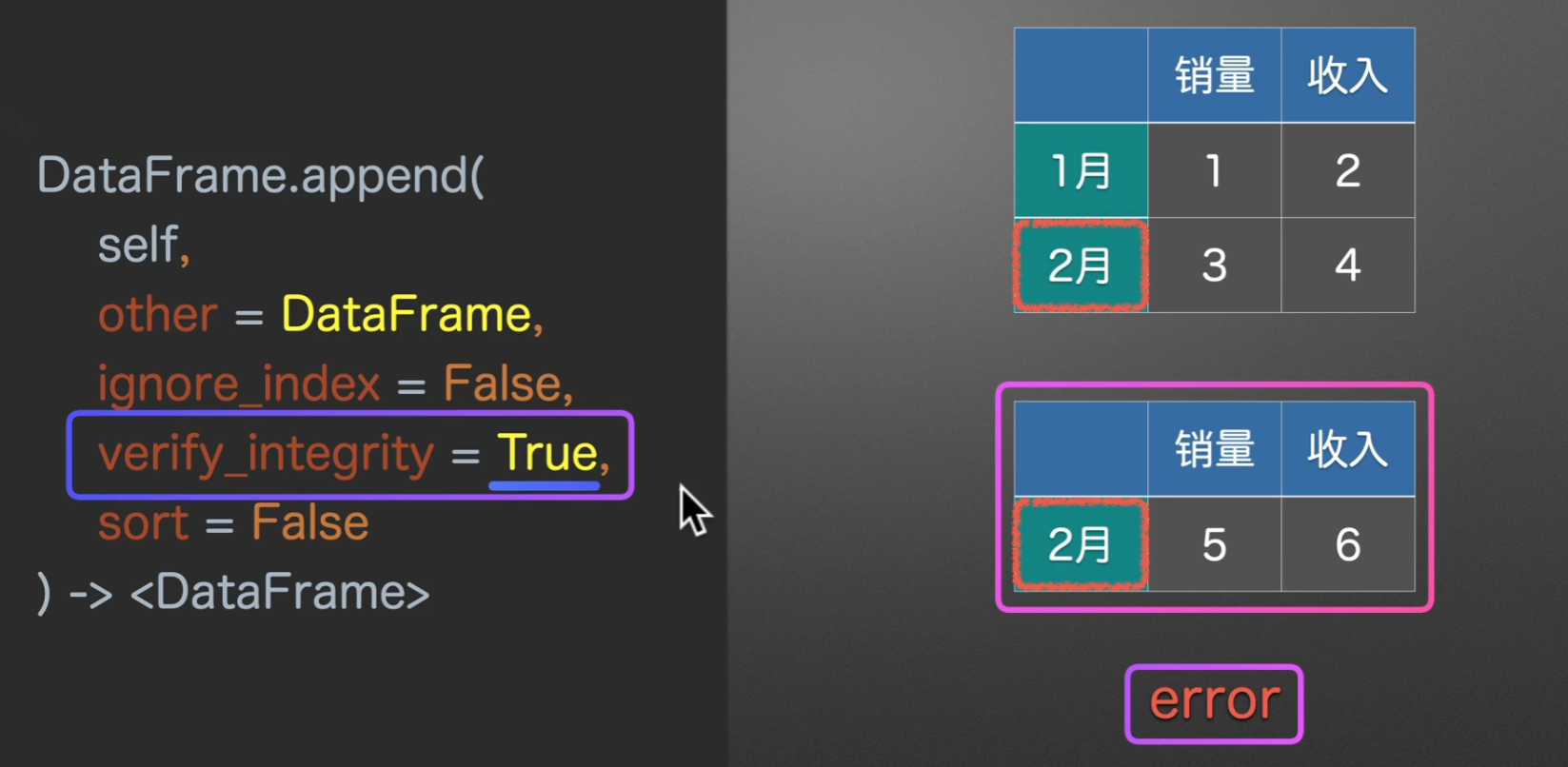
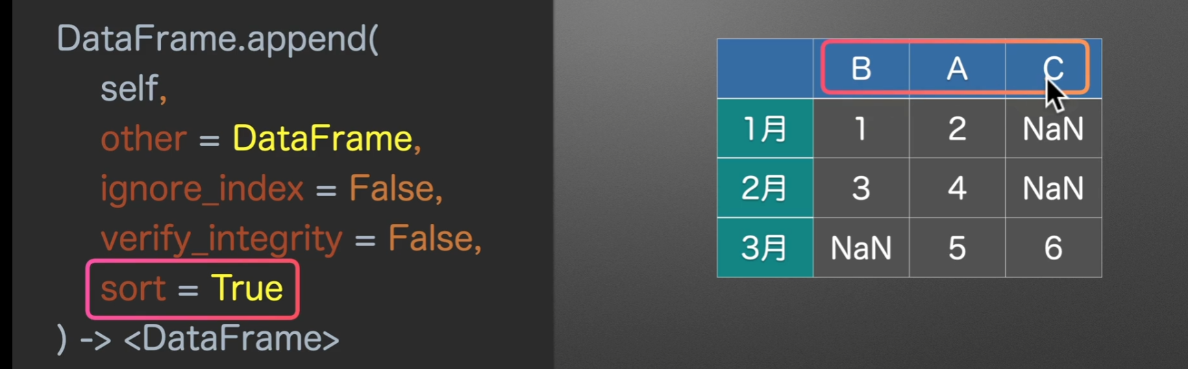
to_append和other名字不一样,但作用都是一样的,指定将要合并的表的类型ignore_index是否忽略索引verify_integrity是否检查有重复的行索引sort对列名进行排序
实例演示
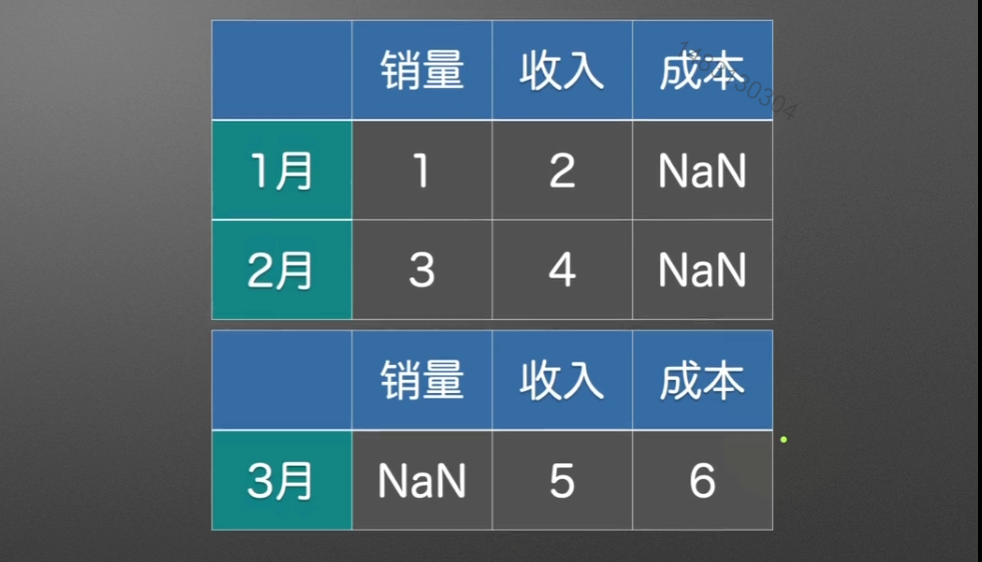
我们关注这种没有对齐的情况,看看它是怎么操作的
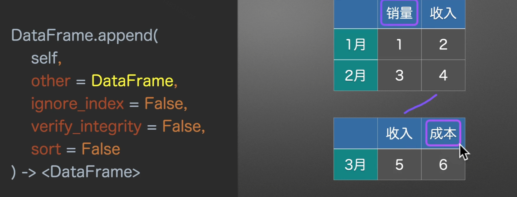
它创造出具有空值的对应列,然后将其append上下拼接
当ignore_index=True时,索引就从1月、2月、3月变成0、1、2
verify_integrity=True,为检查行索引是否有重复,如果重复会报错。如果设置为False,会导致列名重复,多出重复列,默认为False
sort设置为True,自动排序列索引,将这个BAC转换为ABC
合并文件夹的表格
1 | """ |
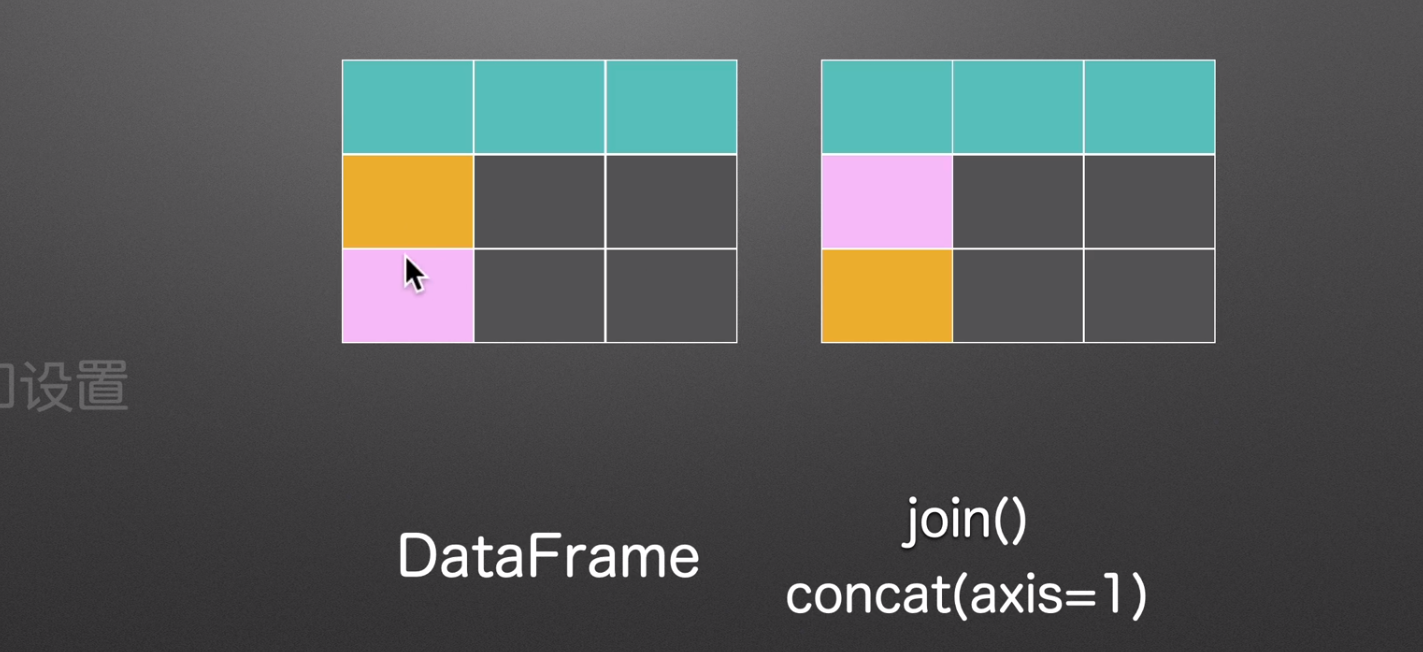
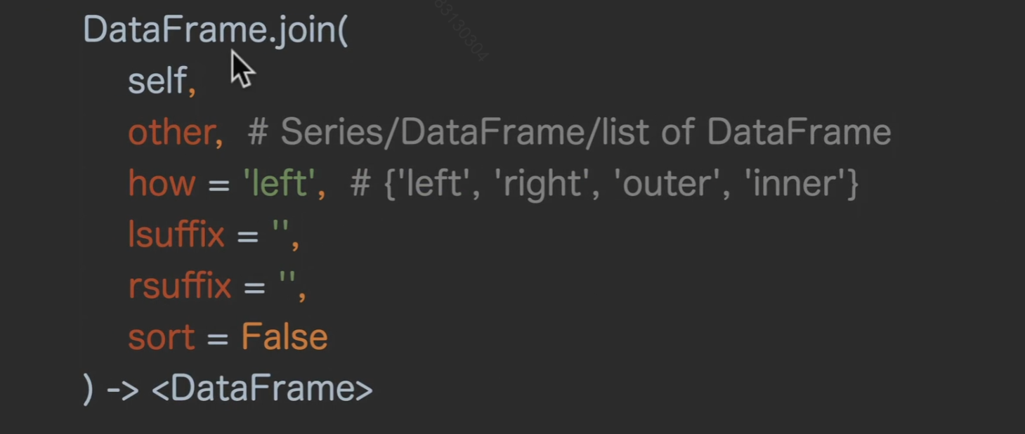
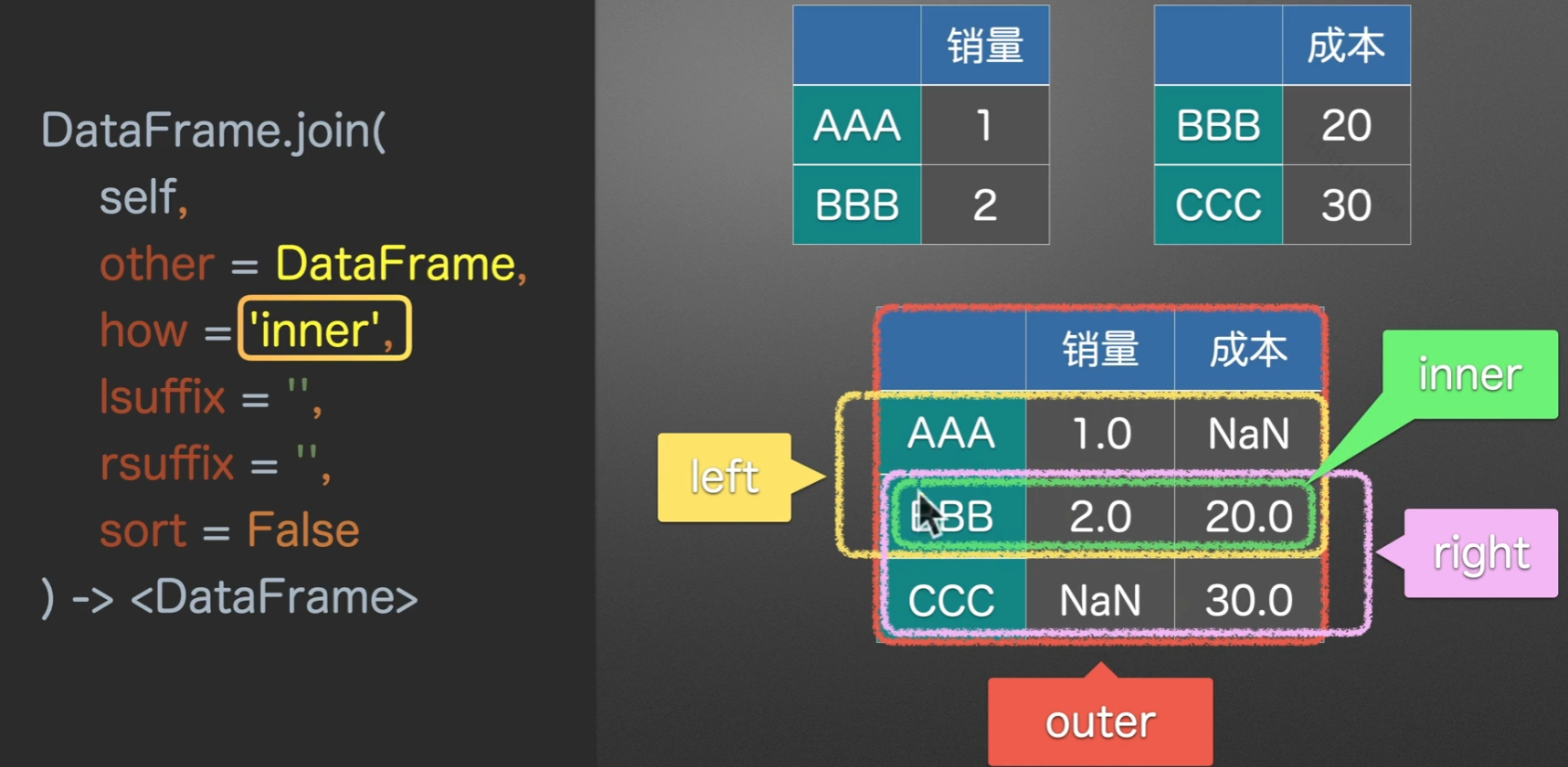
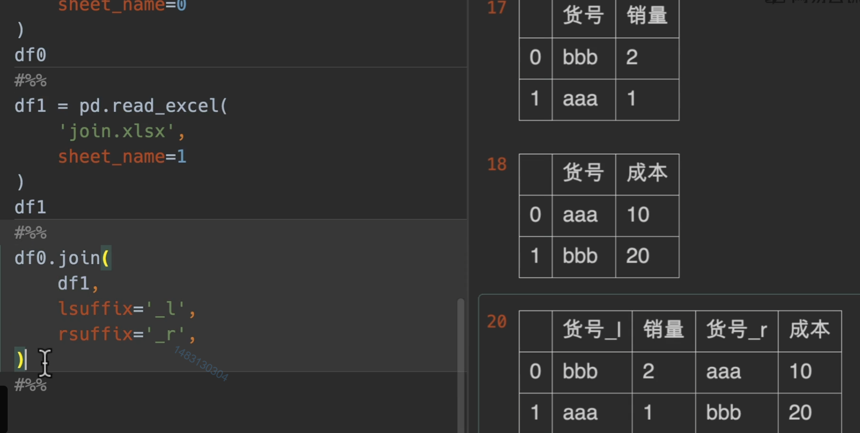
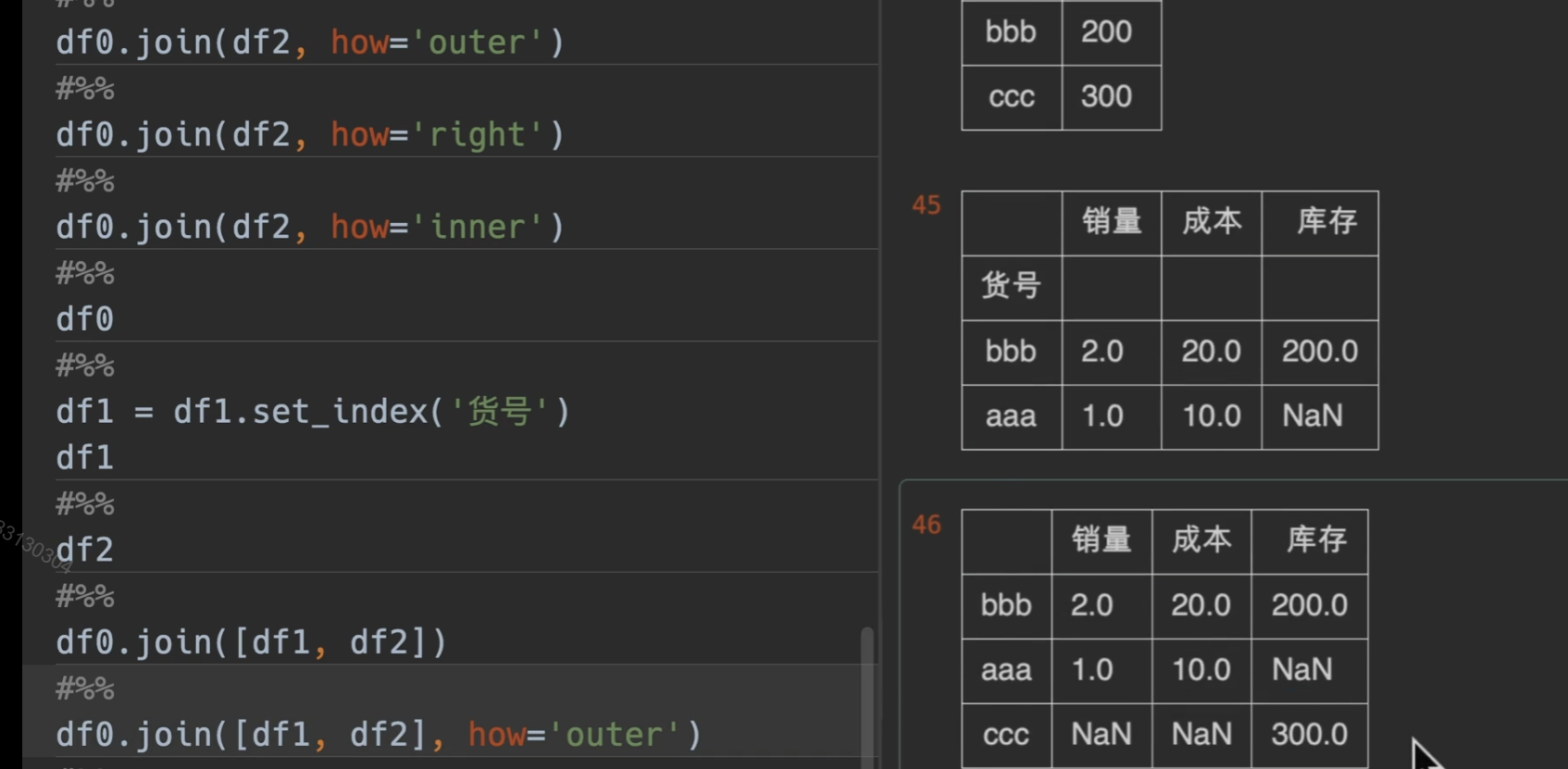
join()左右合并
- 第一个参数
other就是将要与调用join方法的东西合并的东西 - how参数指定合并的方式,默认是
left(依靠左表)right(依靠右表)outer(依靠两个表, 并集)inner(依靠两个表的交集) - lsuffix和rsuffix就是左后缀和右后缀,它们的意思就是,如果合并之后有相同的列名,那么左边\右边的表格就会加上的后缀
- sort是排序,它是对index进行排序,也就是对行进行排序,默认是False
拼接series
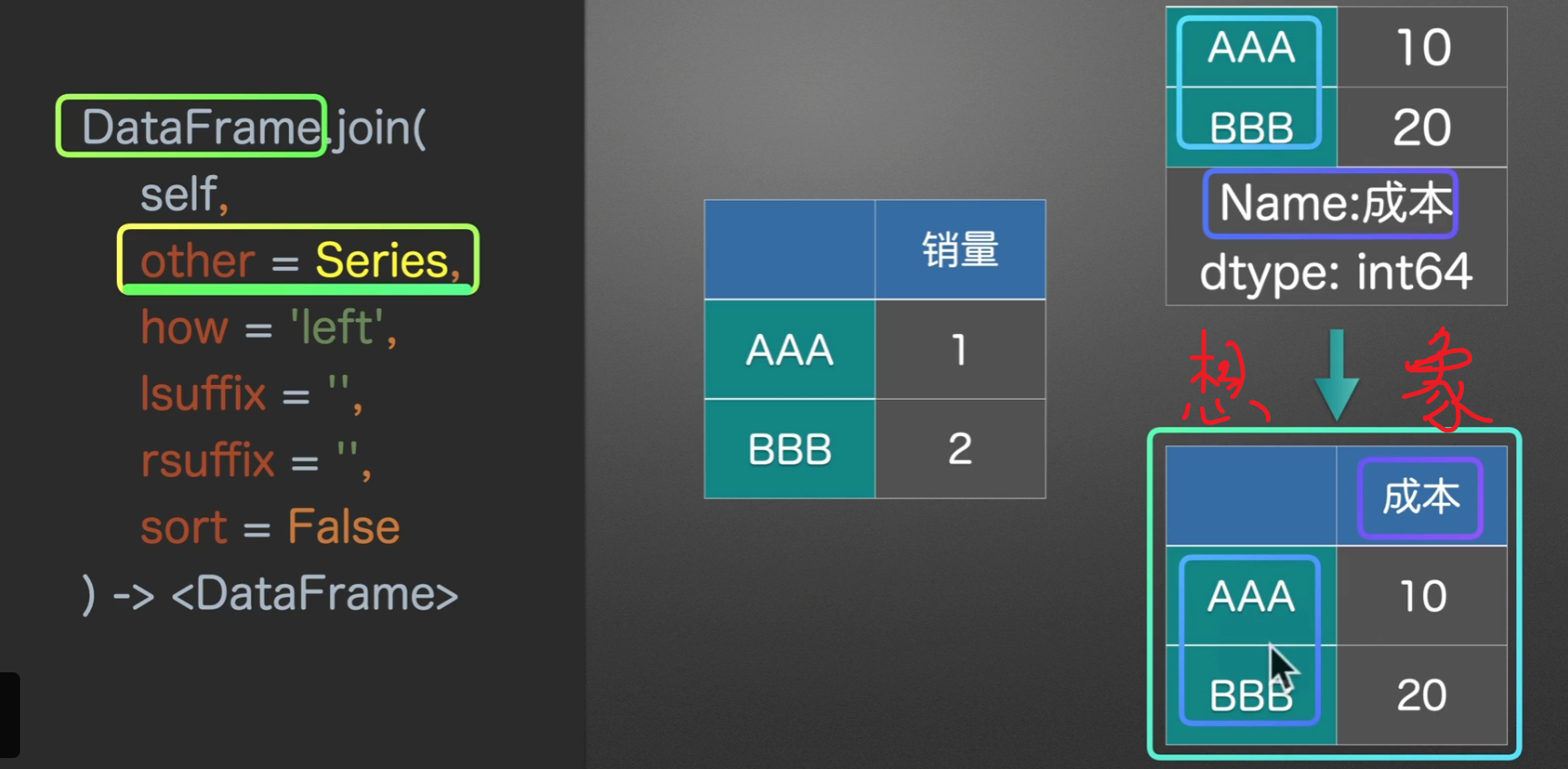
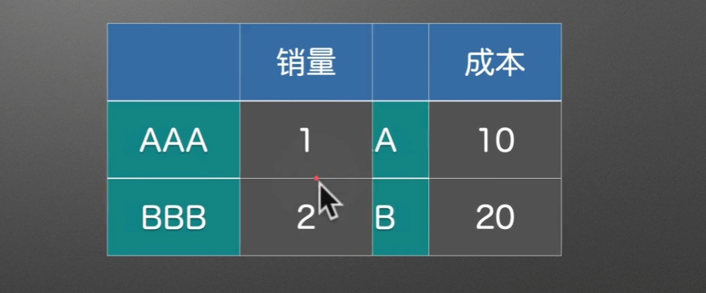
拼接dataframe
how = outer、left、right、inner
实例演示
下面是使用lshffix和rsuffix的实例
join形成列表
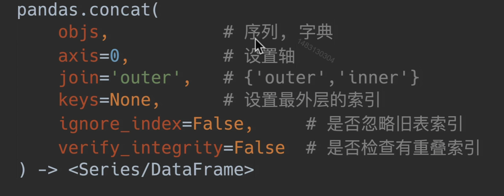
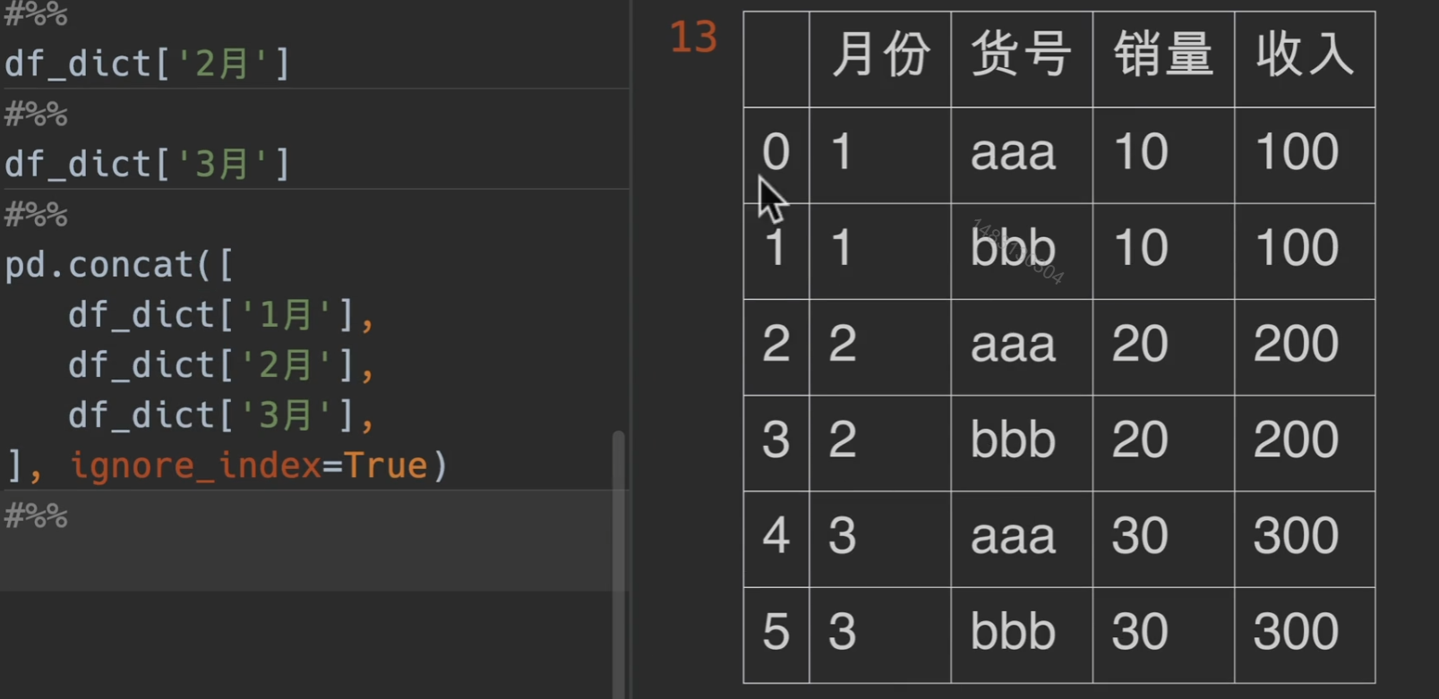
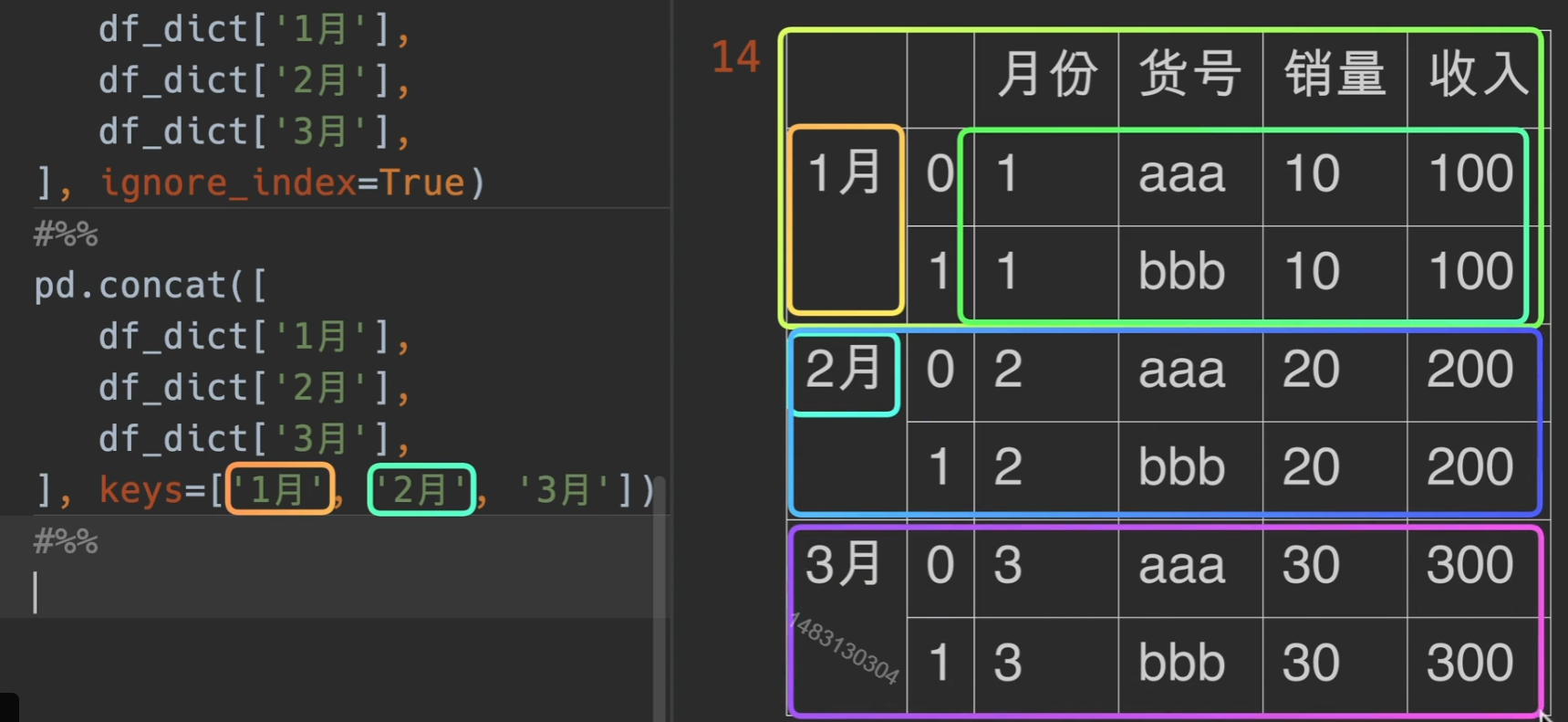
concat()左右/上下合并
- objs:使用对象可以是列表/字典
- axis=0 默认是append,进行上下拼接,1就是左右合并
- join: 只有outer inner
- keys的作用见下面,ignore_index 和 verify_integrity都为之前讲过的
一次性读多表
每一次的储存形式就是列表
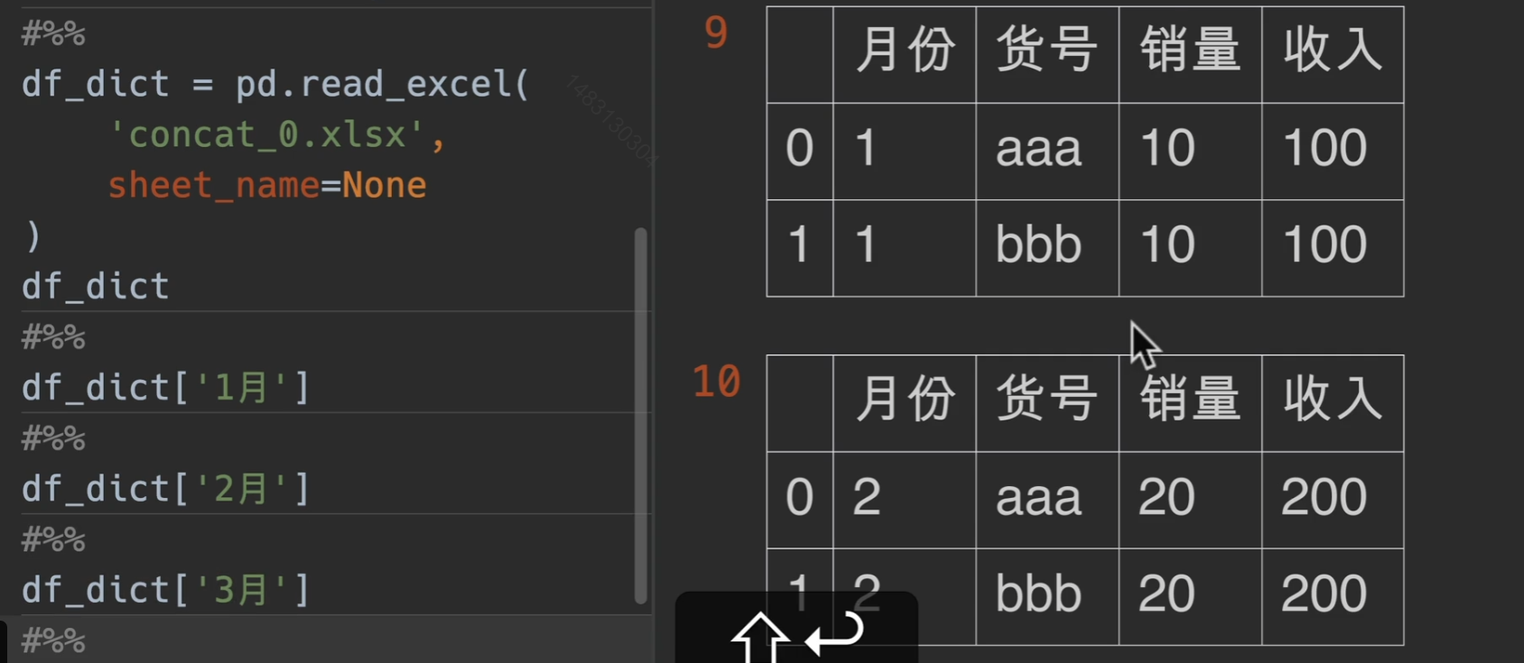
keys的作用
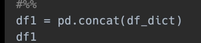
当然,如果直接传入字典的话效果与上面这种一样,了解即可
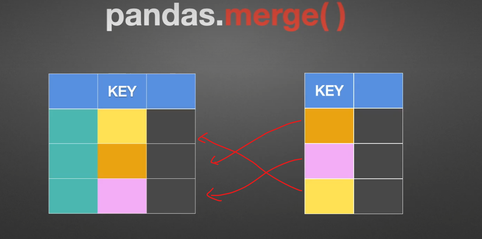
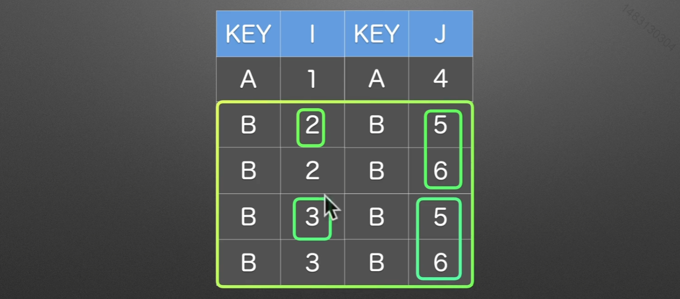
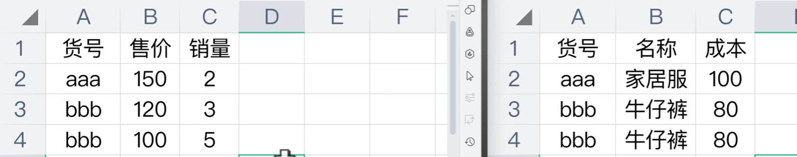
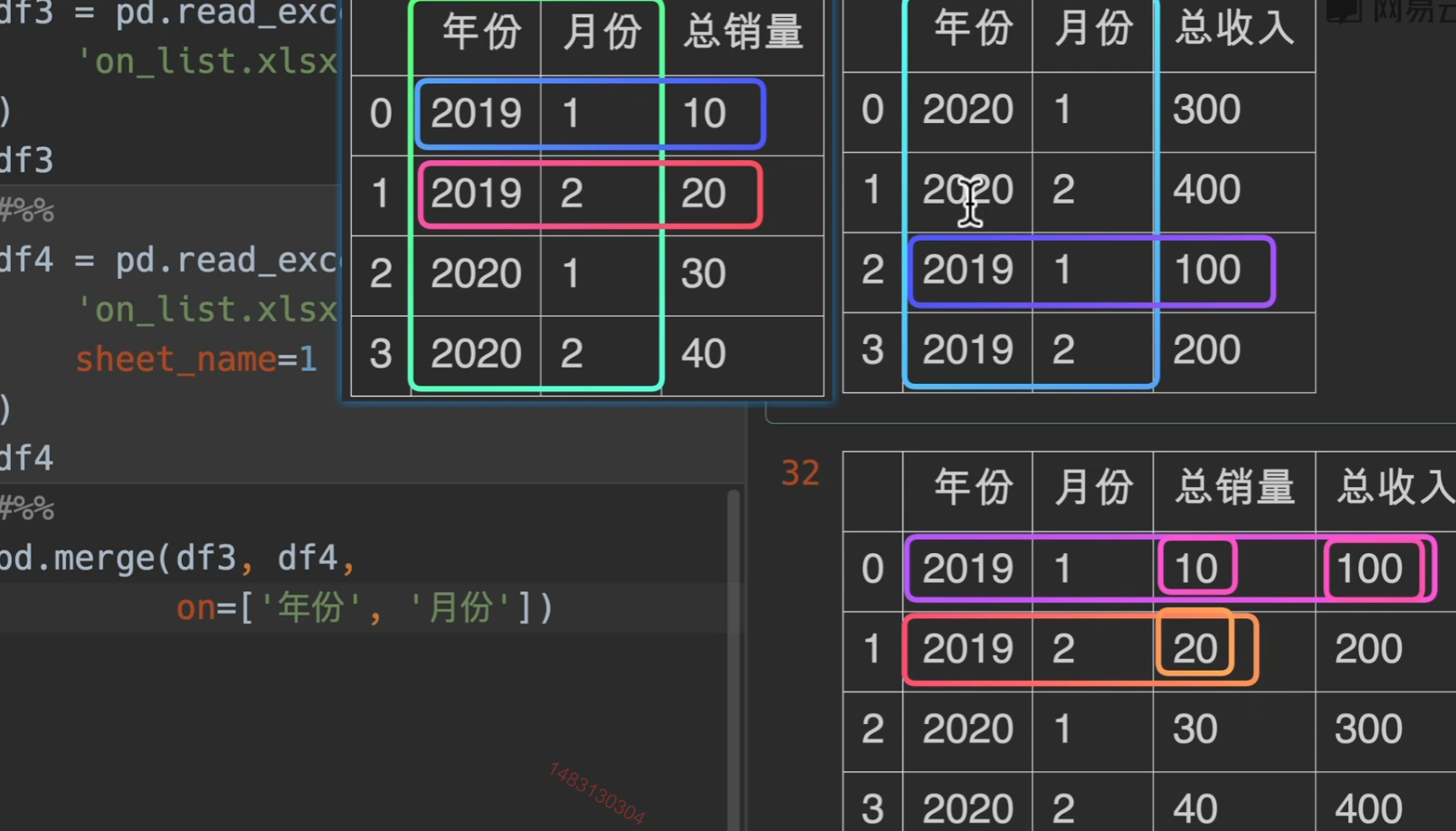
merge()联合
先来看一个简单的实例: 在工作中,可能时常会遇到,将两个表合并在一起,通过一定的索引什么的,这个时候就要用到merge()
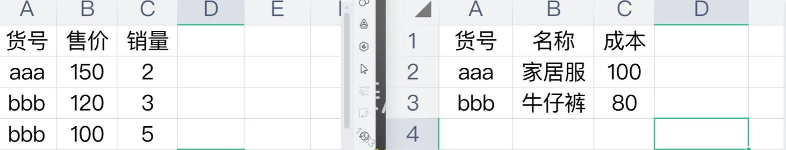
例如我们期望的样子就是下面这样
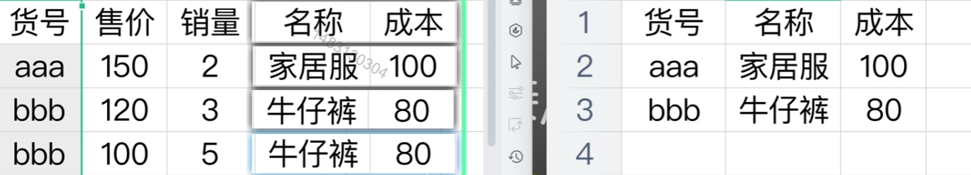
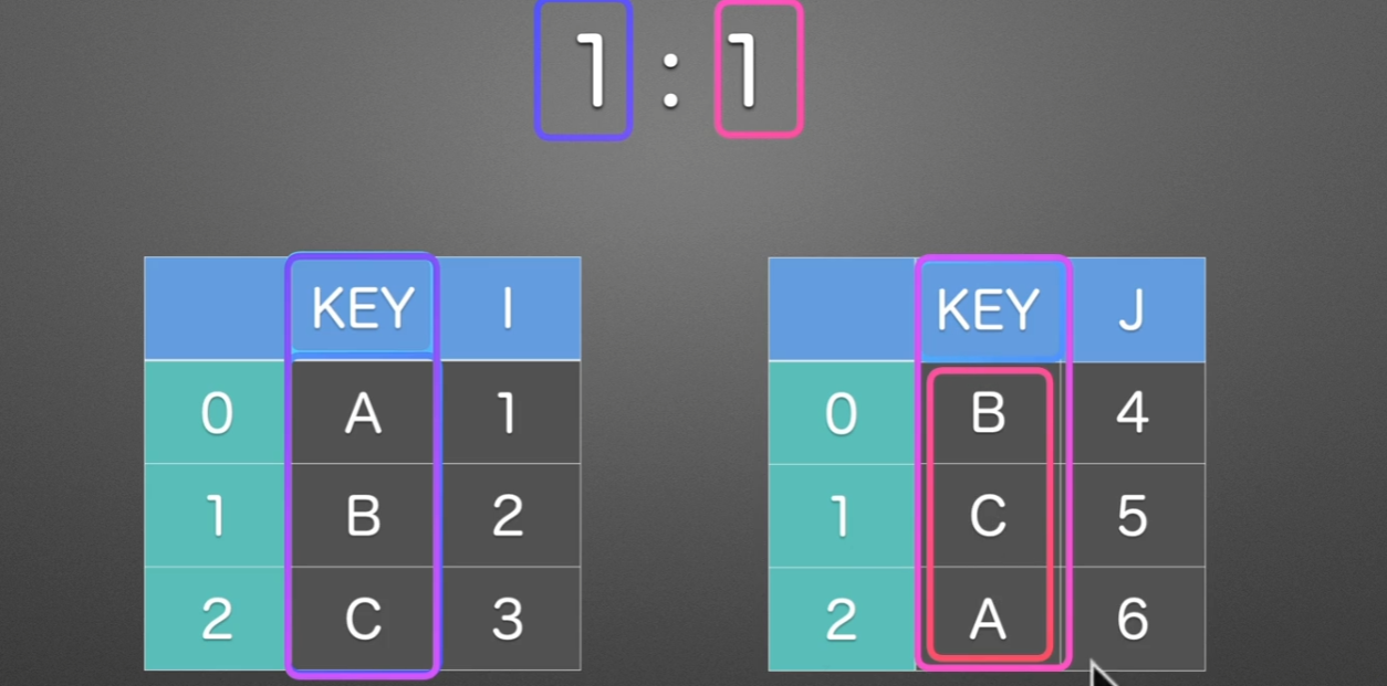
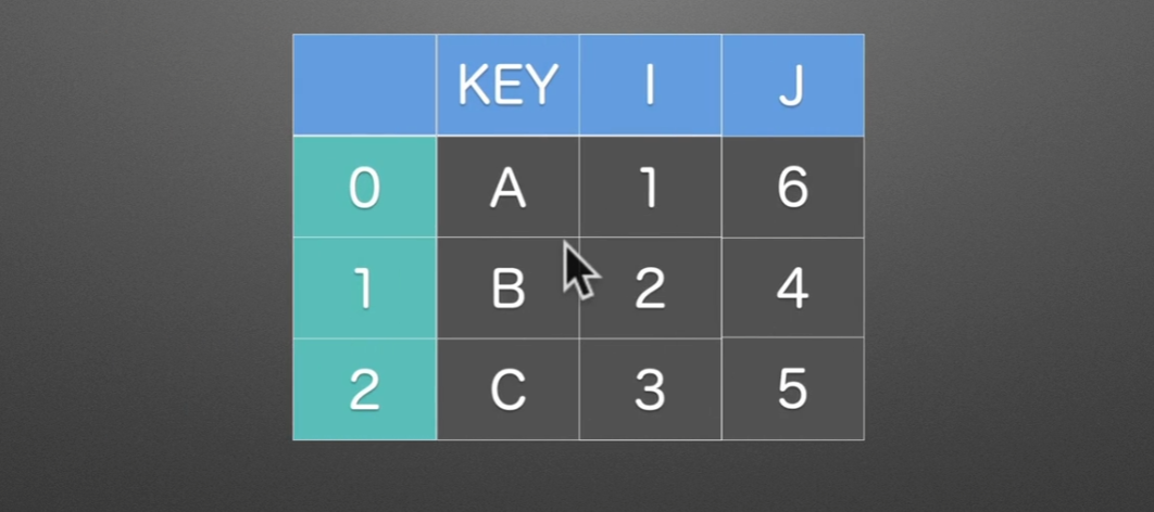
1:1
就这种情况的话,用join(),append(),concat都可以很好得满足任务
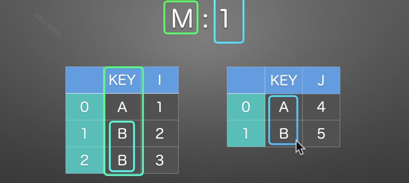
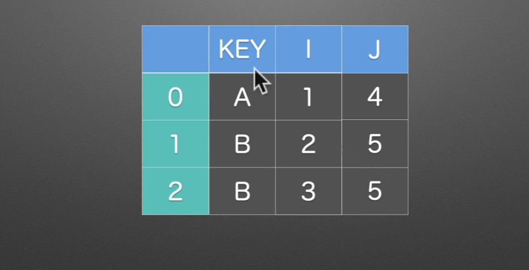
M:1
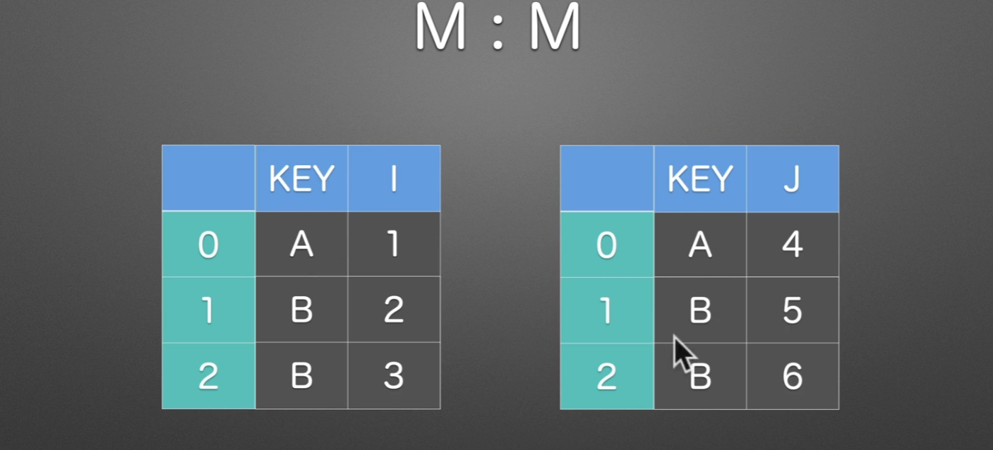
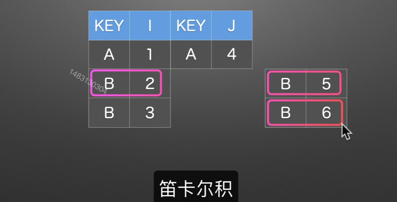
M:M
同样也是根据KEY这一列来进行合并,拼接的时候是使用笛卡尔积的方式,也就是说,全排列。
merge的on就是选择哪一列作为索引,别的join,append()都有这个参数,如果两个表格中,索引的名字不一样,那么可以这样,设置left_on、right_on,不过一般excel都可以移动位置,或者你直接去改一下名字就行了,没必要这么麻烦,就算合并起来了还不是要删除一列。
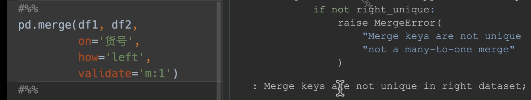
1 | pd.merge(df1, df2, |
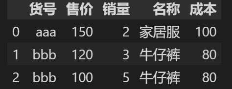
可能会遇到的问题
在电商平台我们可能会出现一个问题,右边的基础信息表,我们不小心出复制了一个牛仔裤,这样的话,如果merge,会导致销量这个本只应该是10的数字变成18
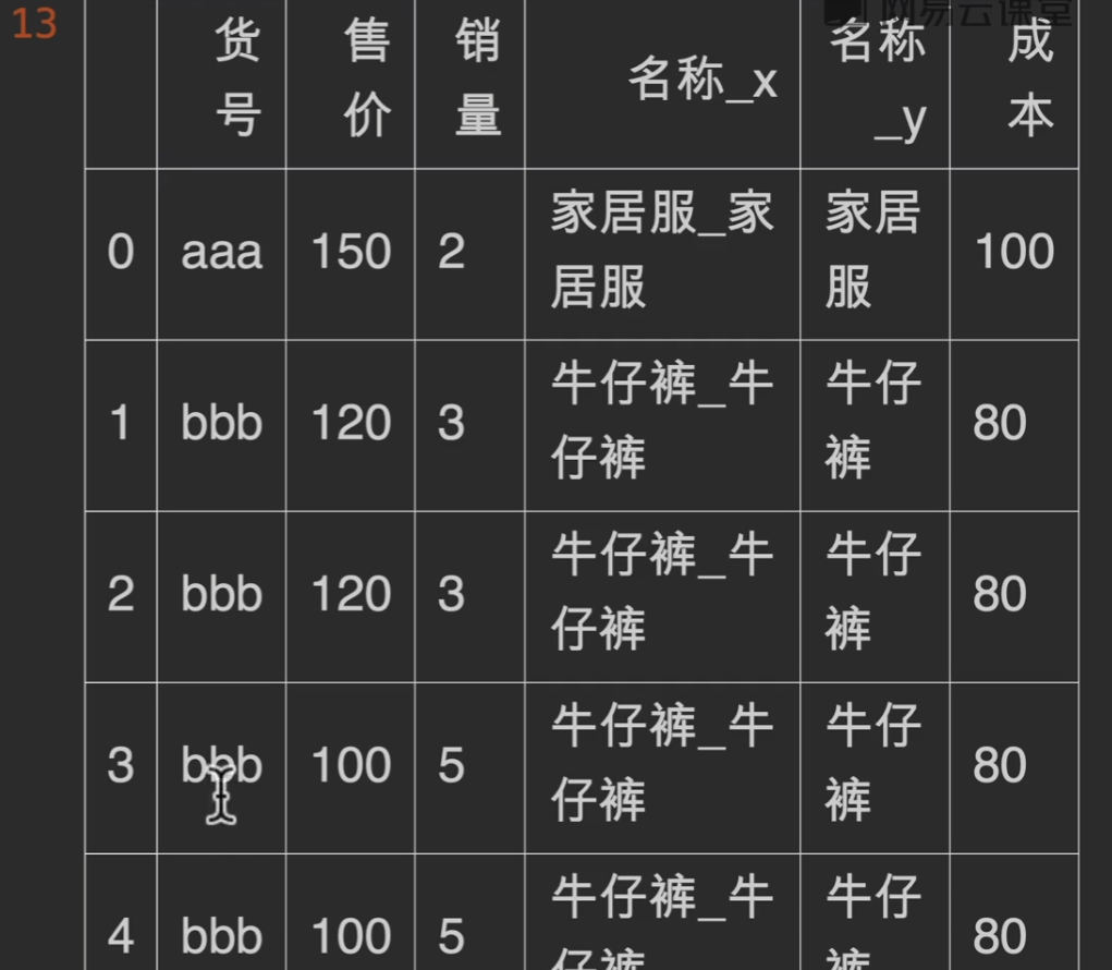
validate
在我们指定模式为多对一的形式,如果右边的索引出现不唯一的情况,就会报错,从而解决掉隐患
使用列表共同匹配
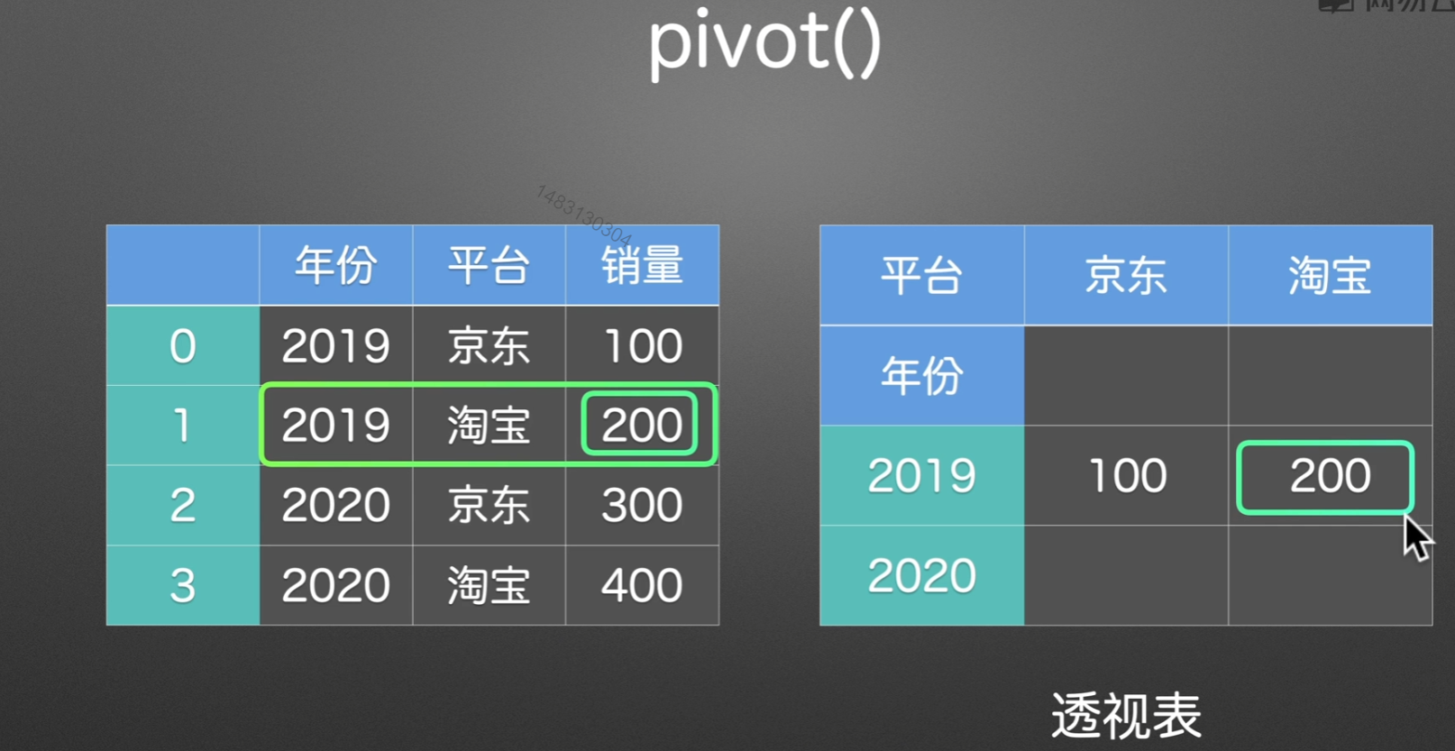
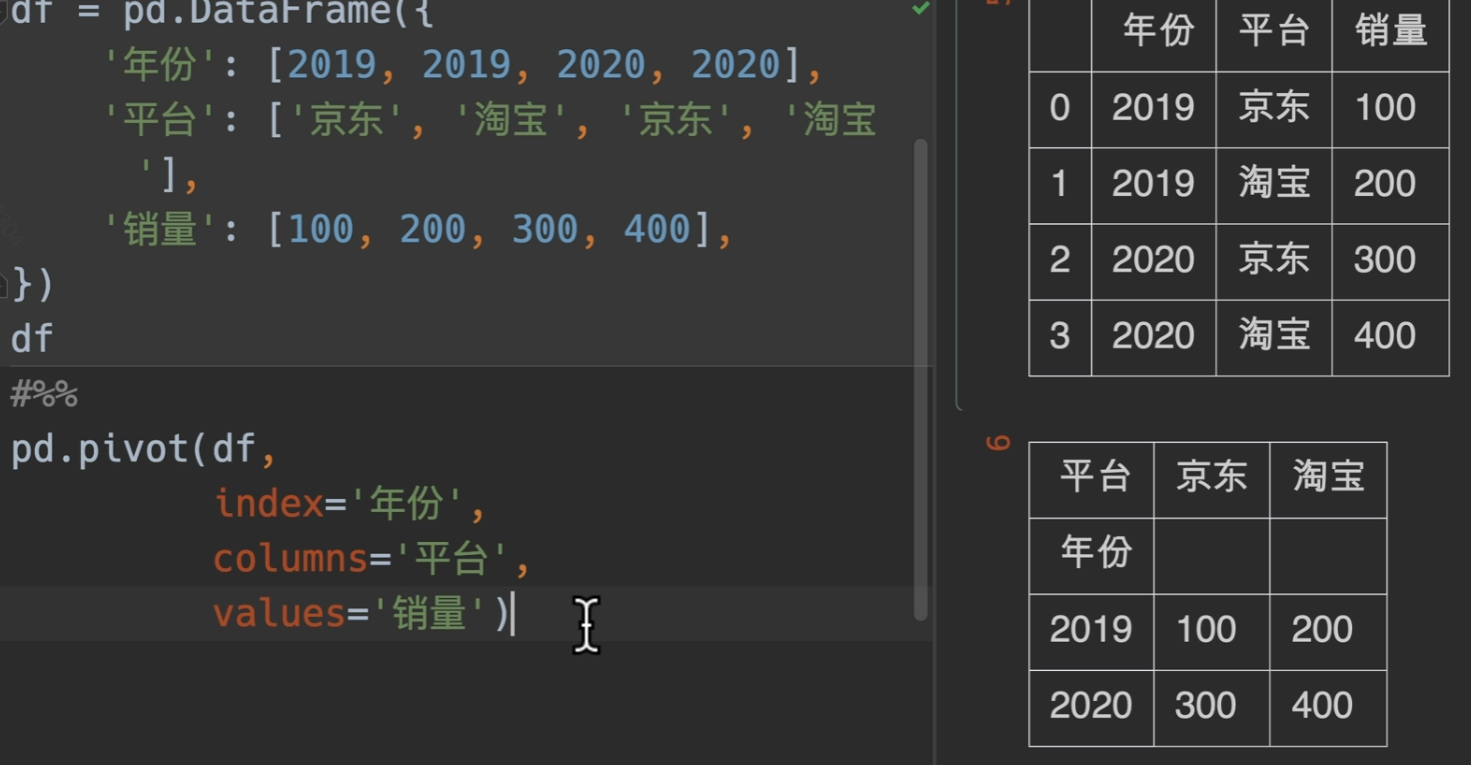
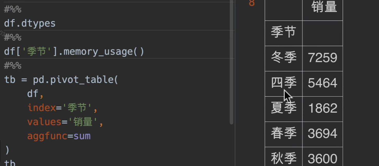
透视表
pivot()
pivot()呈现效果:
但是如果当出现重复数据。。。。pivot()表示无能为力,pivot_table()出场
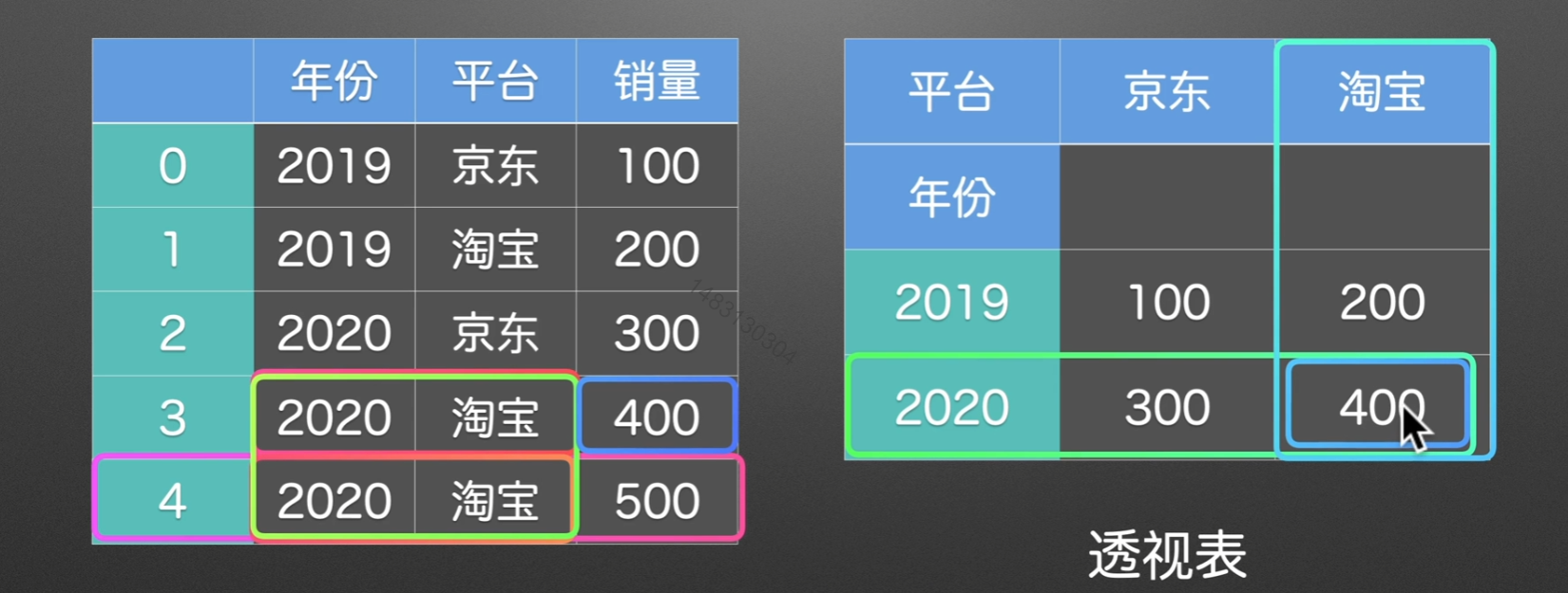
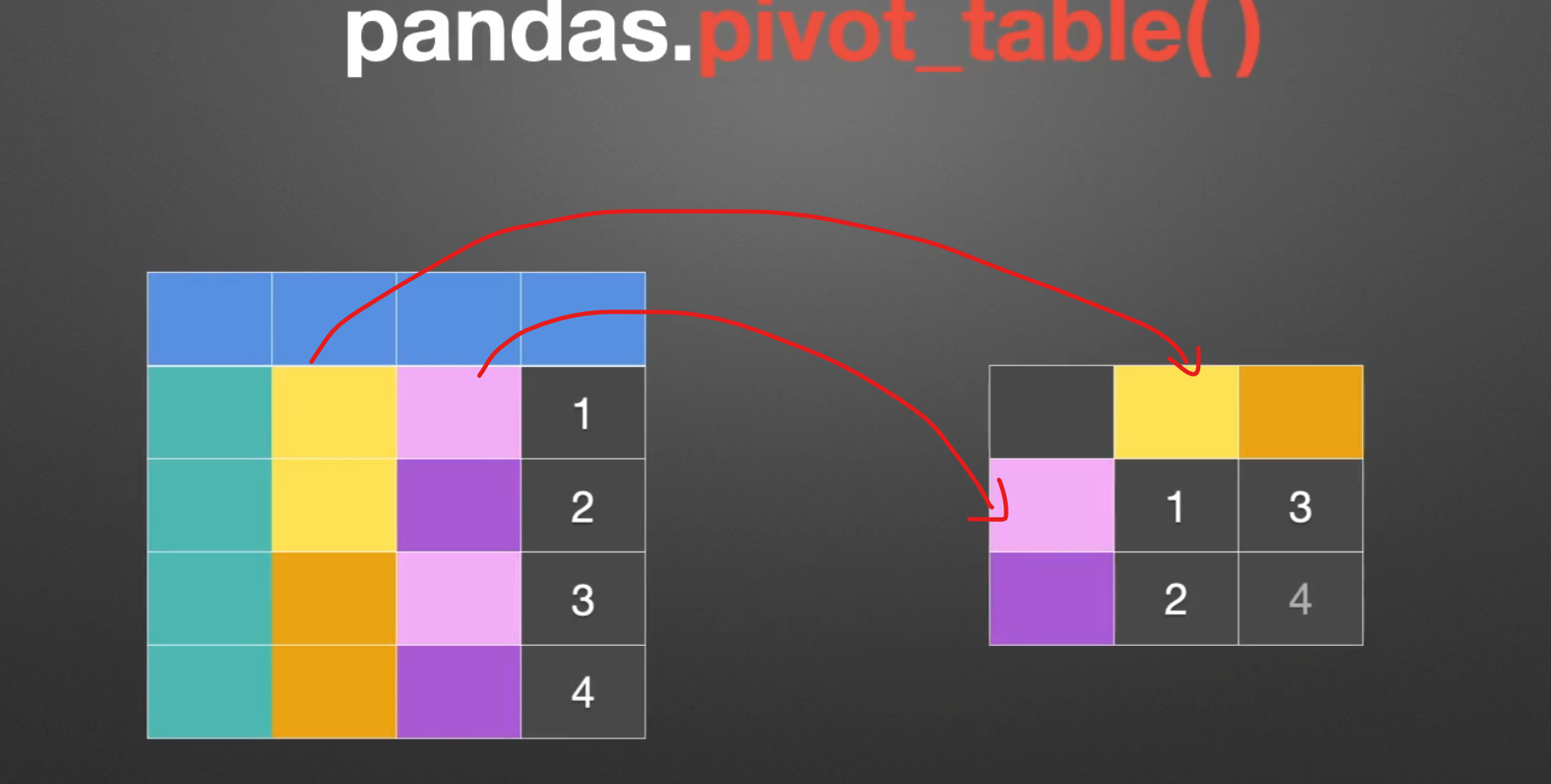
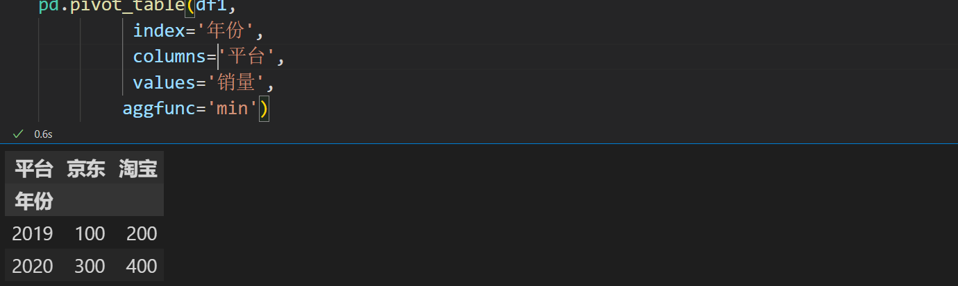
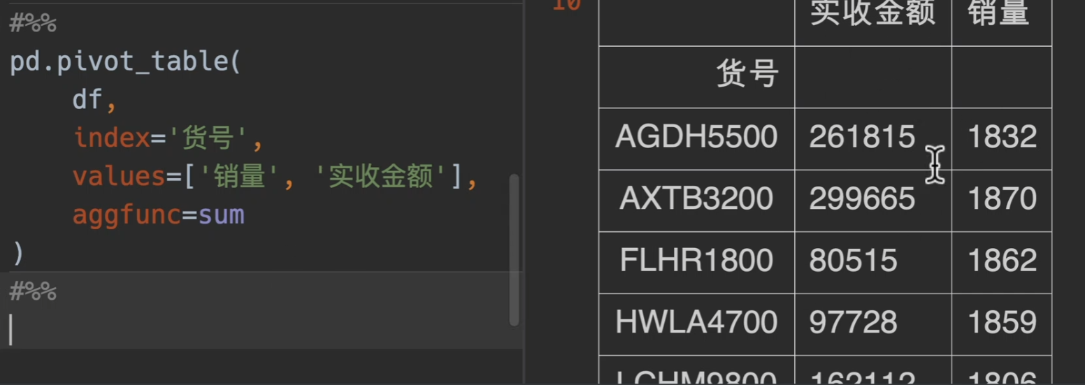
pivot_table()
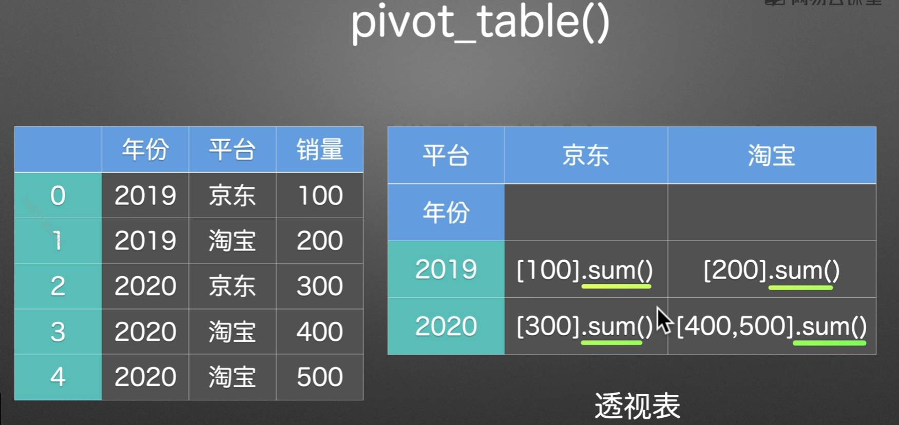
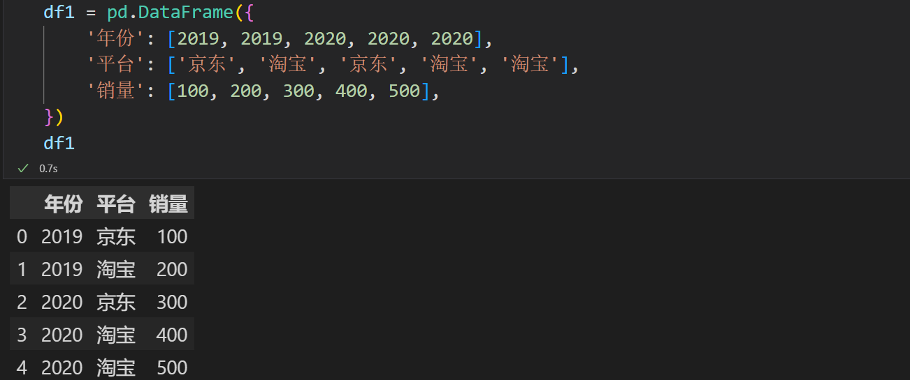
实例演示
如果不传入columns,那么就用values来当做列索引
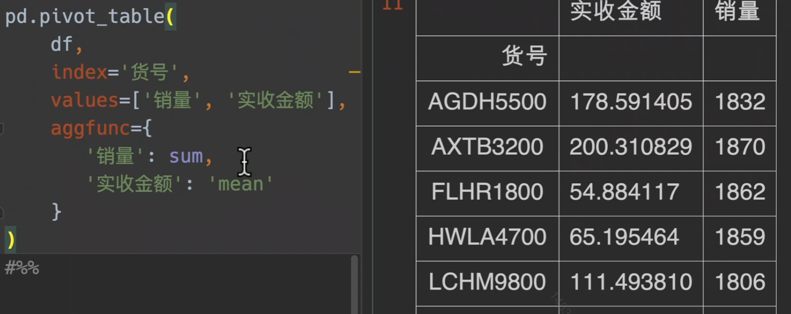
另外,对不同的value做不同的处理,用字典来传入方法
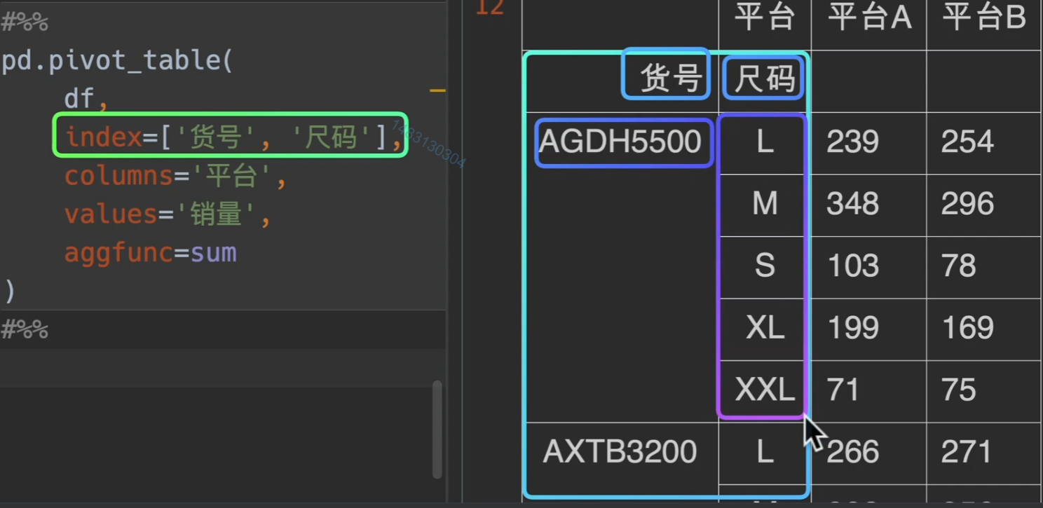
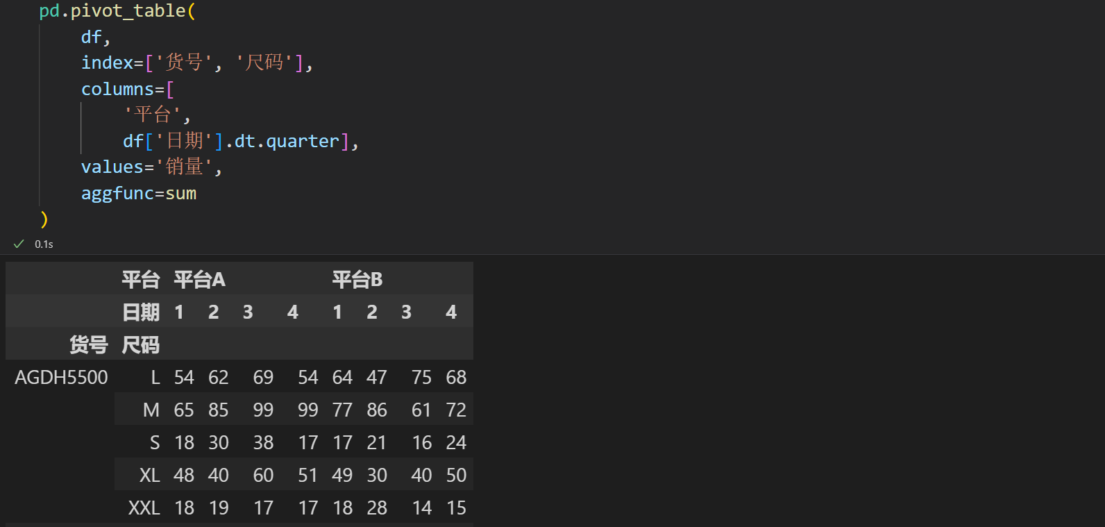
这次我们加上columns
甚至列名还可以调用时间的迭代器,这里采用了季度来统计
聚合函数
1 | """ |
从某种意义上来讲,pivot_table()能满足你的所有需求
排序

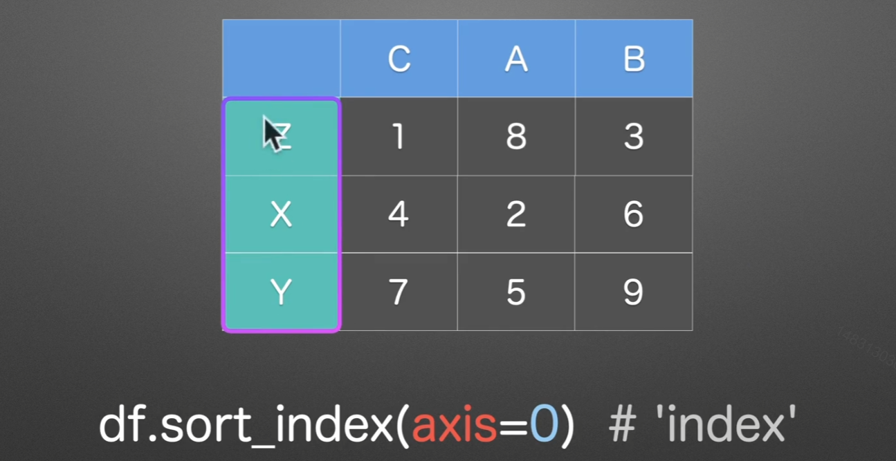
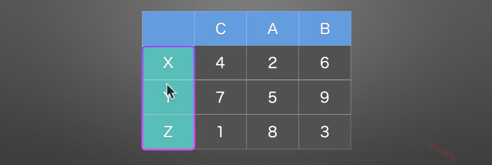
sort_index()
axis=0时,他根据索引大小进行排序,如果是axis=1,就是根据列名进行排序
ascending
ascending参数默认为True,就是升序的意思,我们设置为False,就是降序输出

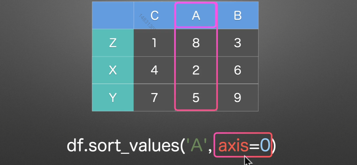
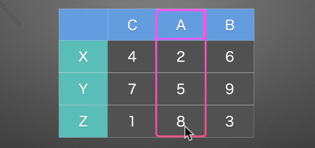
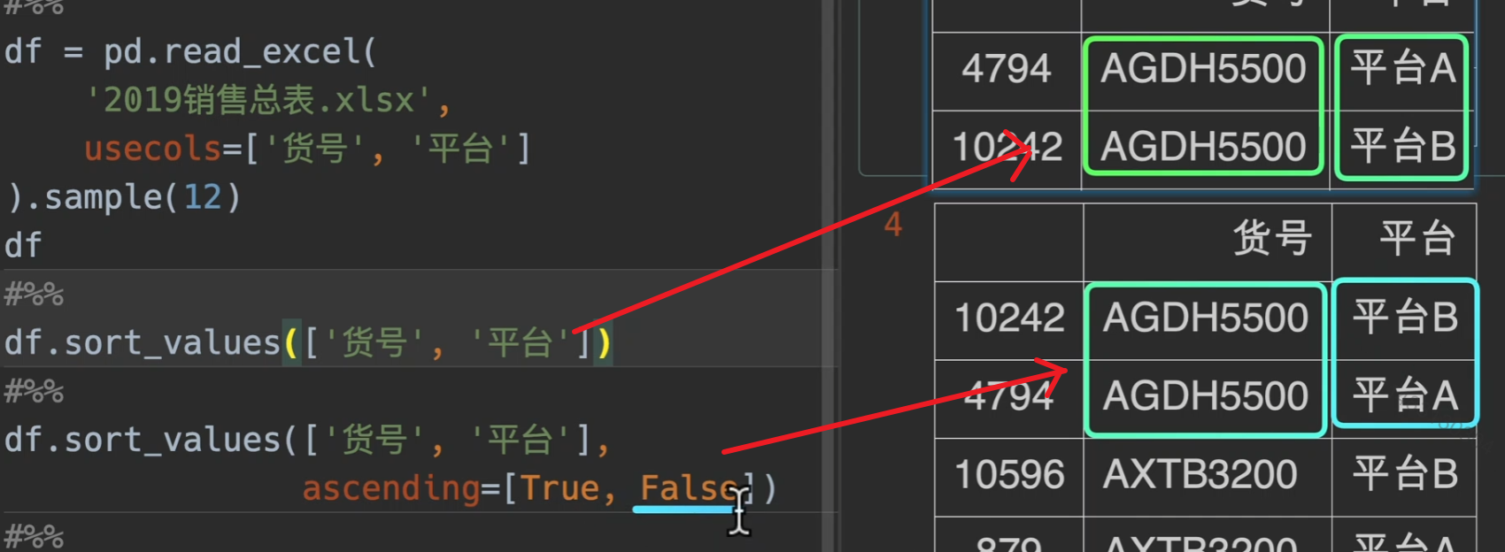
soft_values()
axis=0时,对A列的所有行进行排序
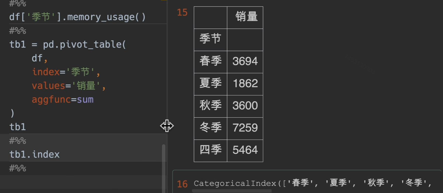
CateGoricalDtype()

实例
我们做一个透视表操作,这是代码的默认排序
现在我们用CategoricalDtype()来设置我们自己的顺序
ordered参数就是是否已经排好序,这里选择True
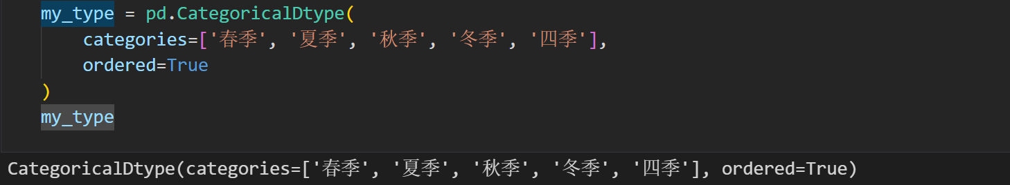
用astype指定为自己的类型
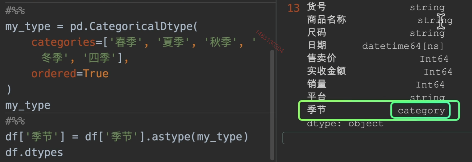
设置完类型之后再次使用透视表,即可得到想要的结果
排序拓展
分组
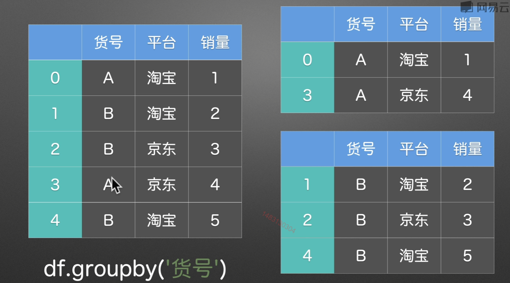
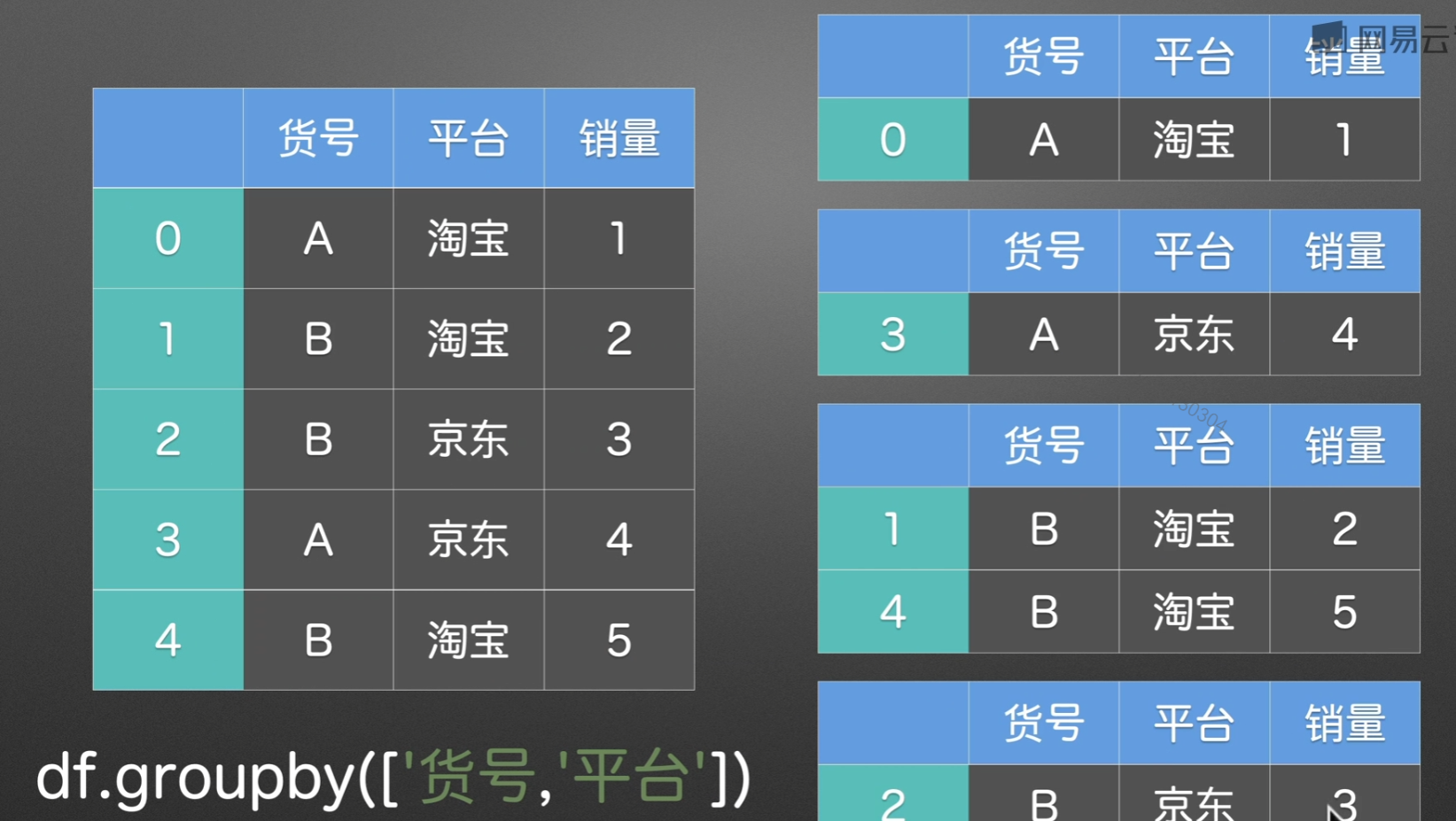
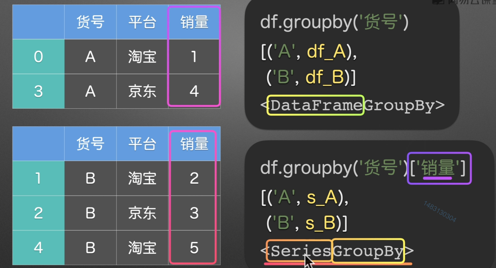
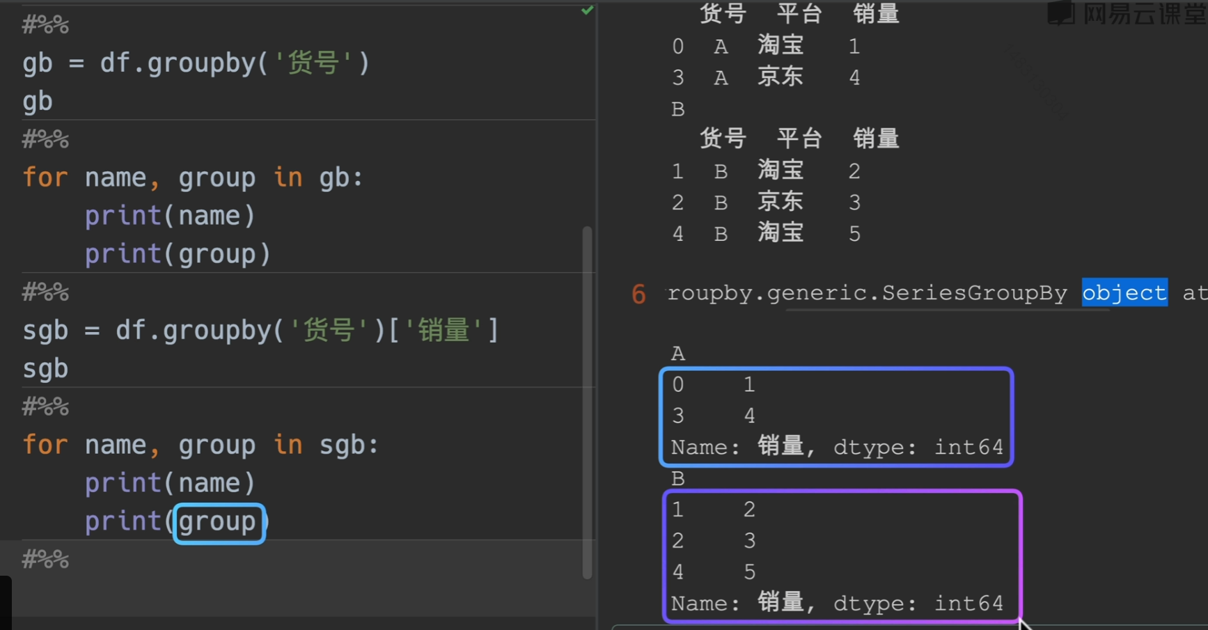
groupby()分组
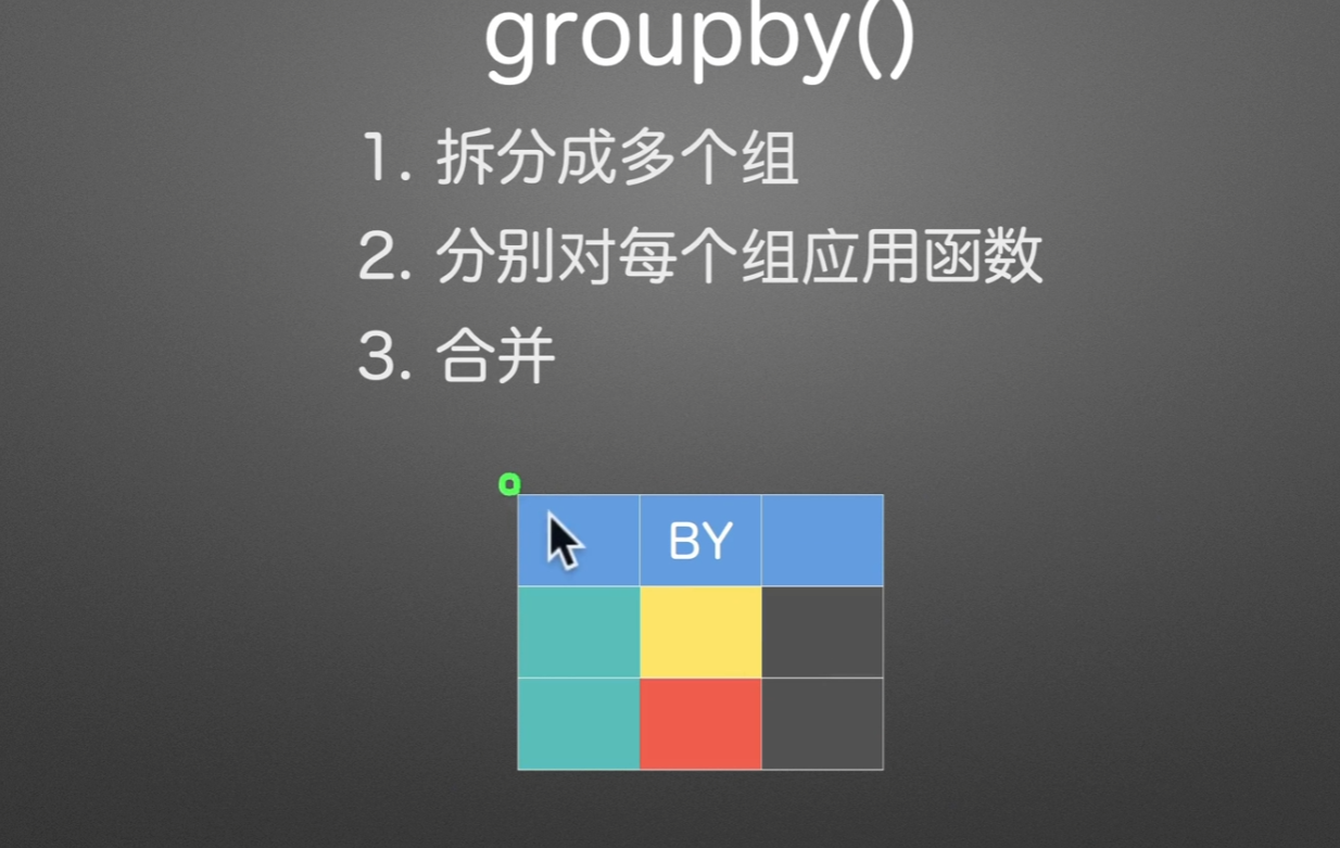
拆分多个组
PPT演示
代码验证
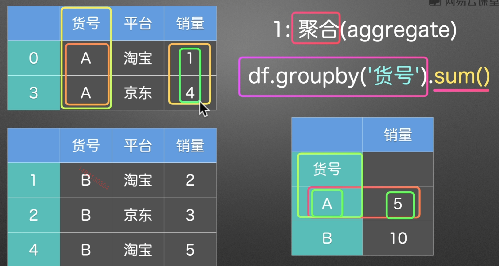
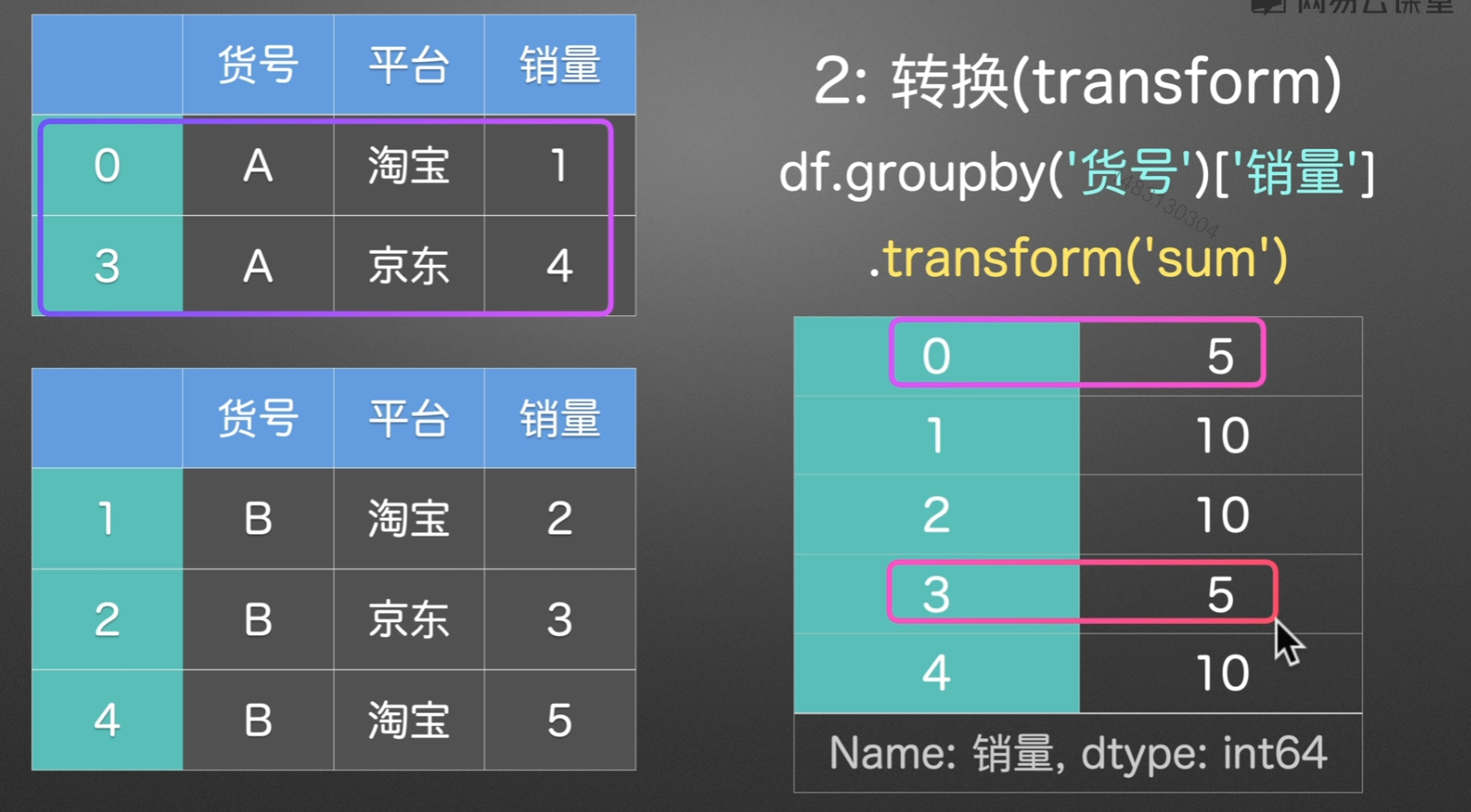
分组后操作
分组后一般进行的三种操作
聚合
直接压扁,总之返回一个新的dataframe
转换
他的索引跟原来的dataframe索引是一致的,也就是说我们总是新增一列来接受转换后的结果,
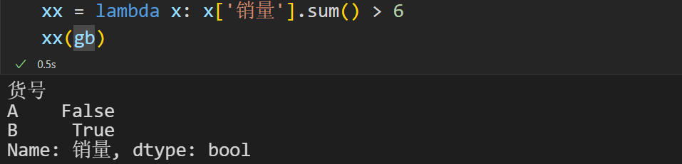
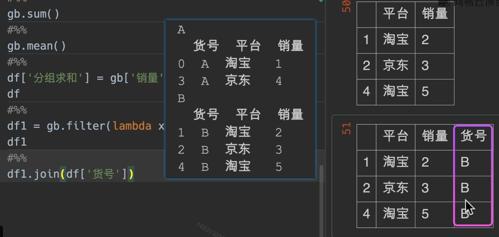
过滤
有几个注意点:
第一:使用之后分组的货号会被抹去,但找回来也很简单,直接根据索引即可
第二:filter筛选我们所需要的东西,这里是用的销量之和大于6的返回
第三:过滤就相当于删除某些行
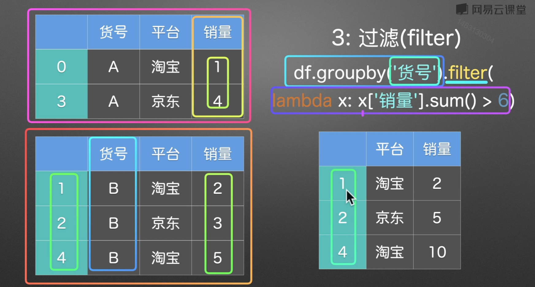
重新加回货号
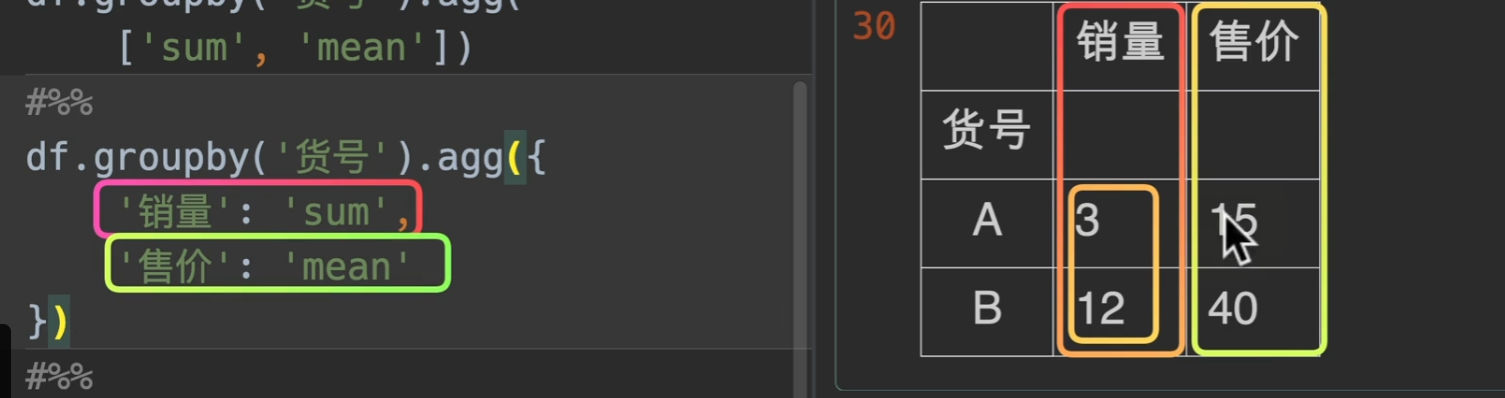
聚合函数
groupby().agg() agg就是聚合的意思。
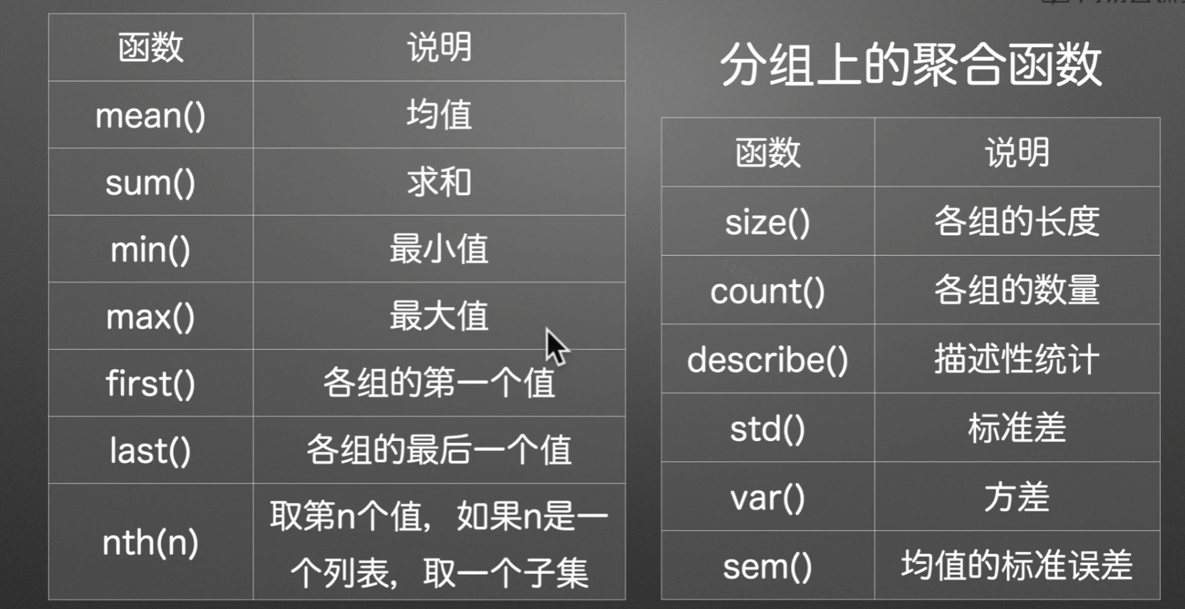
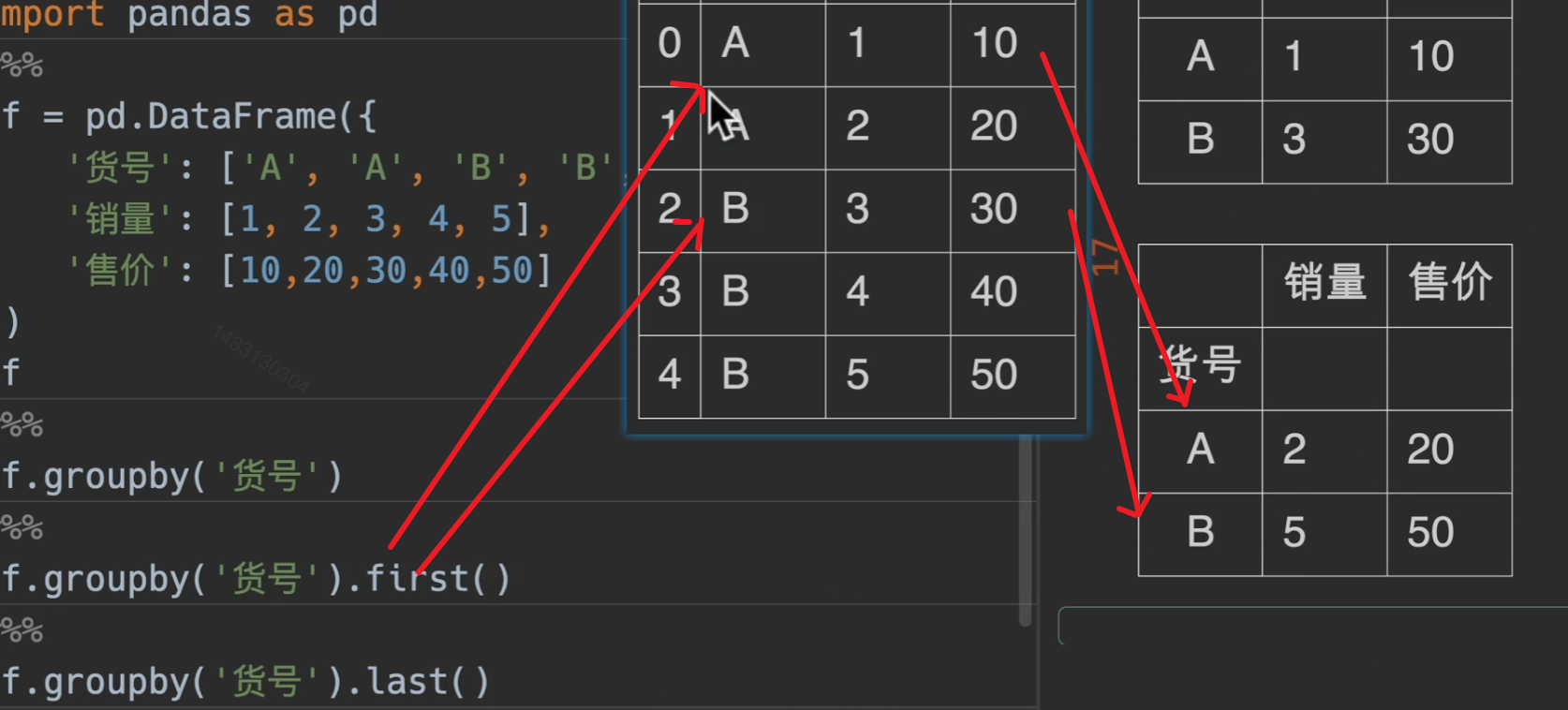
first()
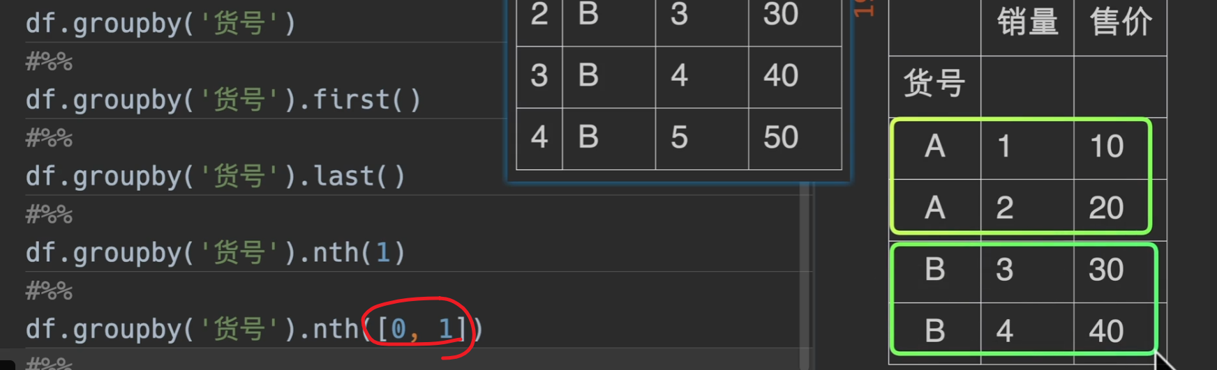
nth()
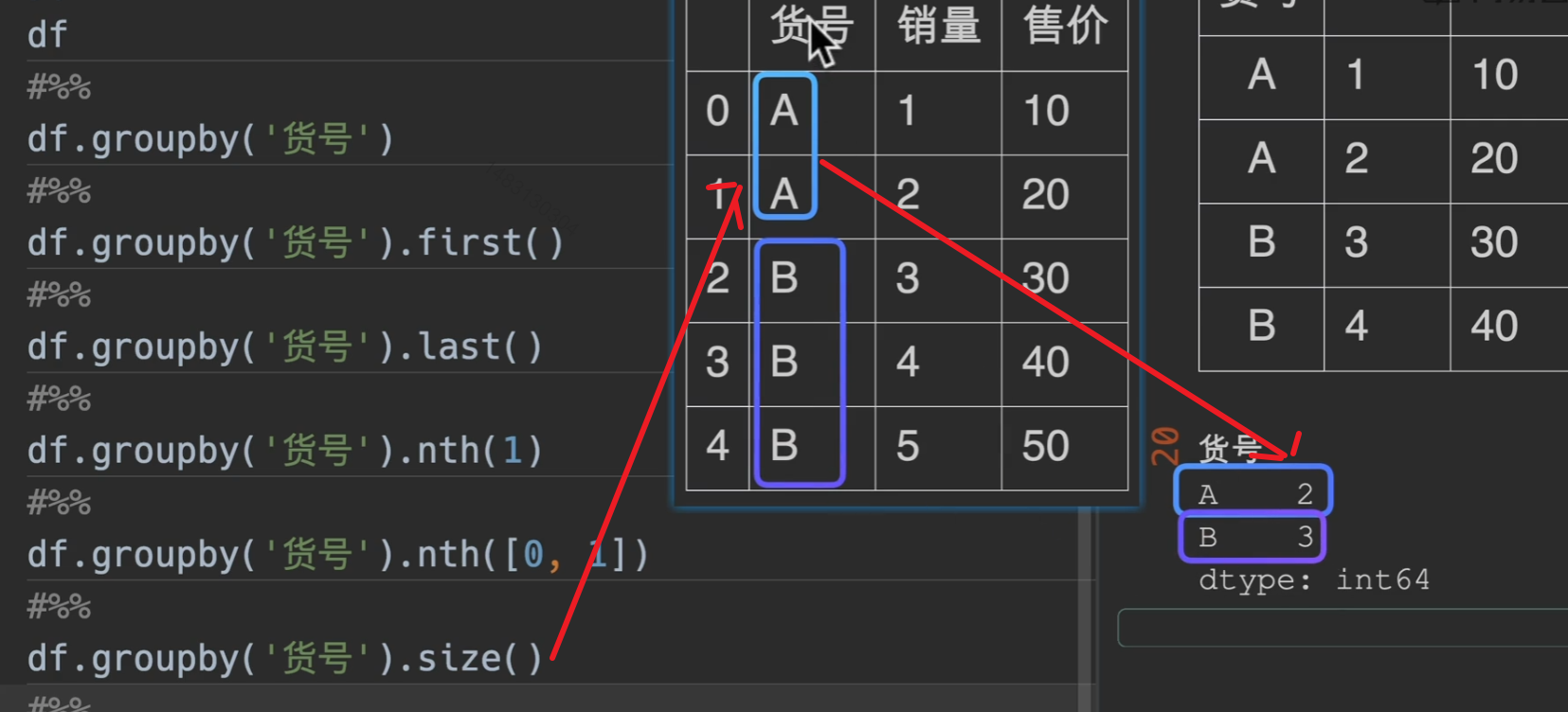
size()
返回一个series
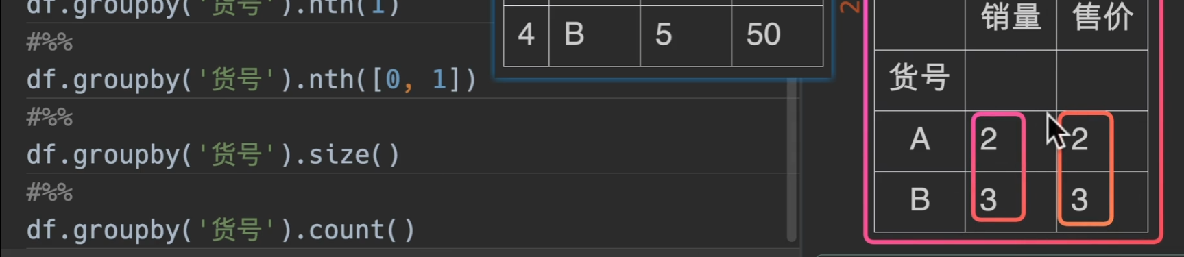
count()
返回一个dataframe,且所有的列都是货号的个数.
字典传入
同样可以配合字典处理
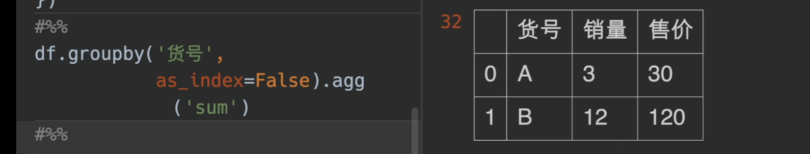
分组条件是否做索引
as_index 字面意思。
分组后自定义处理
理论上可以构建函数处理各种参数
1 | def fun(df, s): |
1 | name age |
窗口
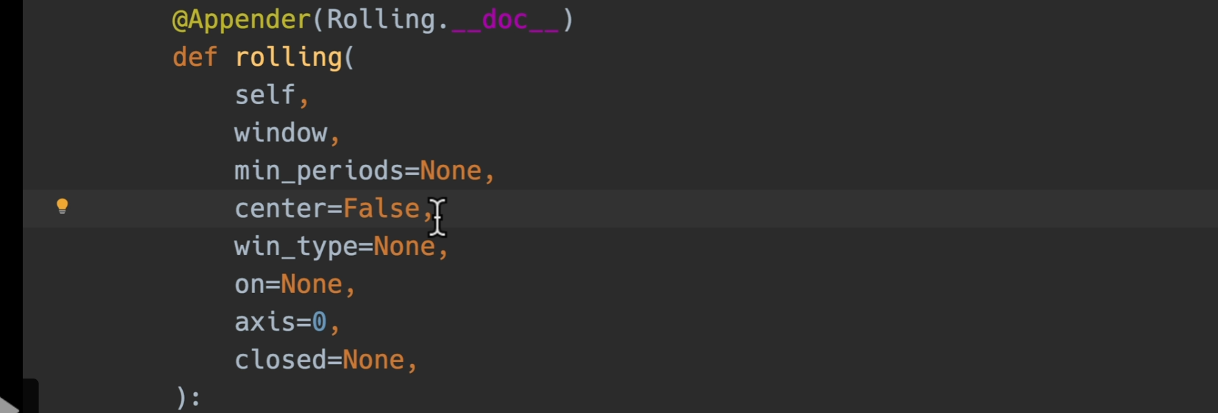
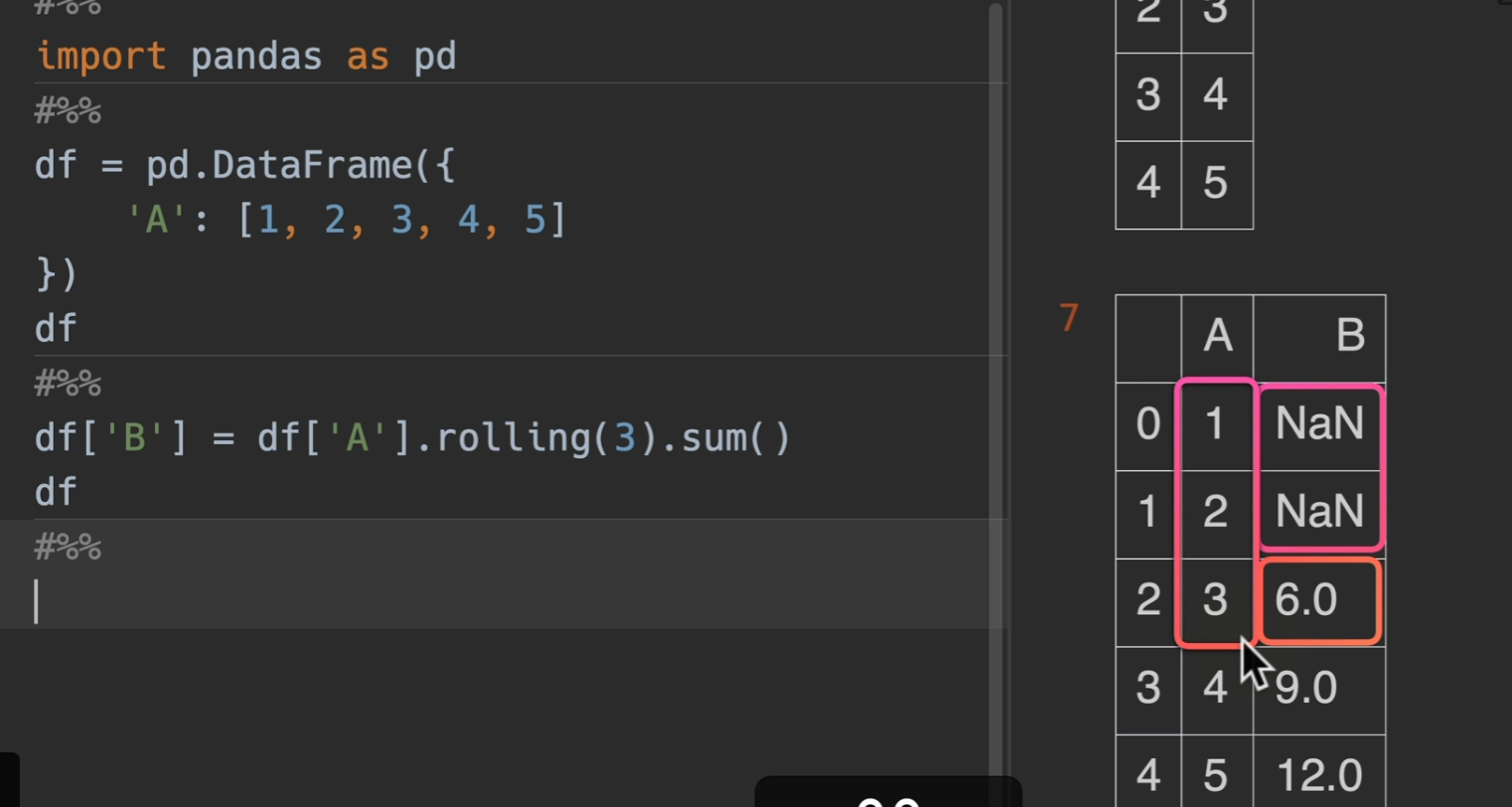
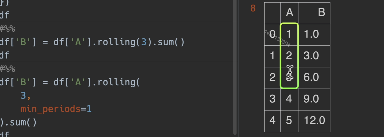
rolling()
基本使用
修改最小观测
如果不想前两个为空的话,可以利用min_periods参数,指定最小观测范围
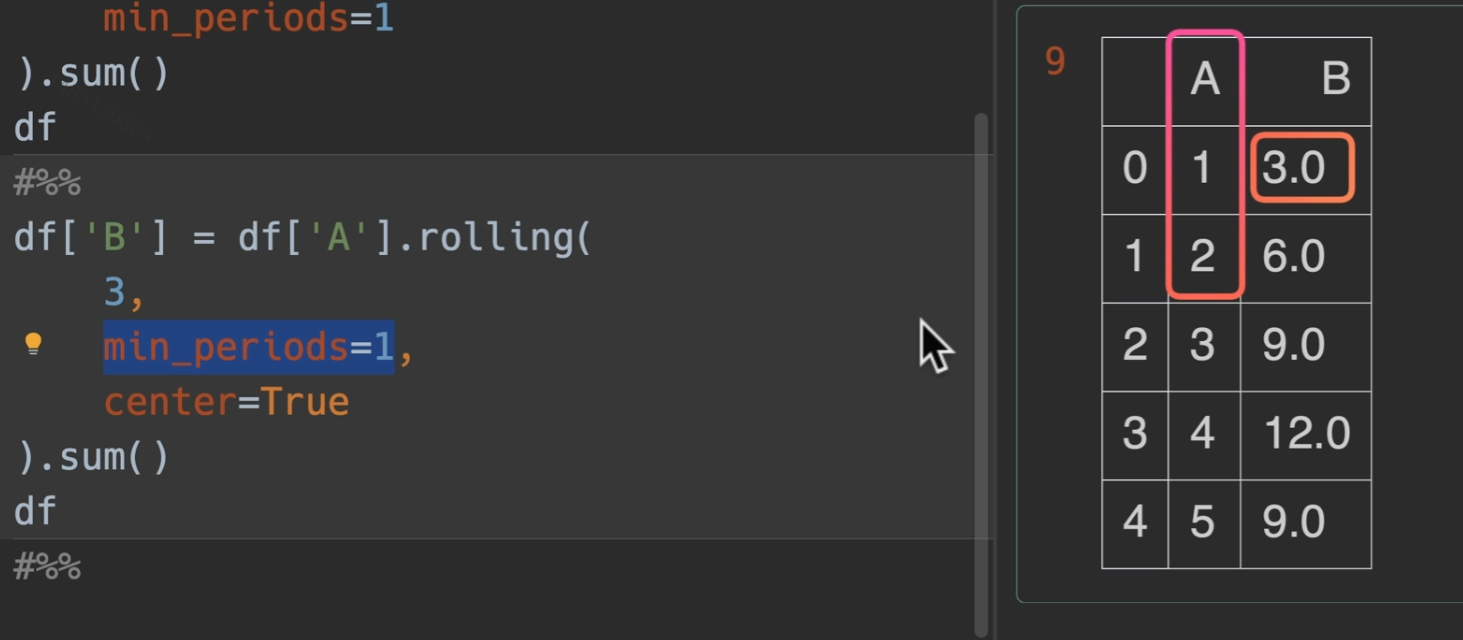
修改对齐方式
如果希望居中对齐的话。设置:center=True
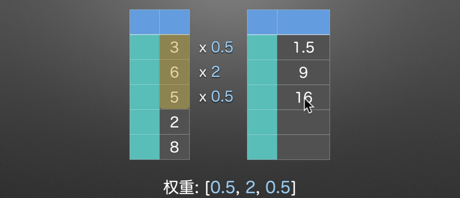
修改窗口权重
win_type() (19条消息) DataFrame加权滑窗rolling使用,win_type=‘triang‘详解_条件漫步的博客-CSDN博客
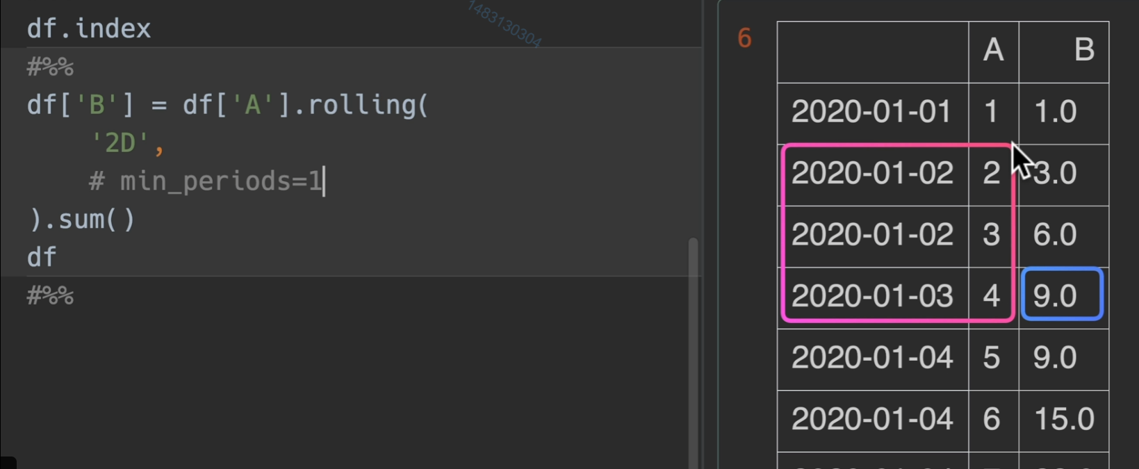
窗口取值范围
offset参数传入2D,他就从当前往前找,直到找完这一天和上一天的
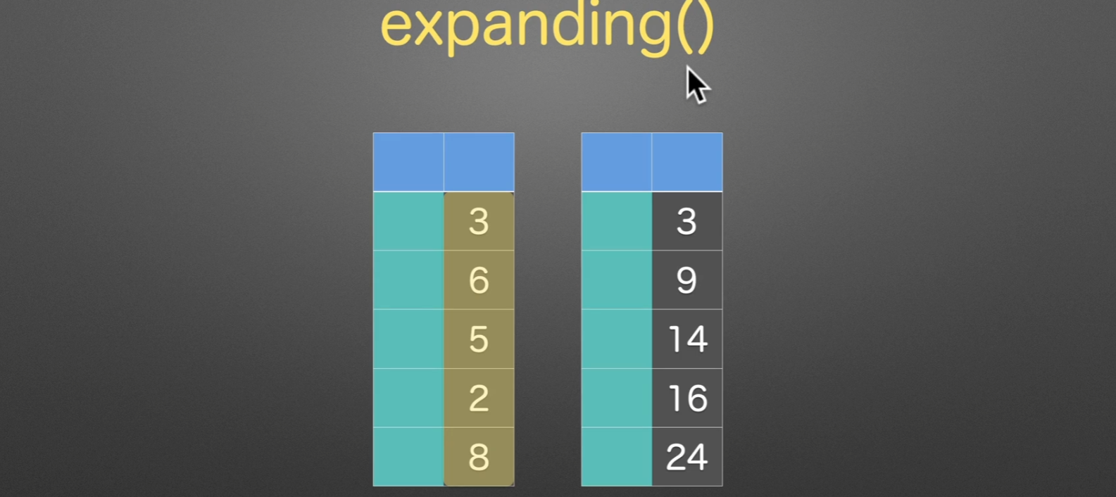
扩展窗口
expanding(), 没什么特别,扩展窗口求和而已。
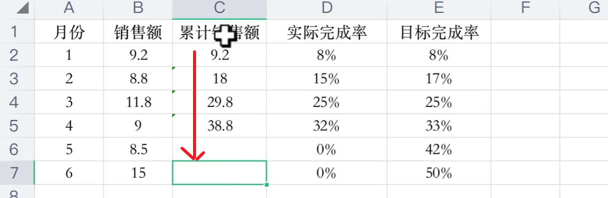
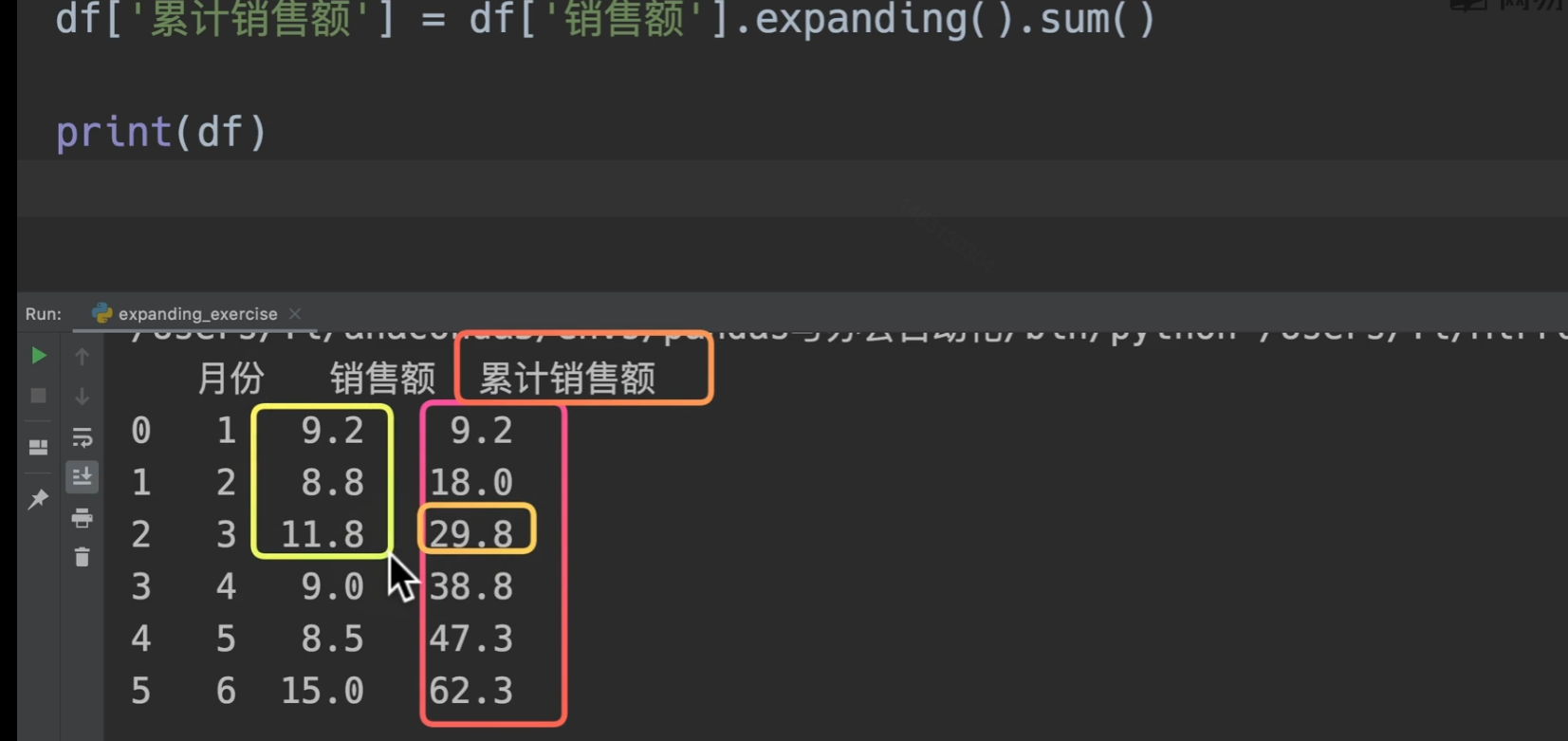
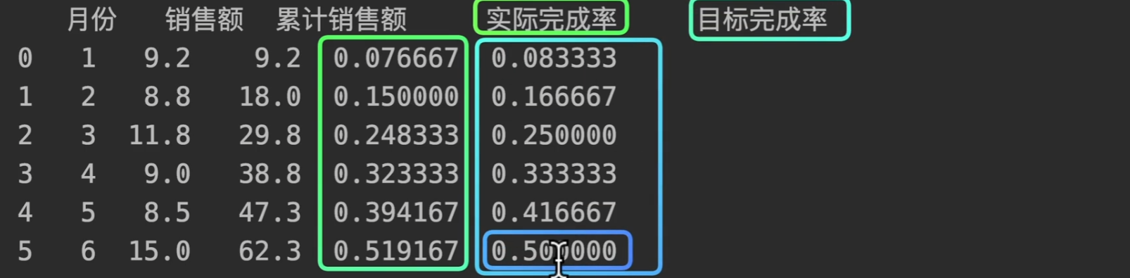
我们用代码来实现这个需求。excel也可以excel 递增求和你会吗?excel 递增累计求和技巧_office教程网 (office26.com)

更多实用函数方法
将已有列设置为index
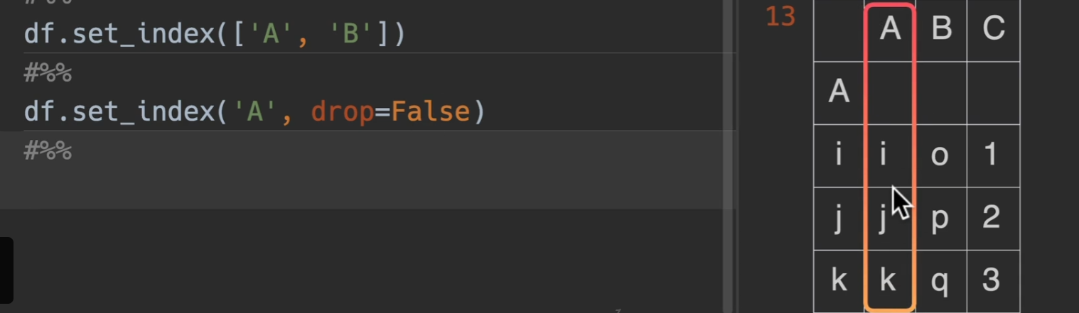
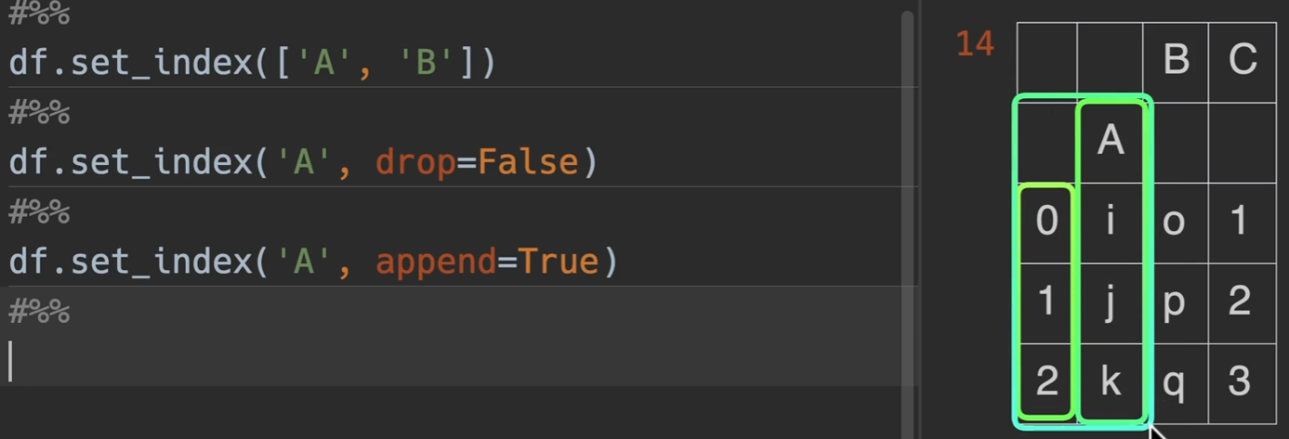
set_index()
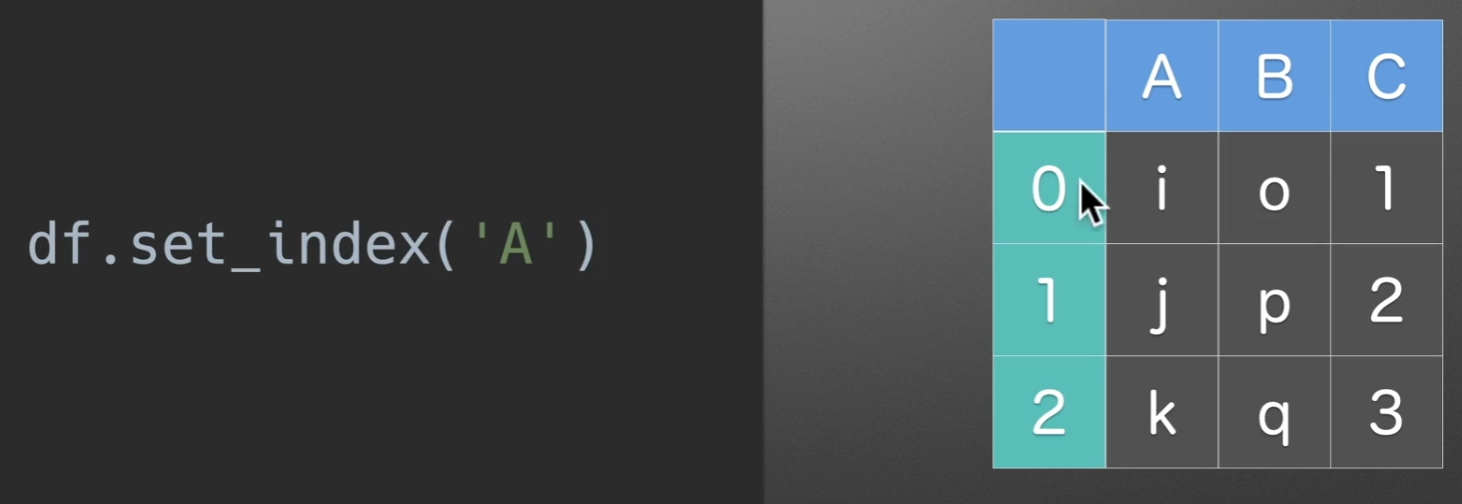
转化为下图所示

keys,第一个参数,可以放列名,还可以放个列表啥的,都行都行
drop,默认为True,也就是删除set_index原有的列,将其转移到index上,若为False,结果如下图所示
append,是否将该列名追加于原来的index之后,默认为False,若为True
转换index为列
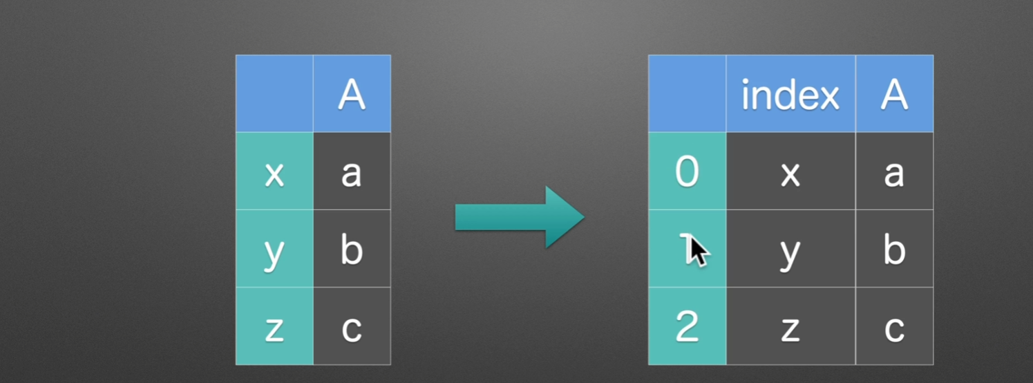
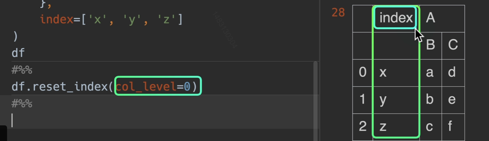
drop即将索引丢弃,level是指你想要设置那一层的索引
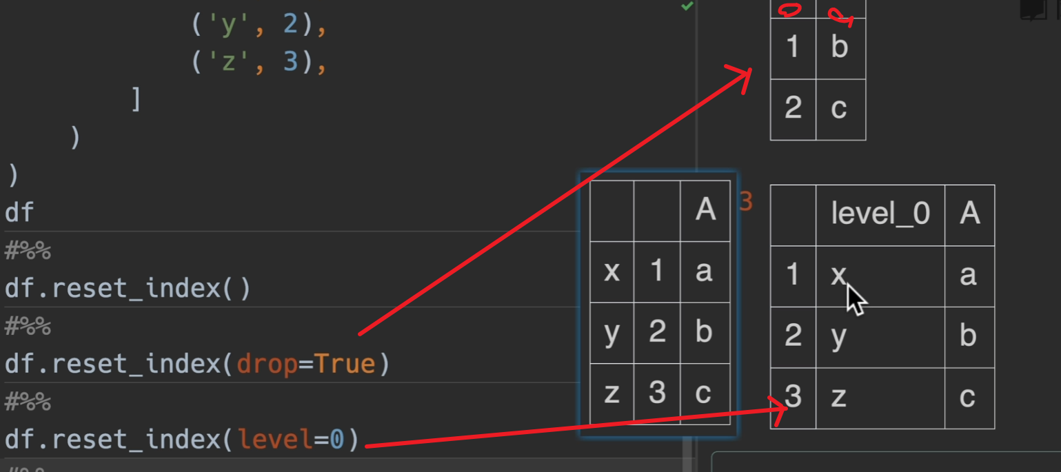
col_level是多少就是说这个新索引的名字出现在列索引的第几层
自定义列名重组
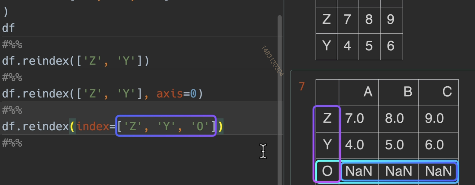
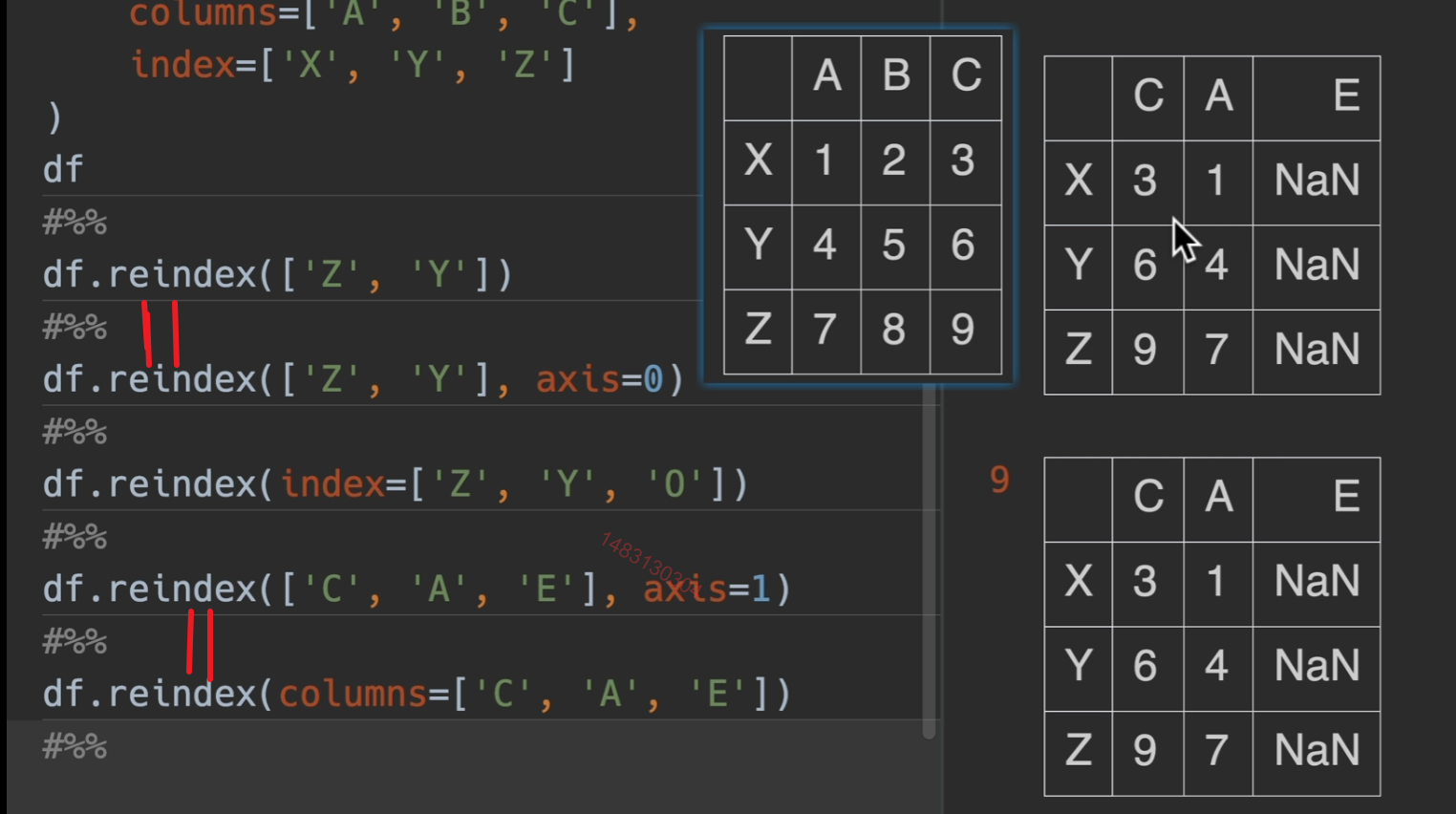
reindex() 对于下面这个dataframe,他的title为 c b e,不包括a,那么会删除a列,然后将顺序改为c b ,将不存在的e列用NaN补全
主要作用:无论你df以前是什么顺序,我一步就设置成我要得顺序


下面代码,index=可写可不写
像df2一样
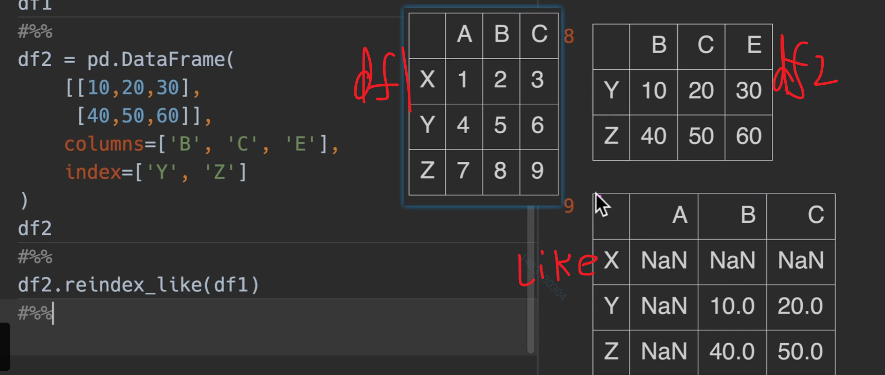
reindex_like()
主要作用就是将df1的格式替换为df2的行列格式输出(数据还是用df1的,只抄格式)
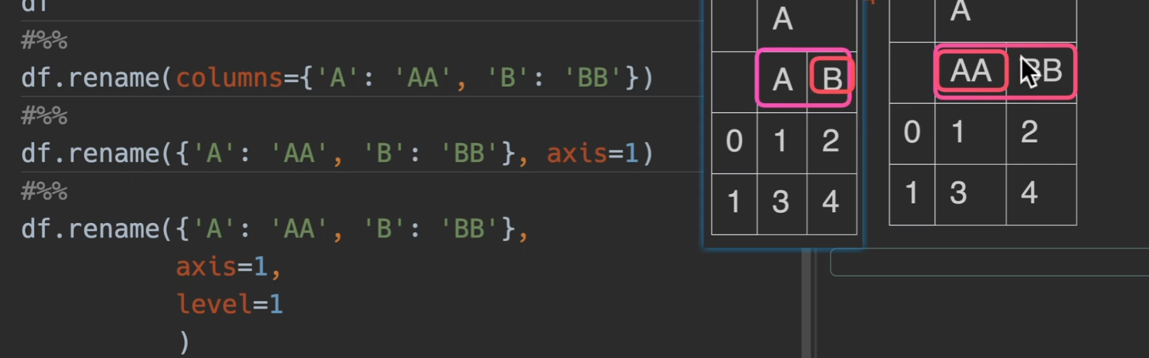
重命名索引
我认为直接excel改
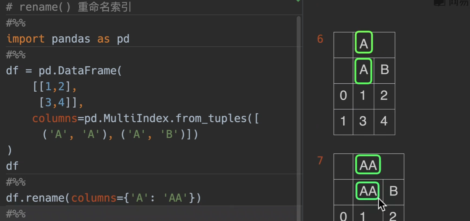
也可以传level参数
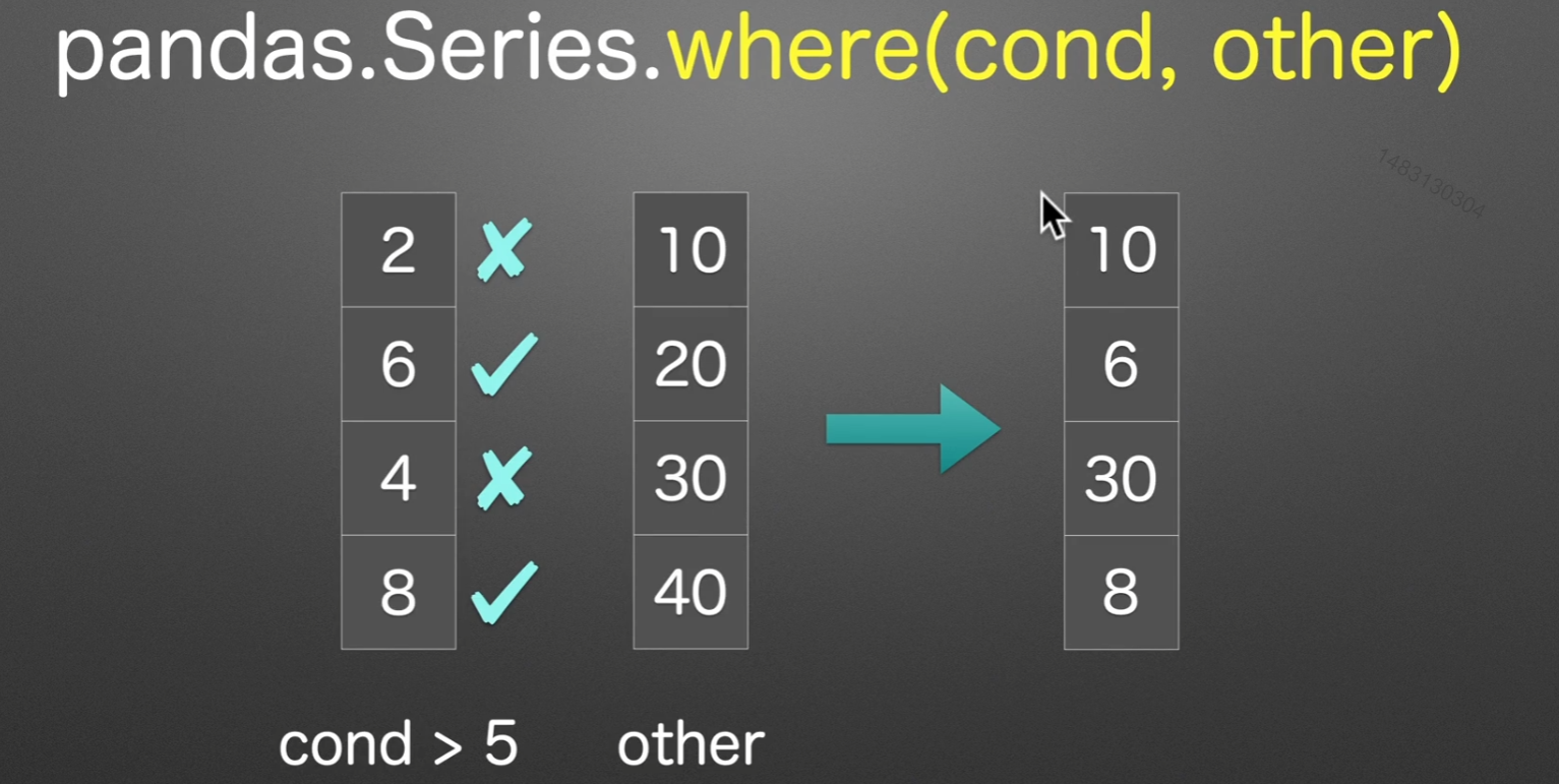
where条件选择数据
pandas.Series.where的返回结果,先用条件筛选,筛选掉的位置用other来填充(通常选择numpy类型的,舍去这种)
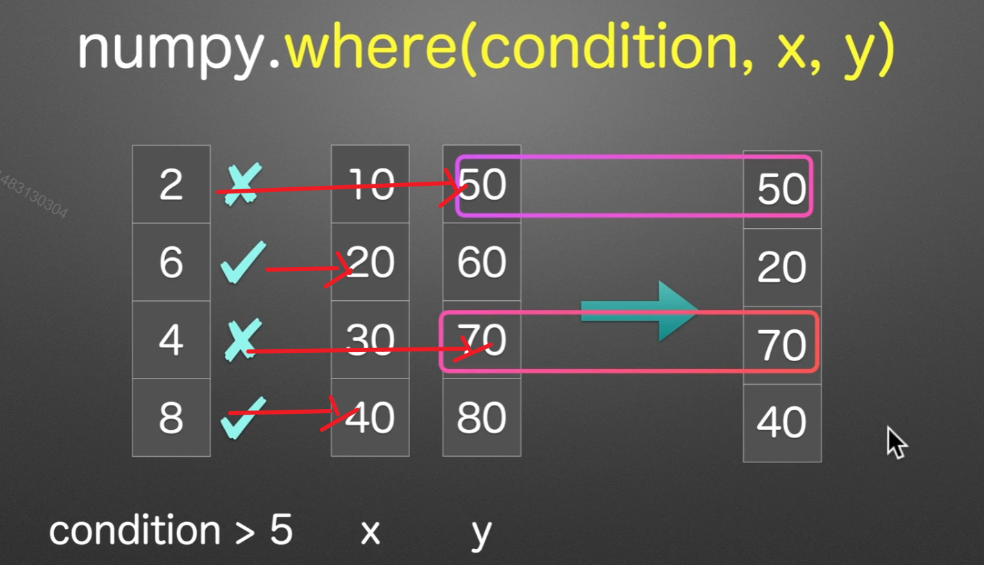
numpy的where在这里可以和pandas混合使用。
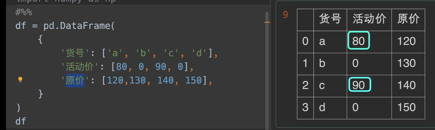
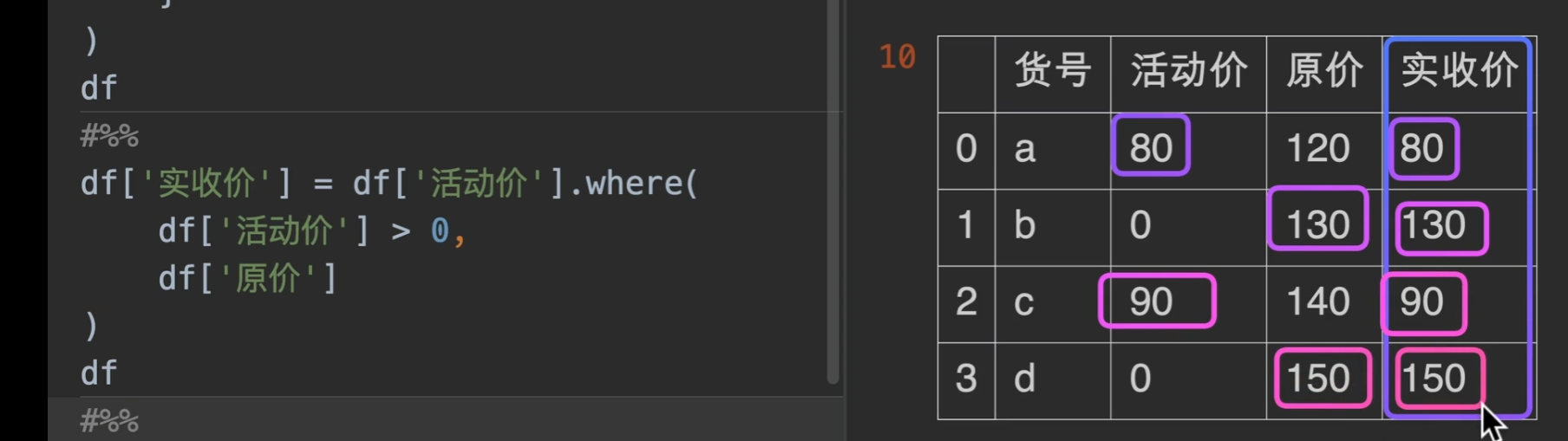
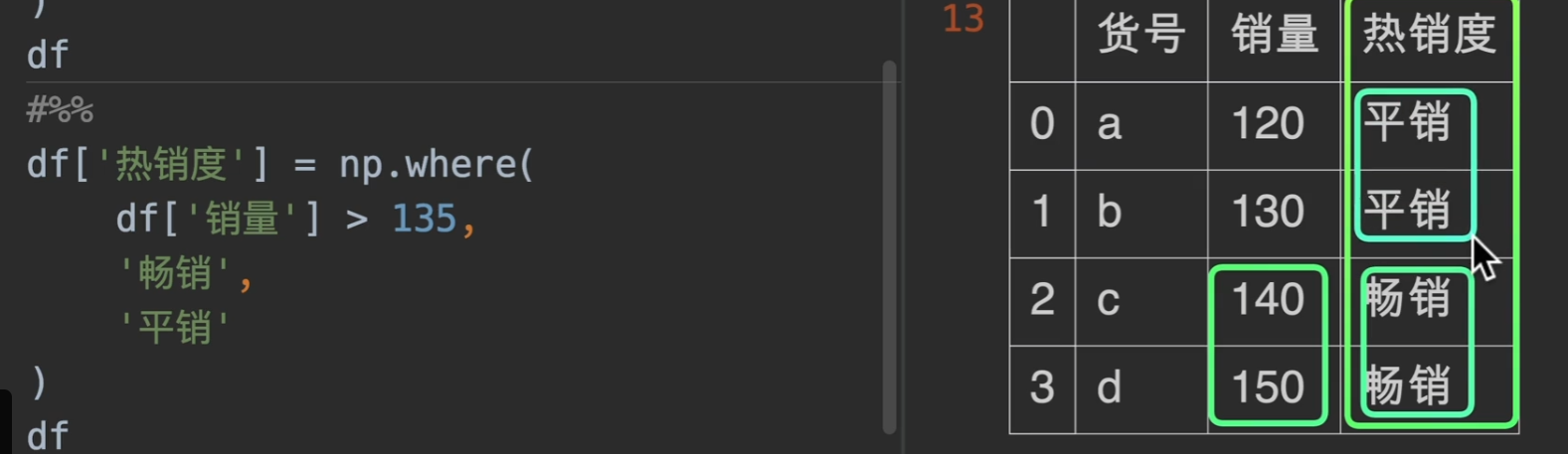
现在我们有一个需求,就是搞活动促销,我们想要知道我们实际收款是多少,那么,用where可以轻松解决问题。
numpy下的where也有他的用武之地,实际工作中使用np.where会更通用,也更常用!!
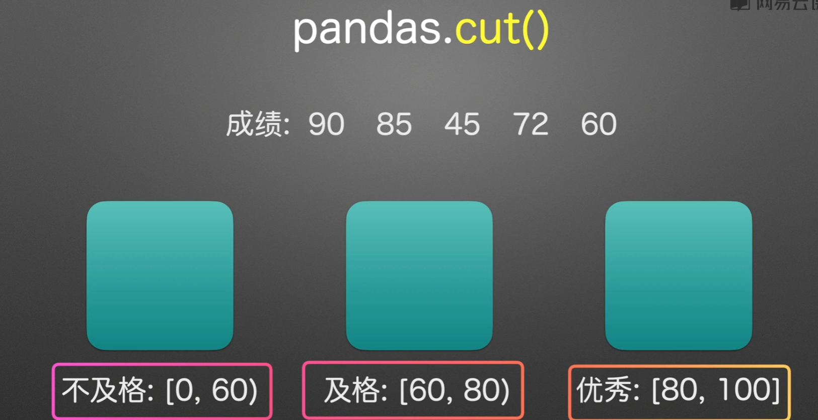
根据区间分类
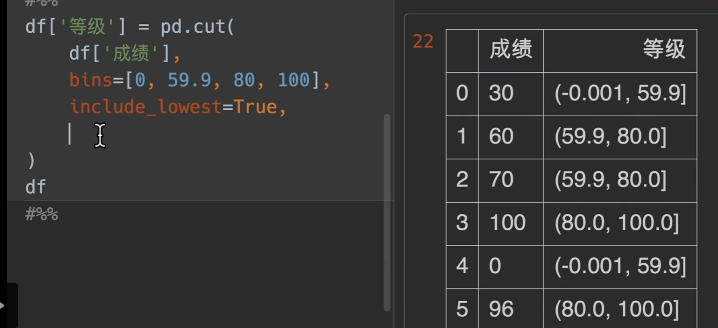
注意cut()方法: 左闭右开
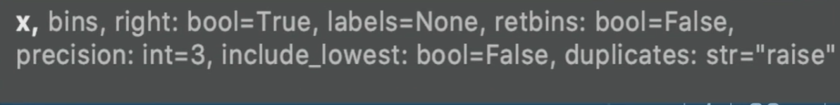
参数列表:
x:可以是一个series也可以是一个列表,一定要是一维的
bins:箱子的意思,就是箱子是如何分类的,将想要分离的间隔值写入一个列表或者直接写入一个数字,这样的话就等距分隔
include_lowest:将间隔的最小值减去一点点,然后包括最左端的值
right:默认为True,如果是False的话范围取值不包括区间右边的端点,此时如果取False,无需更改include_lowest参数
labels:将你定义的区间,显示数字从区间范围变成你定义的labels
precision:保存的精度,也就是小数点后多少位
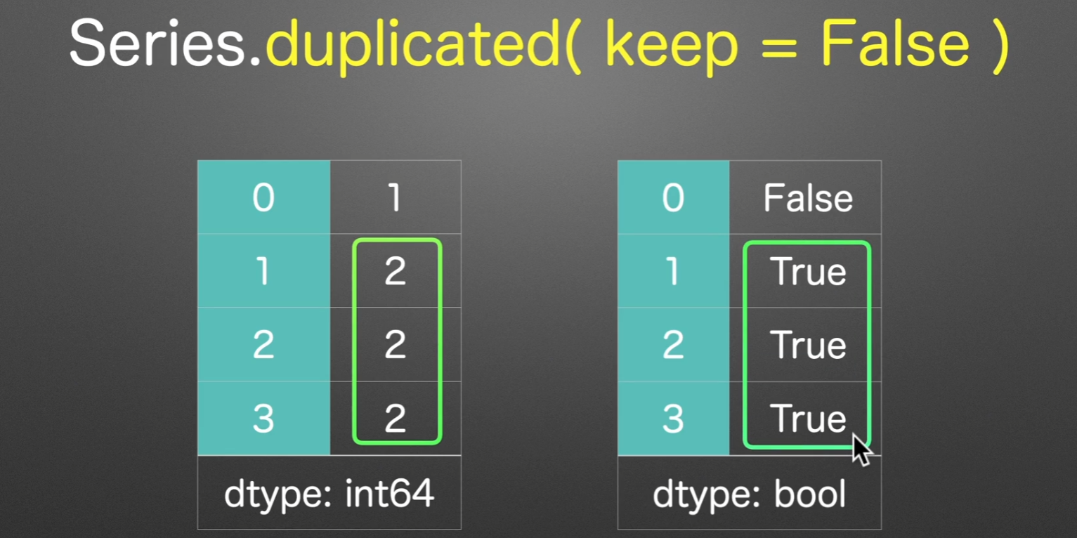
标记重复值
first:第一次出现重复开始,才标记为True,默认也为first
last:用倒序,从后开始记录重复
如果keep=False,那么直接就标记重复的值
丢弃重复值
drop_duplicates,这也是为什么参数叫keep的原因,保留第一个,或者保留最后一个,或者都不保留
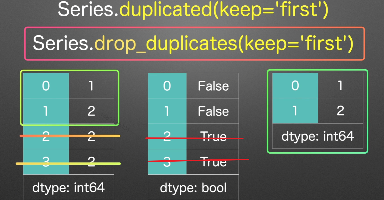
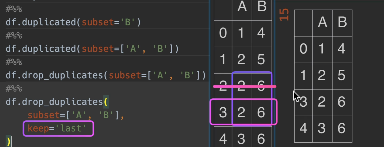
dataframe同时观测两列,那么就以两列的数为基准,当两列两列的出现重复才删,例如这里,2、6;2、6
随机取样
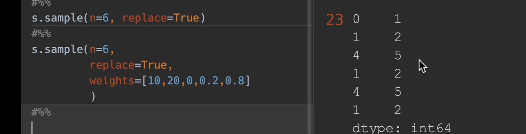
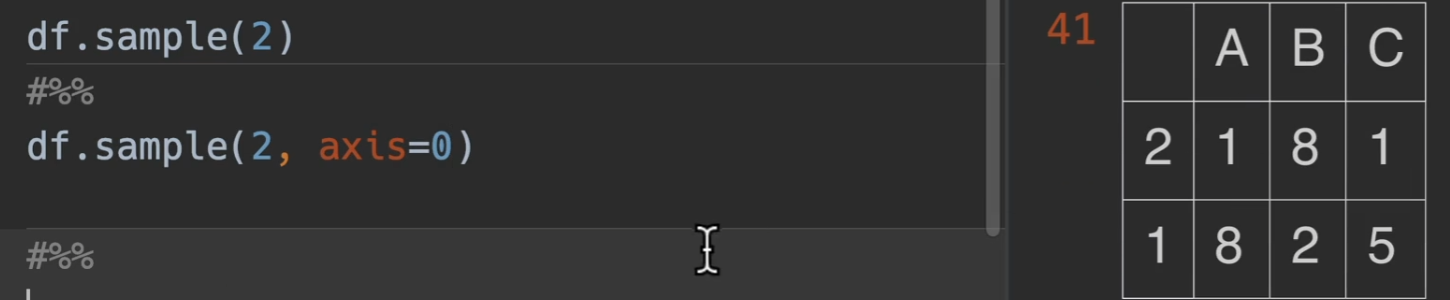
sample()
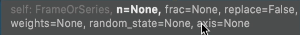
n:就代表取多少个数值
replace:设置是否有放回,默认False(无放回)
frac:取0-1的小数,就是取值个数占所有数的比例,例如总共五个数,传入0.8,则返回4个数。
weight:取到每个数的权重概率,这个就是传入一个有n个数字的列表就行,他会自动把列表进行归一化,总之就是取值越大,越有可能获得,当然,手动归一到0-1之间,会更加直观
random_state=xxx 设置随机种子,也就是把每次的结果固定下来
axis:主要针对于dataframe,如果是0,则取xxx行,如果是1,则取xxx列,也就是随机抽取
重新采样
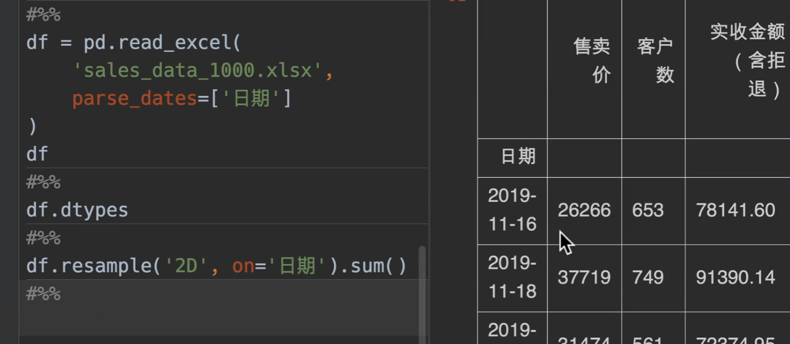
resample
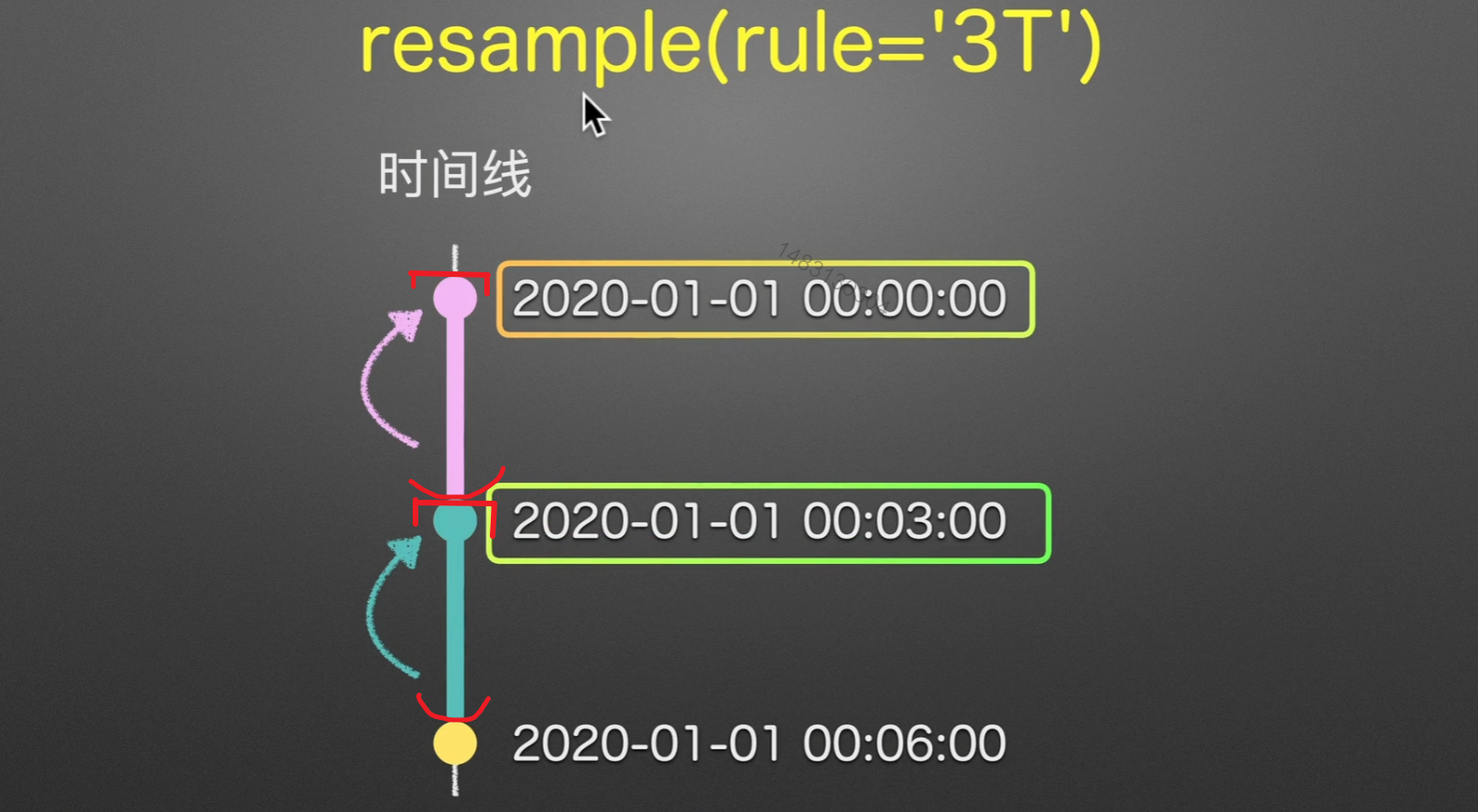
为每一个时间戳生成一个1-6的随机数,然后用重采样对他进行处理!
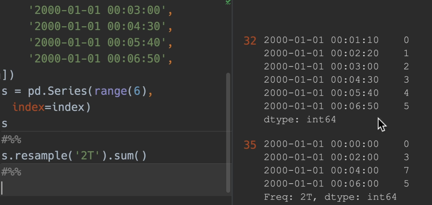
实例
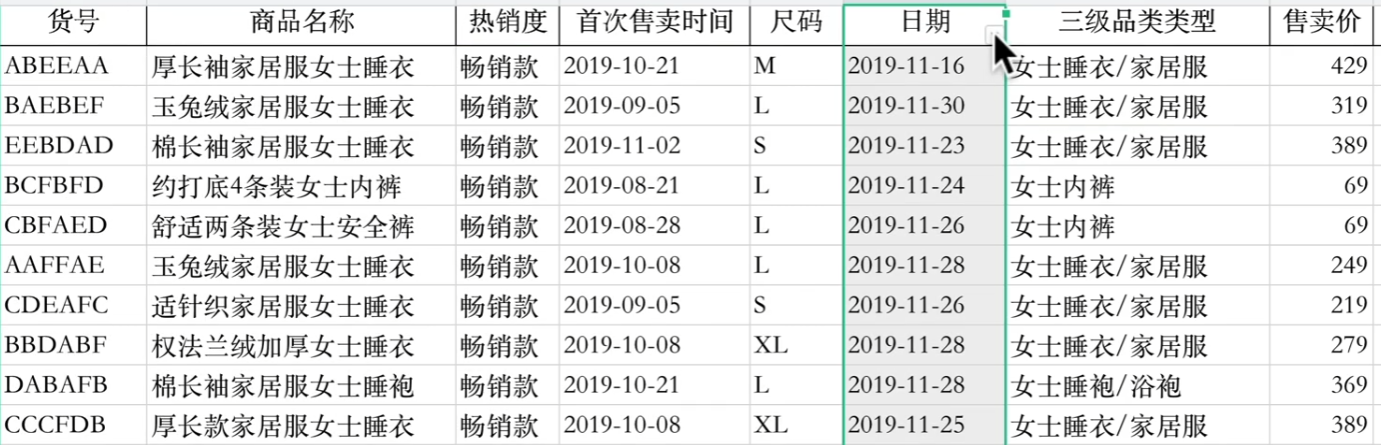
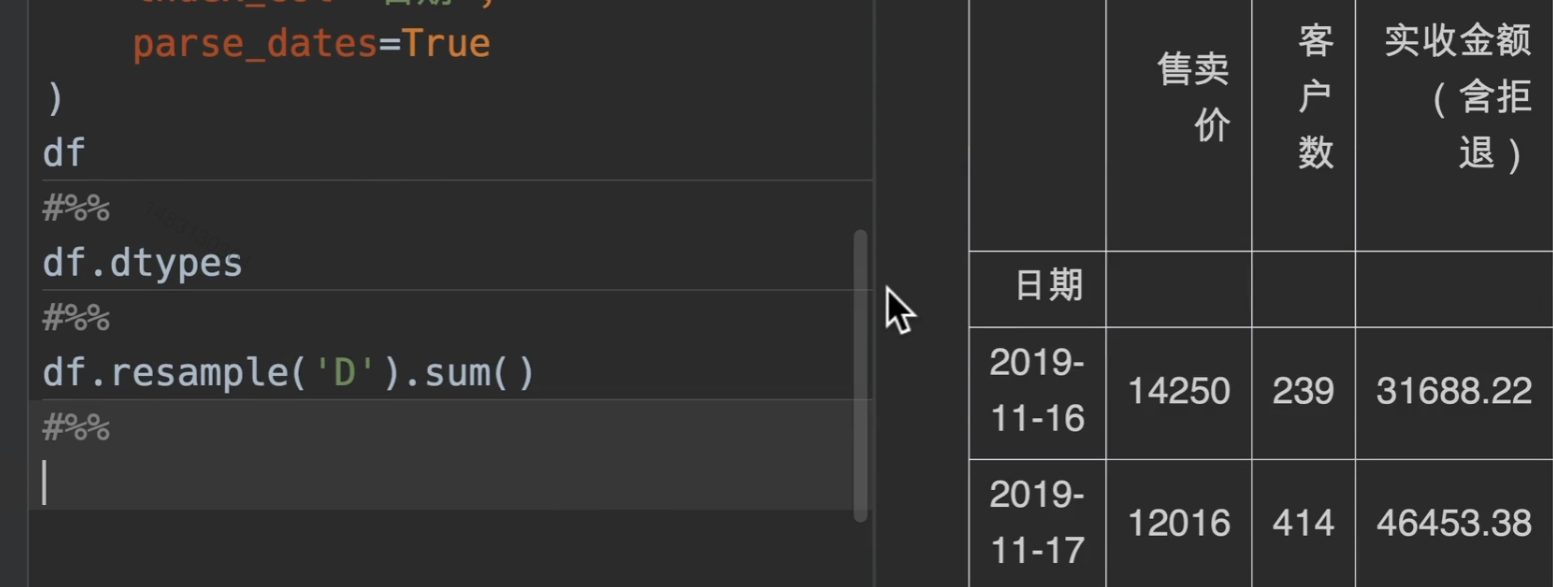
例如对这张表的数据进行重采样统计
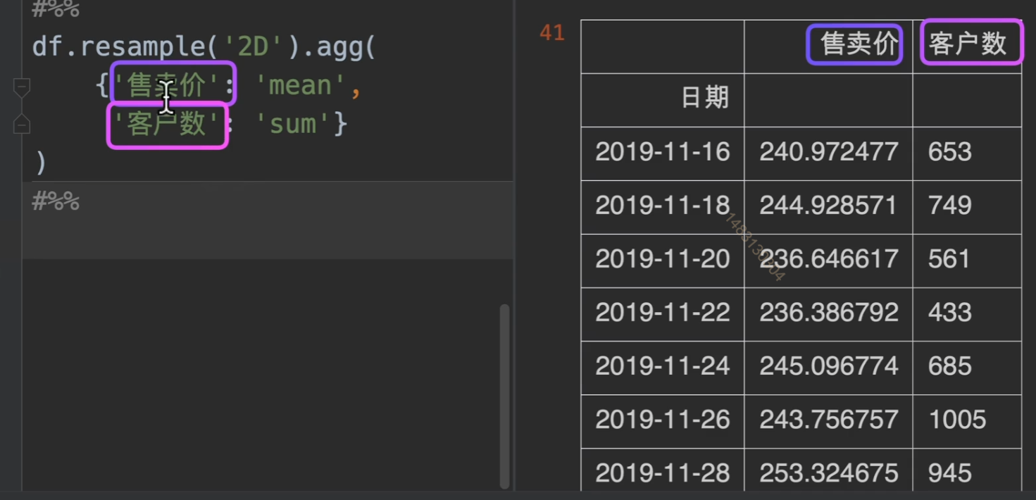
通过重采样,并且sum求和函数,将所有数值类型的量进行统计
同时,当然也可以对其进行字典分组操作.agg
将日期列定义为时间类型,但不定义为索引,我们也可以通过on参数来进行指定重采样的索引
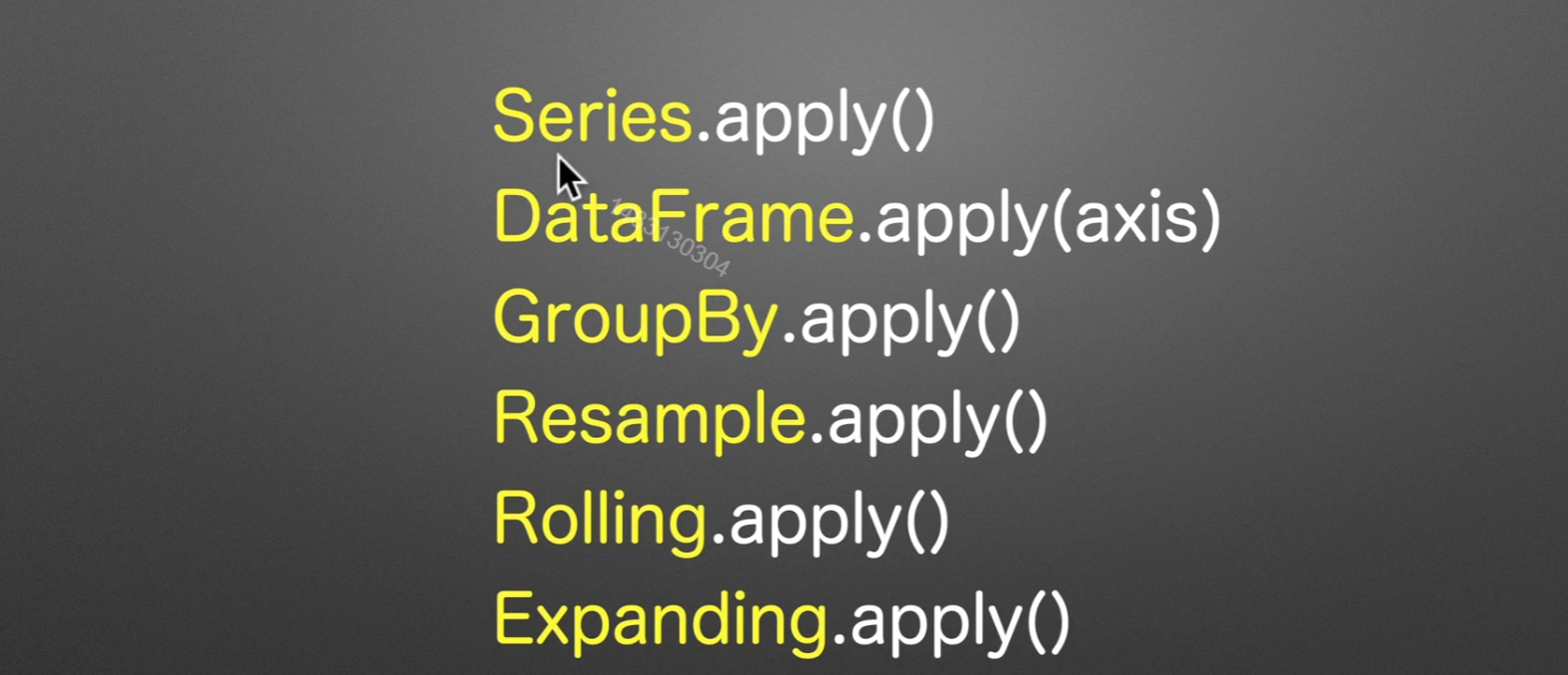
apply()应用函数
我们着重讲Series.apply(),其实这些都可以调用,只不过逻辑一样
apply可以代替聚合和转换功能

传入参数为函数

运用过程
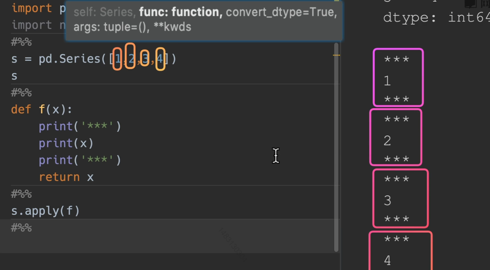
传入python func
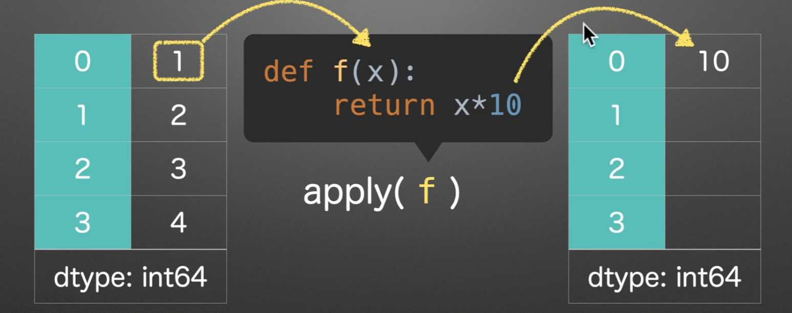
所以我们就可以知道传入一个python函数,他会对series的参数进行逐个传入。
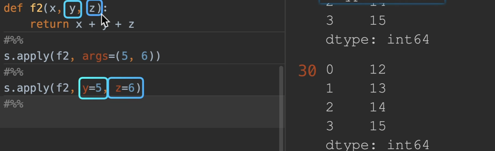
args:传入额外的参数
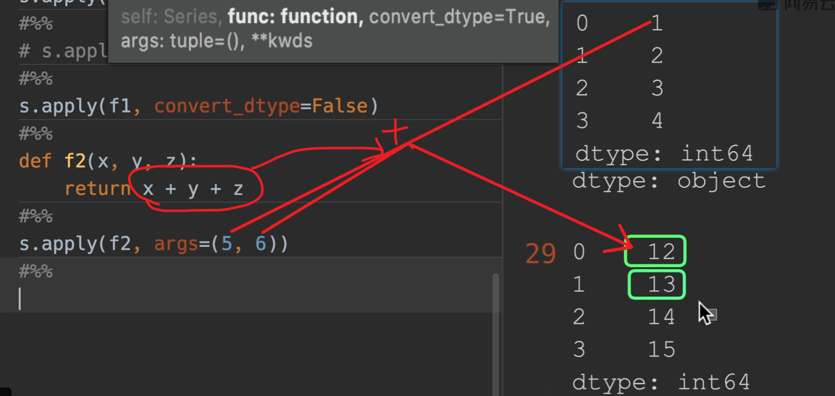
也可以直接用y=,z=,这样更直观一点
axis=0时,设置垂直计算
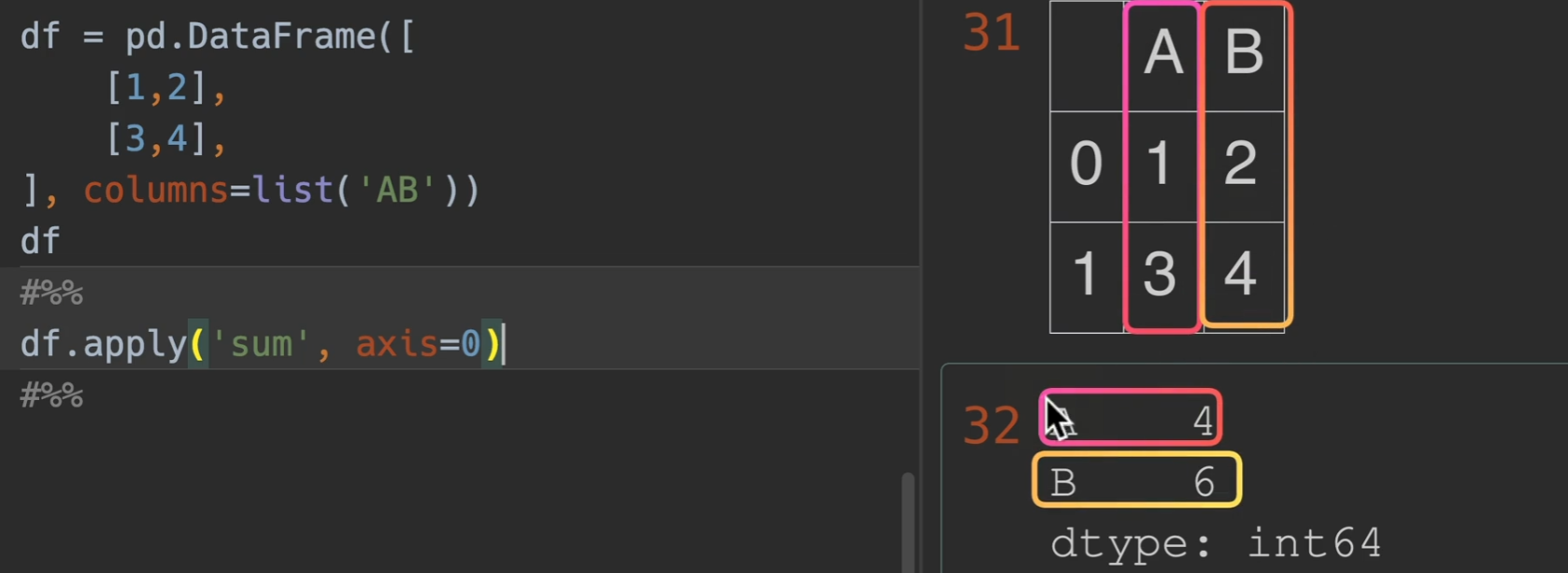
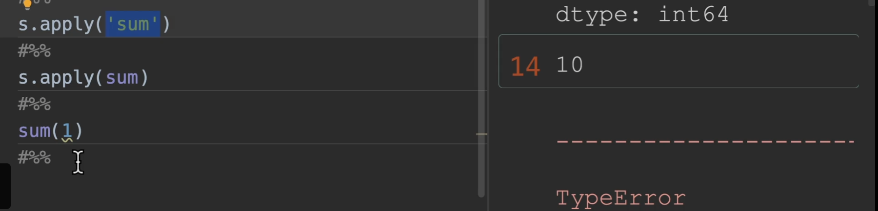
以下是apply调用numpy函数的演示
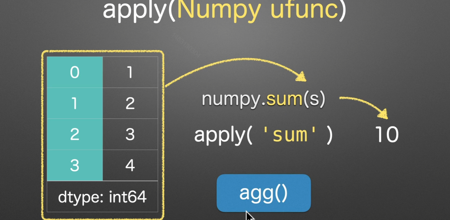
另外,’sum’代表传 入一个numpy方法,如果直接sum的话叫做传入了一个python的内置函数,会引发报错,报错内容就是说int不是一个可迭代参数
排名
rank()

以下是对series([7, 8, 8, 8, 9])的各种排名操作,方法默认使用average,我们实际用dense和first居多
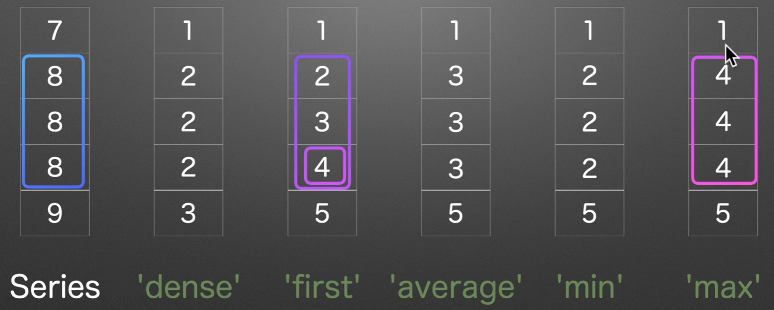
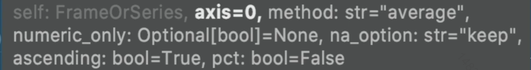
参数列表:
method:选择方法
ascending: 默认升序,改成False可以为降序
numeric_only:只对数字类型进行排序
na_option:对空值的处理办法默认是
'keep'有{‘keep’, ‘top’, ‘bottom’} top bottom就是指把空值的排名定位于第一还是倒数第一pct:百分位的排名
ps:若排序结果为浮点型,用convert_dtypes()可以改变为整型
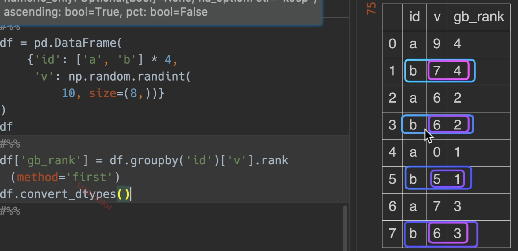
dataframe演示,实现先对id进行分组,然后对value列进行排名
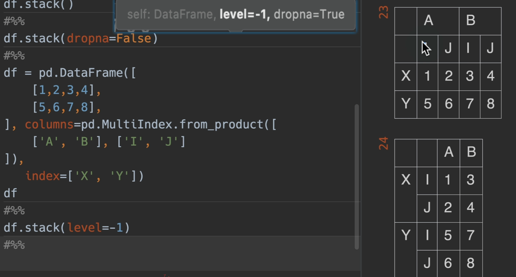
堆叠
列索引堆叠于行索引
stack() 把列索引堆叠到行索引列
参数列表:
dropna:默认为True,就是丢掉数据里的空值
level=-1,默认为是列索引最下面那一层,0就是倒数第二下面的,在这里,-1就是i、j

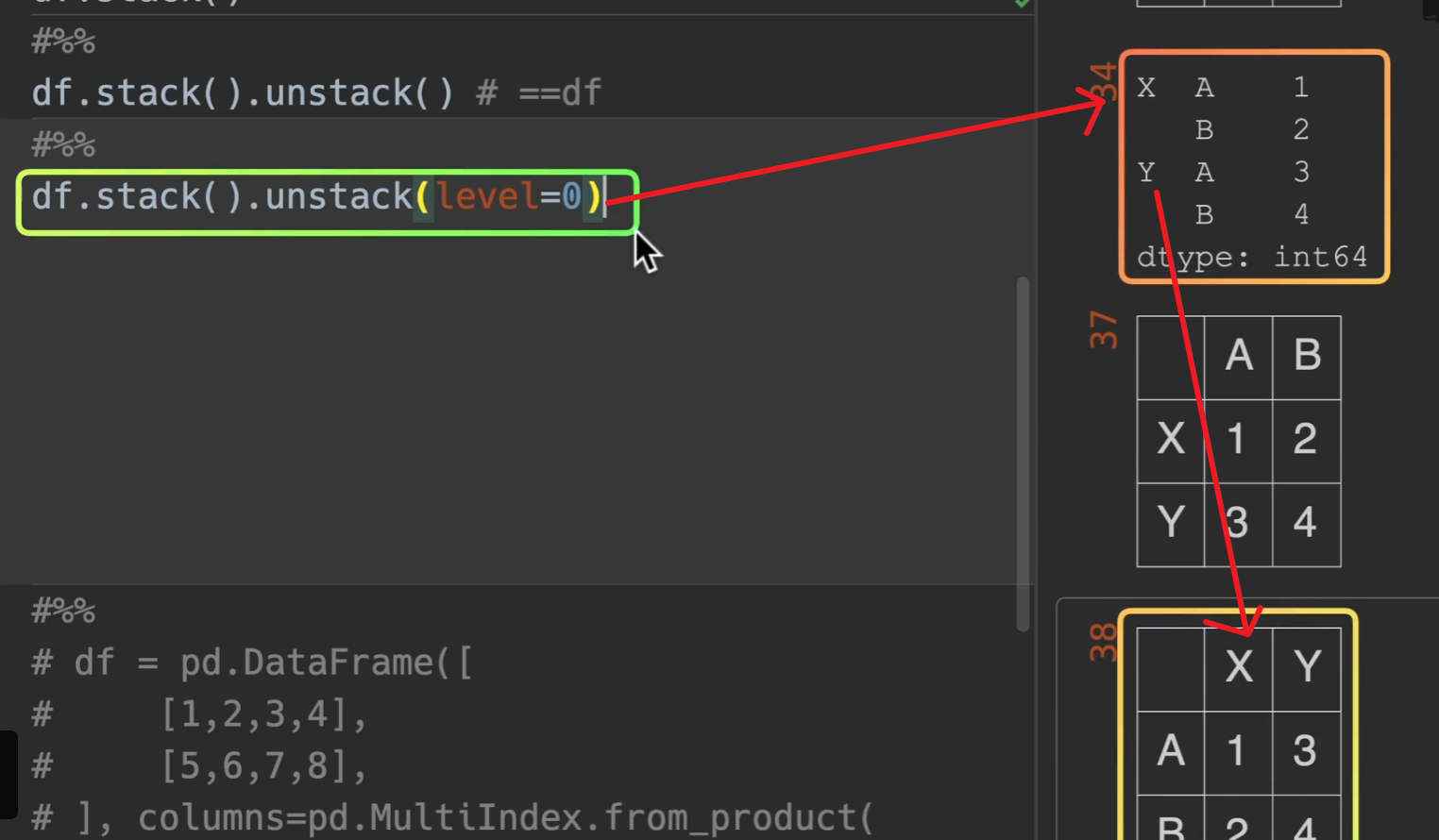
行索引反堆叠于列索引
unstack() 反堆叠 (index -> columns)
和我们想的也一样,level = 0这一层要外面一点。
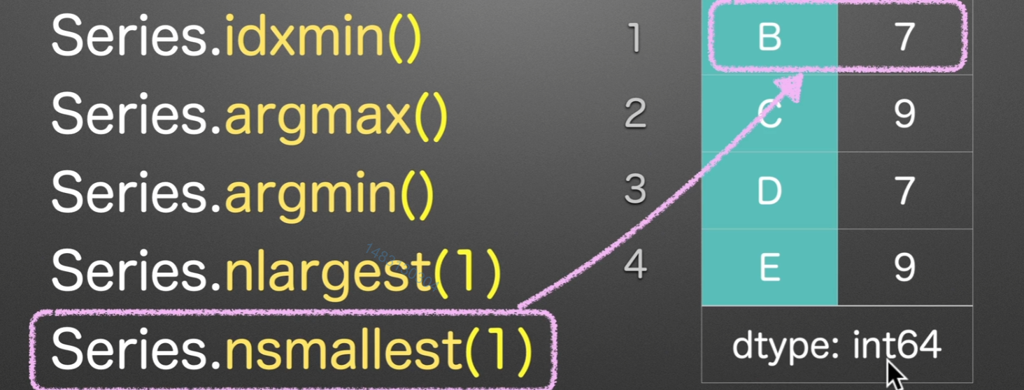
max/min
idxmax/min
idx,依照id来顺序访问,找到第一个idx的最大值/最小值
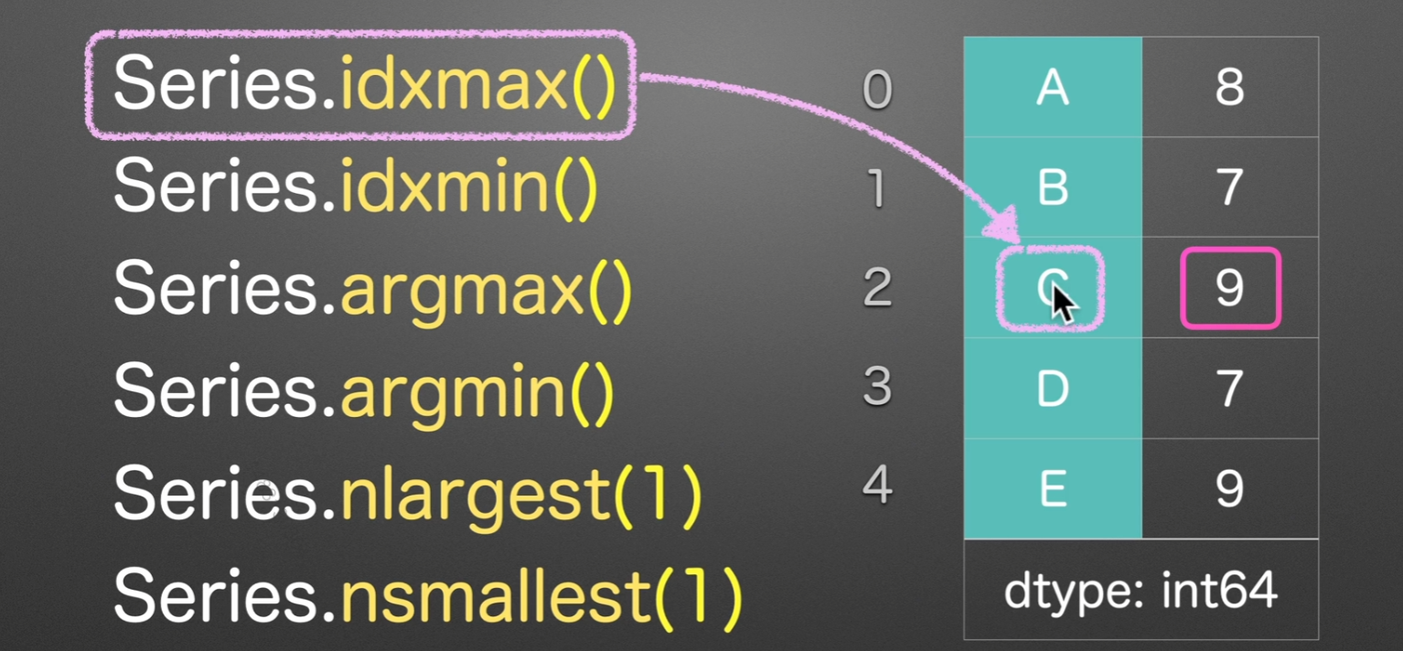

argmax/min
arg找的是数字索引,所以会返回
2和1


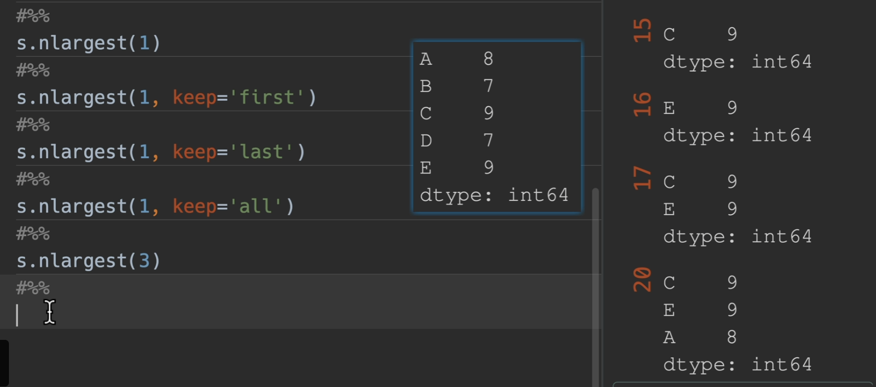
nlargest/nsmallest
nlargest(1) nsmallest(1)、返回的是series

查询并筛选行
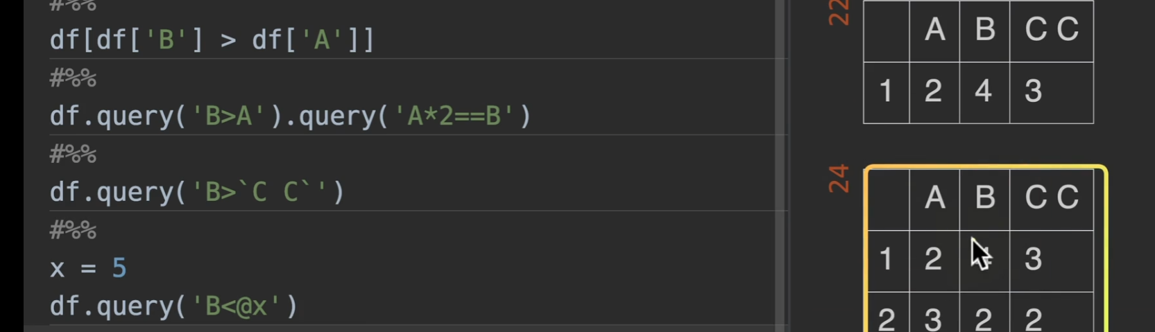
query() ,他的好处是可以链式查询
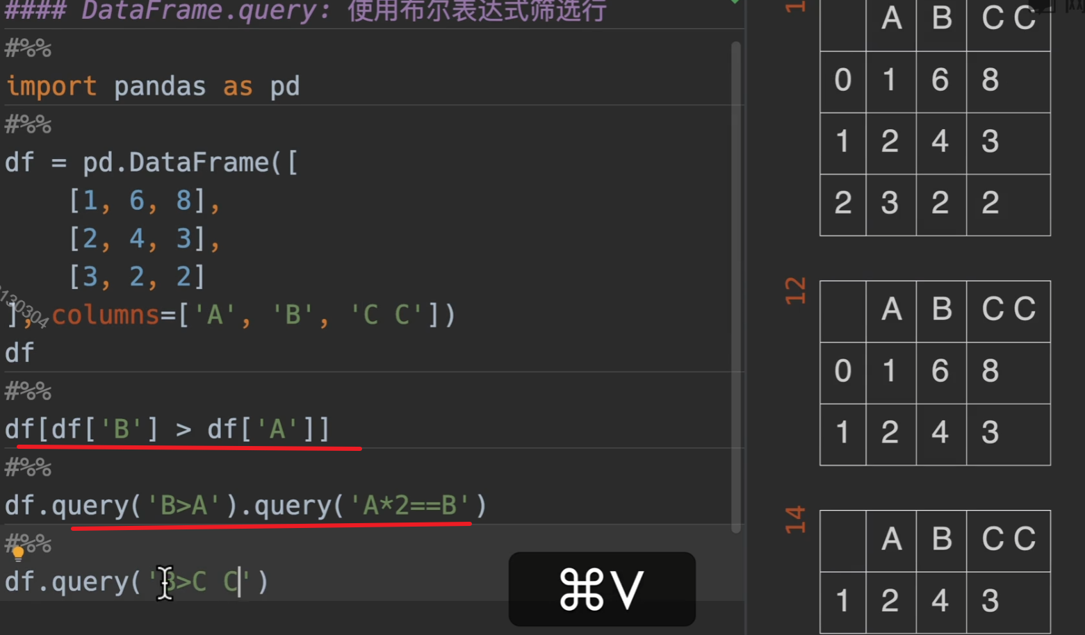
但当列表名为c c,我们需要特殊处理就是加 `c c`
还有就是如果要传入外部变量,需要在布尔表达式中,该变量前加 @
列名转化为数据
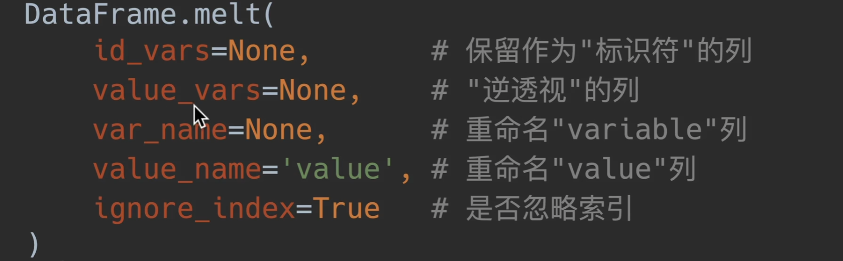
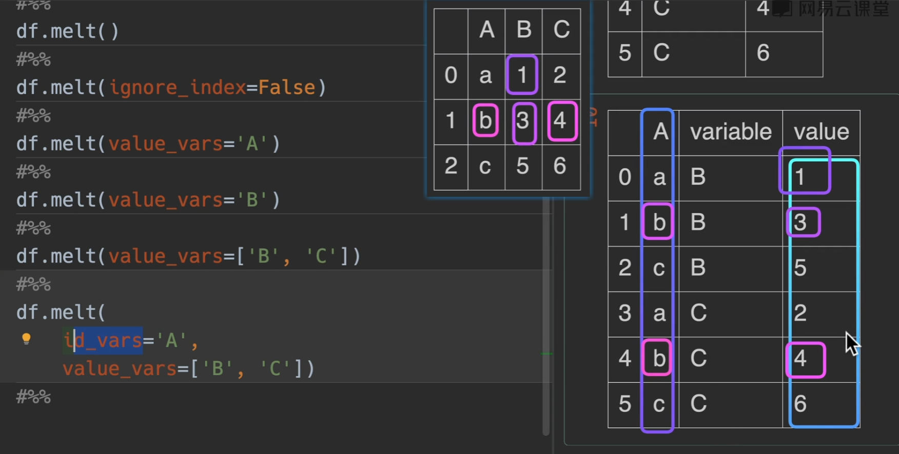
melt() 逆透视

参数列表:
逆透视中只有value和variable,分别是变量和参数的意思
id_vars:就是选择不改变格式的列,也就是输出的结果,该选中列不会发生改变,充当索引,填入列名或者列表的列名
value_vars:选取xx列的变量,填入列名或者列表的列名
用var_name和value_name就是重命名列名,好理解。
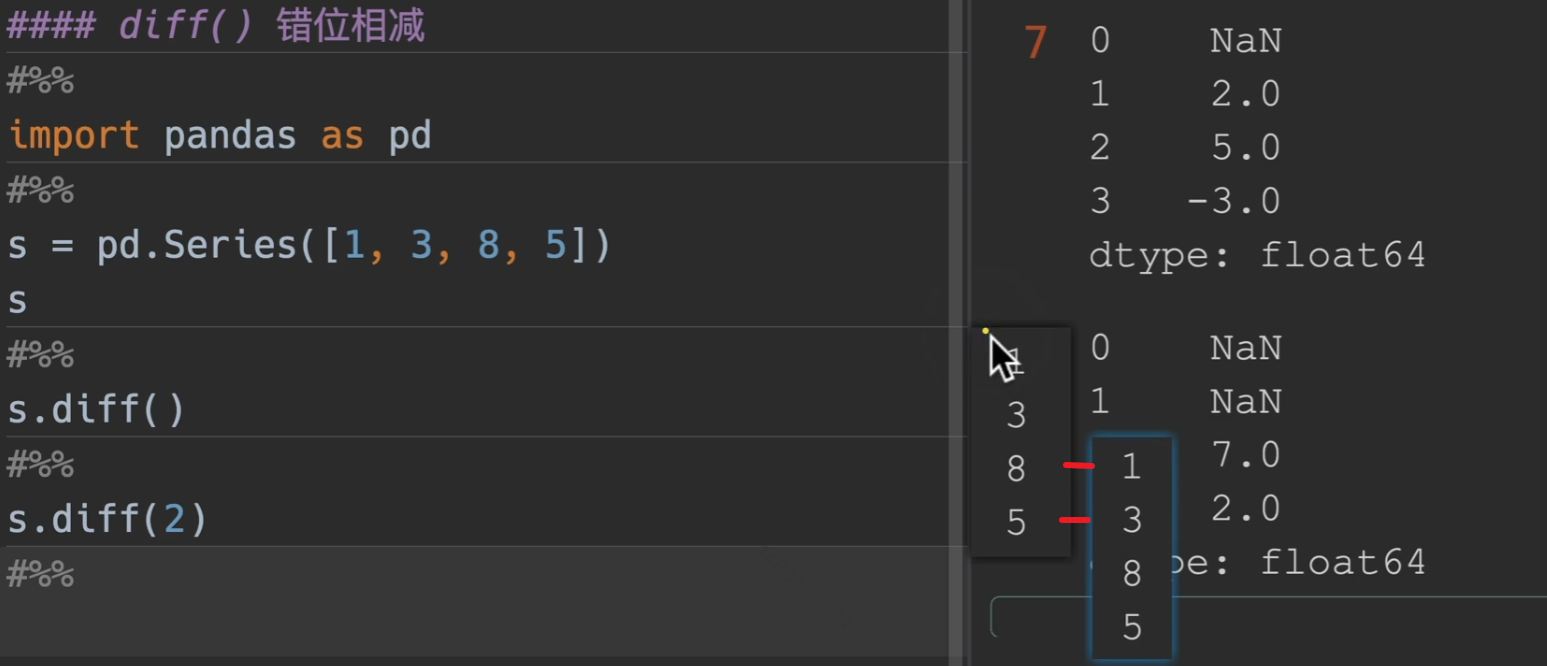
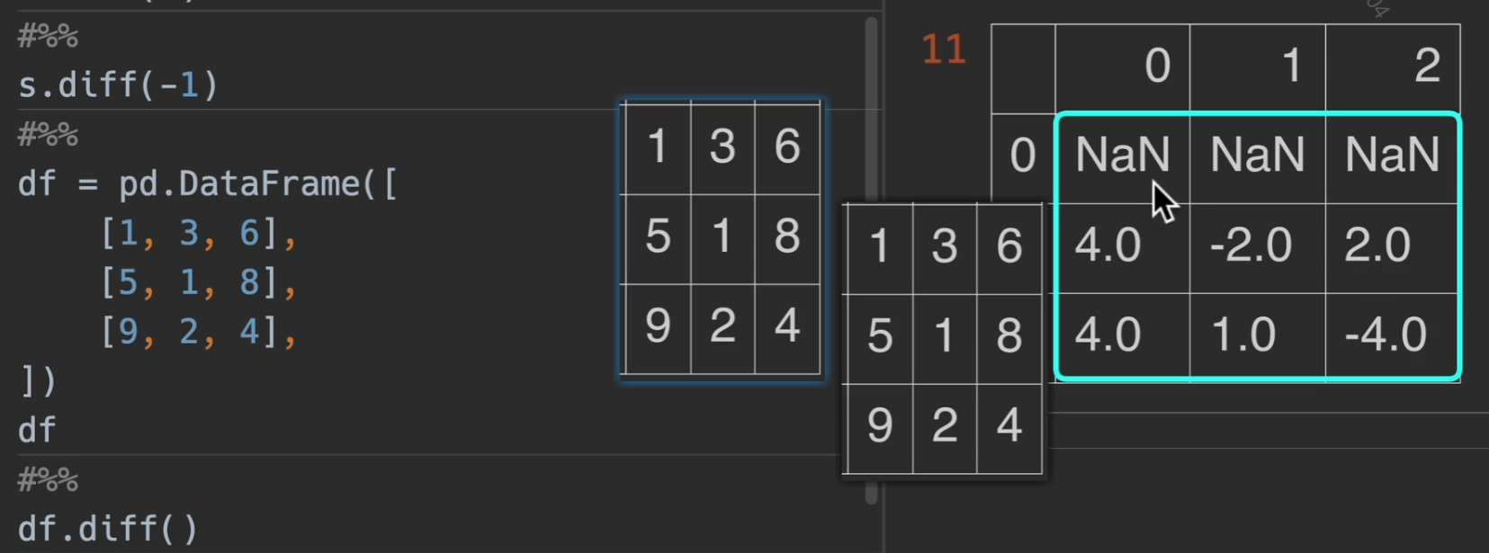
错位相减
diff() 传入的数字为偏移量,默认为1,也可以传入负值,就换成向上移动
dataframe也是一样的
偏移数据/时间索引
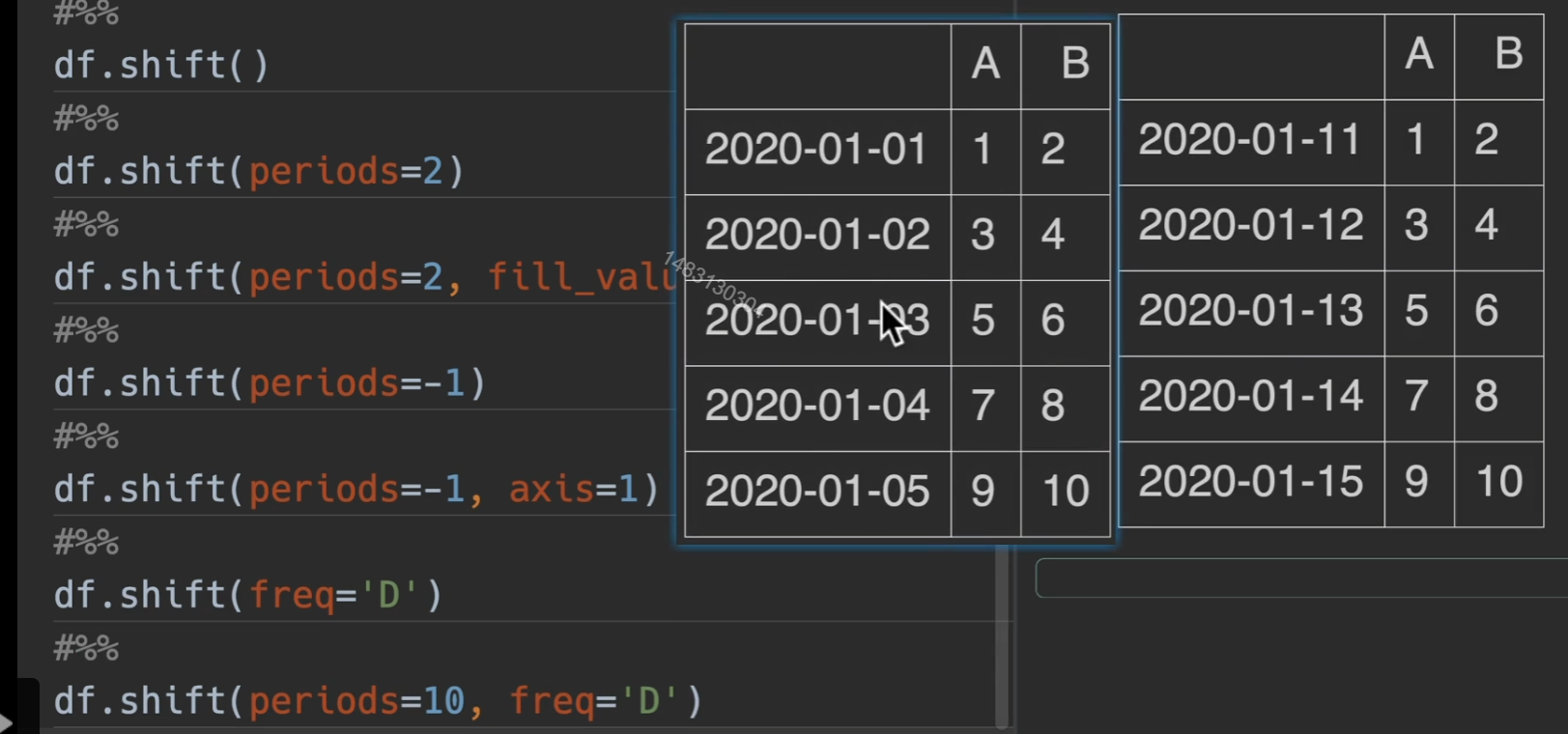
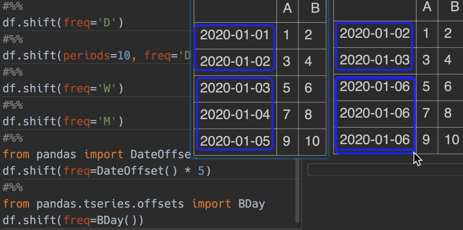
shift()
1 | ##### Series/DataFrame/GroupBy |
freq与periods混合使用效果更佳哦
BDay就是说偏移之后的结果都不会包括周六和周日
百分比变化情况
Series/DataFrame/GroupBy
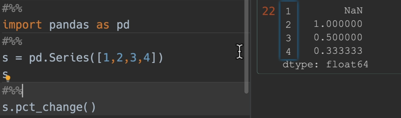
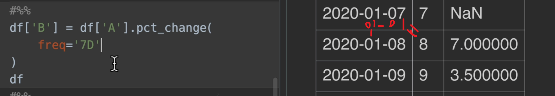
pct_change() (Percentage change) 百分比变化
periods: 偏移量 (例如原来该第二个减第一个的,你设置periods为2,则是第三个开始,减去第一个)
freq: 频率(时间索引)
- “D”, “W”, “M”, “MS”, “B”
- DateOffset, Timedelta
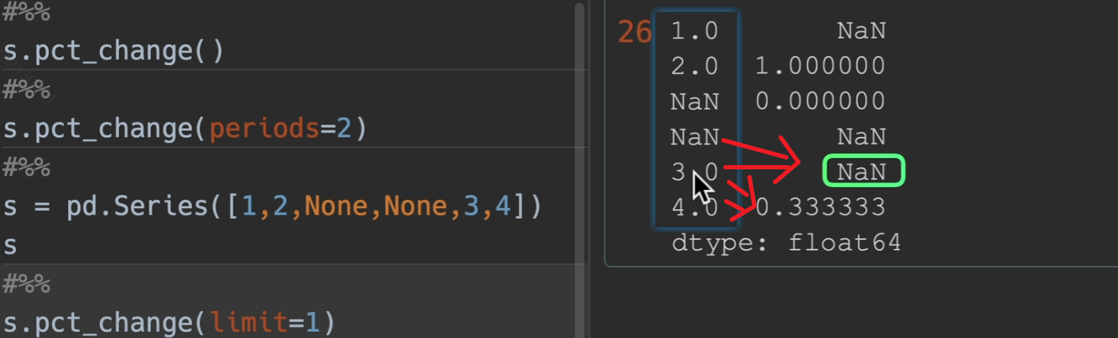
limit: 最多连续填充空值个数
这个是怎么计算的呢?,(2 - 1)/ 1 = 1 (3 - 2) / 2 = 0.5 所以这一列就相当于原始的数据源百分比的增长情况
limit用法,limit设置为1,他只从上到下填充了一个空值
更新
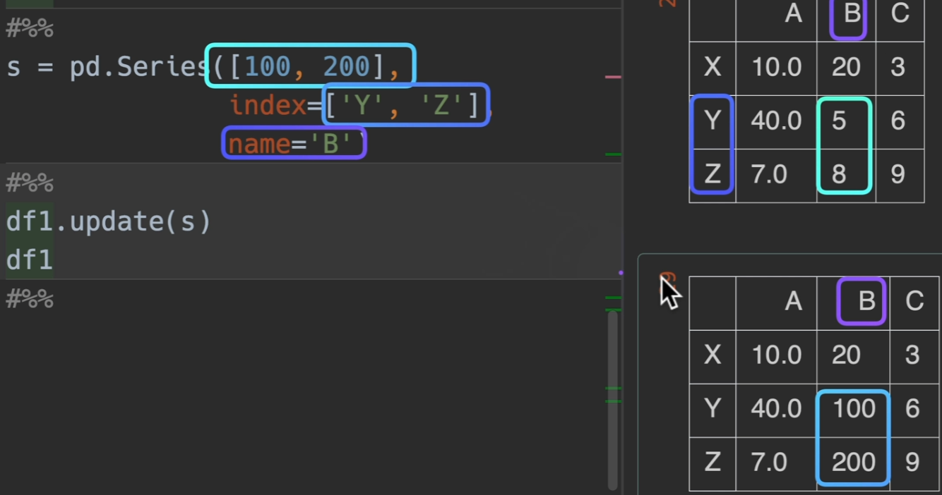
update()

简单说就是替换!用右边的数字来替换左边的数字,是就地修改
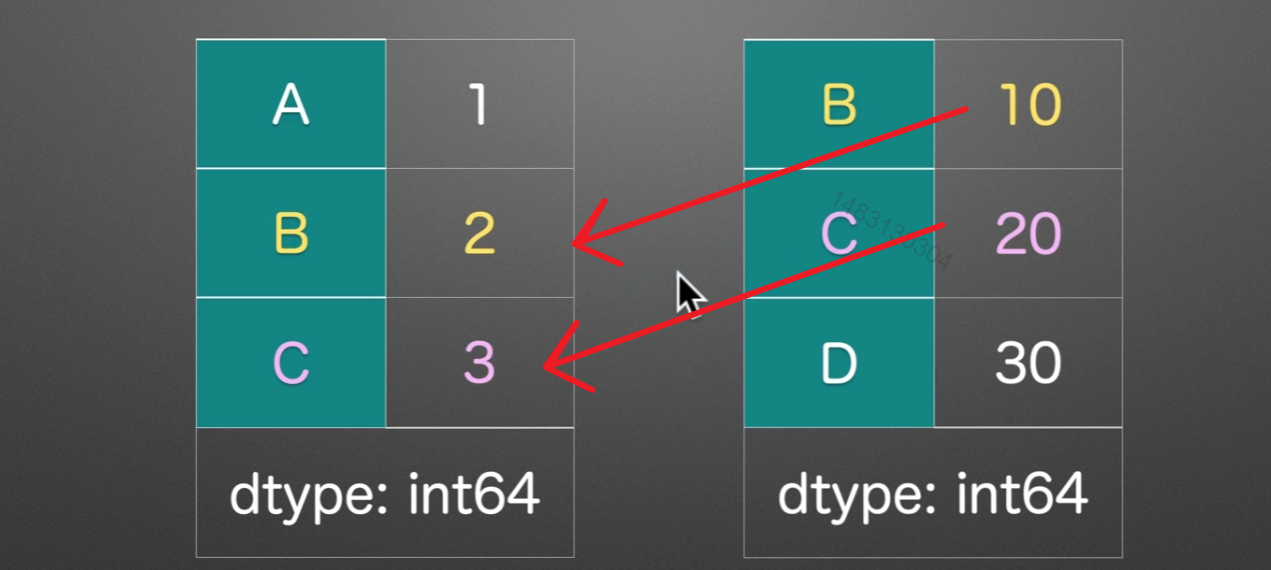
不过,如果右边的表内,该位置数字为空,那么左表保持不变
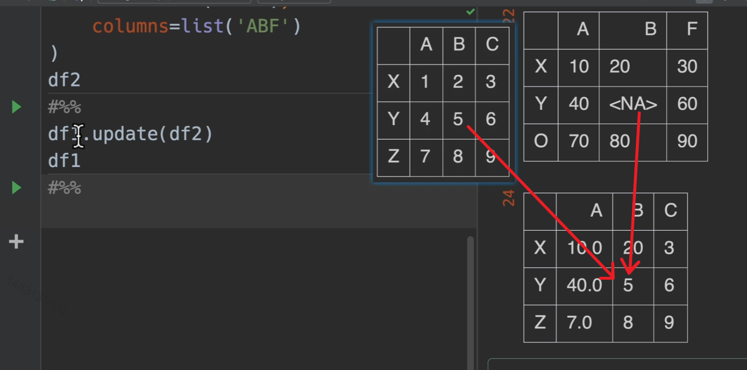
如果需要用series修改dataframe的值,那么需要设置name和index,不然无法对应到位置
数据可视化
支持图的种类
问号快速查看帮助文档
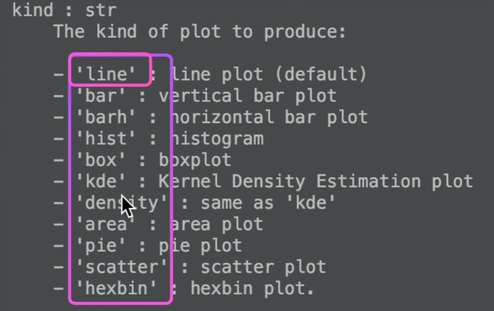
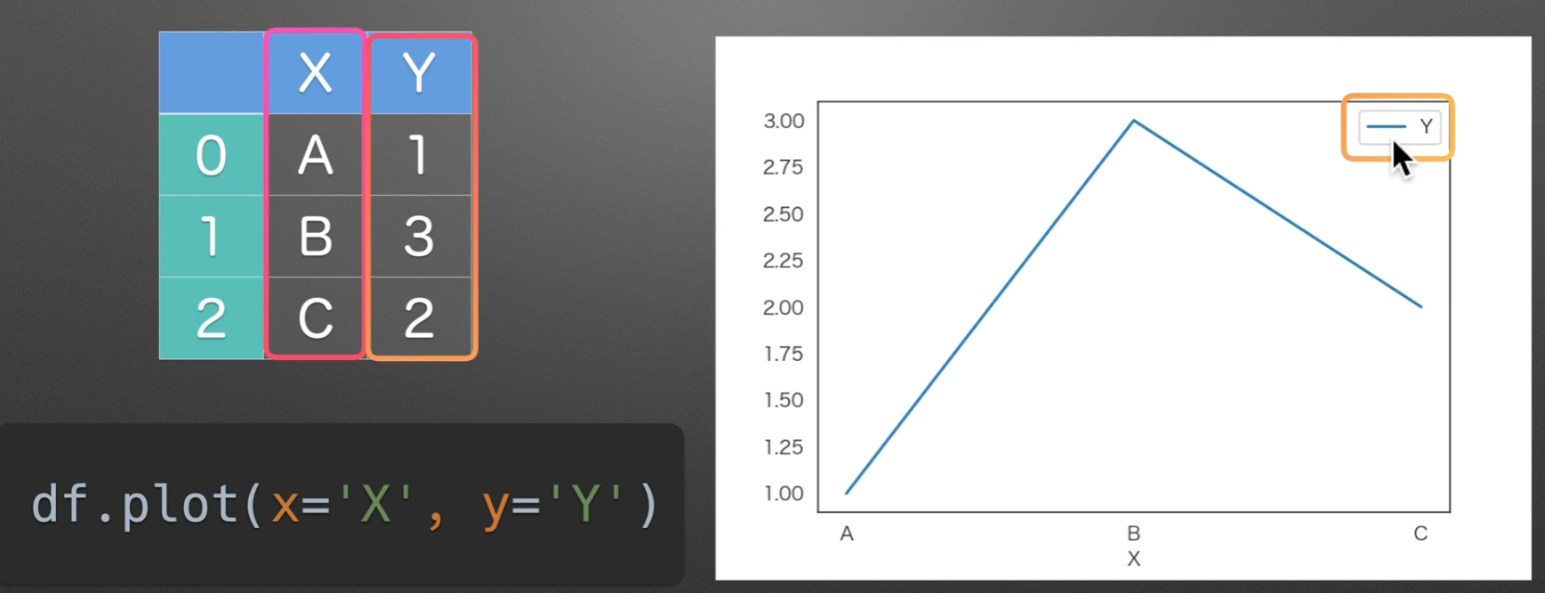
line:直线图
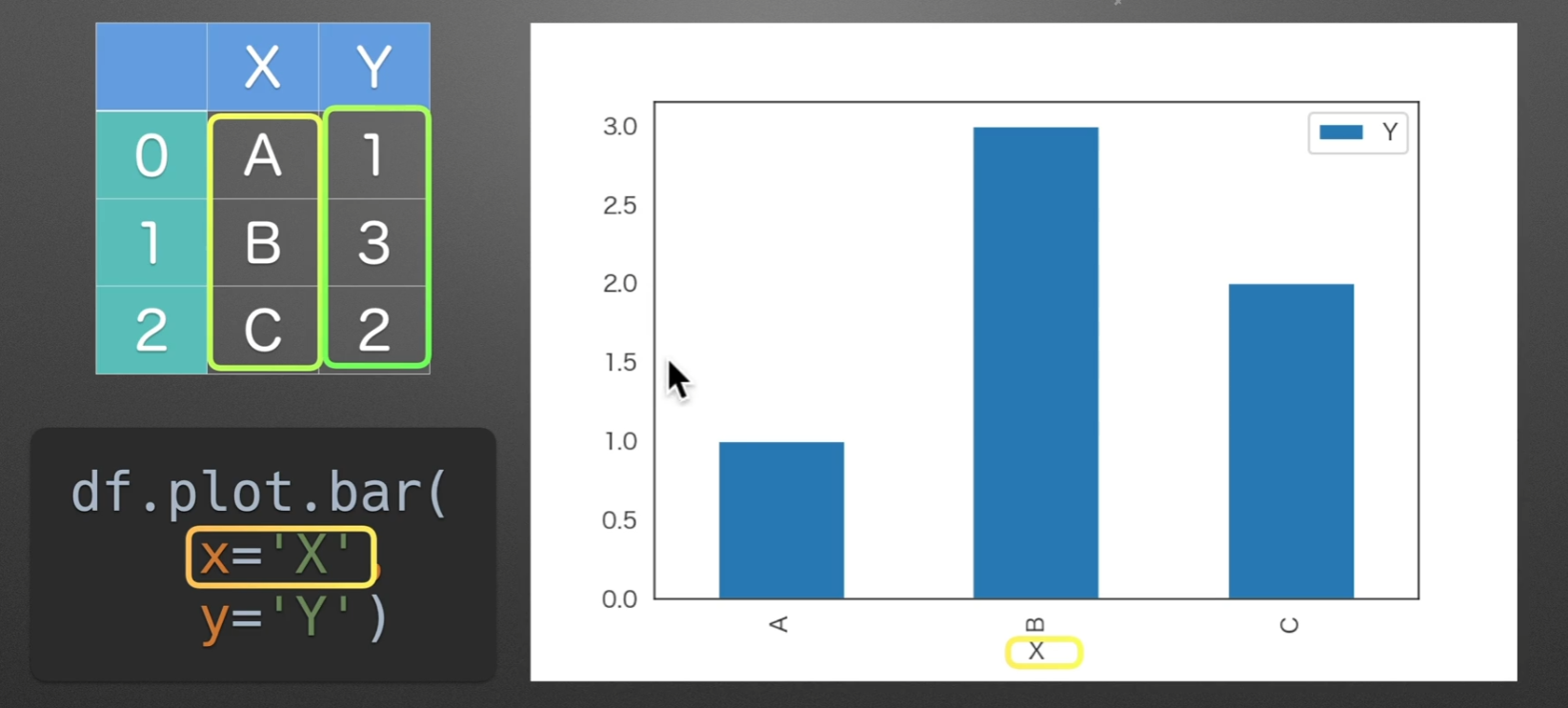
bar:条形图
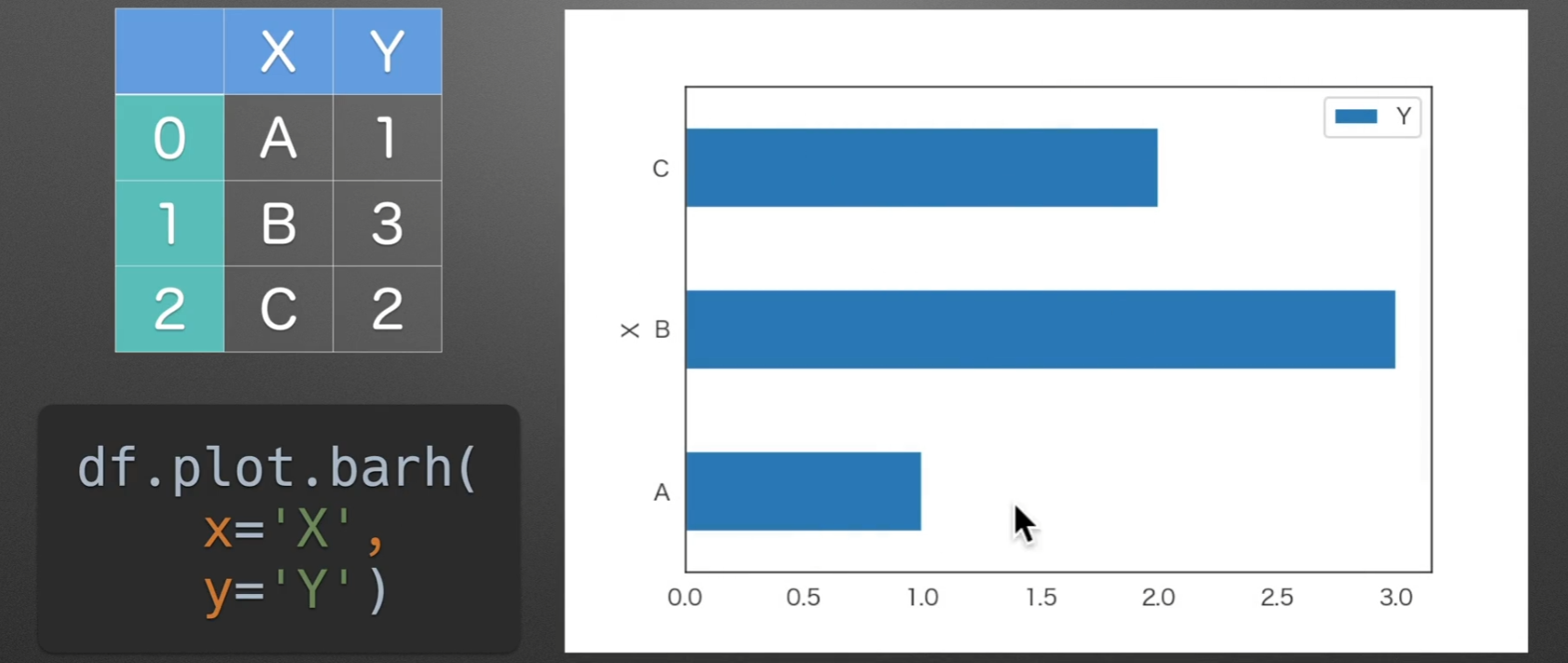
barh:水平条形图
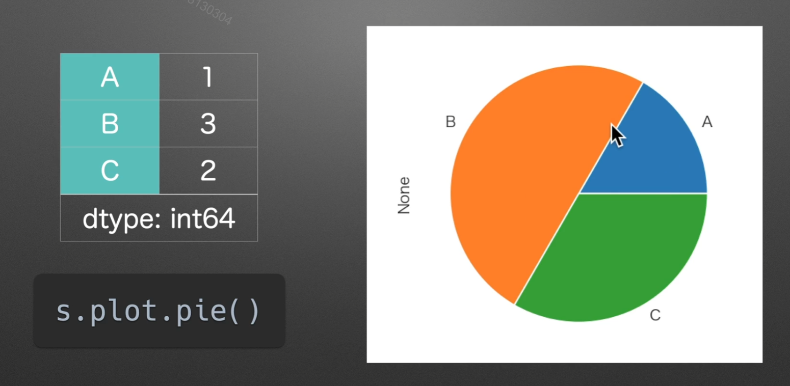
pie:饼图
如果series有一个名字,None就会显示他的名字
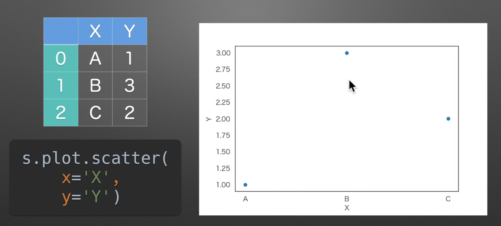
scatter:散点图
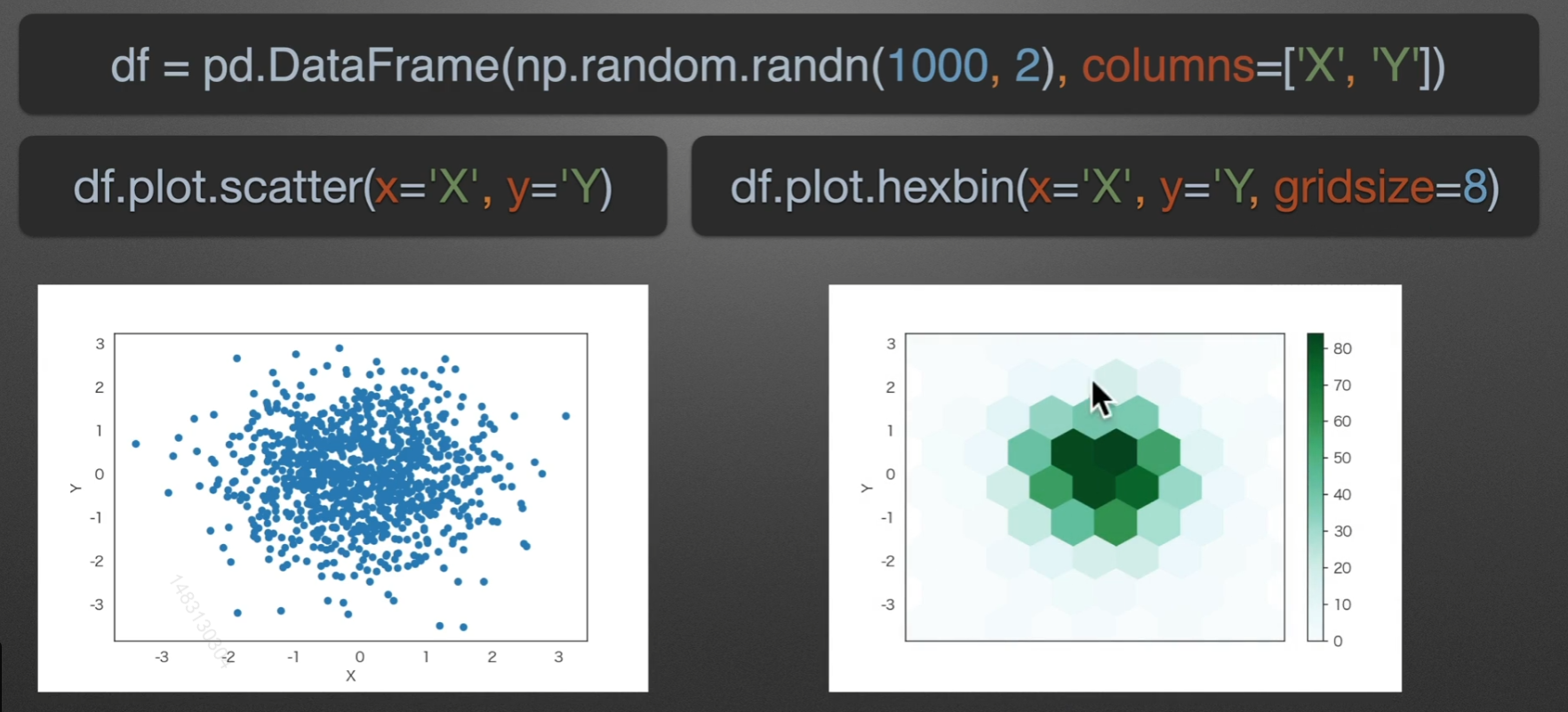
hexbin:六角箱图
颜色越深的地方,六角箱图包含的个数就越多
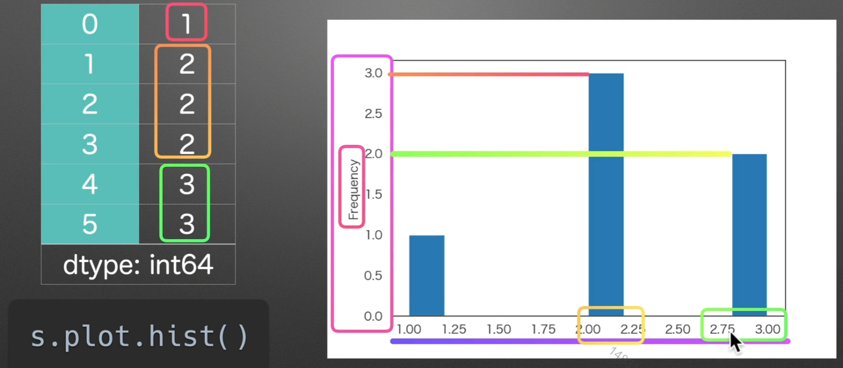
hist:直方图
某个区间的数值所出现的频率
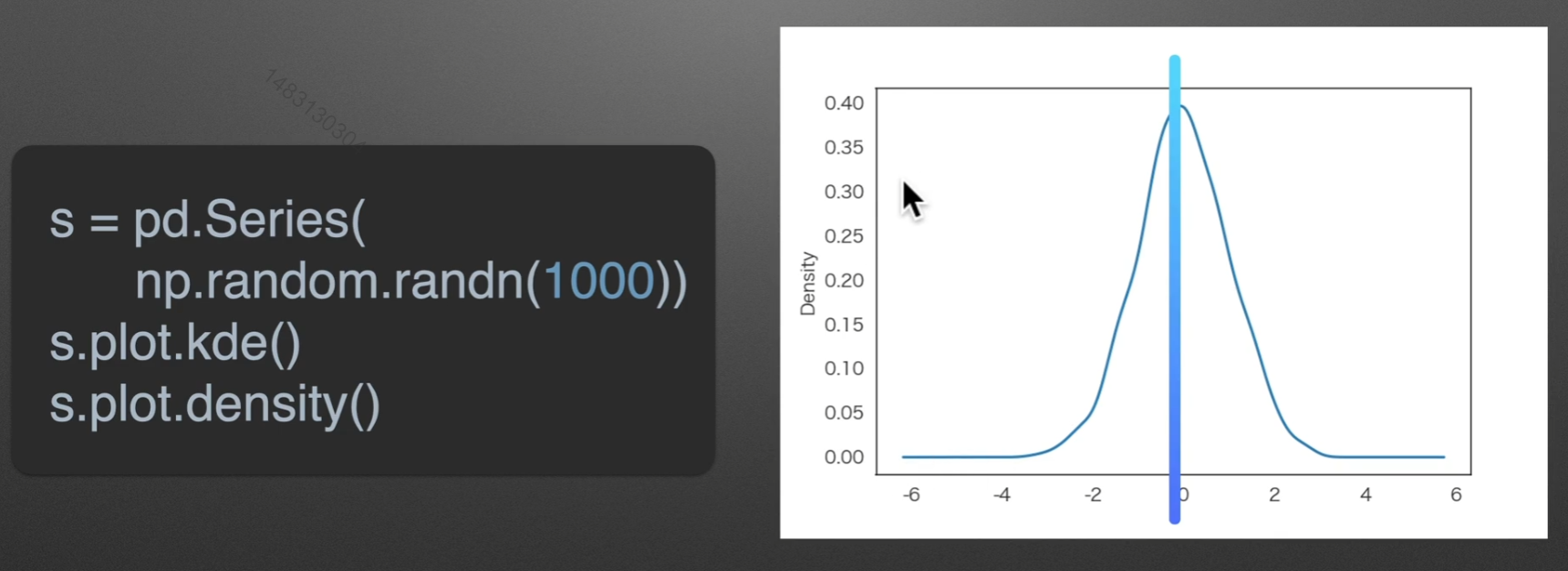
kde:密度图
randn是符合正态分布的,rand不是
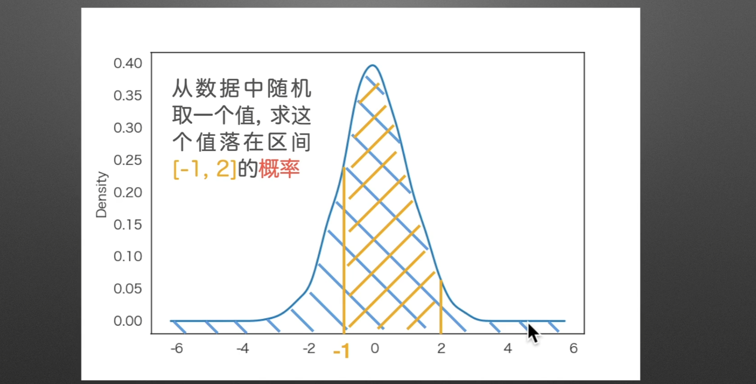
如果求落在某一区间的概率,那么可以转化为求他的面积,因为总面积一定为1
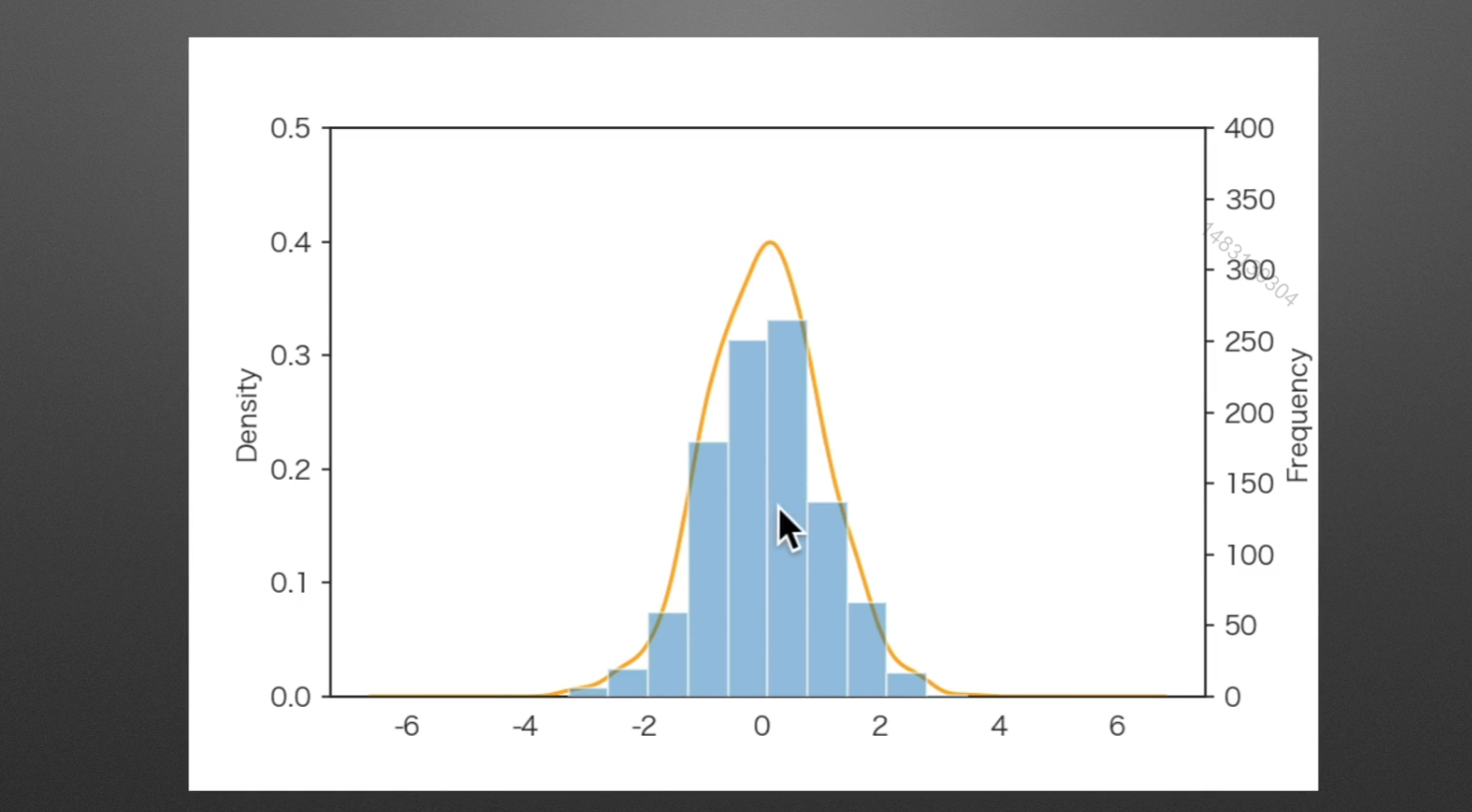
密度图与直方图的比较
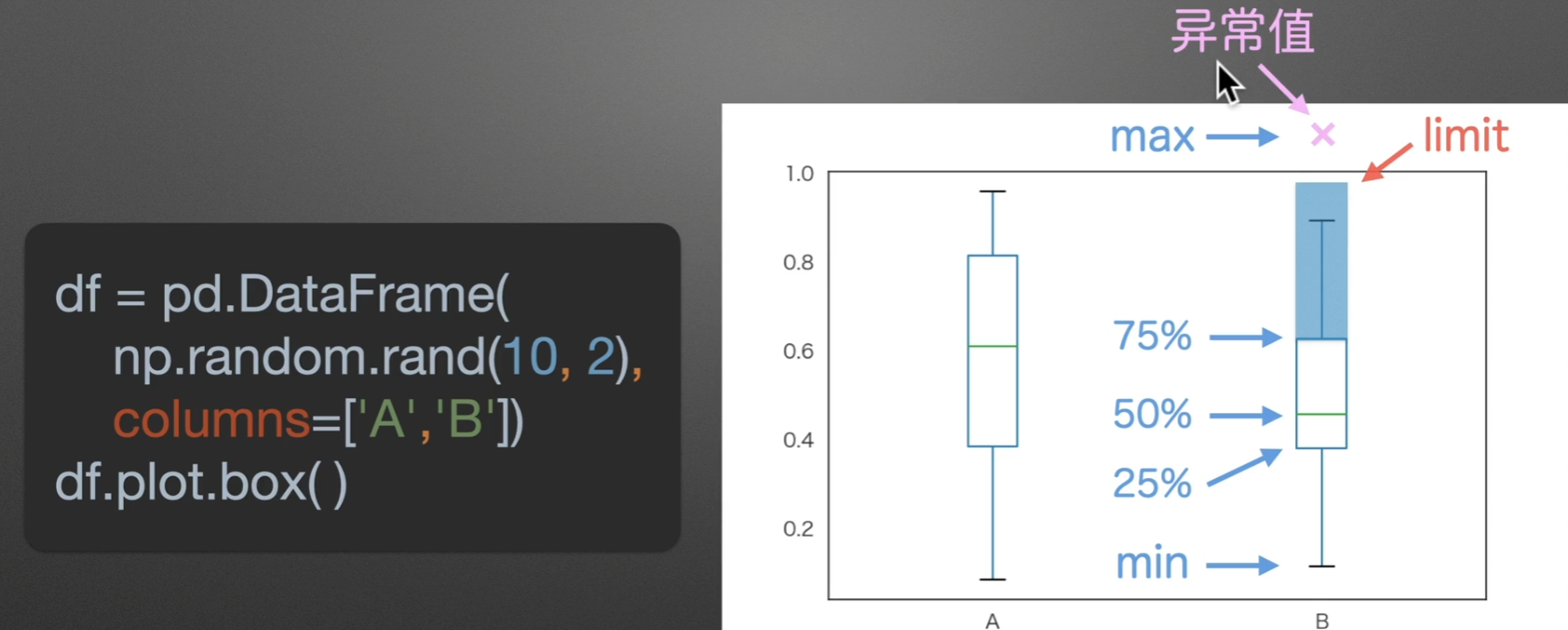
box:箱型图
注意是rand
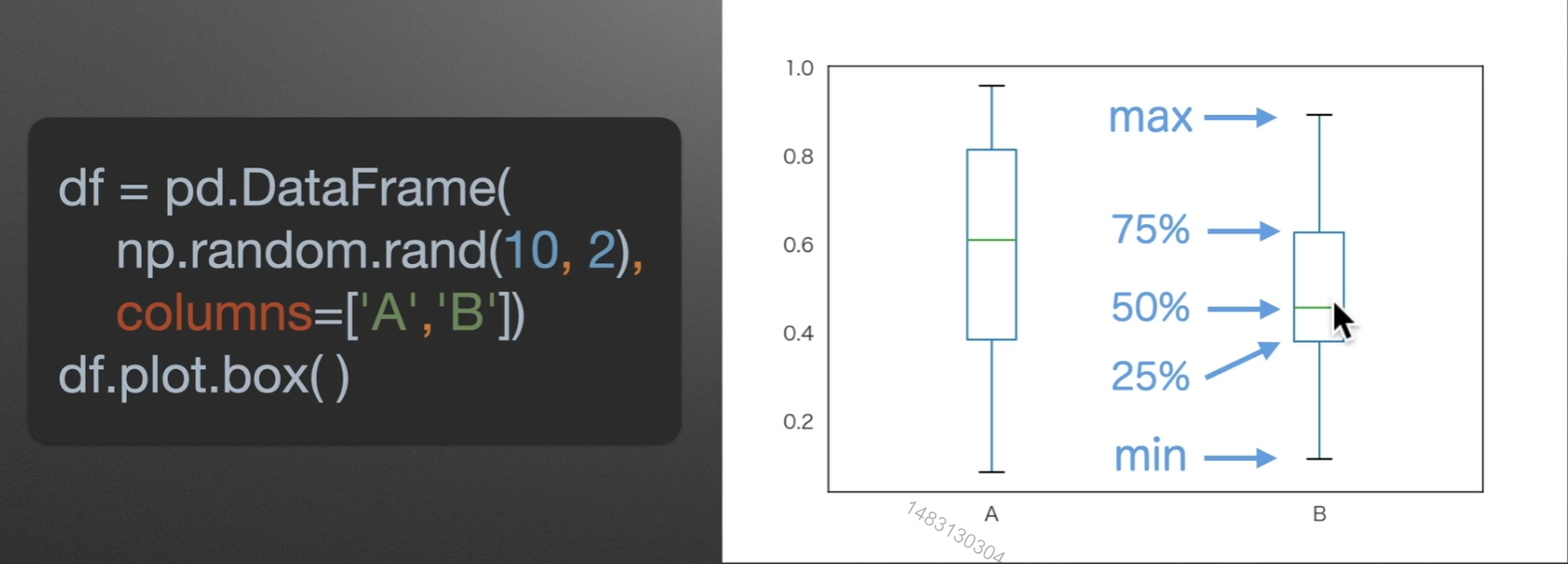
如果有一个点,超过了箱子的2.5倍,自身+自身的1.5倍,那么、就称呼这个点为异常点
另外图上绿色线那里,就是数据最多的位置
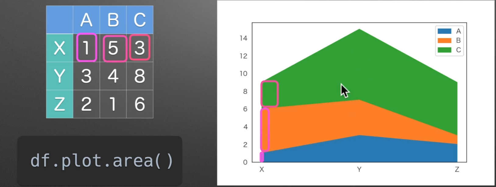
area:面积图
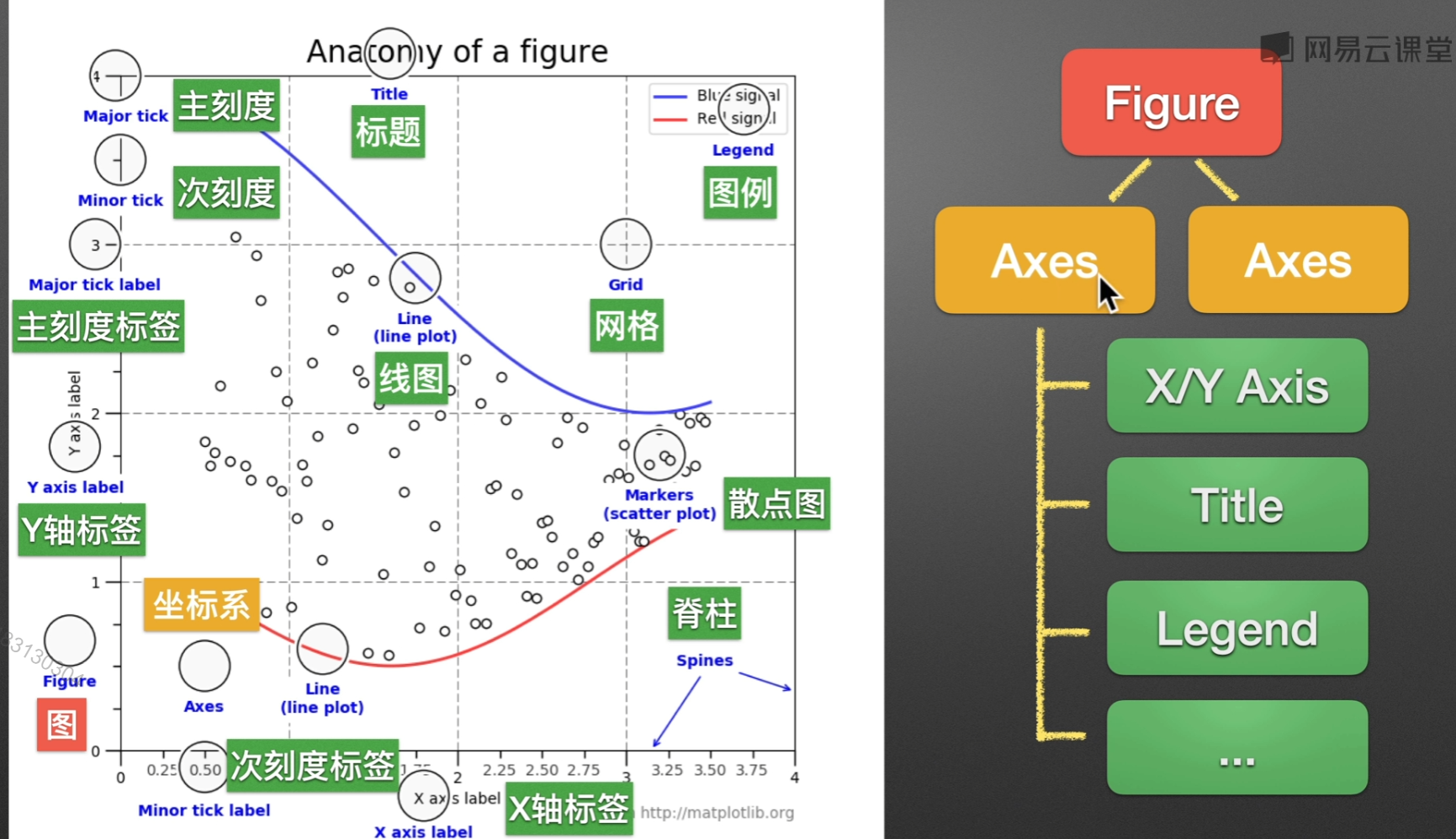
matplotlib.pyplot()
通常绘图都是在Axes(坐标系)来绘制的,一个Figure可以包括多个Axes,Axes是Axis的复数哦
准备阶段
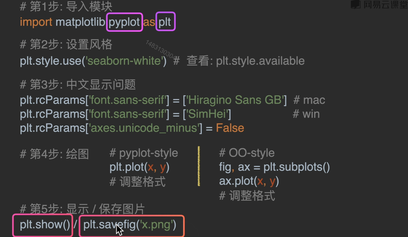
1 | import matplotlib.pyplot as plt |
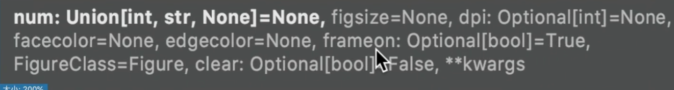
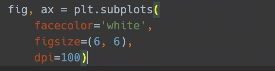
figure()
参数列表:
facecolor,边框的颜色风格
figsize:默认6 * 4(600 * 400),可以调整尺寸
dpi:越大越清晰
pyplot-style
实际使用时建议风格二选一
还有一些值得注意的参数:
title:标题而已啦
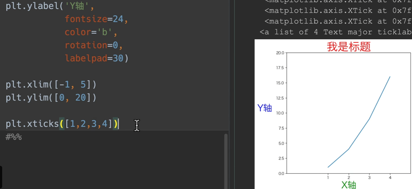
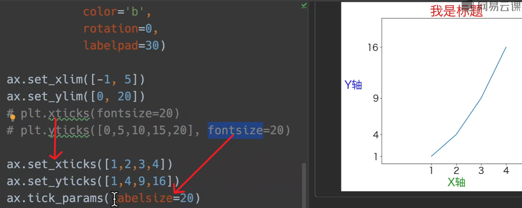
ylabel,xlabel:设置x、y轴索引 可传入参数fontsize设置字体大小,color设置颜色等等,具体就到时候再搜,有一个以前一直不知道的可以设置的参数,将y轴转正,为
rotation=0,还有将这个label往外往里移动的,labelpadxlim,ylim:限制x、y轴取值,传入列表,输入左右两端的值即可
xticks:同样传入列表,具体见下图
grid:是否使用网格
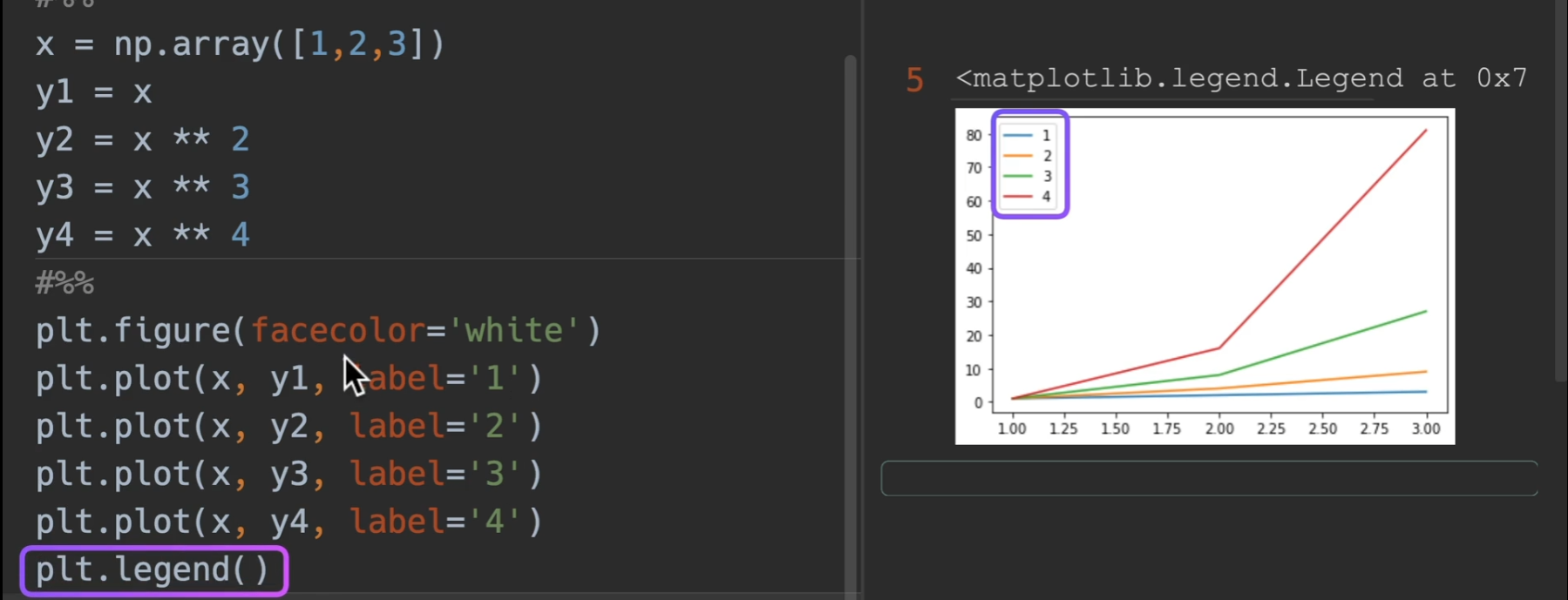
legend:显示每个plt的标签 一个参数 loc= 就是legend的位置,默认是自动选取最好位置
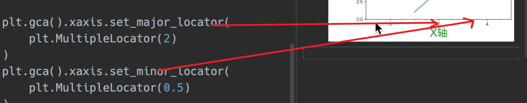
gca:获取当前坐标系,下面这种调用形式设置主次刻度
OO-style
其实大部分情况就是把plt.xxxx调用换成面向对象获取到的轴来调用,这里的话就是用ax.xxxxxx
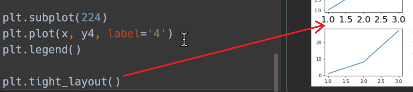
绘制多图
一般来说,下面这种绘图方法,使用面向对象,不适用plt
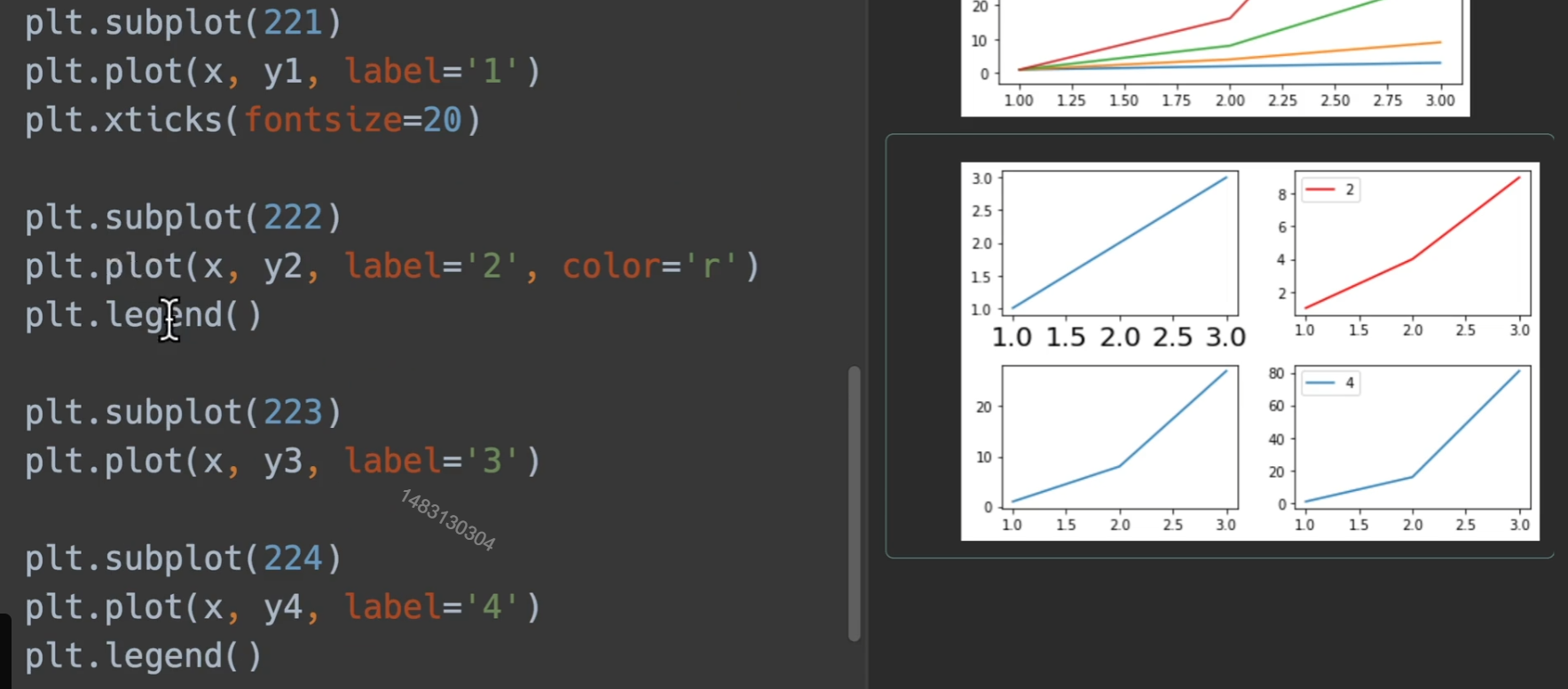
tight_layout()使得均匀分布,不会让大小与其他图碰上
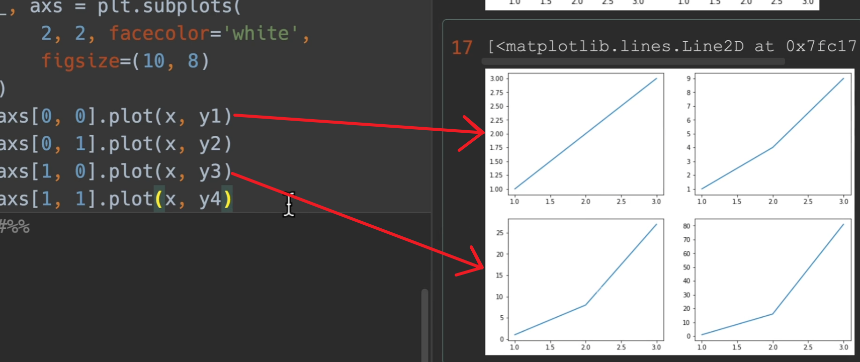
面向对象的形式

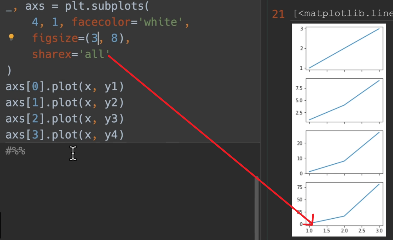
nrows、ncols,多少行列的大图(每一行,每一列,都有几个小图)。
sharex和sharey,是否共享x/y轴。
facecolor:背景白色。
figsize:大图的尺寸 例如10 * 8(1000 * 800)
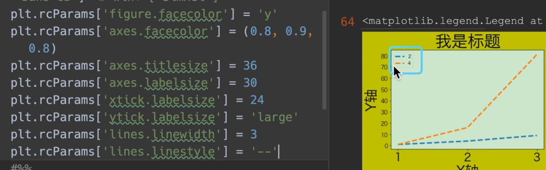
rcParams全局参数
Customizing Matplotlib with style sheets and rcParams — Matplotlib 3.5.3 documentation这里是可以设置的参数
colormaps
colormaps,cmap,cm:颜色表
available显示他的可选参数
也可自定义colormap
设置颜色、线条、点样式
color
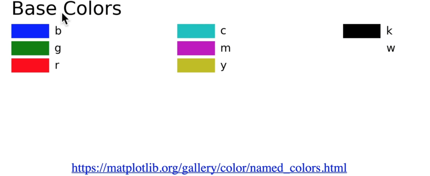
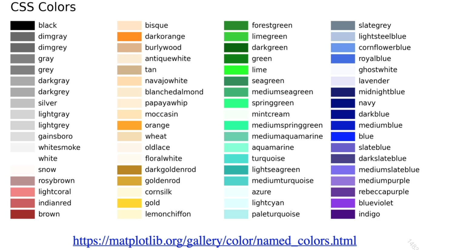
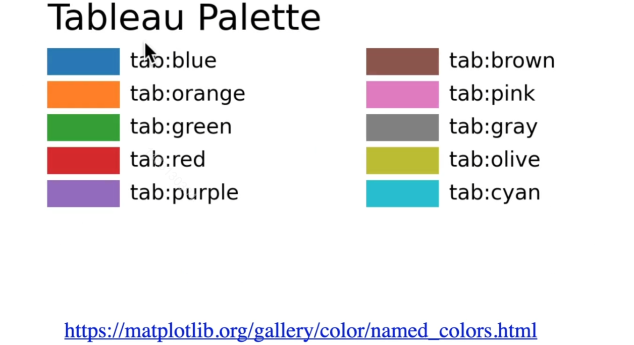
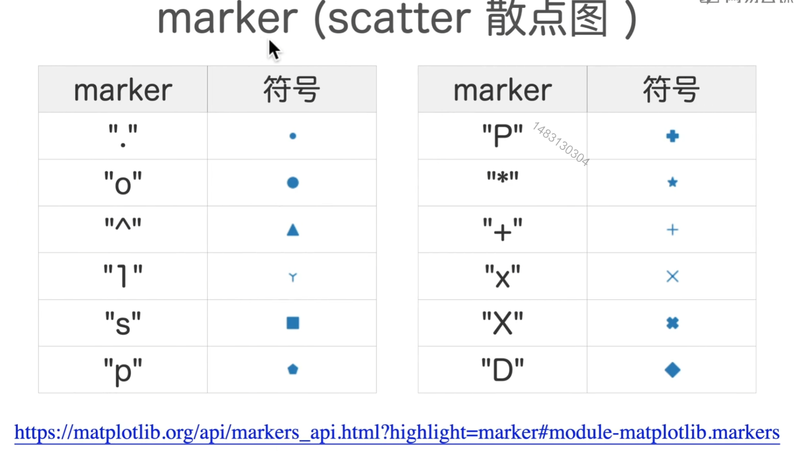
marker
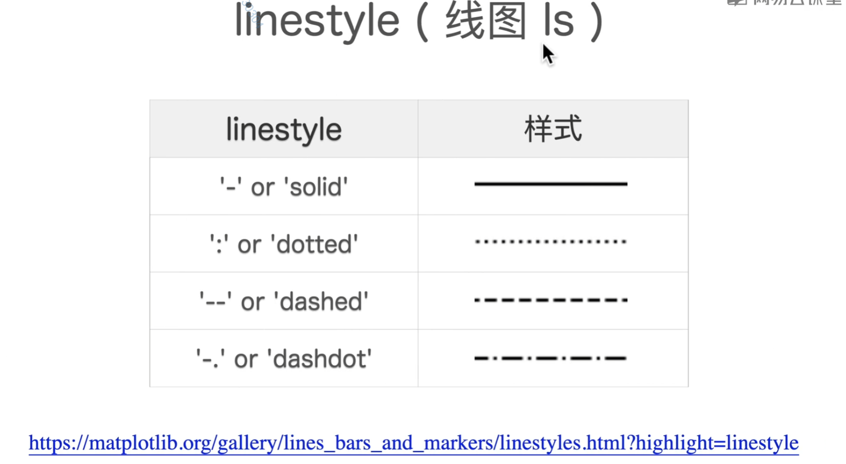
line
seaborn
seaborn: statistical data visualization — seaborn 0.12.0 documentation (pydata.org)
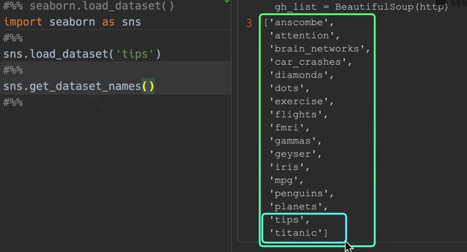
load_dataset()
默认有一些可供练手的数据集
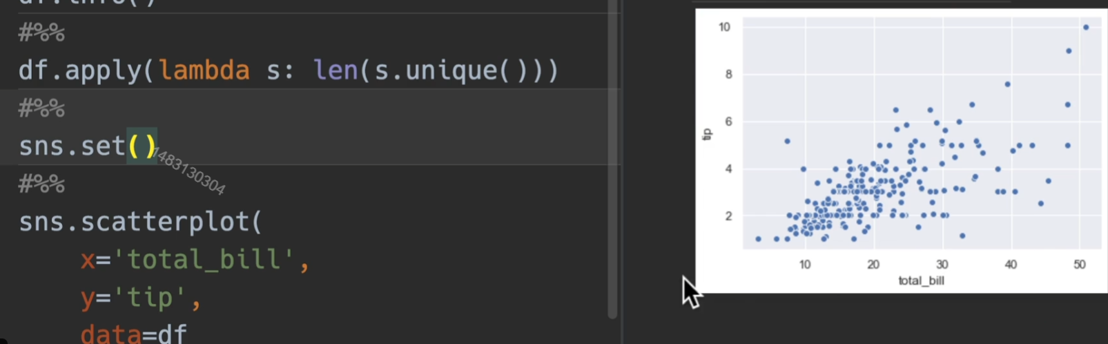
set()
这是默认画出来的图的风格
我们在画图之前set一下,会输出seaborn默认的风格和参数

context可选值仅有{paper, notebook, talk, poster} 主要改变的是x,y轴字体的比例,他们的比例是**{0.8 1 1.3 1.6},不过通常用font_scale**=1.6这样直接替代比较直观
style: {darkgrid,whitegrid,dark,white,ticks}
palette(调色板):推荐使用muted
rc:可以覆盖以上所有,所以肯定不会用,没这需求

seaborn图例关系
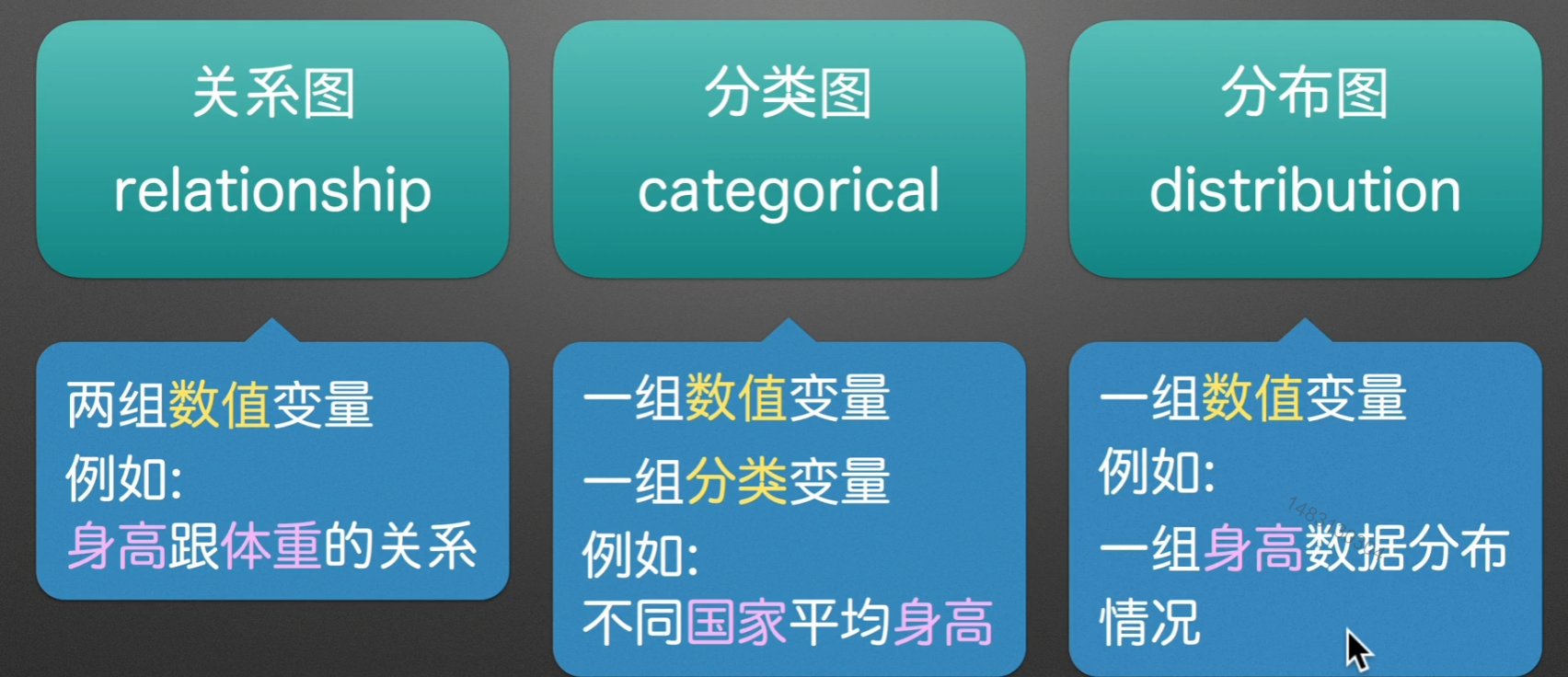
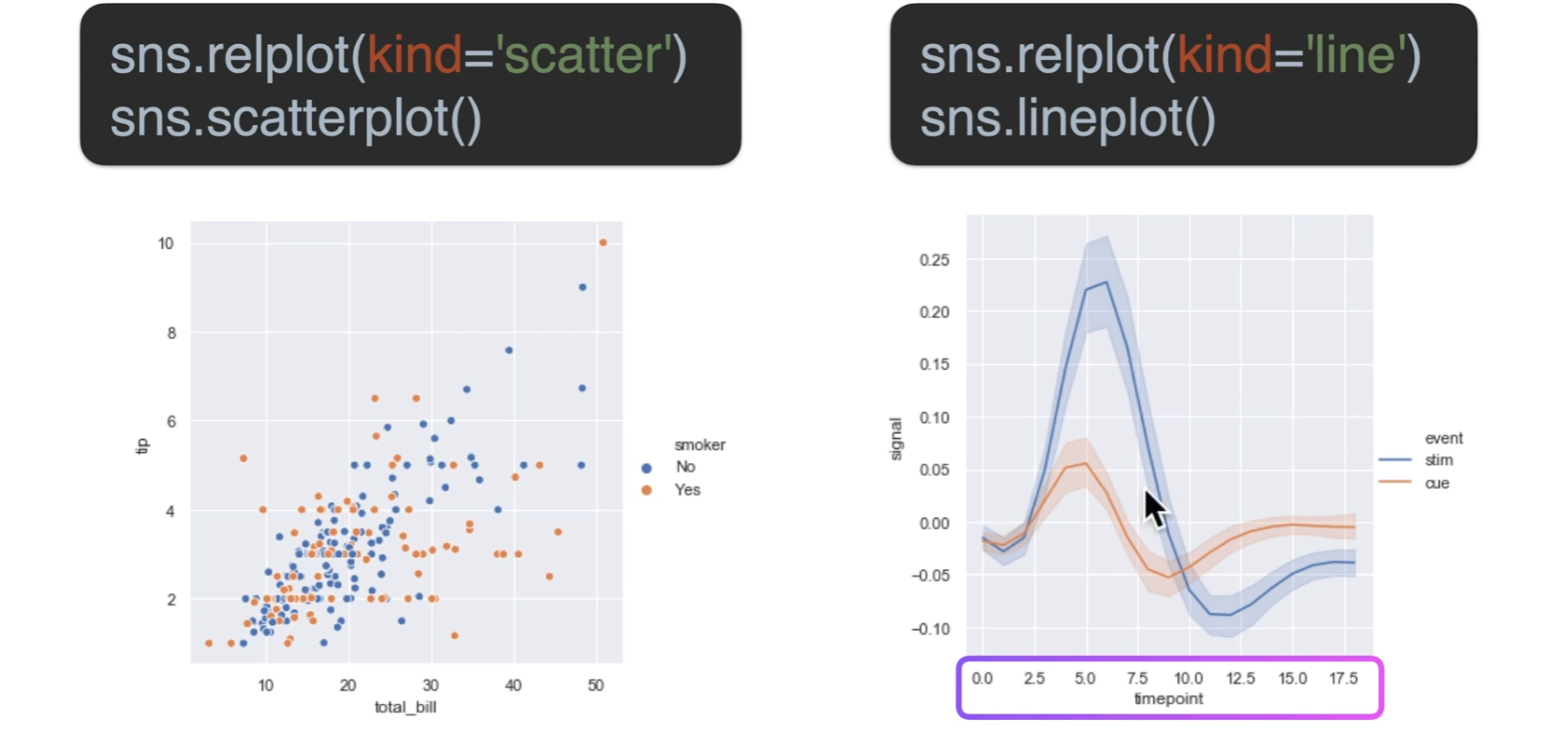
关系图
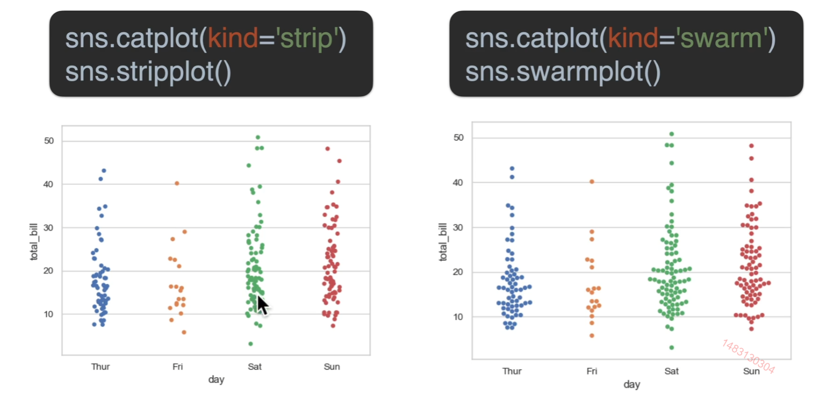
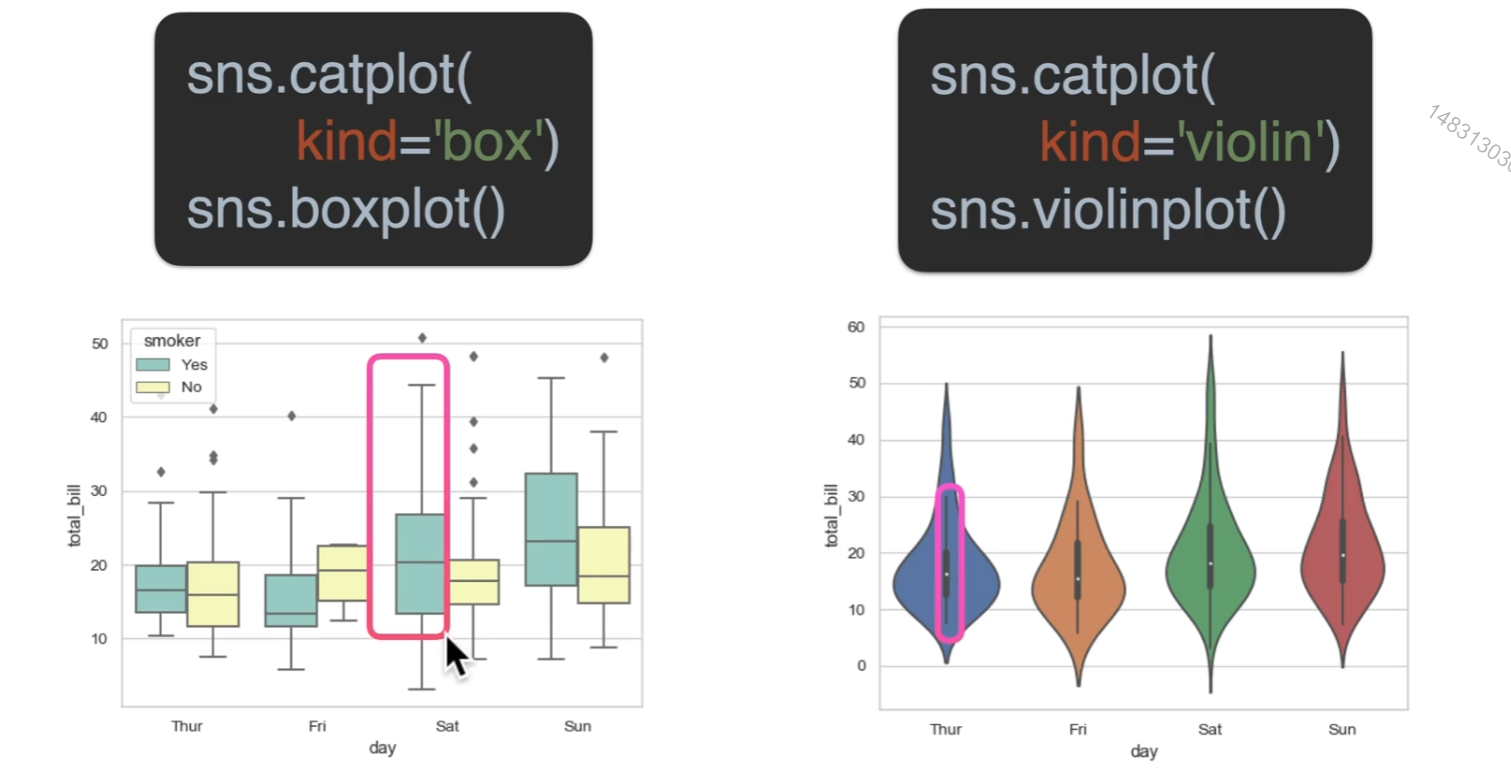
分类图
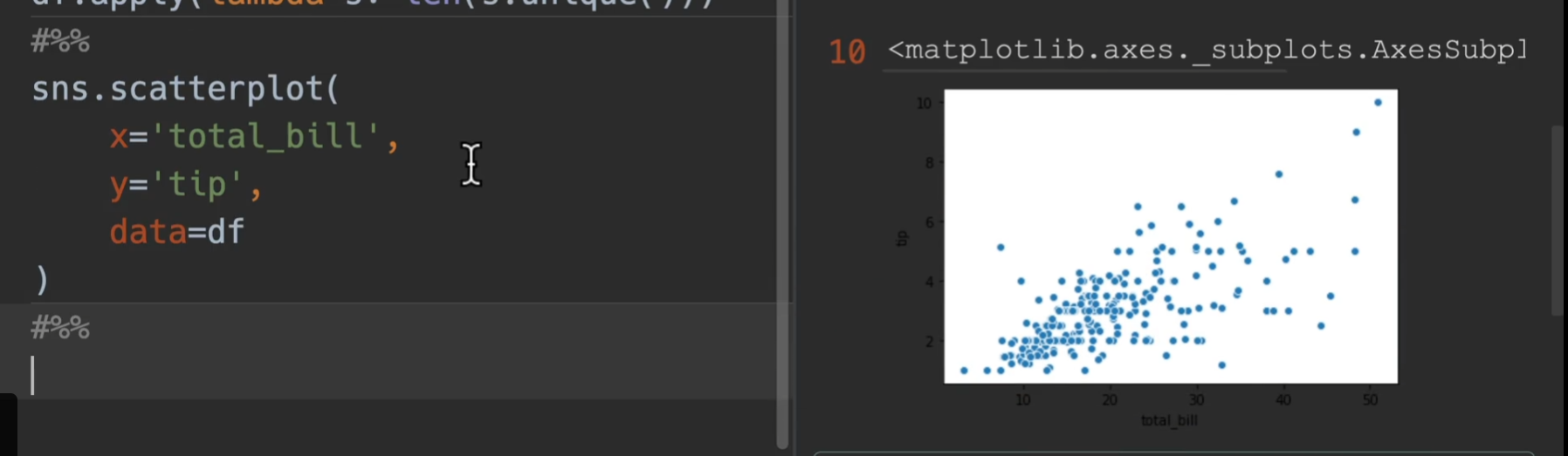
散点
大同小异,左边加了一些随机抖动,右边绝对不会重叠
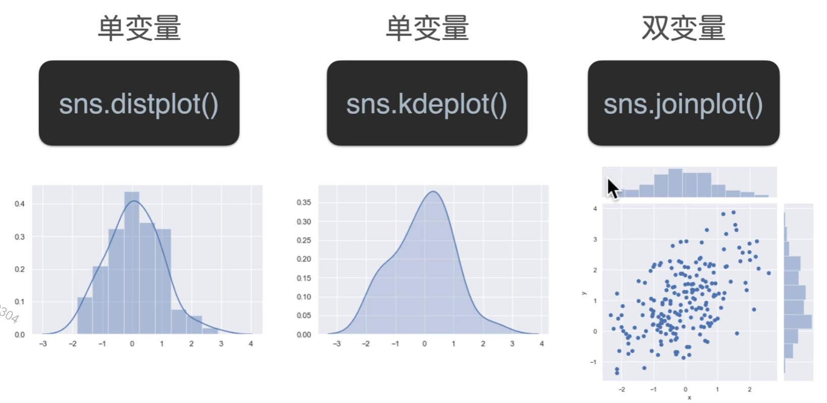
分布
超过上界和下界的都可以看做离群点,小提琴图可以看做是密度图和箱型图结合在一起
估计
箱型图的那条线,表示的是一个置信区间,就是有95的概率落在这条线内(可以自定义),中间这个图,长方形最上端表示的是这个数据的均值位置,右边那个图,是指数量的累加,自然就无均值的意思
分布图
双变量多出来的那两块可以指定为直方图,也可以指定为密度图
重点
Olympic实战
数据集介绍
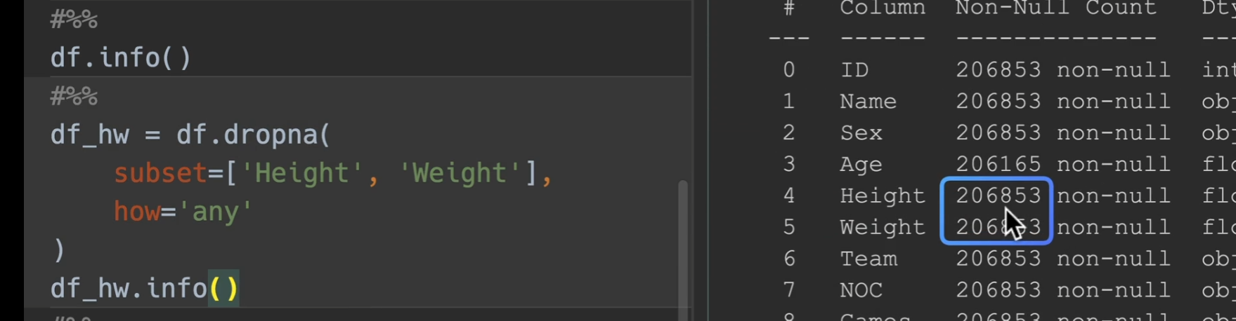
合并检查数据
我们合并两表,并且发现数据集height和weight比起别的少了许多,又因为基数很大,所以把缺少的地方都删掉,并将其存放于一个变量

删除完毕后
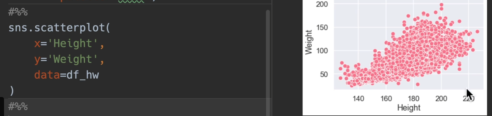
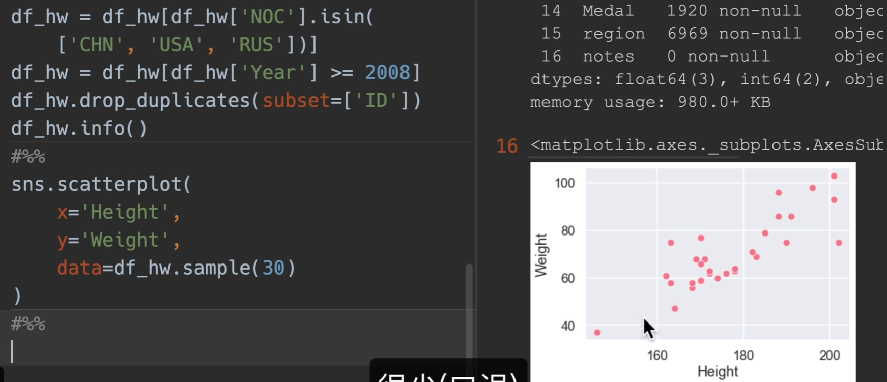
散点图绘制
scatter进行绘图,发现数量太过于庞大
进行筛选,仅显示CHN,RUS,USA,并且年大于2008,并对运动员进行去重
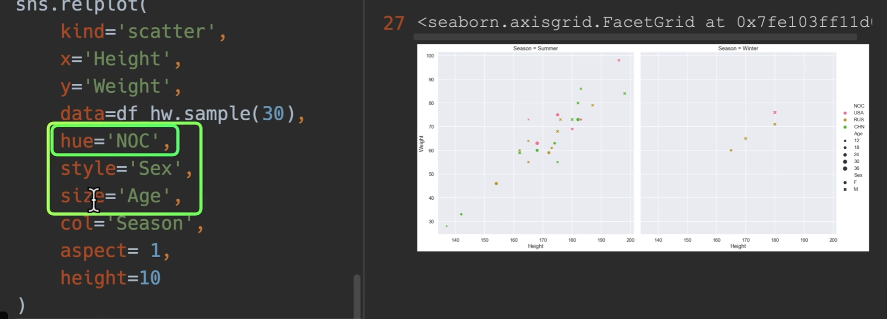
这样还是有6000多个点(没去重成功),最后再随机采样30个点,这样的话点数就会很少了

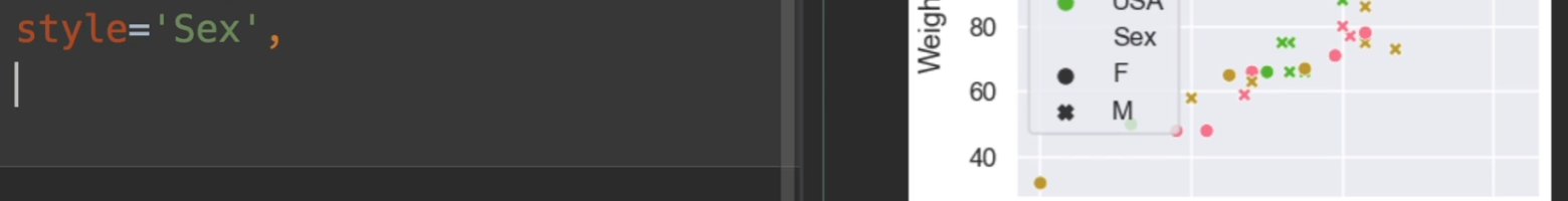
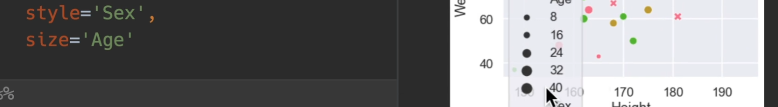
最重要的一个参数是hue,语义的意思、颜色的语义,帮助我们分类,style,风格的意思,也帮助我们分类,区分点的类型,还有一个是size,使用一个数值来表示它的大小
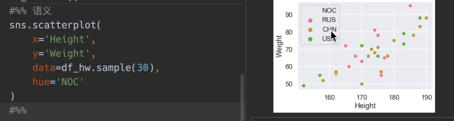
所以说一个表格最多可以传入五维的关系
如果我们换用relation图,然后kind设置为scatter,然后增加一个参数 col 甚至还可以增加一个维度!!!
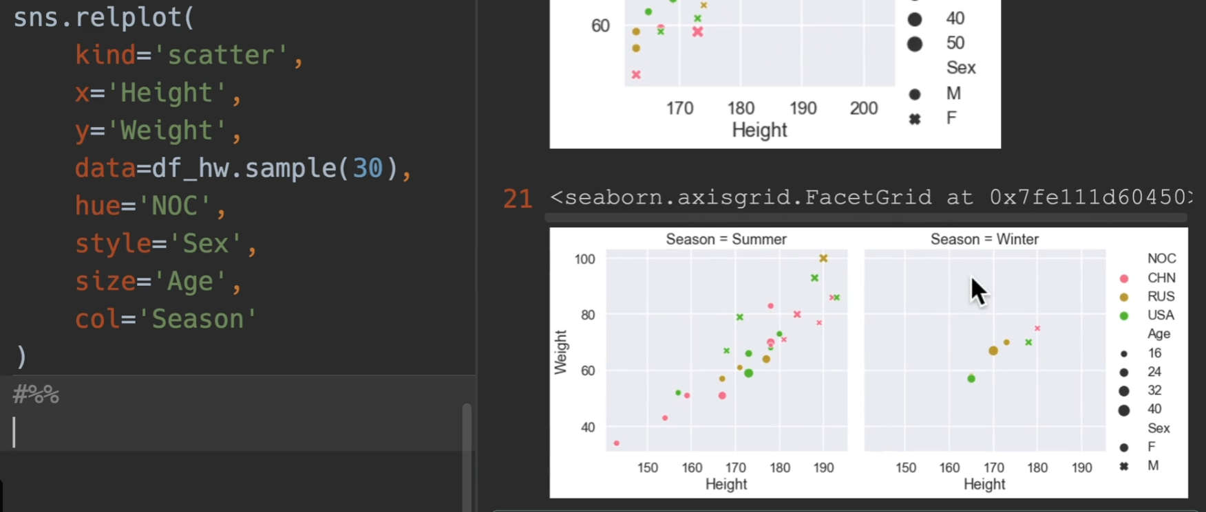
传入aspect,这个是设置轴的长宽比,这里设置为3:2,也可以设置整个图高度height,每一个高度代表72个像素
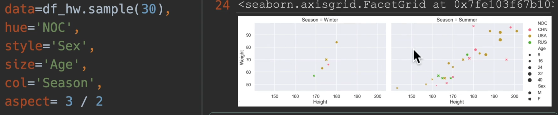
对于语义参数,我们优先选用hue,因为style和size看上去没有hue那么明显。
最后是一些花里胡哨的演示
1 | import seaborn as sns |
线图
line:线图强调连续性,通常是时间的连续。也就是x是年,y是一个数值类型
最简单的画法演示,最外面浅色的是属于置信区间,实线就是平均升高
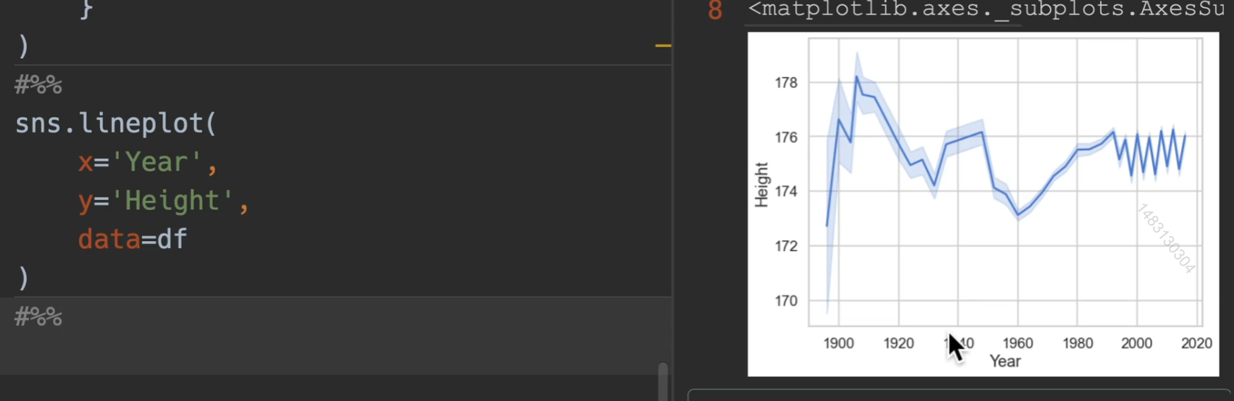
下图体现出他是分组求均值再进行排序,并且如果数据出现空值,会双双删掉
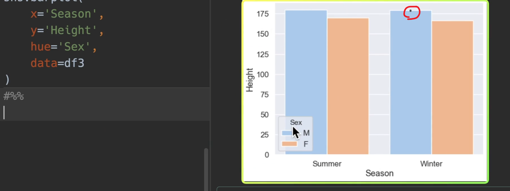
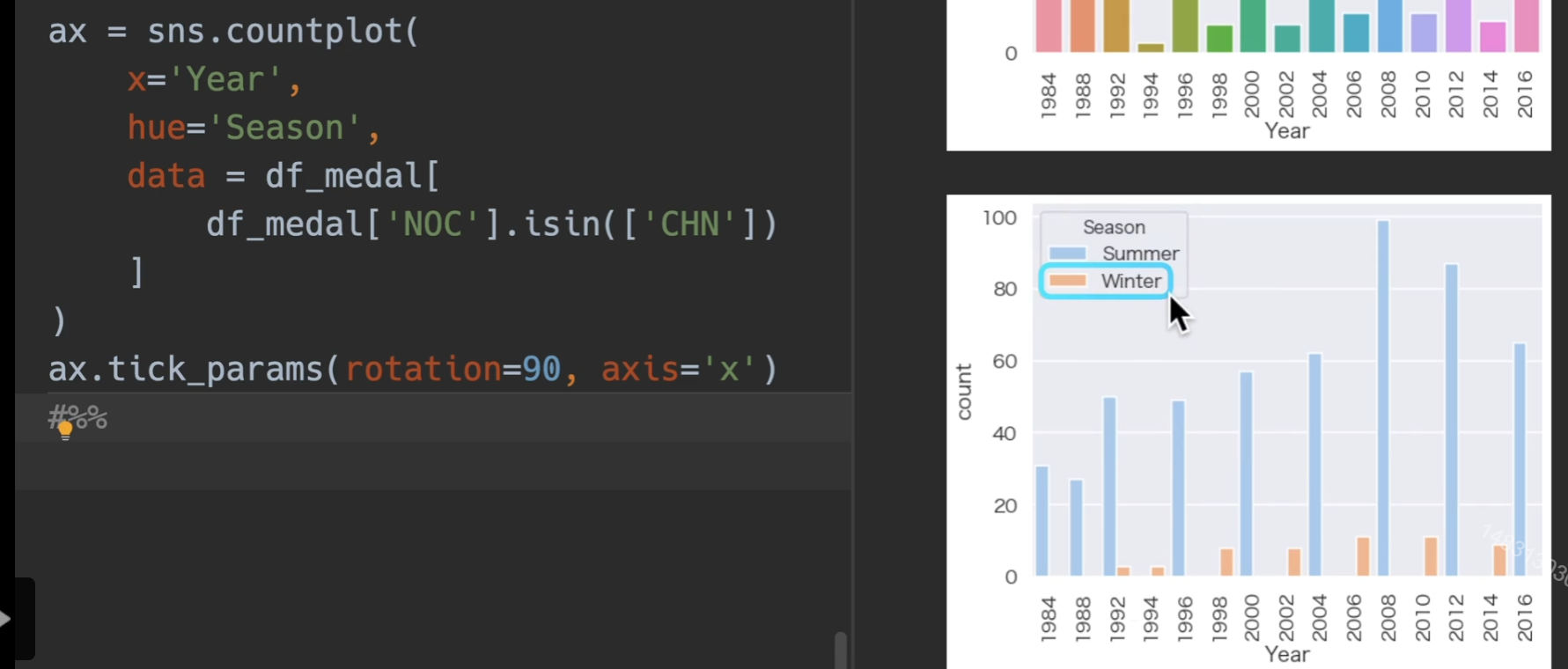
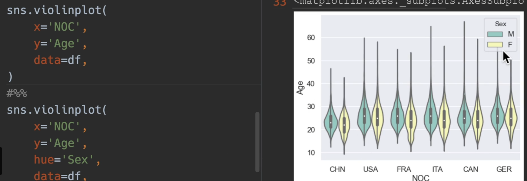
我们观察上上图,最后出现了锯齿状,是因为冬季夏季奥运会的缘故,因此用hue进行作图
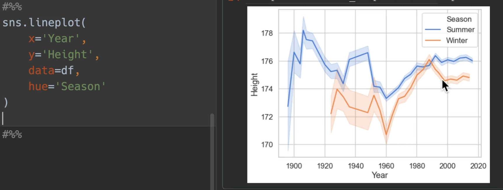
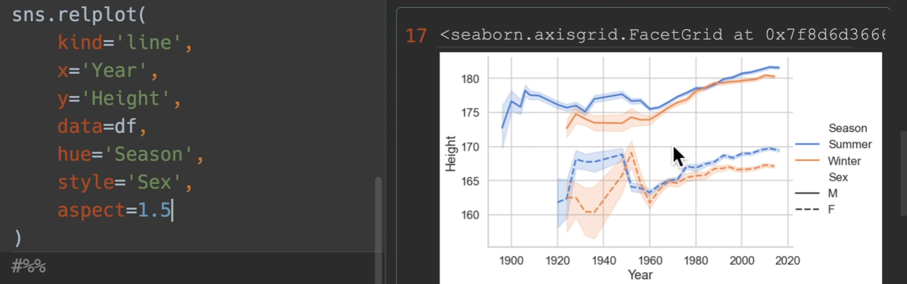
如果用relplot,可以使得图例跑到外面去,从而更加美观(另外新增了sex)
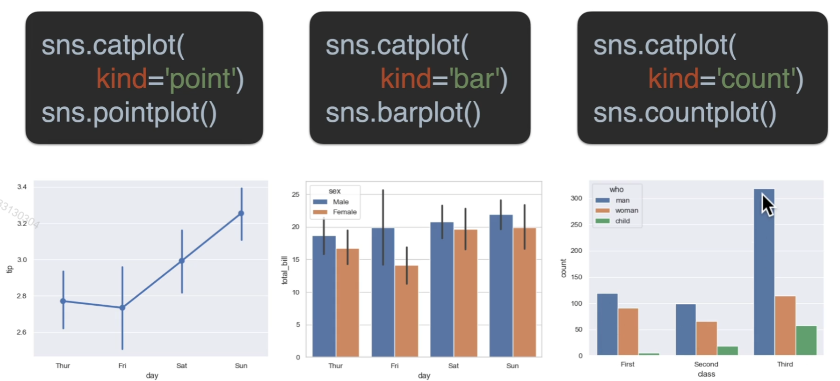
条形图
两种方式均可

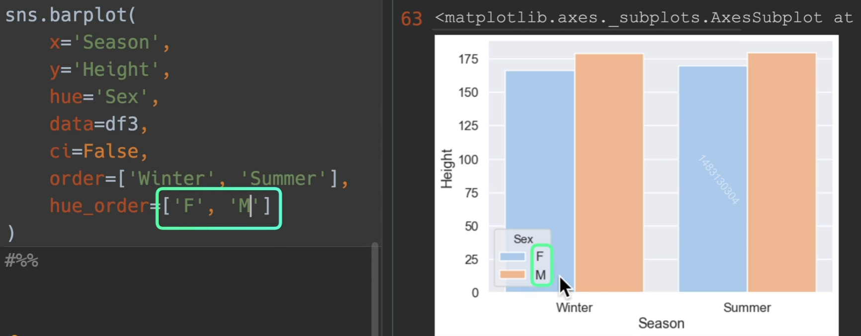
这个小点是置信区间,也可关掉,ci=False
另外order可以进行参数之间的排序
数量条形图
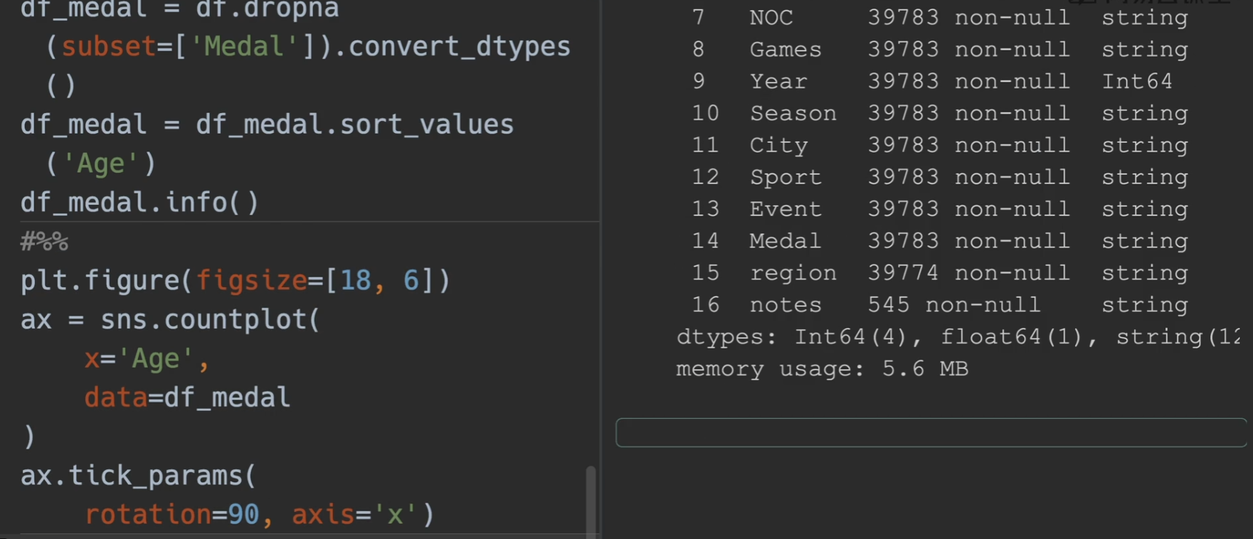
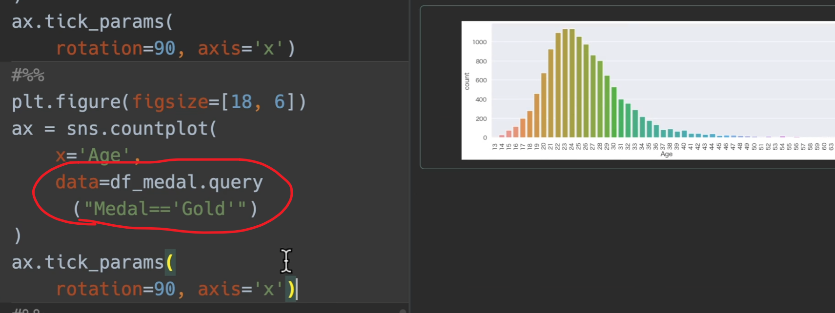
这次我们对奖牌数量进行处理,用奖牌和年龄段进行分析,首先删掉所有None(没获奖的),转换类型,将奖牌对年龄进行排序,然后把x轴转换90度
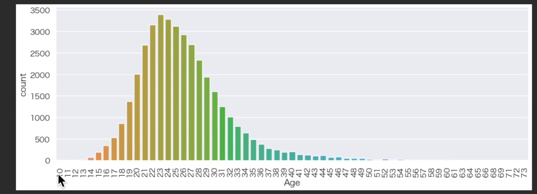
所以可以看到运动员职业生涯的巅峰就在二十三二十四左右
选取拿金牌的人
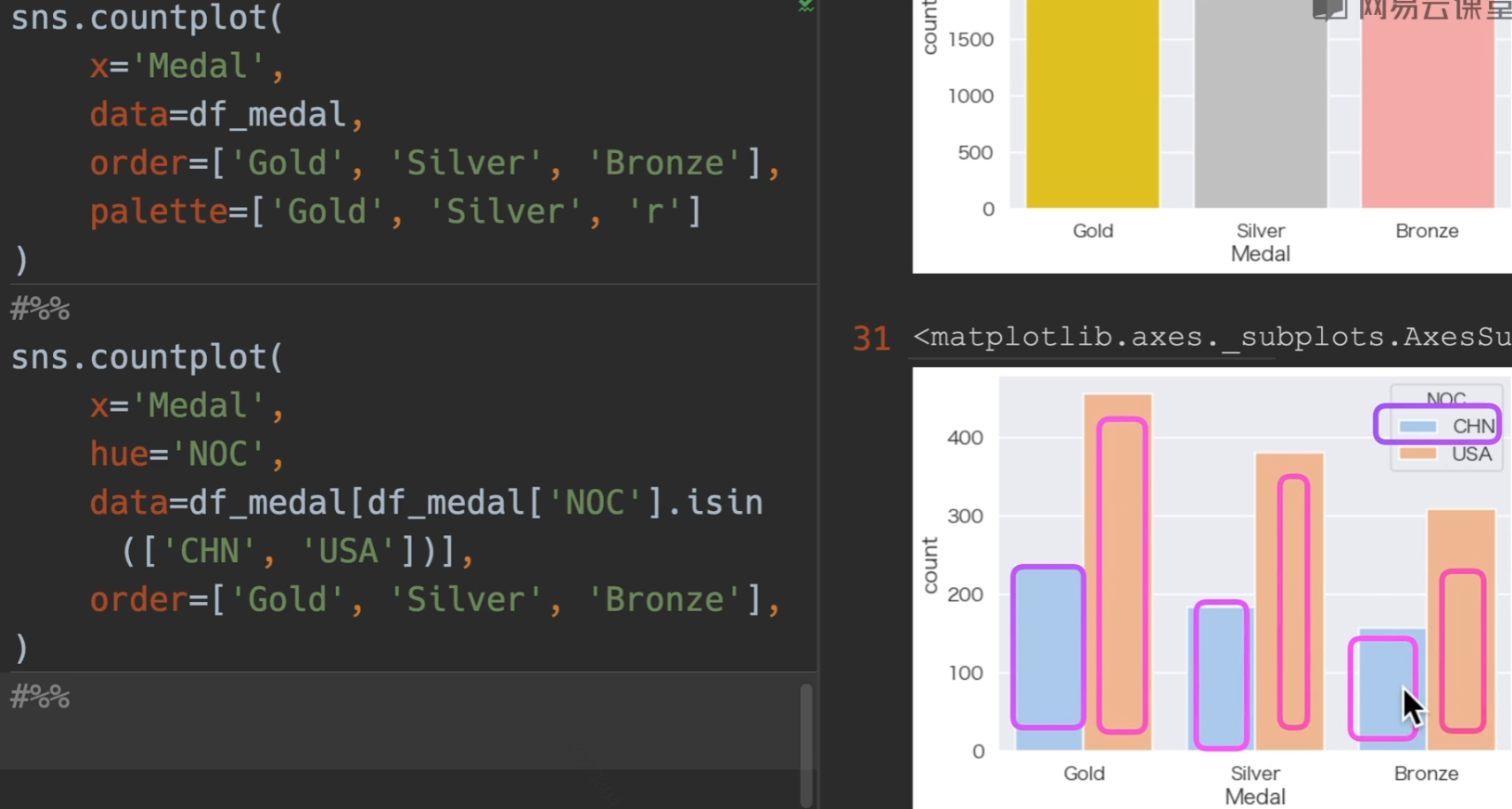
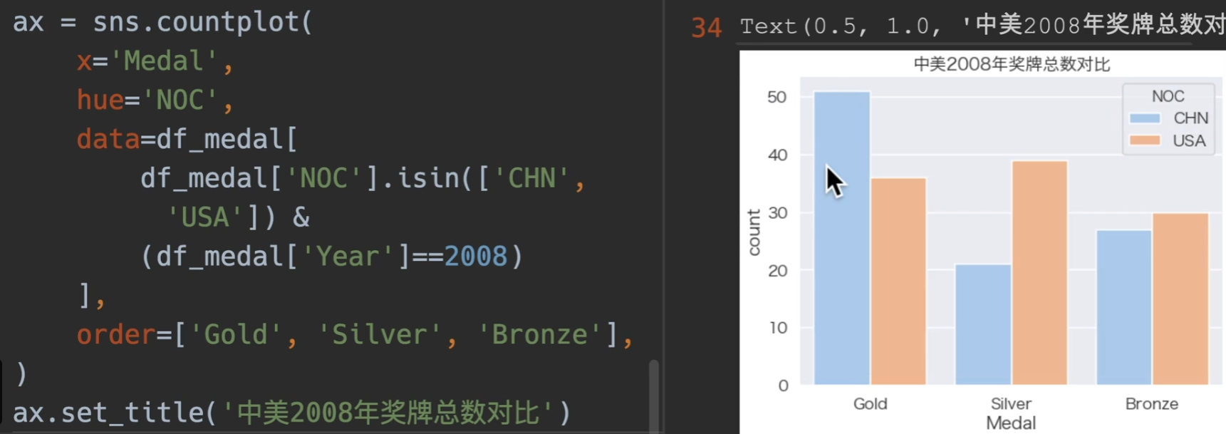
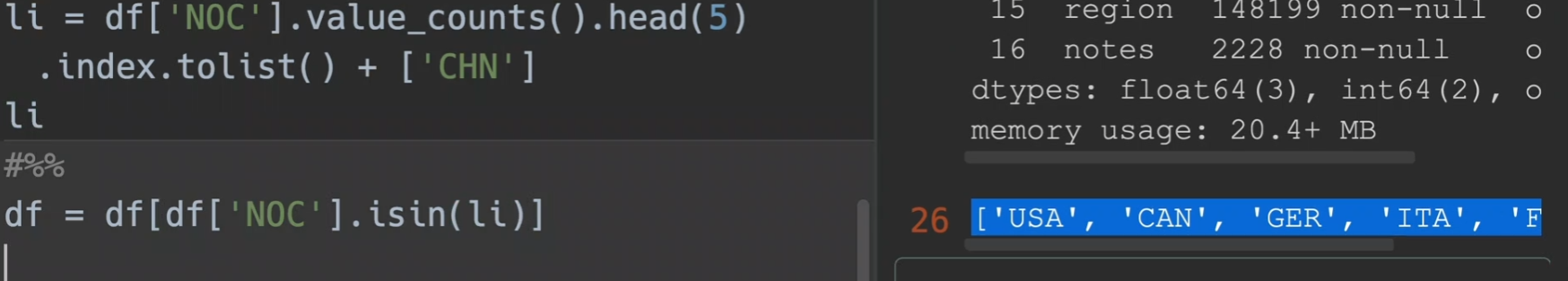
分析国家拿奖牌的情况,我们先进行去重,也就是对同一届奥运会,同一个事件,同一个奖牌,只保留一个,且只取1984年以后的数据来进行对比
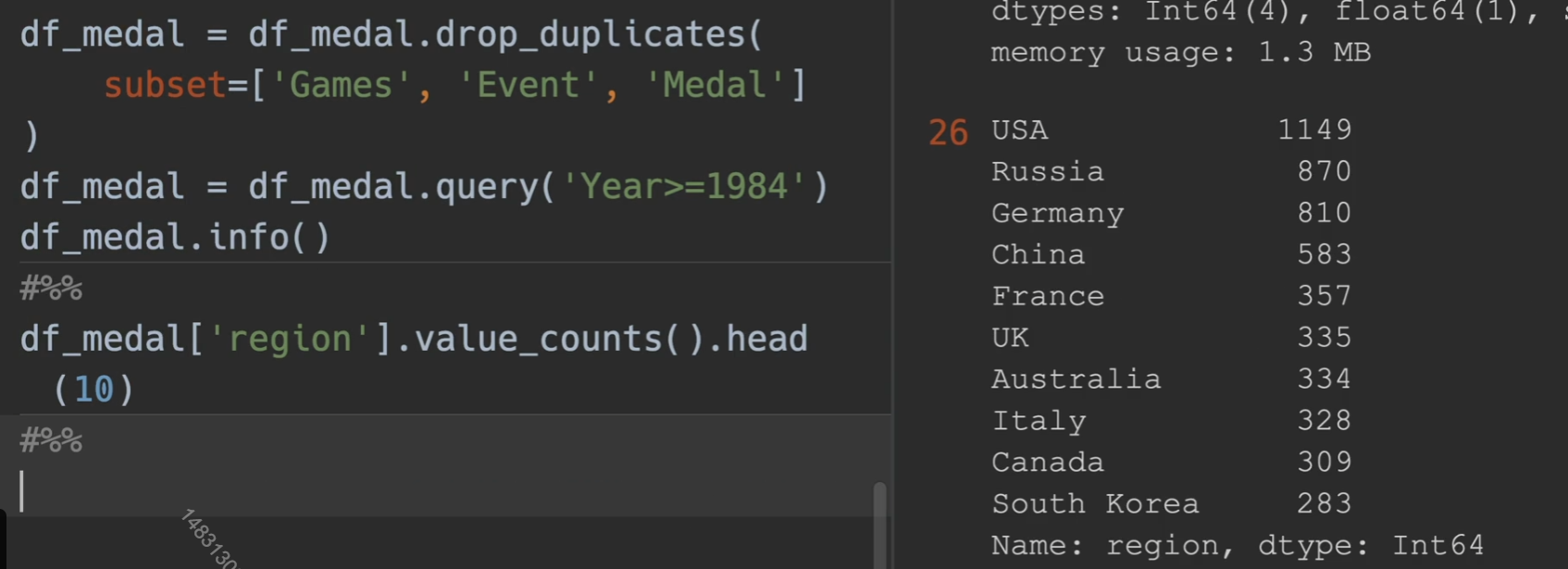
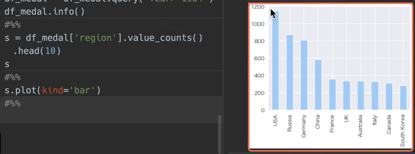
排序中国和美国的奖牌数
08年奖牌数
我国奖牌数
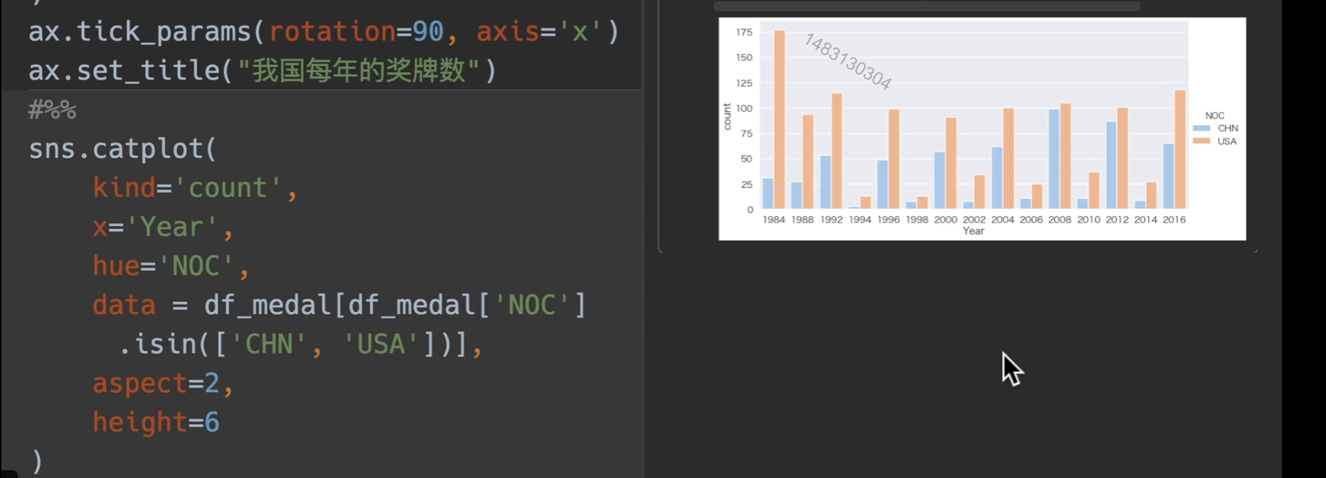
使用catplot展示
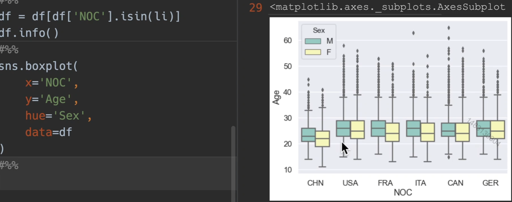
箱型图

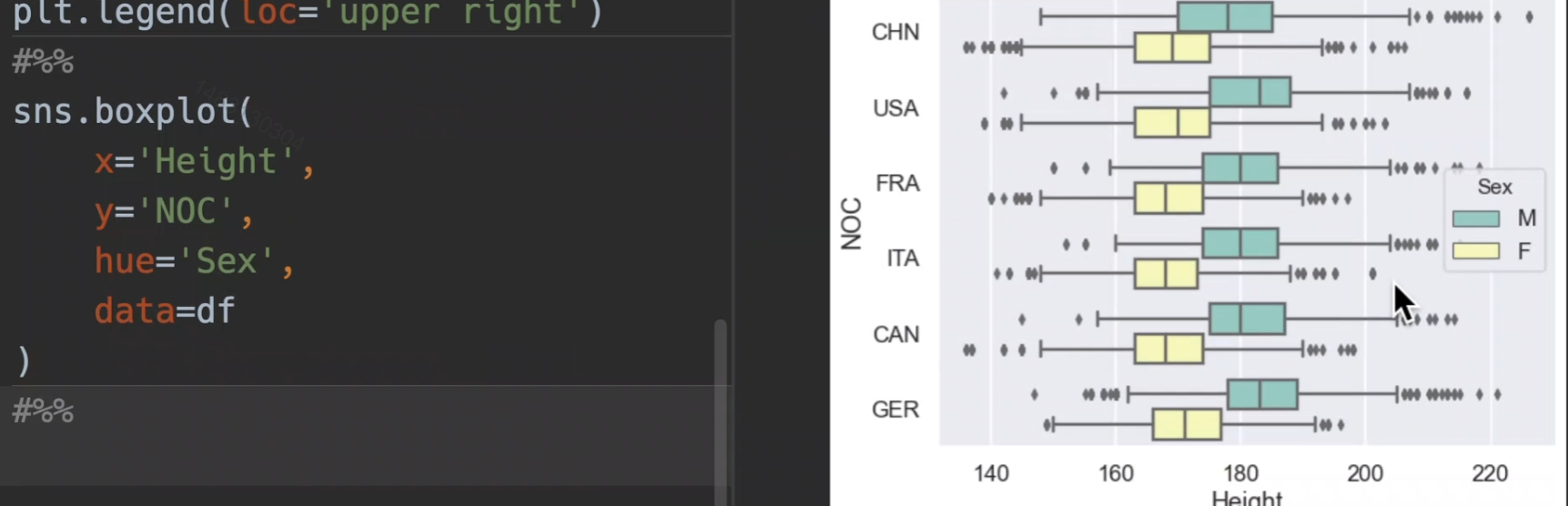
首先用5个例子国家,和中国,定义出一个df,然后用这个df来演示箱型图,箱型图是适合于四分位的图,年龄,升高,体重都可以
分析运动员年龄
分析运动员身高,横过来就是xy数据交换就可以了
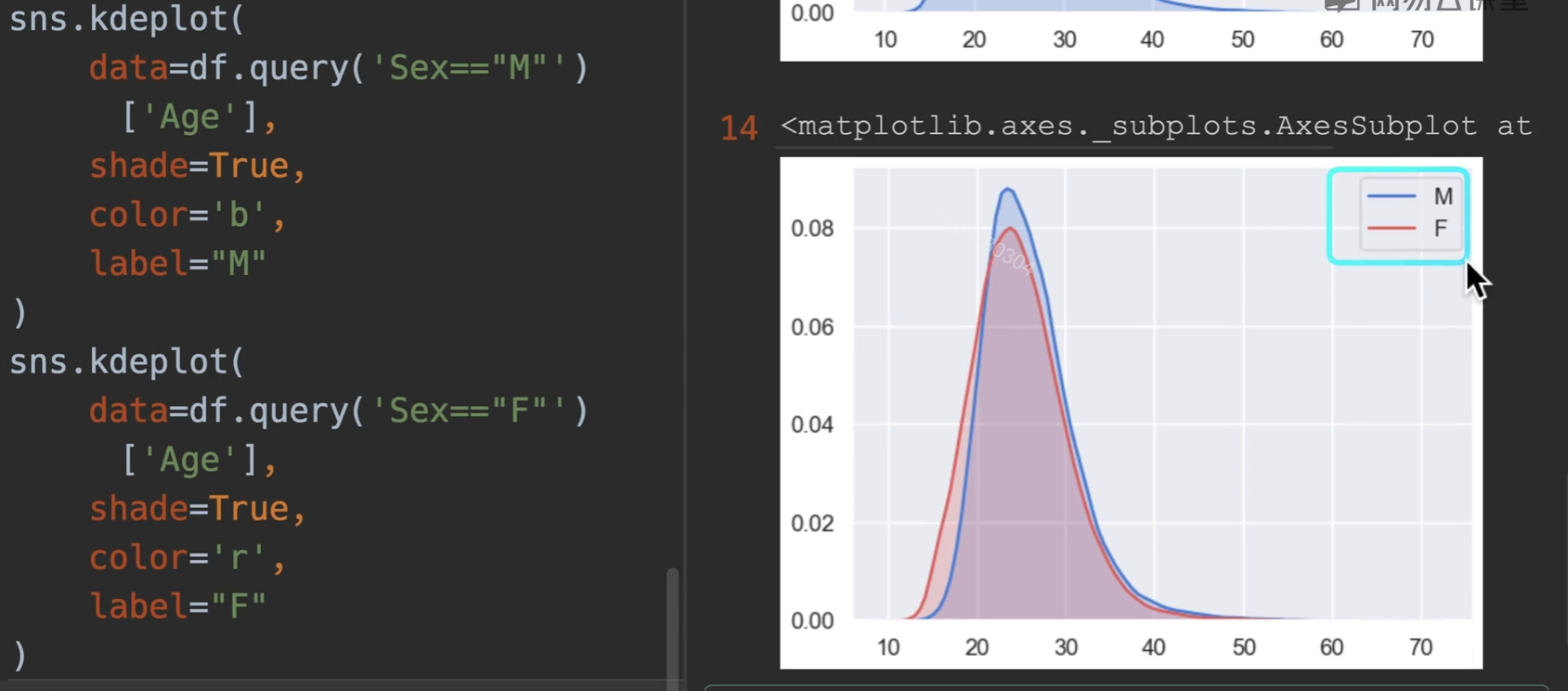
密度图

阴影shade设置为True就会有浅色阴影 ,普遍传入的是一维的数据,默认这样正着,如果你想把它倒着,那么有个参数vertical,设置为True即可
*小提琴图
操作全跟箱型图一样即可,就当箱型图用
*分布图
之前讲过的KDE也是分布图
参数主要使用前五个
a:一维列表或者series
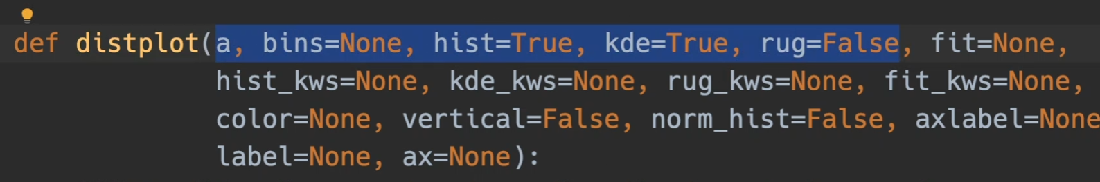
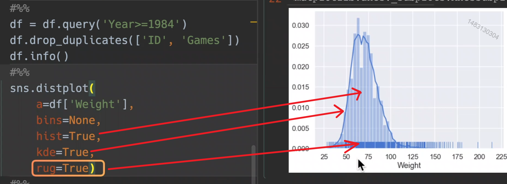
bins控制条的数量
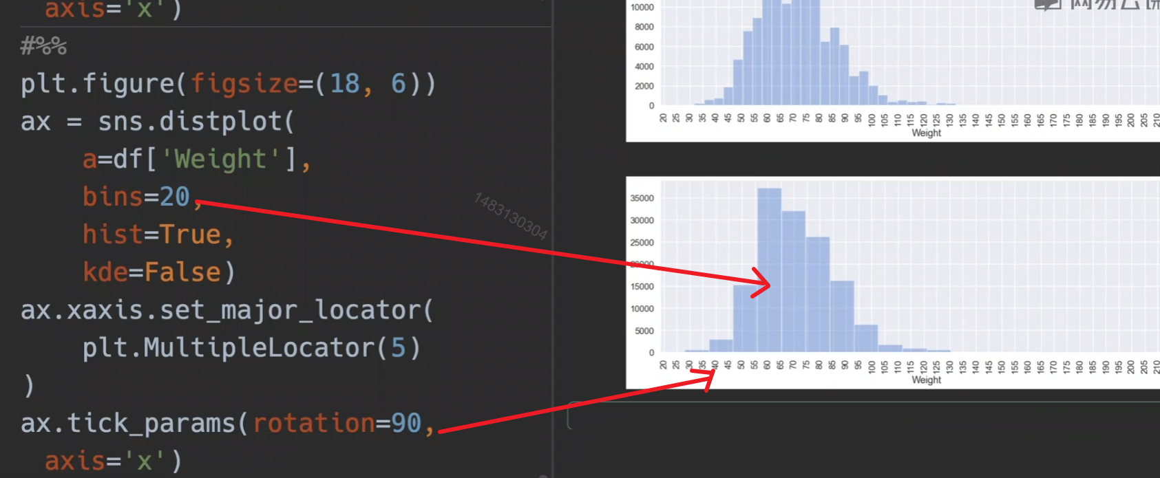
bins可以参考官方文档,可以设置为int或者字符串,字符串就是一些设置好的分箱策略,估计用不上吧,一般默认即可。
figure-level 和 axes-level
一个面下面可以有多个轴,下面的函数都是可以在上面的函数上运行的
FacetGrid 方法
- facet_axis(row_i, col_j): 获取指定轴
- set(
xlim,
ylim,
xlabel,
xticklabels,
ylabel,
yticklabels
title): 在每个子图轴上设置属性 - set_axis_labels(): 设置轴标签
- set_titles(): 绘制标题
- set_xlabels(): x轴标签
- set_xticklabels(): x轴刻度标签
- set_ylabels(): y轴标签
- set_yticklabels(): y轴刻度标签
FacetGrid 属性
- ax: 单轴
- axes: 多轴(axes.flat)
演示
g 也就是seaborn下面的一个类。
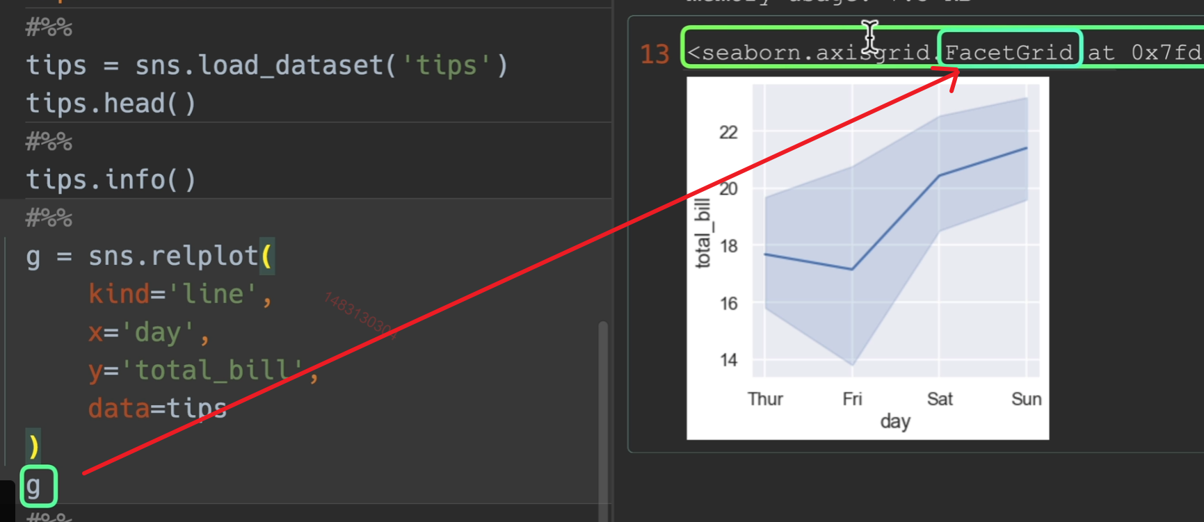
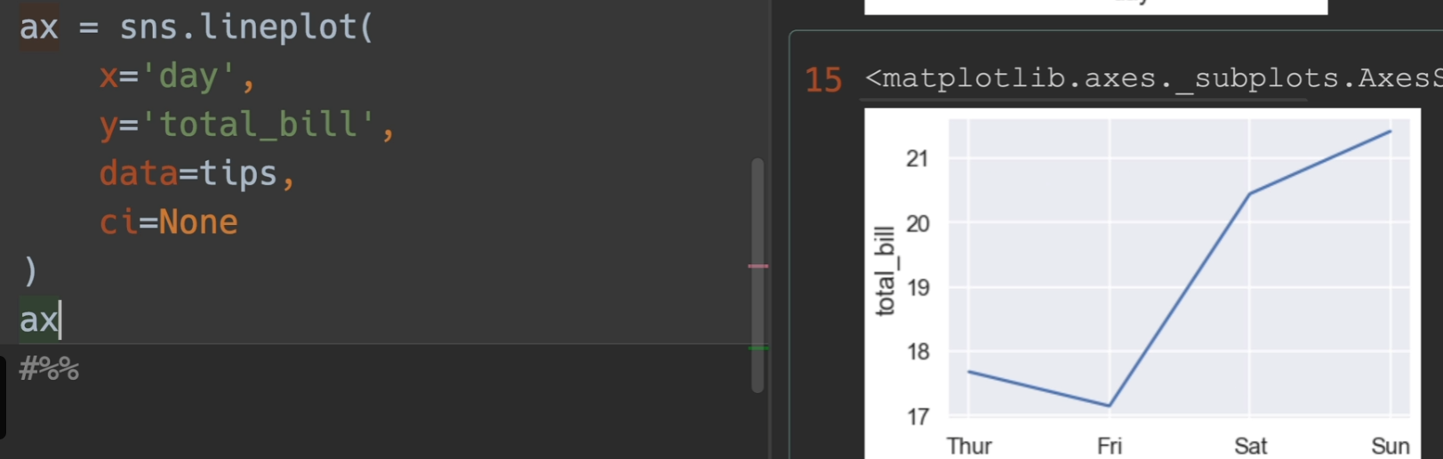
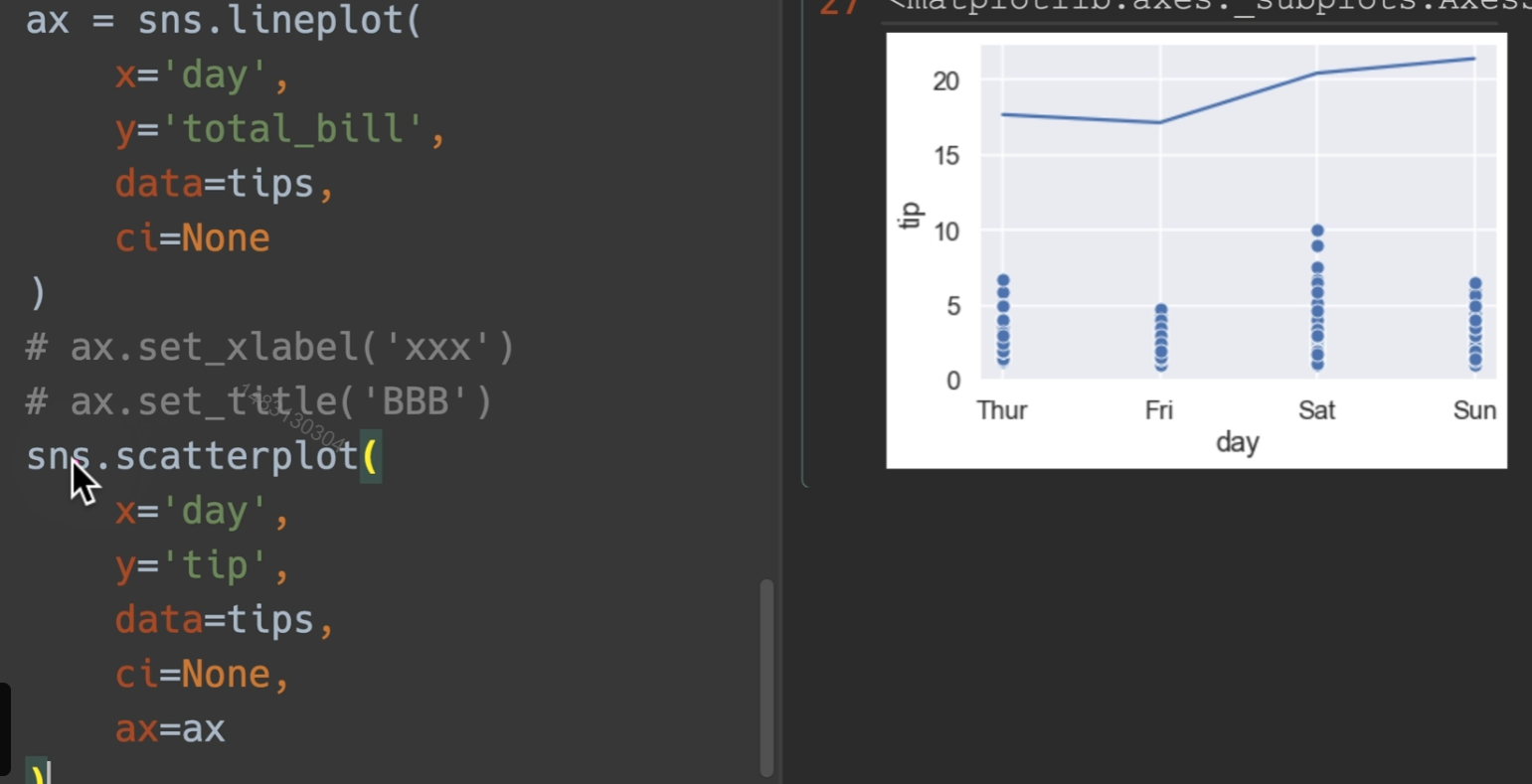
直接用lineplot画,比例会有一些不同,不过返回值就是完全不一样的。
另外,ci=None 关闭置信区间
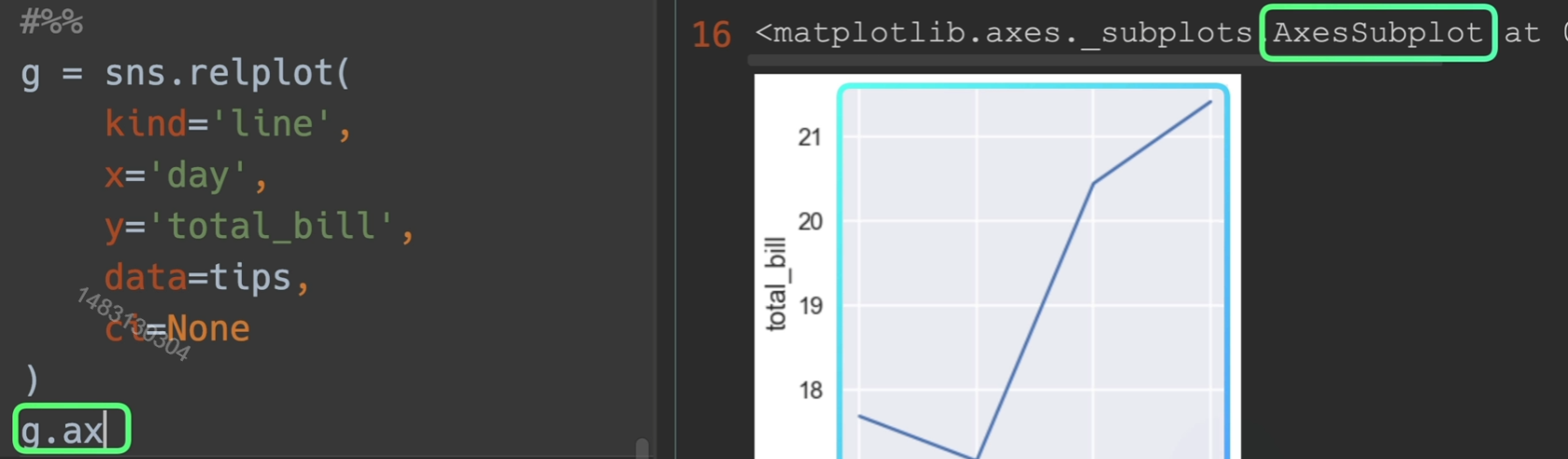
但如果我们对g进行一次g.ax操作,那么返回的就是那个轴
取到子轴的办法
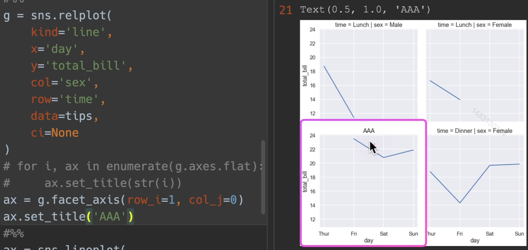
设置标题和label
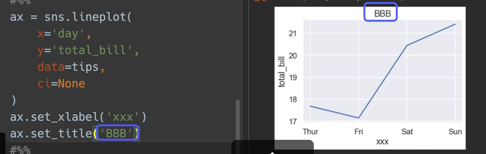
将轴传给自己,他将会继续在这个轴进行画图
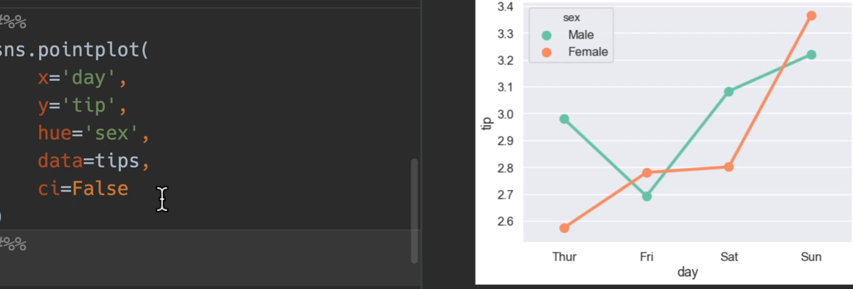
点图
使用tips展示,bar,line,point三合一展示
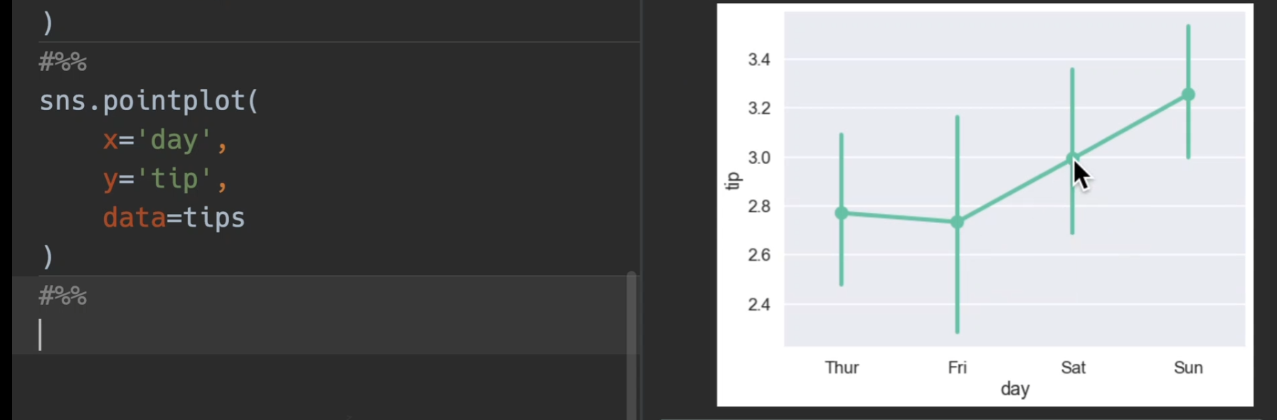
加入了躲避dodge和置信区间ci
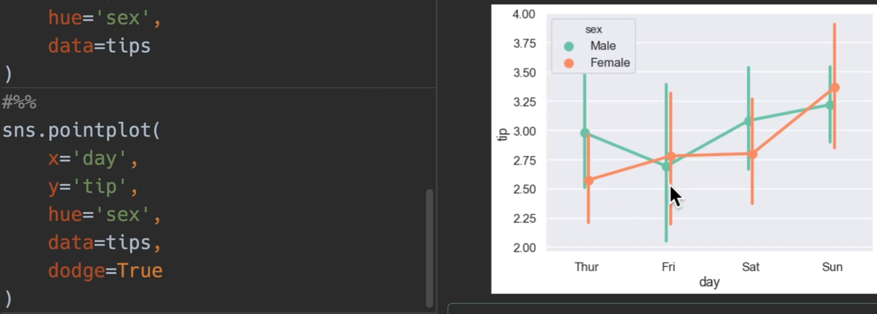
也可以选择关掉
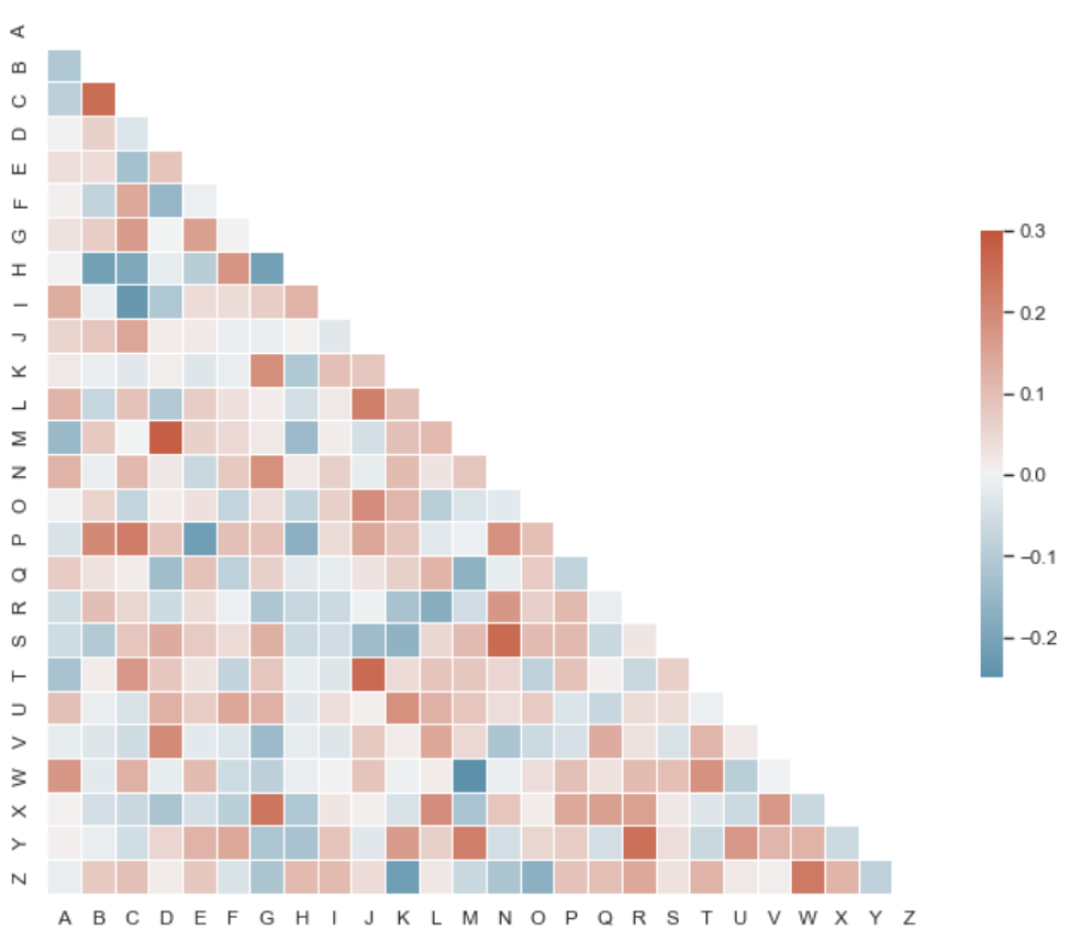
热力图
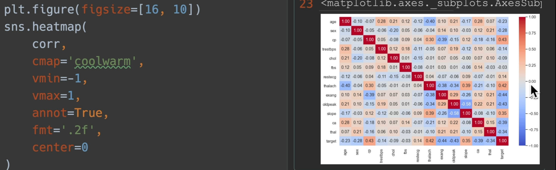
heatmap:根据位置一一对应填数就行
参数列表:
annot:默认False,如果为True,将数字填在热力图表上
cmap:可以填matplotlib的colormaps,要选连续颜色的风格。颜色反转:xxx_r cool_warm是有对称颜色的,如果要设置的话,选择它
vmin、vmax:设置右侧value的最大最小值
fmt:显示字体的格式,比如
'.2f'center:选择右侧数值条的居中颜色是在那个数
cbar:默认为True,为False,则关掉右侧数值条
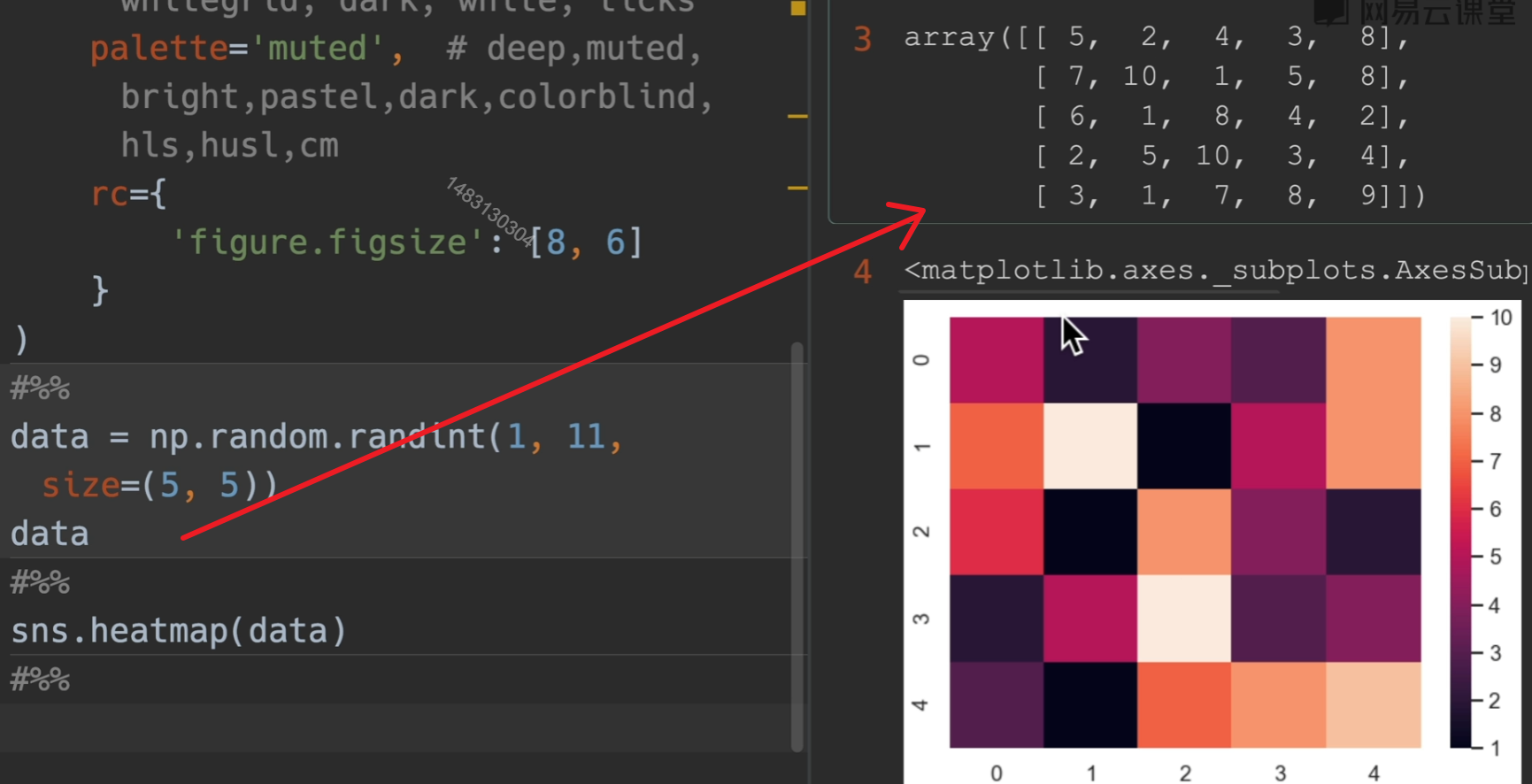
他有一个用途,检测数据之间的相关性
在这里,越靠近一,那么就是正相关,越靠近-1,就是负相关
设置center在这里设和不设一样的,因为定位了最大最小值为1和-1了
这样做的目的就是说我不太关系0附近的点,我关心靠近1和靠近-1的点
回归图
implot()
1 | import seaborn as sns |
高级颜色线图
relplot()
1 | import seaborn as sns |
六面体+柱状图
1 | import numpy as np |
马赛克+柱状图
1 | import seaborn as sns |
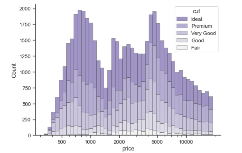
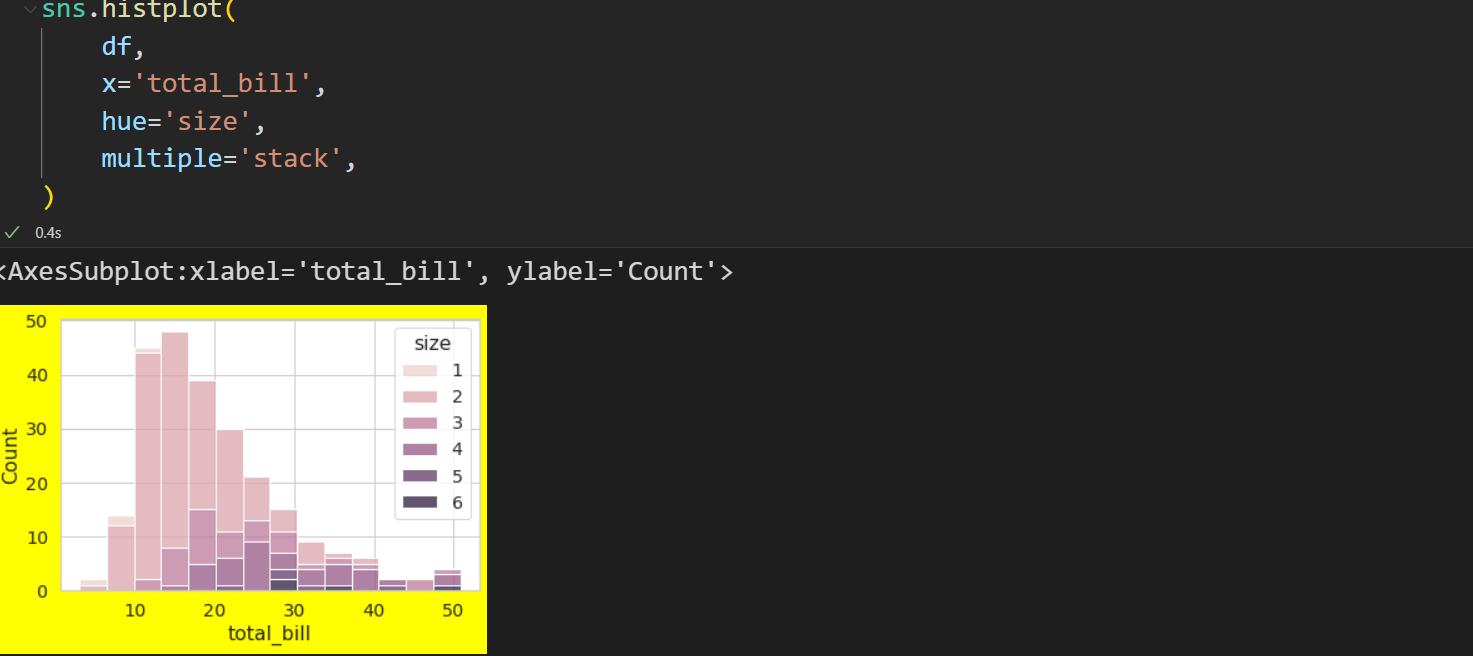
堆叠直方图
1 | import seaborn as sns |
箱型+散点图
1 | import seaborn as sns |
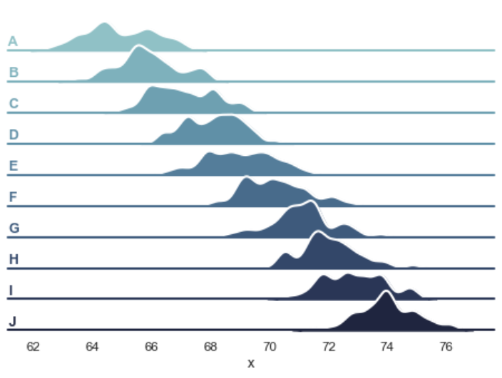
丘陵密度图
1 | import numpy as np |
多维度密度聚类
这个例子好像是物种的长宽分布?
1 | import seaborn as sns |
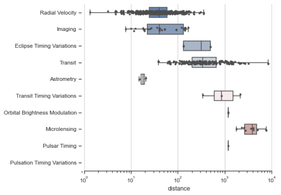
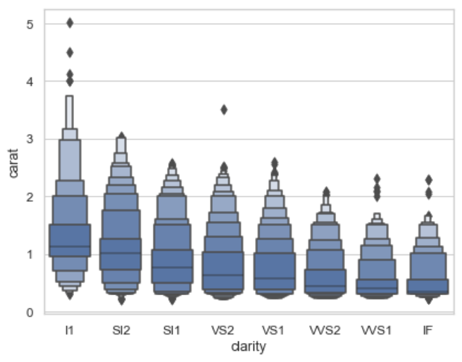
箱盒图
棱形方块就是离群点
k_depth:“proportion” 或 “tukey” 或 “trustworthy”
通过增大百分比的粒度控制绘制的盒形图数目。每个参数代表利用不同的统计特性对异常值的数量做出不同的假设。scale:“linear” 或 “exponential” 或 “area”
用于控制增强箱型图宽度的方法。所有参数都会给显示效果造成影响。 “linear” 通过恒定的线性因子减小宽度,“exponential” 使用未覆盖的数据的比例调整宽度, “area” 与所覆盖的数据的百分比成比例。outlier_prop:float
被认为是异常值的数据比例。与 k_depth 结合使用以确定要绘制的百分位数。默认值为 0.007 作为异常值的比例。该参数取值应在[0,1]范围内。
1 | import seaborn as sns |
高贵蓝宝石密度图
绘制具有密度等值线的组合直方图和散点图
1 | import numpy as np |
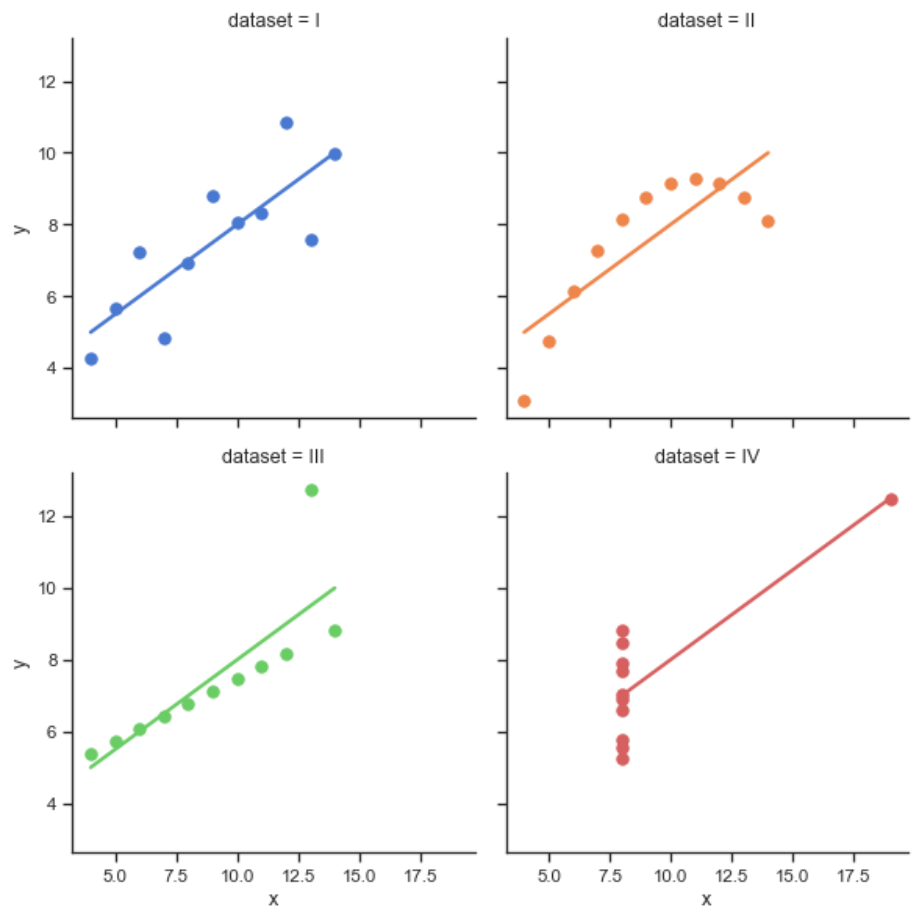
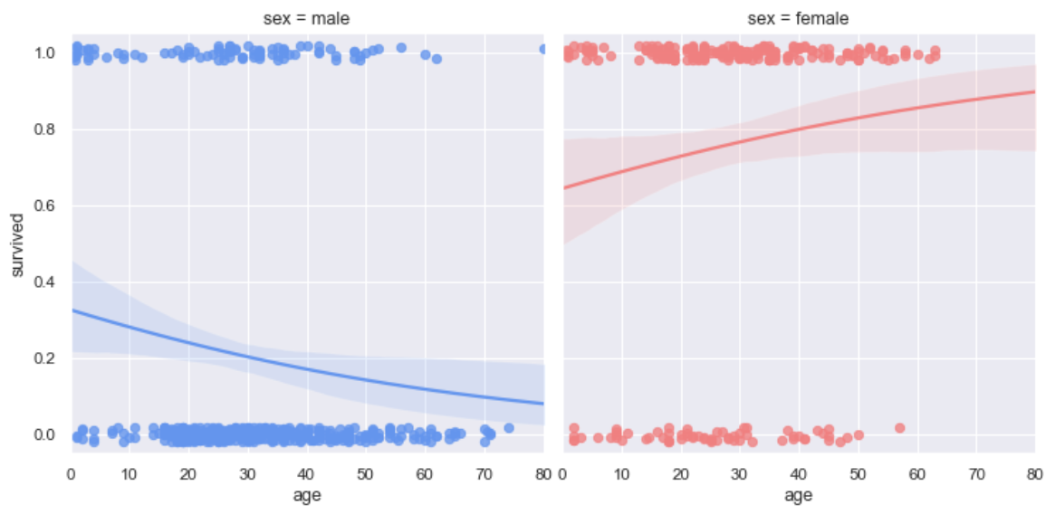
logistic曲线绘制
logistic:调用logistic函数,需要import statsmodels
truncate:默认为True,改为False之后将不将曲线延长(比如这里红色的线,False的时候就后面那一节没有
1 | import seaborn as sns |
步长图
用到在学,感觉用不到Plotting on a large number of facets — seaborn 0.12.0 documentation (pydata.org)
半热力图
主要在于mask,将mask传入heatmap即可
1 | from string import ascii_letters |
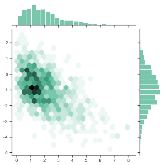
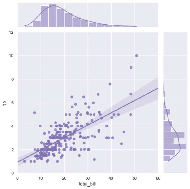
回归+分布图
同样是你最爱的jointplot()
1 | import seaborn as sns |
残差图
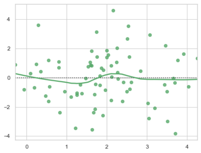
1 | import numpy as np |
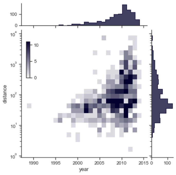
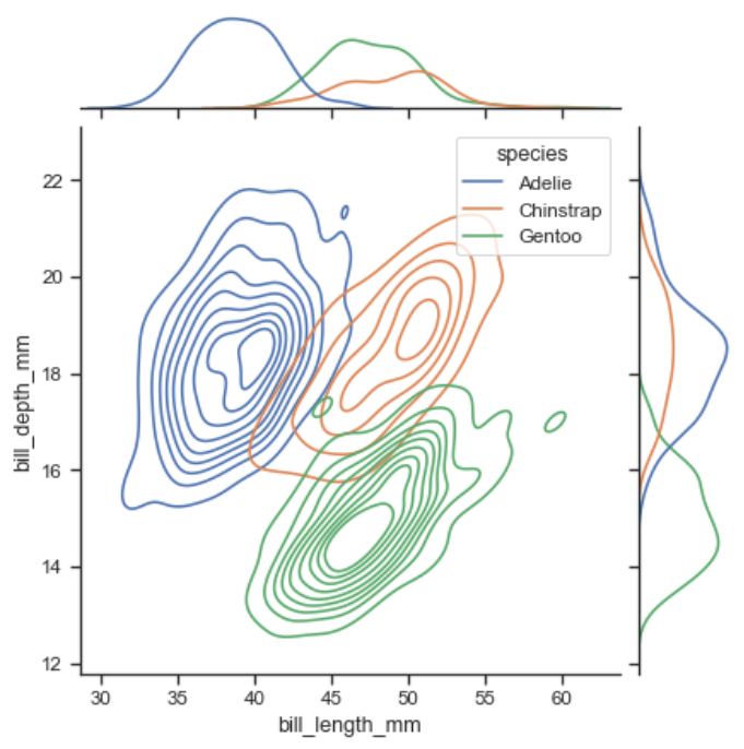
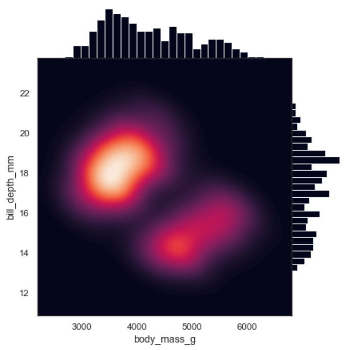
散点+分布图
他好像拿出了四个参数作为轴,同时画了四个图
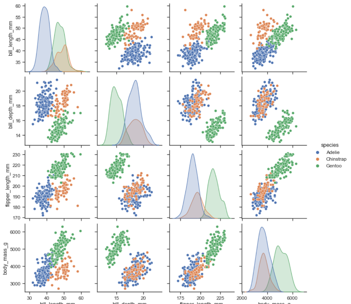
1 | import seaborn as sns |
深邃热力+条形
1 | import seaborn as sns |
带回归线的散点条形图
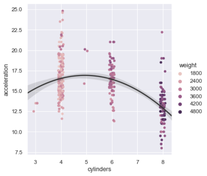
1 | import seaborn as sns |
热力图+树状图
这个是指,多层索引传入,才可以画出来
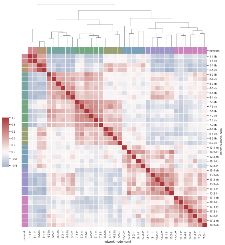
1 | import pandas as pd |
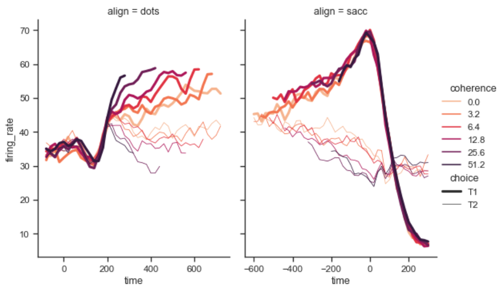
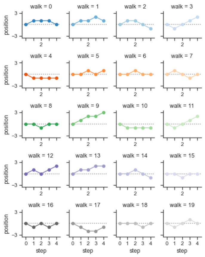
多重时间序列
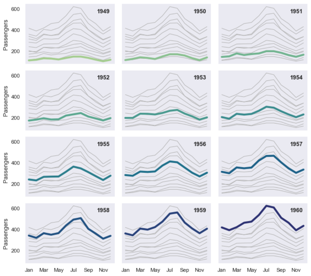
1 | import seaborn as sns |
丰富多彩的线图
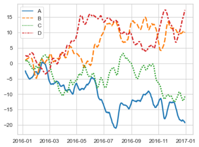
1 | import numpy as np |
生成Mp4,gif
1 | """ |
多图同屏版本
1 | import matplotlib.pyplot as plt |
实战
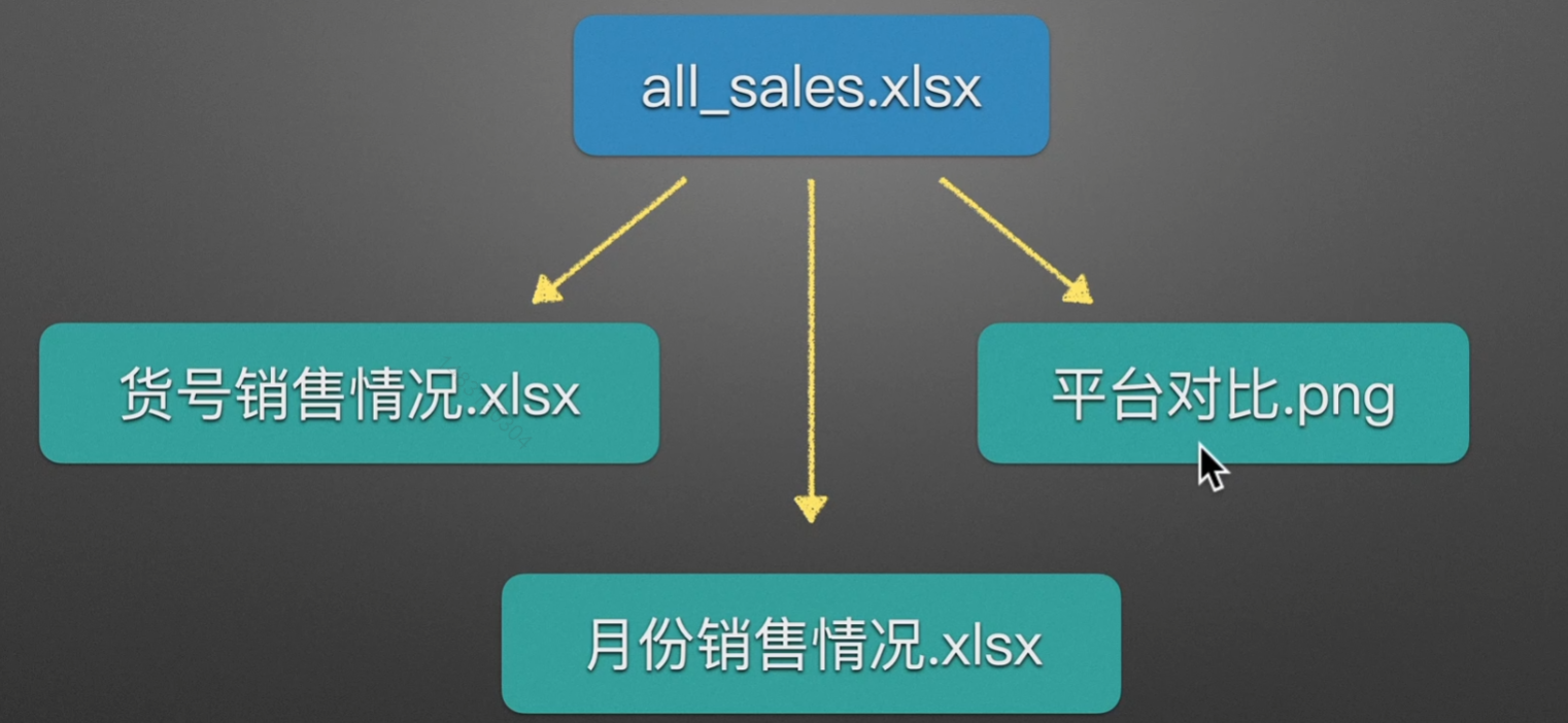
主要步骤
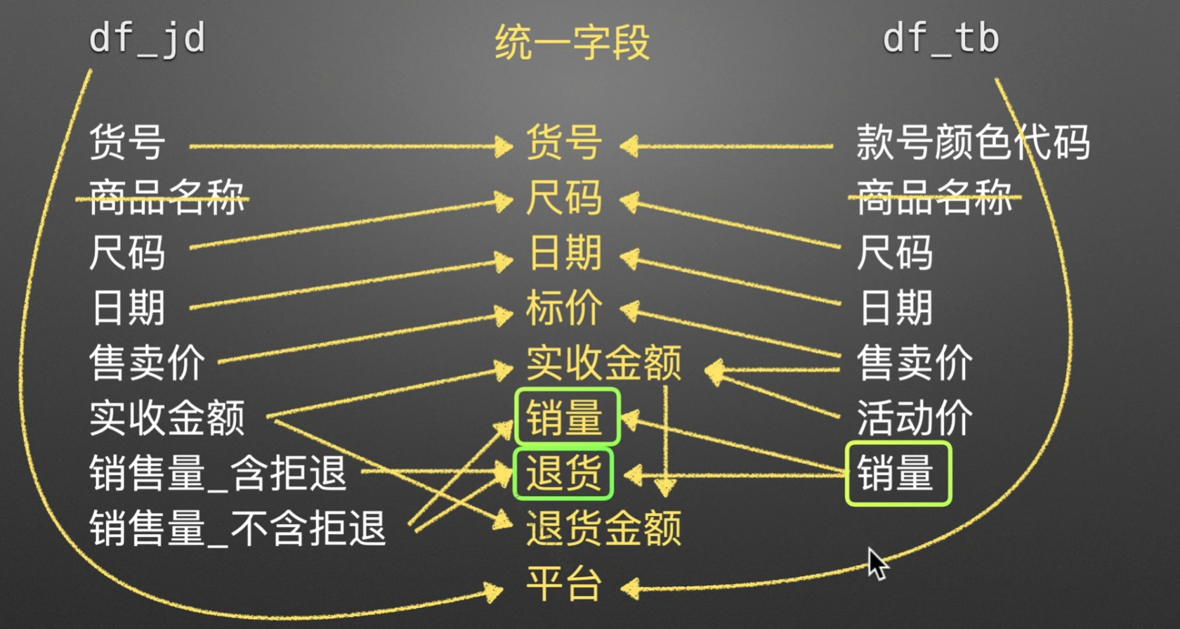
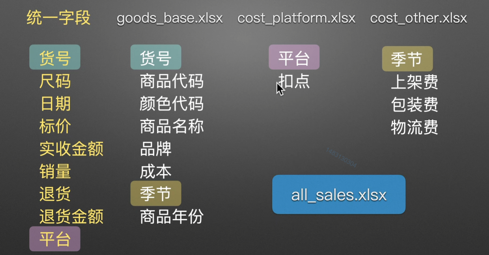
合并单平台表
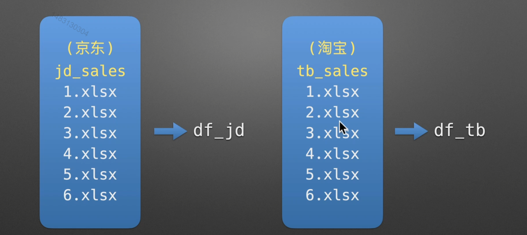
JD TB双平台 + 各种咋二八斤的表合并
得出信息
这里只给出我看到的一些,值得注意的细节:
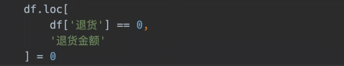
,将退货数量为0的列,设置其退货金额为0
 微信
微信 支付宝
支付宝